09-06-2013, 03:06 AM
Hi everyone !
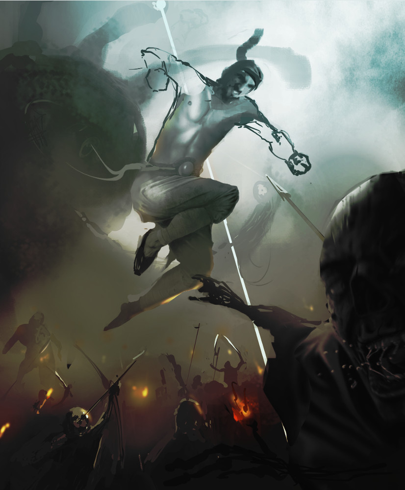
I have worked for 5 days on the illustration below and I thought it would be a good idea to have a fresh eye on that.
This is an illustration I'm doing for a friend who's getting married. I've known him for while, back in the days we were both roleplayers. I've got the idea to turn him into one of the character he used to play, a monk fighter named Fenryl. I first designed the monk, his position and gear, added the face of my friend on the body i have painted.
At first, I just set the monk fighting two orcs and as the painting went on, I enlarged it and really made him fight an army (his character was powerfull enough).
Composition-wise, I decided early to work with the diagonal made by the position of the monk, painting two orcs on the right below him. As I enlarged the canvas, I sticked with that idea, leaning the ground and the army around him to be parallel with his left arm. When the character of the necromancer came out on the foreground, I made him point at the monk to have a nice triangle in the frame. To add a little depht to the image, I came out with the Beholder and his beams which make the viewer go back and forth from the necromancer to the monk to the beholder.
And now, I'm quite stocked.
Working on this for 5 days, I can't see what's working and whats not. I will take a break for a day or two but I thought I could use a fresh eye.
So, after this long introduction, here's my question :
What could I improve ? What's working and what's not ?
Although, I have absolutely no idea for the colors I will be using so if you want to throw some ideas, you're very much welcome !!
Thanks for reading this !
[attachment=32256]


