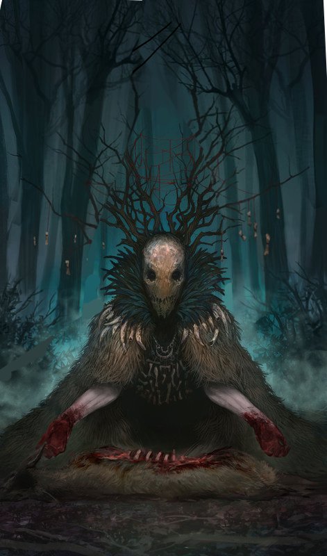
"Guardian of Chaos" - critique/need help
#1
Photo 
[Image: au2l.jpg]

Hey guys
First post in this and is for a critique. way to go.
Anyway.
I have trouble with this illustration. It needs lots of finishng (detail on the floor, detail on the background, maybe some mist in the front or some other thing)

But what I ask is in matter of CONCEPT and COMPOSITION.

I have a really strange feeling with some areas that are not really well done. Like...empty.
I feel i have to put way more substance and complexity into the image.
I'm not really convinced with the little "chicken bones" hanging from the head branches. maybe put something more significant... like... dunno.

lend me a hand over here.
Cheers
and thanks for the opinions and observations in advance.Thumbs_up
Reply
#2
both the character and the composition looks good to me, but why it is called guardian of chaos?
It doesnt look like it is guarding anything, nor there is anything in the picture evoking chaos.

Looks more like a shaman doing a sacrifice or some kind of ritual, you can play with that, do some research about pagan rituals and festivities, i´m sure you will find something interesting.

Reply
#3
Hey dude, I think it looks pretty good so far. Nice use of lighting. The comp is absolutely fine but if you wanted to you could slightly angle the trees as well so they reinforce the strong triangle thing. (see Paintover) You don't want to overload the image with uneccessary detail especially in the background. Perhaps you could push some foreground lighting just to add a sense of depth and throw a little bit of secondary focus onto the kill

The hanging chicken bones are ok, though granted a little odd. In terms of developing the concept, Eduardo is right do a bit of research and see what pops up. You want to add some small things that start to suggest a bit more of a narrative, and what this dude is about. Perhaps a little "ingredients" bag or stuff on the ground next to him or some such stuff. Perhaps look at playing with pattern, within the cloak, his arms etc. Look up "maori cloak" for some ideas on patterned cloaks and things.
I grew up in Malawi (Africa) and this dude kinda reminded me of villages "gule wamkulu" who would freak the living crap out of me when ever I saw them. To start do an image search on that term and they might help you get some inventive accessorising in there as they made their costumes out of anything and everything. Hope that's useful


 YouTube free learnin! | DeviantArt | Old Folio | Insta
Reply
#4
(10-18-2013, 08:13 AM)EduardoGaray Wrote: both the character and the composition looks good to me, but why it is called guardian of chaos?
It doesnt look like it is guarding anything, nor there is anything in the picture evoking chaos.

Looks more like a shaman doing a sacrifice or some kind of ritual, you can play with that, do some research about pagan rituals and festivities, i´m sure you will find something interesting.

Yeah. the thing is that nature itself is a work chaos. It's a concept that puts humanity as a world of order and construction and nature as Satan. It's antagonist. It's really more based on the movie "Antichrist" were it puts mankind as enemy of nature. This would be like a shaman, yes. But as any priest or spiritual authority is more of a guardian of those rites. He protects and takes care of the rites for them to be maintained into posterity.

The fact that is a person in a costume makes you wonder if it's a human or not. But that's what you infer. because you can see a human shape. It's completely transformed and surrendered into death and blood. Life as death. Nature as Shaitan. So acknowledging the victory of Nature over Man.

It's messy. I think I have to think better about it still, but the main topic is there.
Reply
#5
i see! the piece is then much more symbolical than i though, i like it.
I though you were going for something less symbolic and more "direct" but the concept itself is great once you know the meaning behind it.

With that said, i think you could make the character and the sacrified deer pop more, making them the focal point by darkening the rest of the picture and adding more saturation and dramatic lightning. You can also make everything darker and foggy and only add ligth the very focal point.
It depens if you want it to look more dramatic or creepy.

Reply


Forum Jump:


Users browsing this thread: 5 Guest(s)