Posts: 154
Threads: 8
Joined: Aug 2013
Reputation:
6
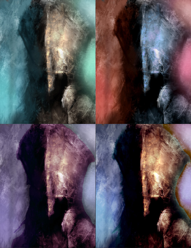
Nice composition! Love the brushwork! Would you mind sharing your brushes? Love the first one.
It's a somewhat solitary existence, a bit like a lighthouse keeper throwing a beam out into the darkness, in faith that this action might help someone unseen.
 My Sketchbook (critique welcome)
Posts: 1,970
Threads: 22
Joined: Apr 2012
Reputation:
243
The two left ones are more harmonious in the transition between key and backlighting though the bottom right probably is a good balance between warm and cool. What is it? A guy in armour I guess?
I'd suggest keeping your values more consistent between iterations, and perhaps add a bit of fill lighting to lighten the really dark shadow areas, because they read too dark at the moment.
Do more iterations just by selecting each piece and colour balancing, and using hue/saturation and curves. Do 10 or 20 of them, it's so easy. Stay away from overly blatant shifts where the fill light is really different from the key or backlight just because natural lighting doesn't work that way unless it is forced artificially and that is what you are going for. Also watch your saturation levels and keep them where the focus should be rather than in the periphery.
Posts: 52
Threads: 14
Joined: Jan 2012
Reputation:
0
Hey thanks guys I really appreciate the feedback! I will see what I can do about uploading some of my brushes Kerm, it's a combination of multiple brushes and honestly I can't remember each one I used lol, but I'll try to keep track so if in the future you or others like the brush effects I'll know which one's to share.
Monkeybread- Hilarious name by the way lol. Yeah this is a really rough sketch of some kind of knight, I've since decided to do include a good portion of his body rather than just the face, but yeah there are definitely multiple things that are off at the moment even in the sketch phase. I've decided to go in the direction of the top left one with the addition of the lower right/warmer helmet color to make it pop more, but I'll take you up on your advice and mess with the colour balancing stuff and see what I come up with.
Thanks again guys, much appreciated!


