Posts: 905
Threads: 39
Joined: Sep 2013
Reputation:
51
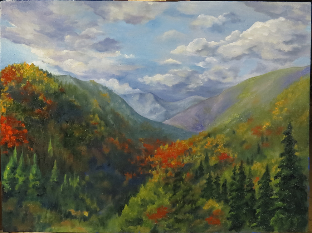
Hi, I'm inexperienced and always have trouble sketching/drawing/painting mountains that are fluffy with trees. Now I have to make this scenic painting for a friend's new home. Any feedback is appreciated! Tomorrow I will also make a trip to a museum to look at ye-O' landscape paintings from the Masters and get some help there.
![[Image: attachment.php?aid=39138]](http://crimsondaggers.com/forum/attachment.php?aid=39138)
Posts: 342
Threads: 37
Joined: Jan 2013
Reputation:
13
im not exactly a pro but this is what is drilled into me every day at school. work in thin glazes of colour, very watered down. find the base colour, so for the trees perhaps a muted dark green, then build from there. find textures or techniques that help by practicing in a sketchbook and experiment.
the main thing is, dont get attached- think of every painting as one you are going to throw away anyways, so just go at it. if its any good then keep it! sorry i cant be more help, thats all i have to offer im afraid, good luck, i know its scary!
Posts: 905
Threads: 39
Joined: Sep 2013
Reputation:
51
(12-13-2013, 09:32 AM)Ward217 Wrote: im not exactly a pro but this is what is drilled into me every day at school. work in thin glazes of colour, very watered down. find the base colour, so for the trees perhaps a muted dark green, then build from there. find textures or techniques that help by practicing in a sketchbook and experiment.
the main thing is, dont get attached- think of every painting as one you are going to throw away anyways, so just go at it. if its any good then keep it! sorry i cant be more help, thats all i have to offer im afraid, good luck, i know its scary!
So like when doing digital painting, do a monochrome paint first then add color kind of idea? I'll give it a try. Back in school I was actually taught complete opposite - put the color down the way you meant it to be. But that's probably because most of the teachings are intended for painting from life, outdoors, where you never really know how much time you have, and if you'll ever get to go back to the same spot second time, or if the same model is coming back next week.
Posts: 79
Threads: 2
Joined: May 2013
Reputation:
21
Hi meat,
That sounds strange... Anyway, the traditional method for approaching any oil painting is usually referred to as "fat over lean". That is to say, darker passages are applied to the canvas (or board) as thin washes(thinned with linseed oil and/or mineral spirits), and lighter passages are applied with progressively thicker paint. Final highlights are usually thick gobs of crusty white paint.
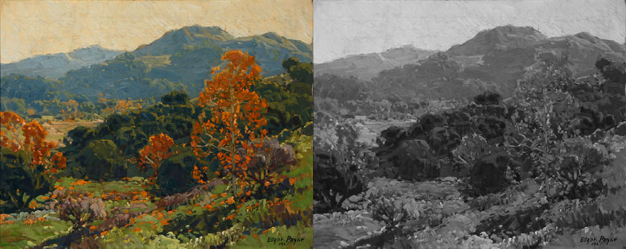
Normally impasto (sorry should be alla prima), or direct painting is used for plein air painting, or observational painting because you can refer to your subject directly, as it is usually right in front of you and corrections are easier to make. However, many landscape paintings you see in museums are in fact "studio" paintings, and are the result of much planning and meticulous execution. Edgar Payne was an amazing landscape painter who wrote a book on the "Composition of outdoor painting". It is very good and you should read it if you get a chance. Here is an example of his work:

You can see that there is considerable color variation and saturation in the image. However, the strength of the image lies in the value arrangement that he chose to emphasize. The bright orange leaves are framed against dark green masses to accentuate their impact.
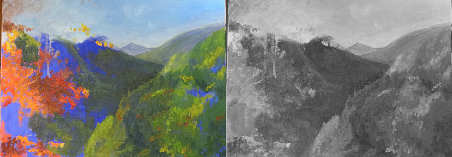
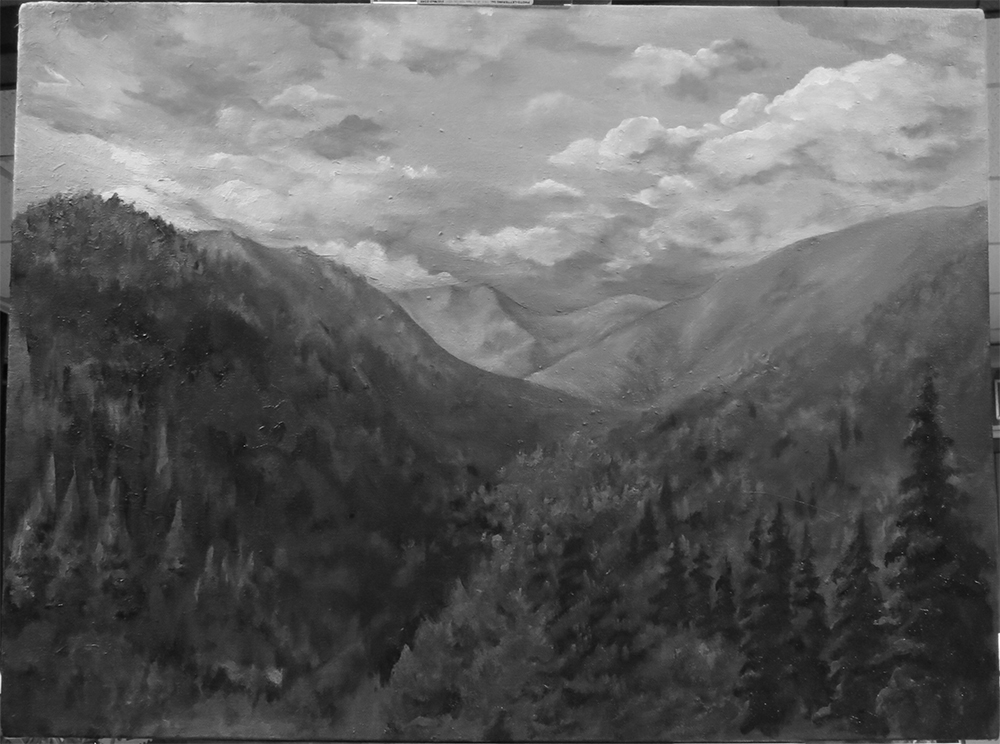
In your image you have a considerable range of saturated colors, but your values are not helping to create depth and interest in your composition:

You have neither very light nor very dark values. This causes your image to read as "flat" and without a focal point. I would suggest spending some time making thumbnail sketches to plan your image. Determine your value range and focal point before you begin painting, as it is difficult to adjust a painting made with very thick passages once you have started(unless you scrape it away and start over). The fat over lean method is advantageous because it allows you to get your drawing and values established fairly quickly with thin, fast-drying paint. Finishing touches can then be laid over a solid framework, ensuring a successful painting.
I hope this helps and good luck with the painting.
-Sketchbook-
"... for drawing is a thinking person's art." - Walt Stanchfield.
Posts: 112
Threads: 5
Joined: Mar 2013
Reputation:
6
For painting trees you could do much worse than check out Bob Ross or William Alexander on youtube. I'm not sure that trees are really the best place to experiment with glazing. Also fat over lean means that you should put oil paint thinned with linseed or walnut oil on top of oil thinned with solvent but not the other way around as it would crack (solvent thinned oil paint dries faster than oil thinned oil paint.)
PS: When I tell you to watch Bob Ross, I don't mean that you should do like him and not use reference and do kitsch cliché landscape, I'm only talking about his use of brushes for texture and layering. I learned a lot about fan brush and spackled textures from him.
Posts: 905
Threads: 39
Joined: Sep 2013
Reputation:
51
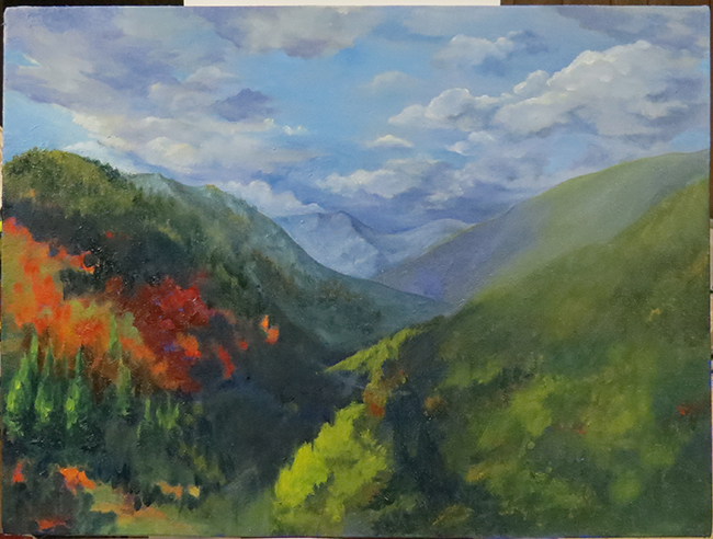
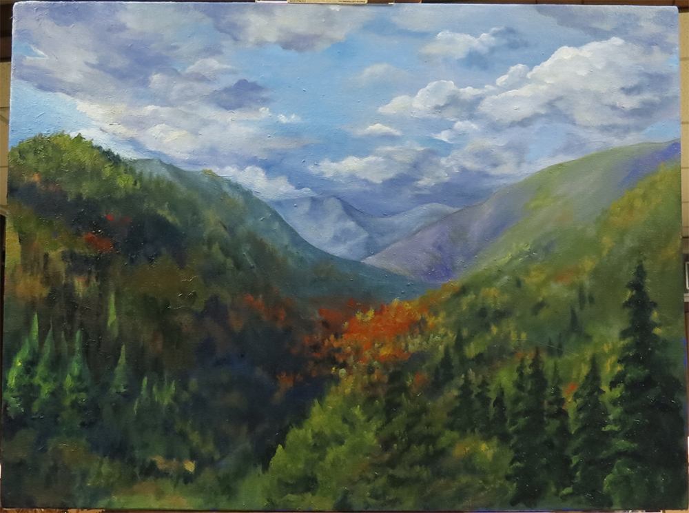
I thought that's what "fat over lean" meant - oil over turpenoid, but college was a long long time ago and I'm not sure anymore. Thanks for clearing that up. What it looks like at this stage.
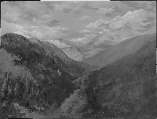
I tried to push the contrast, and checking that regularly by taking a photo then use Photoshop to make it gray. The sky keep blending with the furthest mountains because they're similar colors. If I darken the bottom- most clouds for skyscape contrast, the furthest mountains blend in. But if I darken the furthest mountain more, they start to seem not-so-distant anymore....
I'm embarrassed to say I haven't read the recommended book or the artists on Youtube. Instead I've been sucked into reading and watching videos of a recent fandom. I'll fix that... 'cos I really want to find out what exactly to do with the mysterious fan brush too! I've used it in the sky bits, and the only thing I like about the fan brush is it's flat and pretty easy to clean, haha! I'm probably making way too big of a deal out of this free gift painting, and taking too long.....


Posts: 1,970
Threads: 22
Joined: Apr 2012
Reputation:
243
Hey meat, that is so much better already, just by looking at values. The other thing I would say using Javier's Carlson example; he has reserved the most saturated areas and hue contrast in the desired focal point i.e. that tree. As well as a general value shift from darker high contrast to higher low contrast values from foreground to background for depth, he uses a lot of dark passages against lighter passages to direct the composition and add more depth. If you look at the abstract pattern of the dark and light they all generally lead diagonally to the tree thereby strengthening the composition. The other thing is that overlaying light against dark repeatedly is called counterchange and it helps add to the sense of depth!
Now examine your latest update. The high sat. green in the bottom draws a Lot of focus down and out of the canvas. You do use counterchange a little in a broad sense where the hills overlap, but you can see that the foreground right hill doesn't really make use of this to help the composition. If you did this within the hills themselves it would give them more form and weight to the comp. especially in the foreground. I think you need to pick your focal point, add a sense of interest...and then design your paint passages and values towards accentuating this composition. That orange patch seems to be the place to develop, but perhaps a bit more definition of what is going on there would help solidify it as a focal point.
I also can't help but feel some more foreground would help. The painting sort of peters out in the midground, and feels a bit weak at the bottom. Perhaps a dark foreground passage that goes from bottom right fifth down to the left towards the focal point and into the distance to connect it to the midground more?
If you haven't read it already, I highly recommend a blog by landscape painter Stapleton Kearns. Awesome analysis of masters, and general techniques...all traditional.
This link goes to a list of his own picked useful posts. Lots of good things to read through, but also use the labels tag for specifics. I learned so much from this excellent blog!
http://stapletonkearns.blogspot.co.nz/se...al%20posts
He recommends Carlson's book as well as Edgar Payne's 'composition of outdoor painting', another landscape painter's bible
Hope that helps!
Posts: 905
Threads: 39
Joined: Sep 2013
Reputation:
51
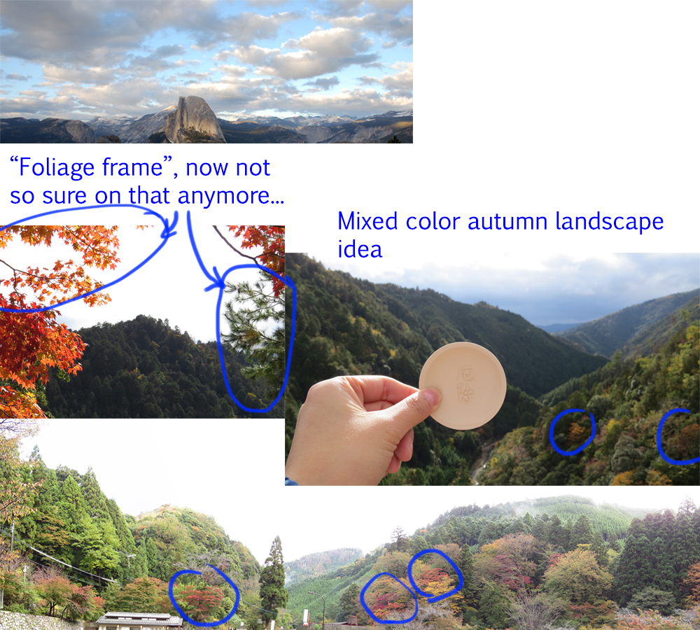
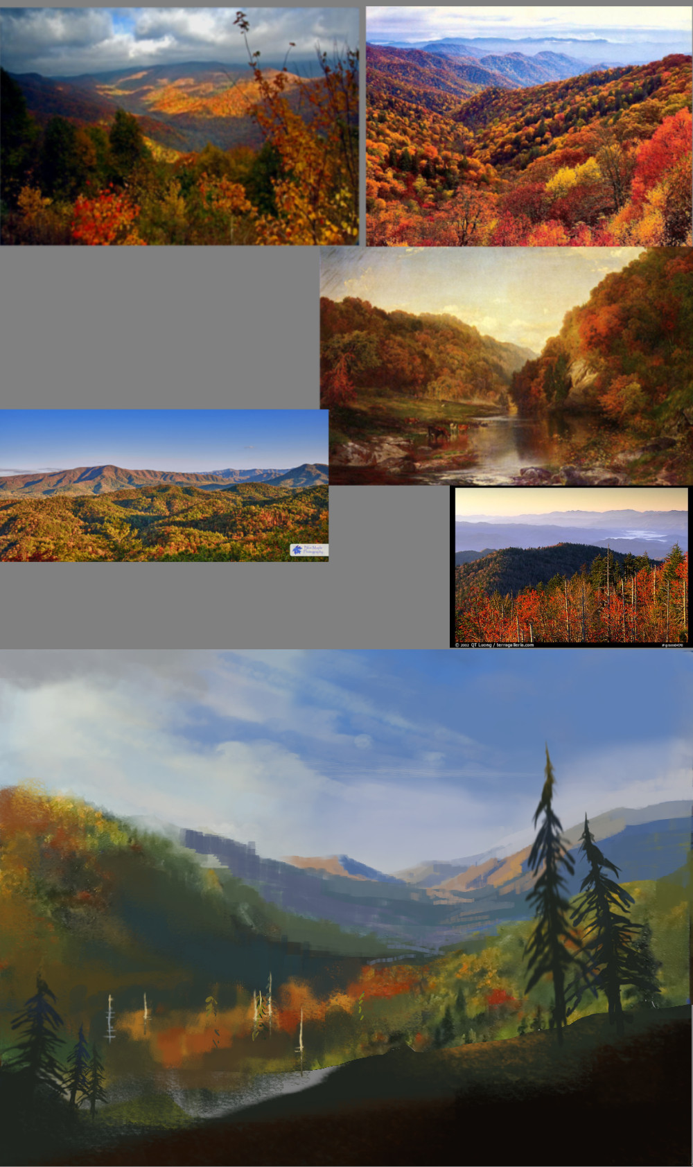
Hey, thanks man! Lots of good pointers there. Those books are hard to get unless buying from amazon, but I'll get to 'em. Agreed there's ambiguous focus in this piece - that seems to be a common theme with me lately. Originally I meant for this to have a "foliage frame" for focal point, and that's what that bright orange blob was. Best explained by showing you the reference photos I've been using. But now I think it'll look cheesy and "slapped on", and not part of the landscape at all, so I've lost the painting's focus. It's also meant to be a colorful autumn landscape with mix of green, yellow, and red.
Here's my references for this painting:

Posts: 1,970
Threads: 22
Joined: Apr 2012
Reputation:
243
Yeah I got the foliage frame thing from your first go. I guess the problem with not painting plein air is that you have to make everything up and you are completely reliant on your reference and your vision. So you really don't want to use bad references! If you look at the reference image of the foliage frame itself; It's a terrible photo in terms of composition as well as value, as are most of the other images. Also different exposures lighting conditions etc.
That's where vision comes in. If you don't have the vision and you are reliant on your ref, then chances are you are going to get lost.
I'm not sure you did any underpainting or value sketching or thumbnails before hand, but this would be a non negotiable step if you aren't working from life. You could probably get away with it if you were.
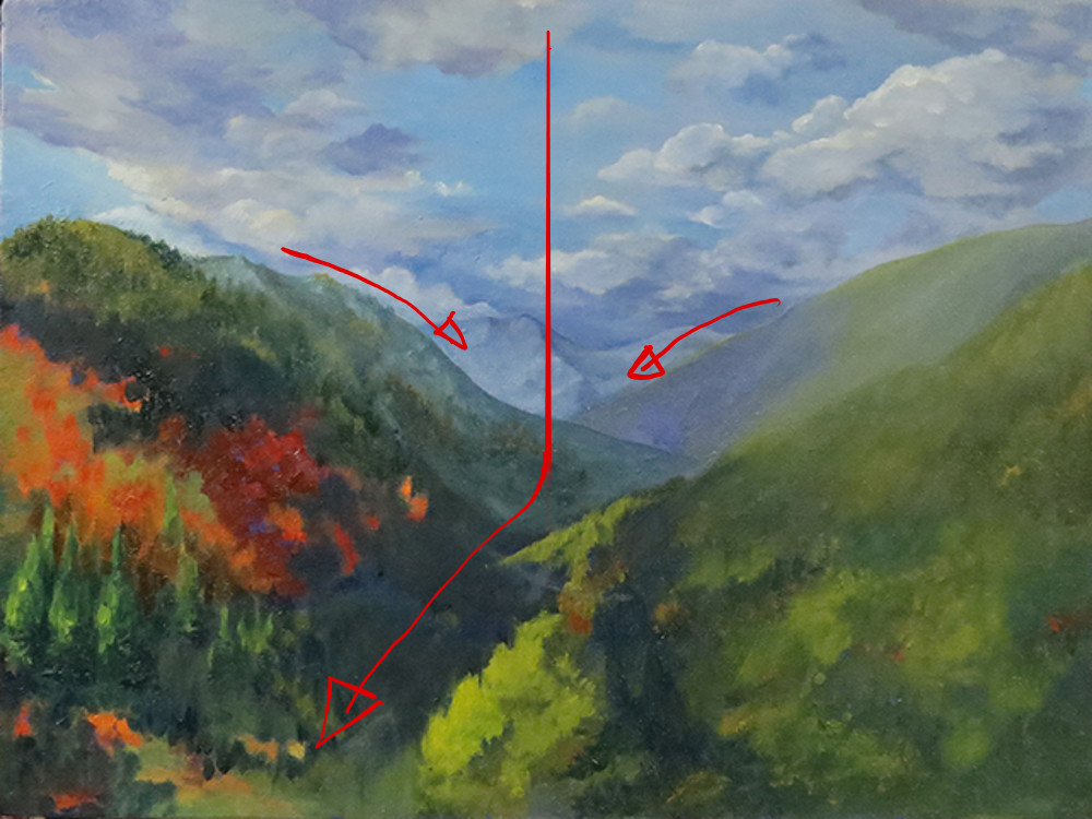
Besides the other points I'm attaching just a quick demo of your comp. It's split in two and trails off at the bottom.

This is a basic fundamentals issue. Sorry I don't want to be a downer, but I guess especially when you are using traditional you really have to do your prep work up front. Digital you can be a bit lazier, but not much!
Posts: 905
Threads: 39
Joined: Sep 2013
Reputation:
51
Haha, yeah, you got me there. I didn't thumbnail anything, was going to just paint from one of the photos and add the foliage frame. Eventually turned into this.....
For future projects, what's a good way to study composition? Despite having studied fine arts a long time ago, I don't recall any lessons on color theory or composition. We just painted a LOT from life, and learned how to build our own canvas.
When I see the master paintings in a museum, I'm just impressed, but doesn't get any deeper than that even though I know there's a lot of some kind of planning going on behind the color and lights and anatomy. Otherwise it won't be as much an artistic painting as a catalog image of a specimen.
Posts: 1,970
Threads: 22
Joined: Apr 2012
Reputation:
243
Well you nailed it there. Master studies! You can desaturate some master paintings you like particularly and do small quick value studies of them, where you are copying and thinking only about value arrangement and composition. Then spend a few minutes analysing what about the arrangement of values makes the image work, take small notes if you want. You can even then do your own value thumbnails trying to apply what you learned from imagination.
A favourite painter of mine is Winslow Homer, he has very strong composition and value control, also any of the hudson river group are good for romantic landscapes.
Besides that when starting your own paintings, don't just launch in there and hope for the best, a little bit of planning up front, sketches, light linework, underpainting whatever, can really help you.
Of course the internet is there. A quick search for composition resources should bring up stuff to look at. I'll see if I can find any useful ones I may have in my resource links. Mostly what I use is the rule of thirds because it is so simple and versatile,but it depends on what the painting is.
Stapleton kearns has several articles that analyse master paintings and talk about composition for landscapes.
I think those books are going to be incredibly useful, but yeah hard to find in libraries sometimes and quite expensive!
Just remembered another great book about painting in general and that is Alla Prima by Richard Schmidt. Absolutely fantastic book on his knowledge and process. And of course can't go wrong with Gurney's Color and Light for light theory and a bit of colour theory too.
Posts: 905
Threads: 39
Joined: Sep 2013
Reputation:
51
Here's what it looks like. I tried to put in more feel of a foreground, but I'm foregoing the foliage frame, and I think I'm going to leave this like this, and make the second painting my friend requested as companion to this one. One day I'd like to get paid for making paintings...
How should I finish an oil paint? I'm going to look it up on Google as well, of course, but I'd like to hear what you guys do to finish your paintings.


Posts: 1,970
Threads: 22
Joined: Apr 2012
Reputation:
243
I think you've addressed some of the issues, but also created new ones. Focal point smack in the middle for example. I think it's best to be done with this piece and start with more focus with the next ones. I wish I could help with finishing, but I've never oil painted :/ something I hope to fix one day.
I have a particular bug with friends asking for stuff. I would get this all the time until I put a stop to it.
Get out of the habit of agreeing to paint things for friends for absolutely nothing all the time; even for the really good ones unless you genuinely want to give a gift.
"Painting is fun, surely you must be doing it only for fun, and so surely I am just giving you something fun to do and you don't need anything in return." Bah!
If you want to get paid, start asking for something in return. It may not be money at first. If you have friends who work various places then maybe get a freebie out of them in return...a free car wash, accounting help, store discounts, some new brushes, canvases etc. Then wait to see the reaction. What, brushes and canvas and paint cost money?? Who would have thought.
The moment you start equating what you do with what they do, the smarter and better ones will realise what they are asking you to do.
Out of ignorance people don't even realise they are taking advantage of you but they will do it without batting an eyelid. The moment you start valuing what you do, others will as well.
Rant over :D
Posts: 905
Threads: 39
Joined: Sep 2013
Reputation:
51
I knew dead-center focal point's bad, but I figured it'd be slightly better than having a composition that looks like dropping a ball in the middle, and letting it roll off frame. What can I do? I'm done with this freebie! It's for one of my best friends, and I'm not sure what I can ask for return from a computer code writer, but maybe she'll give me a bottle of Honey Jack if I ask ;)
Two more, and that's it for freebies - just my two best buddies happen to get their very first house/apartment all at the same time. I've quite learn my lesson now about freebies - even if it is hard to refuse when the temple people asked.

Posts: 1,970
Threads: 22
Joined: Apr 2012
Reputation:
243
Hey that looks a lot better. The red balances it out a bit more than before. I suppose what you could do since there's a bowling alley leading down to that corner, is plug up that leak with something foregroundy if you really wanted, but I think it's a lot better man.
Yeah I don't mind so much when good friends ask of it's for genuine gifts, but if they make a habit of actually asking for stuff repeatedly...oh hell yes they're buying me two bottles of honey jack! :D
Posts: 905
Threads: 39
Joined: Sep 2013
Reputation:
51
(12-28-2013, 05:39 PM)monkeybread Wrote: Hey that looks a lot better. The red balances it out a bit more than before. I suppose what you could do since there's a bowling alley leading down to that corner, is plug up that leak with something foregroundy if you really wanted, but I think it's a lot better man.
Yeah I don't mind so much when good friends ask of it's for genuine gifts, but if they make a habit of actually asking for stuff repeatedly...oh hell yes they're buying me two bottles of honey jack! :D
Thanks man! Right now for plugging I'm thinking either more dark pines, so it blends with the rest of the landscape and not draw attention too much, a Pride Rock sans Simba, or more red maple (which might accentuate the leading-out-of-frame composition rather than help it?), what do you think?
Posts: 1,970
Threads: 22
Joined: Apr 2012
Reputation:
243
Hey man, well after looking at this again after some time off, I really had to say that you've been dancing around the composition issues. Sorry I didn't suggest alternatives strongly enough and I didn't have time to paintover properly. Plugging up that corner actually won't solve the main issue.
The main issue is the canvas is divided into halves both ways. The horizon bisects the canvas, the valley line vertically bisect the horizontal halfway point. You have a composition divided into equal quarters with more weight going into the bottom left. If I was fixing this digitally I would actually crop the image at the top and bottom to get more balance.
Also without actually changing the major shapes in the painting you will be able to do almost nothing to fix the composition.
So with that in mind I did a paintover thinking about how to address the composition. I offset the the centred horizon by adding a strong foreground in the lower third. I shifted the valley centre to the right so it wasn't in the middle of the painting. I simplified shapes everywhere to get a sense of flow to the comp, you can see this in the background hills. I also used the clouds to help this flow rather than just have them horizontally across the image. I used counterchange (dark against light, light against dark) to highlight particular areas and show depth.
Another thing to think about that I noticed, is your brushstrokes. You should be trying to express the shapes you want with the least number of strokes and with the biggest stroke size possible. In your painting we can see a lot of small fiddly work going on all over, especially noticeable in the distant hills. Those hills could potentially just be a couple of well placed swipes with a palette knife for example. You want to nail the shape, colour and value with one stroke somit retains a sense of vitality and action to it. So it is better to scrape off and repaint a stroke if it isn't right rather than fiddling shapes with lots of little ones, because you are dulling down the vitality of the brushwork. Be bold! Another thing is edges. You have accentuated all the sharp edges of the valley hills which is why they draw so much focus and don't recede as much as they could. Edges are incredibly important for focus so you definitely need to start learnung and planning how to use them. Stapleton kearns posts on edges are great.
I know this isn't exactly "finishing" feedback, but I really think you should see it even if you don't do it this late in the game. You must be a bit sick of looking at it by now.
I left the ref I used in there as well.

Posts: 905
Threads: 39
Joined: Sep 2013
Reputation:
51
I saw the composition problem after you first pointed out, and it was my own laziness at not wanting to basically do a new painting by redrawing composition (which I'm uneducated about). I knew I was dancing around the problem, but I rather just get this freebie done, because it is a freebie, along with 2 more. I know, I know... there are things related to strengthening portfolio and 3D and animation skills I should be doing instead with my time, but I still want to do these.
For the next couple freebies I'll start posting with thumbnails in hope to save myself from further disasters. One will be small and simply a butterfly painted from life (I have a dead butterfly), and ANOTHER tree-ish landscape, much like this one. I'll make sure to use the Rule of Thirds, and use less and bigger strokes (which should come easier if I knew what I was doing, which will have been the result of proper thumbnail planning).
I'm really thankful you're taking the time out of your day to write these feedbacks even if they're not "finishing" feedback. Painting is an on-going journey, so if not for this painting, certainly for the coming one :)
Posts: 1,970
Threads: 22
Joined: Apr 2012
Reputation:
243
ha yeah all good. Definitely get crit on the thumbnail block-in stage next time because that's where you will fix composition. :)
|
![[Image: attachment.php?aid=39138]](http://crimsondaggers.com/forum/attachment.php?aid=39138)


