A pirate in love
#1
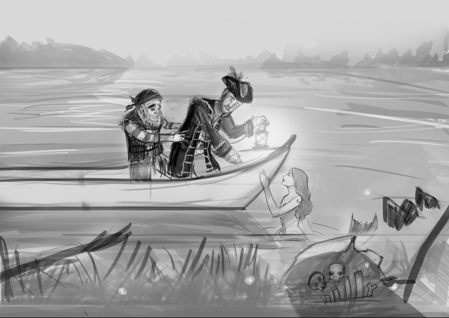
Hey there guys, I'm making an illustration about "A pirate in Love" where the main subject is the young captain, mesmerized by an interesting creature of the sea, a siren. The old man behind him, having more experience with such situation is trying to pull him back to safety.

The siren looks completely harmless, of course, but the viewer is given a glimpse of a possible future with the scene of a skull and a ribcage (not final) behind a rock facing away from the pirates.

At the moment I'm working with this composition, realize that the captains face is out of perspective, and want to crop it in before I start working with finer line work.

I am going for a more realistic approach as far as rendering goes, but may change to a less realistic approach in terms of render. If I do go with a less realistic I may have the young captain smooching at the siren.

The scene's setting is at night, and as previously stated the main focus is the interaction of the captain with the siren, and interest in the old man pulling him.


Feel free to critique in any way possible, and paintovers are welcomed as well.

Reply
#2
Your composition is too flat, I think.

And I'm not so sure if we need to be pulled back so much.

I think you should do some thumbnails that are closer to the characters and at a more dynamic view than what you have here.

Hiya! Hiya! Hiya!

Sketchbook | Deviantart | Tumblr
Reply
#3
(02-11-2014, 11:23 PM)Psychotime Wrote: Your composition is too flat, I think.

And I'm not so sure if we need to be pulled back so much.

I think you should do some thumbnails that are closer to the characters and at a more dynamic view than what you have here.

Thank you Psychotime, I didn't realize how flat my image was until I read your comment. I definitely agree. I'm bad at dynamic compositions, as I lack practice in them, are there any suggestions as far as reference or resources go? I'll sketch up some more thumbnails today.
Reply
#4
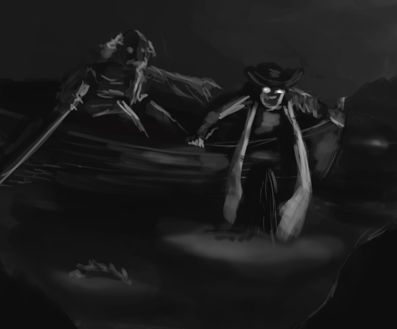
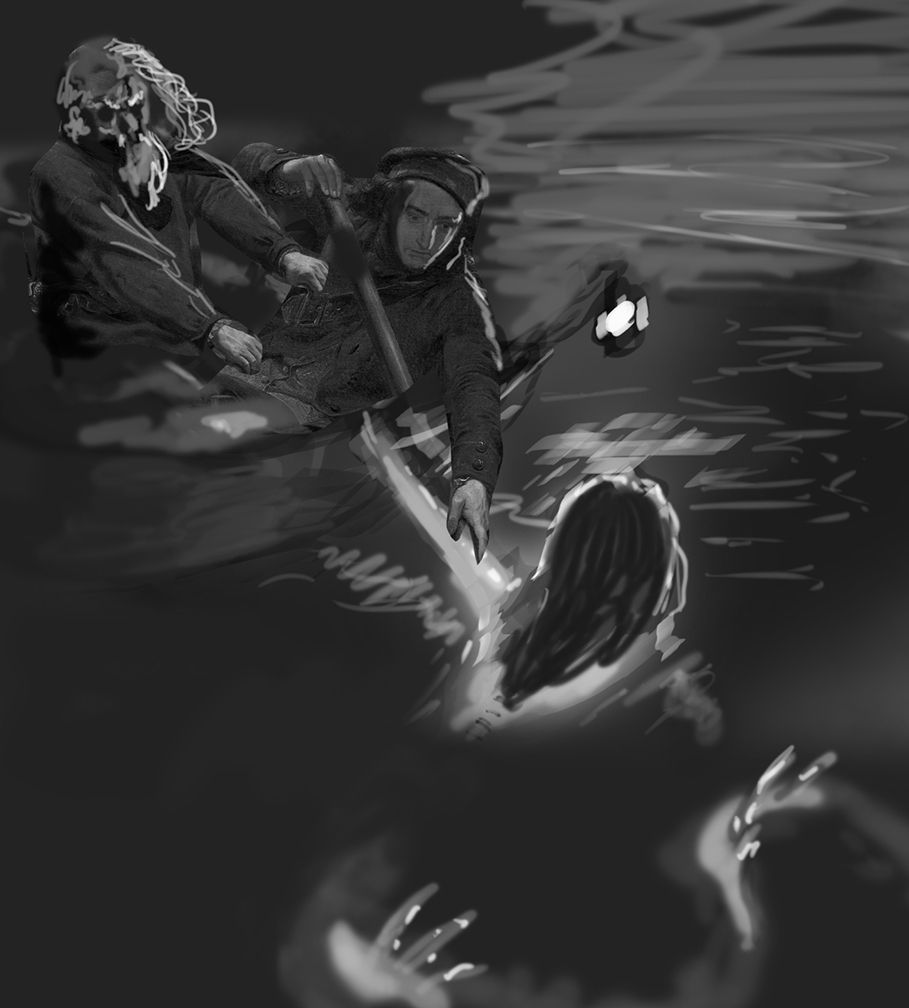
Hey man me and Mike086 did a stream and video painting over and discussing what you can do to try and improve upon your piece, we go into alot of detail and we both came up with different paintovers but essentially kept the same idea. I tried to stay close to the type of composition you originally had but here is the product of what I did also some links to some reference images that me and Mike discuss. He will post the video shortly. Hope it helps! :D

http://3.bp.blogspot.com/-2Hc7z1pDEvM/T9...0A0608.jpg


http://www.propondandlakes.com/images/busch3-1.jpg


http://upload.wikimedia.org/wikipedia/co...,_1851.jpg


http://www.awn.com/sites/default/files/i...irates.jpg


http://mavrixonline.com/wp-content/galle...at_554.jpg


Reply
#5
Hey we did a Critique and Paintover on Livestream for you: http://youtu.be/ik0vhmEsDn8


here is the final image:

Livestream Crits/Paintovers: www.twitch.tv/mike086
Loomis Study videos: http://www.youtube.com/user/mike086


My Facebook page: MCIII
Reply
#6
Wah, weh, woaah! Thank you guys, I am going to soak it all in. I haven't watched it yet, but since I may take a while, I decided to let you guys known that it has all been noticed. I'm working on a thumbnail that I shall post once I am done.

Once again, thanks. You guys are awesome.
Reply
#7
(02-17-2014, 07:56 AM)Mike086 Wrote: Hey we did a Critique and Paintover on Livestream for you: http://youtu.be/ik0vhmEsDn8

Alright, so, I finished watching the video. Btw, feel free to just call me Gabe, since I'm sure I'll be posting more stuff around here, and the name, if you still feel like pronouncing it is pronounced "chiaoGabe", but no need to!

I was going with a different composition after I posted this one. Many of the stuff you guys mentioned was awesome. I had thought about the glowing of the eye as to add some kind of spell casting of some sort, but I never thought about the glowing of the siren. I also didn't think about not revealing her face, but it makes so much sense. After seeing this composition, there's no doubt in my mind that anything else (skulls or bones) have to be added to ensure the viewer that the young lad is in danger. I love the idea, and I'd like to develop it further.

I have been doing some studies on water, and several of the materials in the scene to make sure I would be able to render it, and I will look into the yacht pictures of the glowing water for reference there. The 3 sources of light I'm sure could be tough, but like you mentioned, would really pay off if done right.

If I decide to only use 2 sources, I could still paint the lamp, but make it as if it just has been blown off (the fire) and illustrate some smoke coming out if it (adding more magic to the siren).

Thanks guys!
Reply
#8


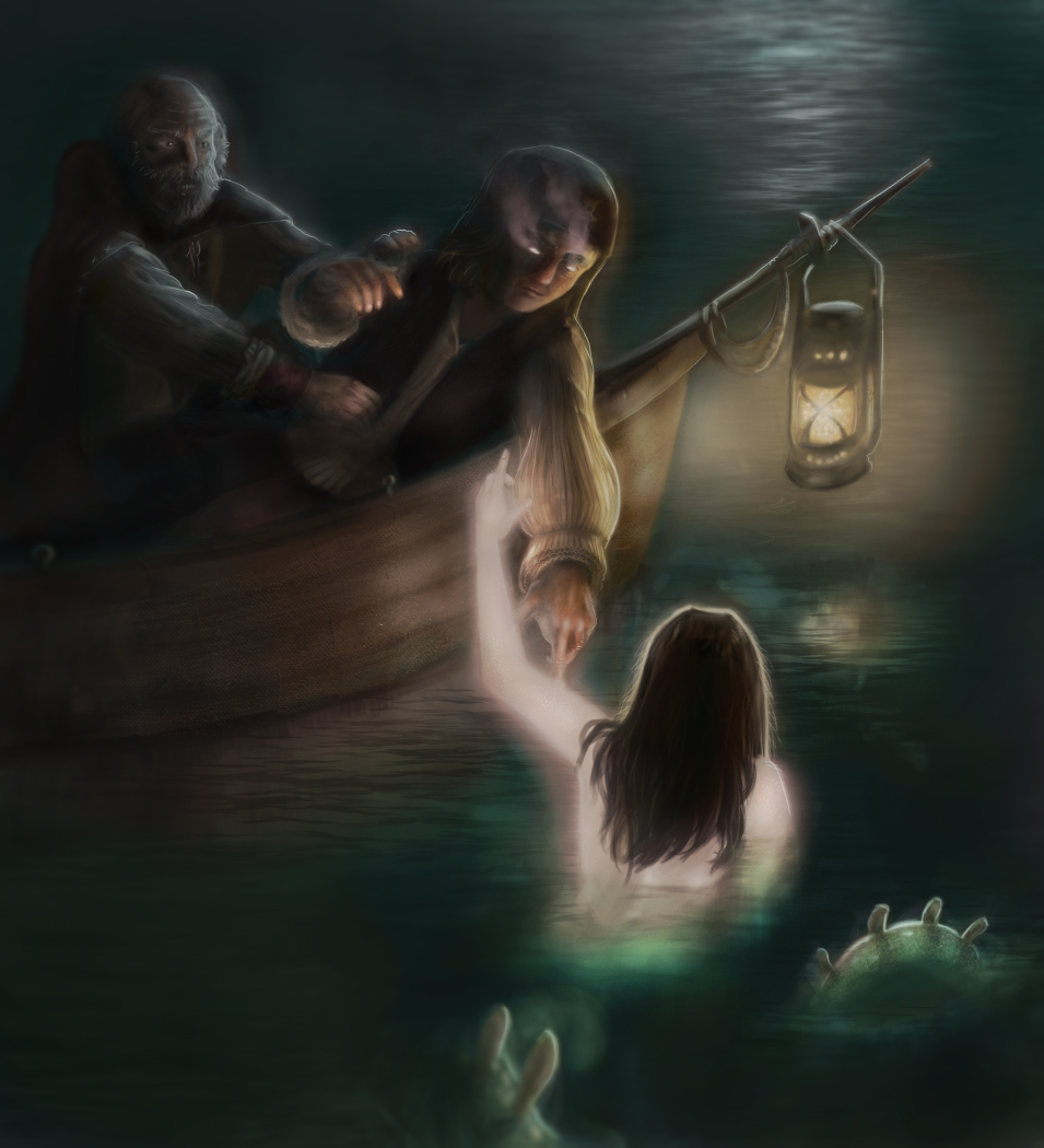
Here's the work that came out of it, I am still willing to change and/or add stuff to it to further improve it.
Reply


Forum Jump:


Users browsing this thread: 9 Guest(s)