Character Critique?
#1
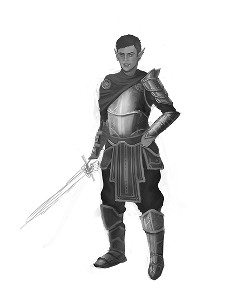
I'm in the process of doing some practice characters before I start my portfolio for character design work.

The premise for this first one is an Elf who isn't noble or elegant like a lot of elves are, but instead a knight. Just a run of the mill knight character to start practicing armor along with my studies.

Would greatly appreciate any paint overs and hints at where I've gotten the figure or anatomy wrong before I continue with the image. Mainly the armor is giving me a lot of trouble.


Much thanks in advance.
Reply
#2
The design itself is pretty bland. Try to come up with some cool shapes and details- especially if you are practicing for a portfolio. If you're going to have a bunch of characters in there, the designs need to be very strong. Just try something ridiculous that you wouldn't otherwise attempt, that helps me out sometimes.

...nothing crazy ridiculous though :P

Reply
#3
I agree completely it's really bland, and I'll be working away from that more, I'm going to add all the little engravings and details after I get the armor believable. Is the armor is correct if the light source is from the left? Especially the legs and the chest piece, I'm having a lot of trouble on.
Reply
#4
It's hard to get the lighting looking good with a completely white background, especially if you are painting shiny metal. Also, remember that armor like this is very reflective... you would probably see his left arm (our right) reflected on the breastplate. Details are nice, but I think the shapes of the armor could be a lot more interesting, just keep that in mind for next time.

Reply
#5
When you wanna design characters that are interesting, think about their silhouette! does it stand out from other characters? is the post interesting? will people recognise it in a crowd?

Mickey mouse is an increadibly simple character, but you would know those ears anywhere.

And this guyy sillhouette is really bland, nothing really stands out about him, What can you do to change that?

http://www.youtube.com/watch?v=vXoLPU9AklY heres a video on the topic of character design : )

good luck
Reply
#6
Thank you both for the tips! I always just thought about clothing and armor design but never really got into silhouettes. Will definitely make it less tacked on and more layered so that it reads better as shapes.
Reply
#7
My 2 cents are... the fellow is very symmetrical, except the shoulder bits. Add some small variations, or minus some small... stuff. Just to vary the, um, beat throughout this character a bit. Hope that makes sense.


Focus.
Reply
#8
If you're going for a less than noble knight type character, you might want to try a few things to make the design more interesting.

Make the armor less shiny and more rusted, give his fabrics some wear and tear. Knights are generally seen as noble, embodying purity and chivalry and things, if you're trying to break from that, make him look unkempt. Maybe get rid of the smile and give him a cynical frown.

If you're going for an elf that is trading in the nobility of his elfhood for the rough and gruff kind of nobility of a knight in shining armor, there are a few things you might want to do in order to get that working, too. Make his features less fair and make him look more aggressive. Again, some wear and tear to show that he isn't afraid of getting his hands dirty. Maybe lose some of the bits of cloth and the shawl and go for some heavy plate, to show that he really isn't your typical elf type character.

To really make it interesting, try losing the sword and giving him a two handed ax or hammer or something. We associate swords as elvish type weapons because they are precise, but if you give him a blunt or weighted cudgel, it really shows he's not your usual elegant type elf character.

Hope this sort of this helps!

[Image: TempleBabe.png]
Reply
#9
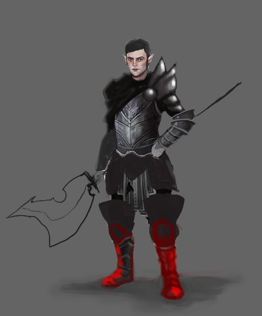
I started changing up the shapes a bit, bigger leg plates to protect his lower regions and some waste armor as well. Do these shapes work?


Attached Files Image(s)


Reply
#10
Hi, I'm new to the forums, and you're further than I am in rendering skills so pardon if my critiques are off.

Big improvement on the silhouette, the asymmetry and the weapon add a lot of character and make interesting thoughts to ponder for the viewer.


The values seem a bit muddy and you should try pushing it a bit more. A band-aid trick I've been trying to out-grow for pushing my values is to create an unsaturated layer of the artwork, fix it's levels, and set it to overlay over the original. Then adjust fill/opacity to taste.

I also find that working on any background other than white helps me judge the values better. Such as solid gray for example. Don't fully understand why yet, but it might have something to do with the white canvas affecting how I see light.

Right now the face stands out with color, but once you push the values, the increased contrast might pull attention away from it so darkening the cape might help bring the attention back to the face with it's overall contrast against the image as a whole.

Aside from value/contrast, color choice, and saturation should help you drive the eye towards key points on the image.

Something is off about his left foot, might be better to have it twist outwards like the other foot, and maybe add a floor shadow to "ground" the figure.

I'm attaching a quick redline(?) of the image to try and illustrate my suggestions. Hope you don't mind.

All in all, good work with the image and look forward to the finished work.


Reply


Forum Jump:


Users browsing this thread: 5 Guest(s)