New to environments
#1
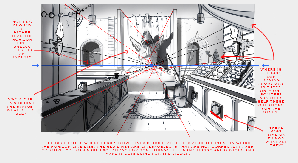
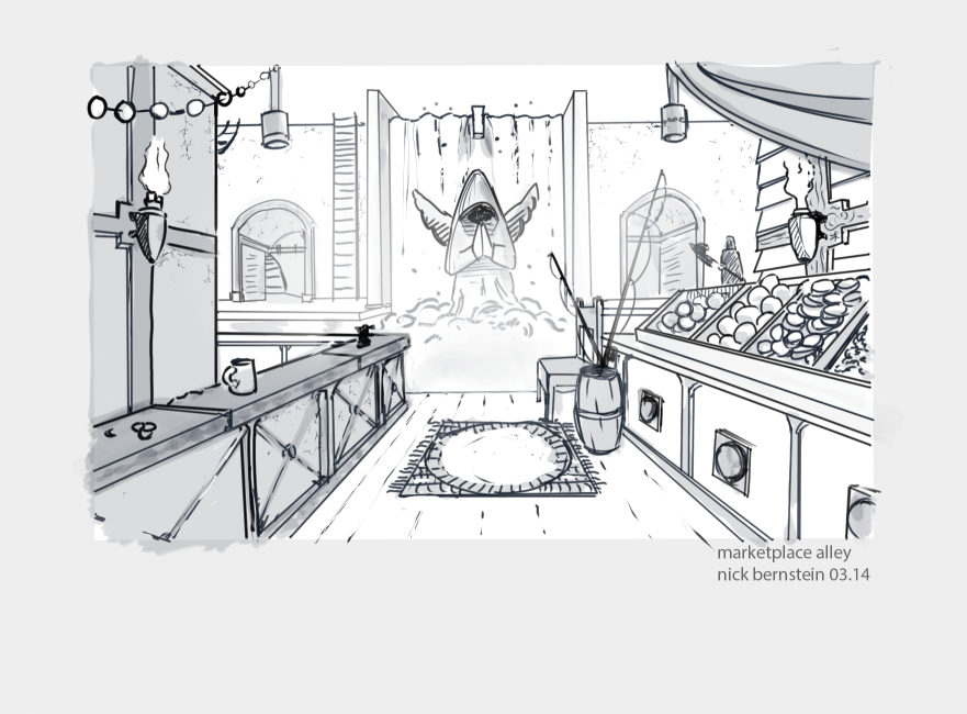
I don't do a lot of environments, but I'm trying to do more. This was for a class on perspective that I'm taking, and after doing some work on it after getting feedback from turning it in, and hopefully fixing some of the more basic issues, I'd really like to hear from people regarding what I can do to make it better. The assignment was to use line so that it's easy to read, but I may go back later and render it.

Thanks in advance for any feedback you can give.

Reply
#2
looks like cool concept.
Mind the perspective, by this i refer to the barrel for example. It should be bigger compared with i guessing fruit next to it. Also you should try to clearify why the statue is there, you draw the attention to it, try to force some story in there.

An example. The streets are ruined, an army has passed through the village, but no mather how big the damage. The people find hope in there God. They get out their hide-out and start repairing the streets, back to fishing, harvesting...

You know what I'm trying to say :) try to make some thumbnails with different perspective points, different angles. You might find some interesting things to combine :) good luck

Reply
#3
Thanks. I was telling myself that the barrel was fine that size and could be a basket, but I really should go back and re-do it, and not be lazy. I'll try and give more thought to a story and see if that leads me to any changes. Thanks!
Reply
#4
Hi, first of all, cool! Perspective is hard, but keep it up and you'll get it!

1. Add more shadows and pick a direction of light. It sort of looked like it is coming from the top left hand corner so that’s what I did. Stick with one light direction and use it to determine your values, color, composition, mood, story, etc. Later on bring in more if you wish, but I suggest practicing with just one.
2. I am confused as to what is happening with the sudden drop off from floor to statue. maybe add stairs, extend floor, etc.
3. Pick a theme. It looks currently like a market, bar, religious cult, and fishing village all in one. play around with themes, but i suggest limiting yourself with a maximum of two or three at once.
4. The focal point is unclear. Is it the center statue, the warrior on the right side, the fruit and fishing rods?
5. Often it is better if the one point perspective doesn't lead right to the center, as then the focal point will likely be in the middle. Works sometimes though.

You have to ask yourself the reasoning behind things. Like the ladder, chair, solider, fishing rods, statue, etc. Hope this helps!


Reply
#5
Thanks for the feedback, this was useful. The intent was for it to be a waterfall behind the statue, where an alley opens up to a canal that flows by it. I'll look for reference for canals, to see if I can indicate that better. This was the thinking for the chair and the fishing rods, but I'll get rid of the cup, which I agree indicates more of a bar.

I was thinking that the curtain would be attached to where the lamps terminate, maybe a beam, or door above that is out of view, and was hoping that it would imply that there was more going on behind the viewer.

Thanks so much for taking the time!
Reply


Forum Jump:


Users browsing this thread: 2 Guest(s)