Posts: 340
Threads: 10
Joined: May 2013
Reputation:
23
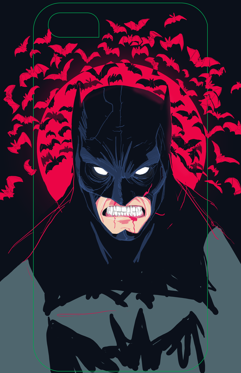
colors and lines are stylized so hard to correct them, you have your idea how they should look like and until now they look good. Problems start with anatomy, why he have more teeth on right side? Top of the head looks odd, and bat ears don't look correct too.
Posts: 3
Threads: 1
Joined: Mar 2014
Reputation:
0
thanks foryour comment!
yes now that i look it needs some work on the teeth and some better proportions with his head
Posts: 84
Threads: 6
Joined: Oct 2012
Reputation:
3
His torso just looks like a big lump that his head is sitting on. I need to see some landmarks, like the collar bones and defined trapezium muscles (which look like they're each bigger than his head at the moment). Get some reference for those shapes, and get some reference for that mouth. The fangs are a little distracting. Another thought: wouldn't the mouth be in shadow?
Stylistically, I think there are some mixed messages going on. I would ditch the soft, red rim lighting on his head. It just clashes with the graphic quality you have going on. The bats in the background look too clean for the scratchy, raw quality you have in the Batman. They look almost friendly, like Halloween decorations or something. As far as that scratchy line, I like it, but I think it needs to be pushed further, and look less obviously like Photoshop. Work your way to a finer line, and use the eraser tool too, so that you can work it like scratchboard. I feel like you could get a lot of energy this way. I would do this to the background too, just to get it to gel together, but keep the focus on Batman. It looks unintentionally rough right now, but this would make it look intentional.
That's just my opinion, based on the style you're already showing us, but obviously you could go with a lot of different styles.
Posts: 3
Threads: 1
Joined: Mar 2014
Reputation:
0
thanks for the great feedback! I'll look into that, and yes I was having my doubts with the style of the bats flying behind.


