03-18-2014, 12:21 PM
Hello again, crit center!
After my last attempt for this little sub-project of a project for the sake of skill building, I've learned a good bit about composition and graphic design. Things that were right in front of my face, but I never noticed until now.
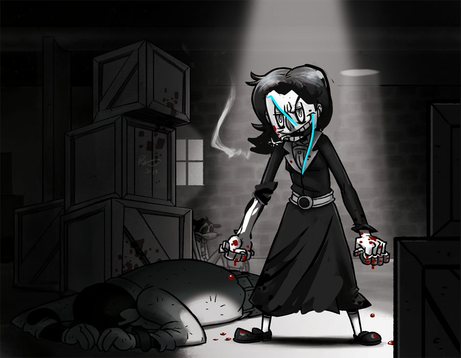
So I've got a new one. This time one of the main characters. Helvetia or "Vet" (named after Helvetia Boswell) is a sadistic pseudo-vigilante who intentionally gets involved with the main plot because it fits her "hobby". She loves beating up "tomato cans" and loves finding opportunities to do so, but she's very observant and never does anything on impulse. She's very cautious and deliberate about everything she does. Most people don't see this side of her, and she wants it to stay that way.
On a normal day she's personable, very easygoing and almost fades into the background, but needless to say she scares the hell out of (most of) the other main characters.
If she had a theme song, it'd totally be Crazy People.
About the illustration, it's nothing specific. Two random throwaway characters beaten up. I was initially going to make them humans, but being funny animals made it...funnier.
I'm at about my 6th card frame now, but I feel it's improving every time. I've made everything much simpler now, less cluttered and haphazard. Text is easier to read.
I've since learned a good bit about the composition necessary for character based card illustrations, and it turns out to be much less rigid than I originally thought.
![[Image: tumblr_n2ly1pTqpH1s6dh1ho1_1280.jpg]](https://25.media.tumblr.com/1afada216966263b26fd77543e869dac/tumblr_n2ly1pTqpH1s6dh1ho1_1280.jpg)
![[Image: vet4drop.png]](http://i32.photobucket.com/albums/d17/CaptainKRool/vet4drop.png)


![[Image: tumblr_n2ly1pTqpH1s6dh1ho1_r1_1280.jpg]](https://24.media.tumblr.com/b43eac24e77f33ef22596c02d2ef497a/tumblr_n2ly1pTqpH1s6dh1ho1_r1_1280.jpg)
![[Image: persp-1.jpg]](http://i32.photobucket.com/albums/d17/CaptainKRool/persp-1.jpg)

![[Image: tumblr_n2ly1pTqpH1s6dh1ho1_r2_1280.jpg]](https://31.media.tumblr.com/02abc1a72ccd0a8b0daf692fe3c22ba6/tumblr_n2ly1pTqpH1s6dh1ho1_r2_1280.jpg)