Yo, I tried to outline some basic fundamentals that could improve your image. Always do thumbnails and simple value arrangements before you render a piece to make sure all your elements are working.
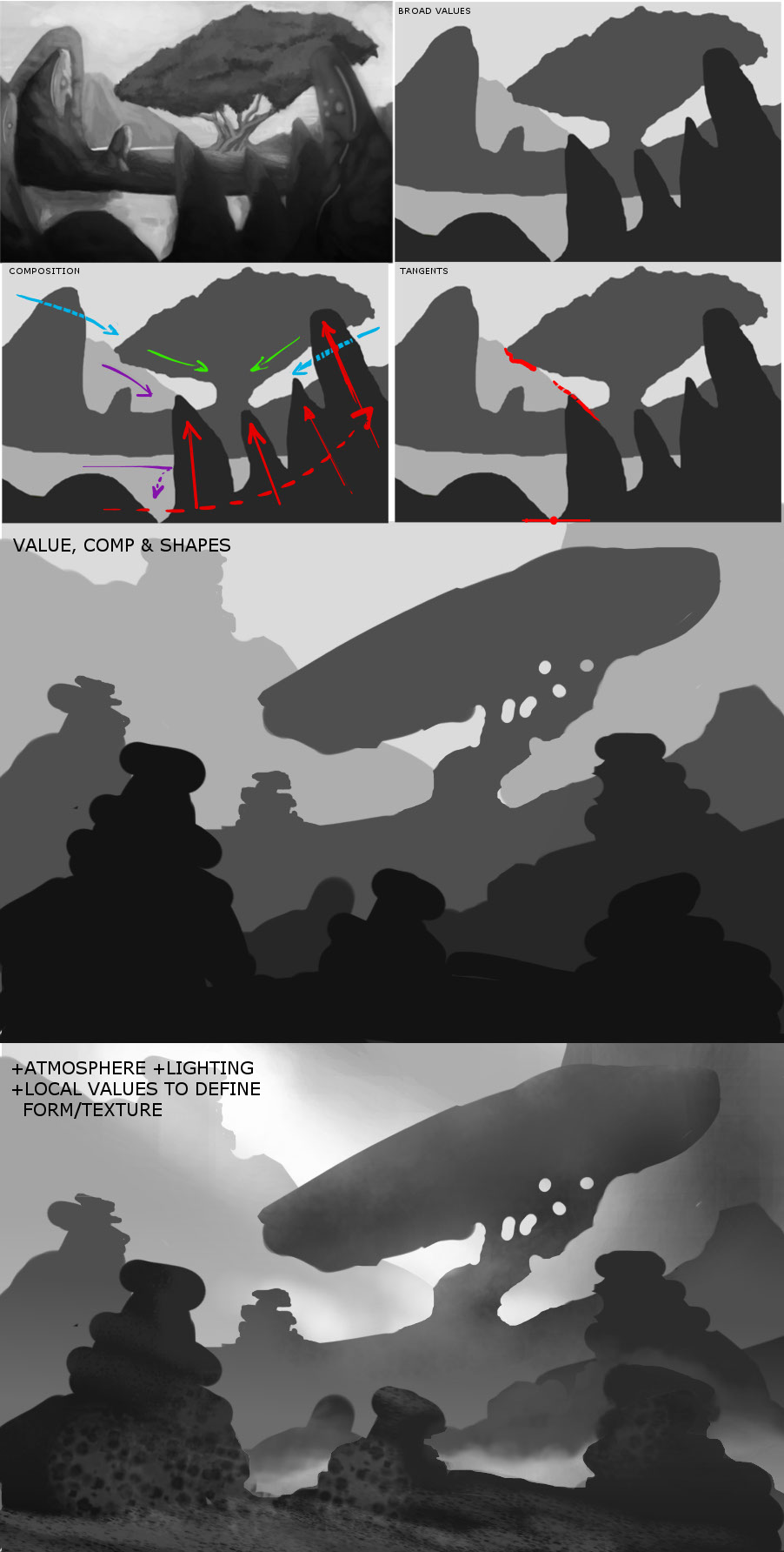
So below, in the top right image, I simplified your composition into 4 basic value layers. You'll notice there is an immediate jump in readability just by simplifying. The reason for this is that you have values in some layers that bleed into the values of other layers thus flattening the distance between them in the image. Also notice the similarity in value between the sky and the lake..this is why it looks like the midground is floating on top. Value and contrast separation is equal to depth separation.
In the "composition" thumb, I tried to show the main lines of your composition with the shapes you used. Blue is the sky layer, purple the distant hills, green the tree, red the foreground. Where there are dotted lines this is to show the general flow of the composition being broken by other shapes in the way. You have picked a focal point (tree trunk) and definitely are working shapes towards it for the most part, but look at how badly the foreground interrupts this.
The 'Tangents' thumb shows you where you have the outlines of separate objects touching each other creating depth perception issues. Examples are the tree and sky; also having lines continue on from one object to another (see dotted line from background hill to foreground rock) cause depth issues. Also lines meeting or touching the canvas edge create unwanted focal points and break composition. Check this link out for more on tangents.
http://blog.drawn.ca/post/13752763449/du...o-spotting
With a value thumbnail you should be looking to determine your value arrangement, composition, perspective and general shape language as well. Shape language is your use of shapes to indicate intangible things about the image. Rounded and curved shapes are soft and inviting, organic. Hard edges are dangerous or intimidating and so on. Using opposing shape types can help draw focus. So if the surroundings are hard edged, then maybe the tree could be the only soft shape thus drawing focus to it. Shape language is important in design work, and you need to think about this with intent and apply this within your work to achieve a sense of design consistency and cohesiveness across the image.
The last image is using the separate layers and adding, atmospheric perspective, lighting and beginning to indicate form and texture locally to start creating additional focal points. Note at this step you should always be trying to keep your general simple value scheme intact overall otherwise things will start moving around in depth. Work with your piece zoomed out as much as you can, or use the navigator to show a small version of your image to make sure you maintain the overall readability of the piece.
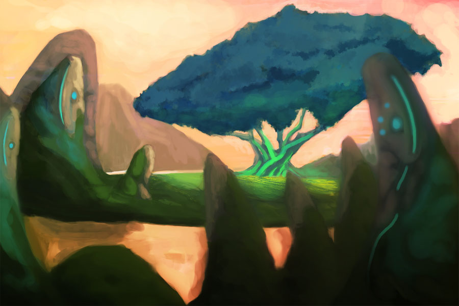
In terms of colour, your piece goes from 30 to 70 in saturation across the entire piece, with most of it in the higher ends. Saturation tends to draw focus, so maybe work with more desaturated colours to start with and reserve your highest points of saturation for focal points and accents.
Hope that helps. Feng's videos are great but they do not focus on fundamentals, and this is what you need to focus on. I also recommend Shaddy Safadi's video series on Youtube for some really important ideas and workflow steps. It's not a "tutorial" but he knows what he is talking about, and it is packed with lots of information if you listen closely.
https://www.youtube.com/watch?v=NygkJEc3yu4


