04-14-2014, 08:32 PM
Hello,
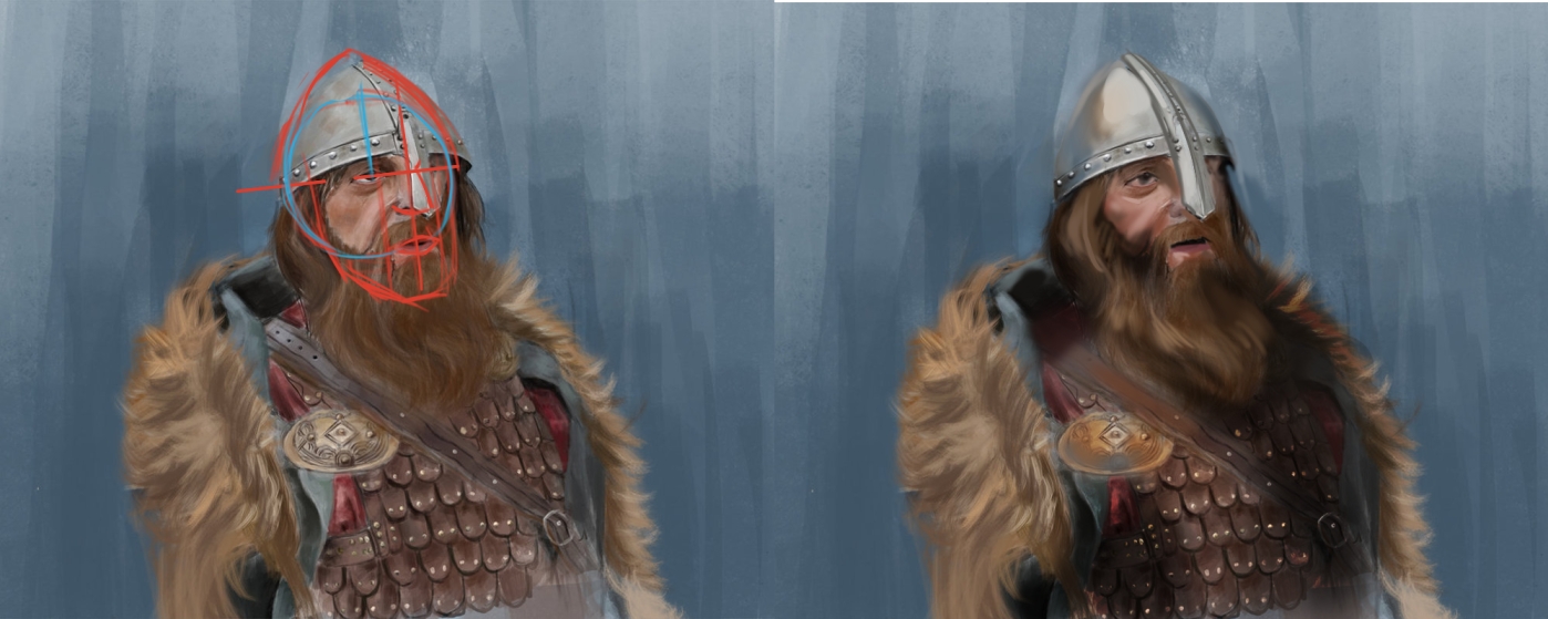
My name is Bogdan and i am new here. This is my 1st post hehe and im looking forward to getting better with the help of this awesome comunity! Feel free to critique !!!![[Image: viking_by_kammao-d7eei6f.jpg]](http://th05.deviantart.net/fs70/PRE/i/2014/104/9/d/viking_by_kammao-d7eei6f.jpg)
My name is Bogdan and i am new here. This is my 1st post hehe and im looking forward to getting better with the help of this awesome comunity! Feel free to critique !!!
![[Image: viking_by_kammao-d7eei6f.jpg]](http://th05.deviantart.net/fs70/PRE/i/2014/104/9/d/viking_by_kammao-d7eei6f.jpg)


![[Image: b08871f91ceebef898071b368bbe9da1.jpg]](https://s-media-cache-ec0.pinimg.com/736x/b0/88/71/b08871f91ceebef898071b368bbe9da1.jpg)