Monsieur-Beefy
Unregistered
@ rich4rt : whoa! thanks bro! various depth cues are gonna be something I really hold in my mind for my next painting. I completely missed them on the pokemon piece to be honest. I got the darkening + lightning pop critique on CA as well, but I just don't think it's the right way to go. I mean look at mine and then look at your paintover. Which is happier? I like the feel better with the sunlight. I should definitely push the highlights more on primary light sources though, even if they are 'secondary' and/or dimmer. I'm gonna read through color and light again tomorrow and try and conquer this warm cold thing. I can see the difference, but I just don't really understand how to do it. I feel like the colors are nice in the light, but get muddy when they hit the dark values. Also, I didn't do the lightning ball the way I wanted it. More like
[this] is what I was going for. Thanks again for your help, it does wonders for my motivation!
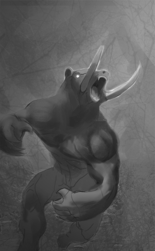
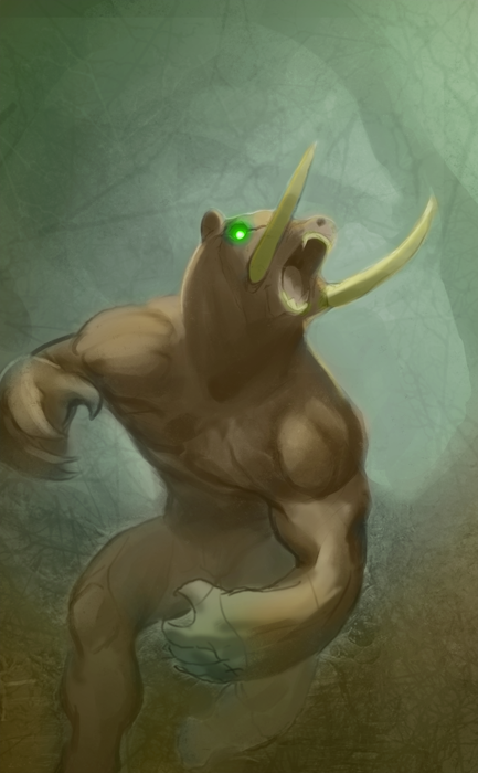
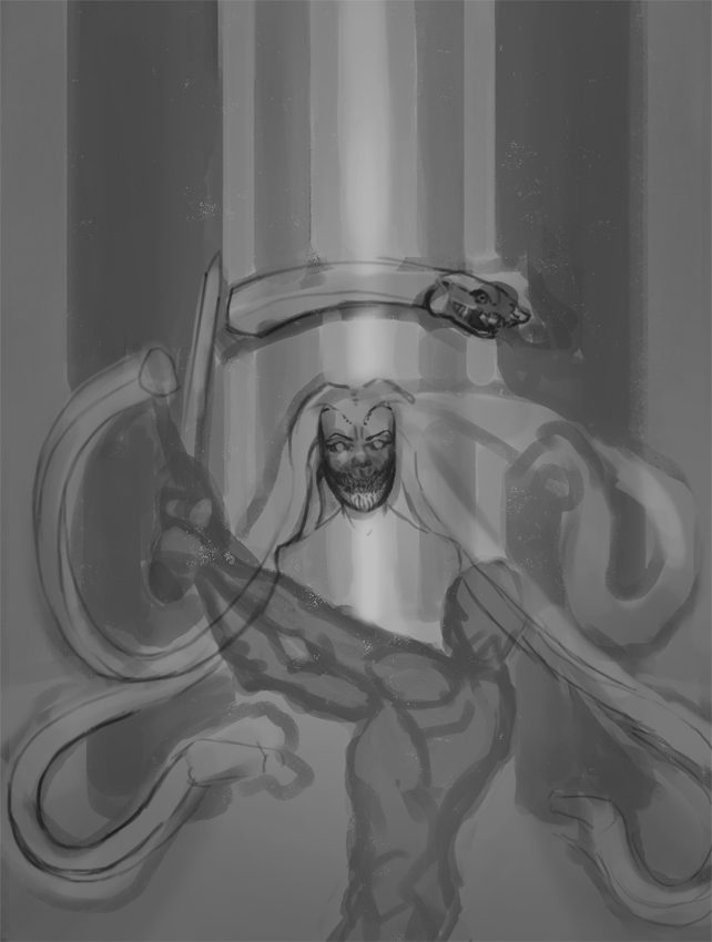
Sketch for my COW...

Monsieur-Beefy
Unregistered
Color comp. super rushed. quarter ending = work+10

Posts: 160
Threads: 3
Joined: Jan 2012
Reputation:
10
Nice movement on this piece! Just need to pop in some color variation warm/cool variations and drop in some deeper values. Good luck finishing up this quarter!
Monsieur-Beefy
Unregistered
@ CoreyKLamb : thanks :D that's the plan haha
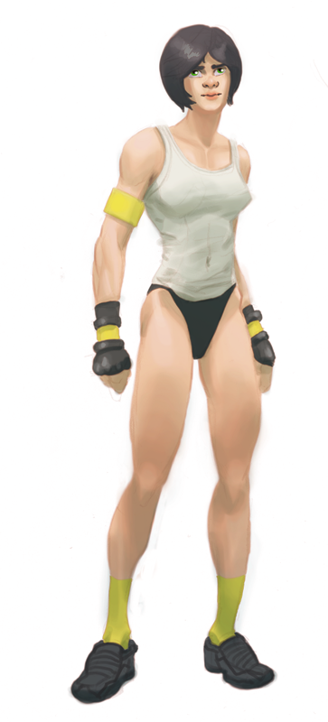
Today I just drew a character I've been thinking about. She is a fighting game character. everything about her is boring haha

Monsieur-Beefy
Unregistered
@ lake : thanks! I want to stay away from tattoos, so I'm unsure as to what the options are. I'll try out a couple of variations when I get the chance :)
I'm sooo tired :(

Monsieur-Beefy
Unregistered
@ AJCC : thanks :D
Drawing from reference feels soo good. Imagination feels soo bad :( must improve!


Monsieur-Beefy
Unregistered
Today I upped it to 5 mins. I don't think I need the gestures right now and they aren't feeling good sooo...

Monsieur-Beefy
Unregistered
That's two months down :( I think I'm getting worse ~
WIP

Heya Beefy, don't discourage yourself, as long as you are practicing everyday and taking things seriously then you will not be getthing worse.
Be sure you practice the same amount of work from memory after doing some studies, that's the fastest way!
The new piece has potential, can't see anything wrong so far!
Monsieur-Beefy
Unregistered
@ Tooth : Thanks :D I was wondering about that ratio, I'll make sure to apply it!
@ AJCC : yess sir!
tightening my lines.. should I be using reference for these pieces that are *not* studies? I feel pretty lost sometimes, but I don't want to end up trapped in some reference. Anyways..

Posts: 43
Threads: 0
Joined: Feb 2012
Reputation:
0
You should DEFINITELY 100% be using reference for all of your pieces that are not studies. When in doubt, always find ref. Sometimes you will be strapped for time or what you are trying to draw has no real-world correlation... but in all other cases, ref is KING. All the guys at MB use ref. Dan Dos Santos, Rockwell, Ilya Repin, Leonardo da Vinci, Antonio Lopez Garcia - all these folks use ref as much as possible.
Monsieur-Beefy
Unregistered
@ lake : okay, will do then :D I'm was just a little afraid that in the long run it would impact my ability to draw anything that I can imagine, realistically, from my mind (my goal). I will start using reference from now on!
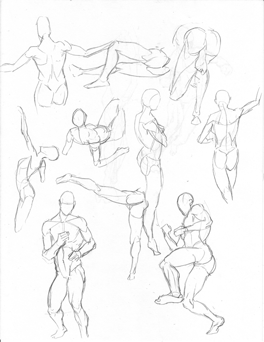
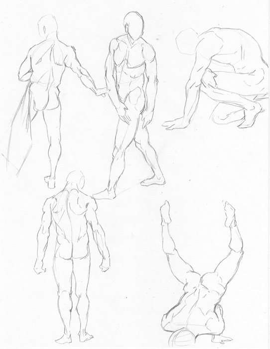
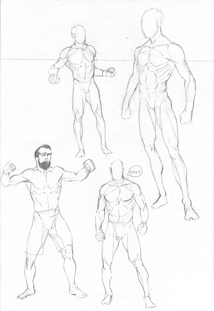
Today felt AMAZING. totally felt all sorts of learning vibes from this. just short studies for legs and weight/stance, but really clicked for some reason. The top two are imagination and the bottom two are from photos. I do have one question though. In regards to the loomis proportions (8 heads) which is what I use for imagination, does it seem like I'm stretching my figures vertically? I enjoy drawing in real-life proportions much more, but 8 heads is sooo convenient for perspective that I feel like I'd be better off getting good at that instead. opinions?

Monsieur-Beefy
Unregistered
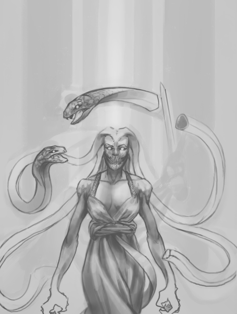
BAM! linework done.. light + shadows comes tomorrow

Monsieur-Beefy
Unregistered
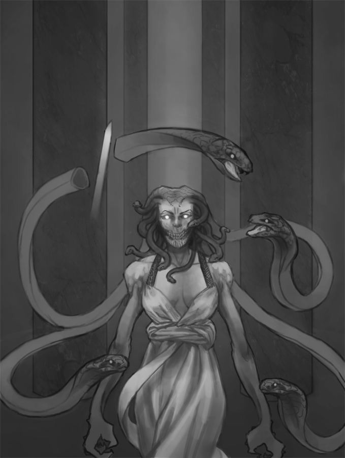
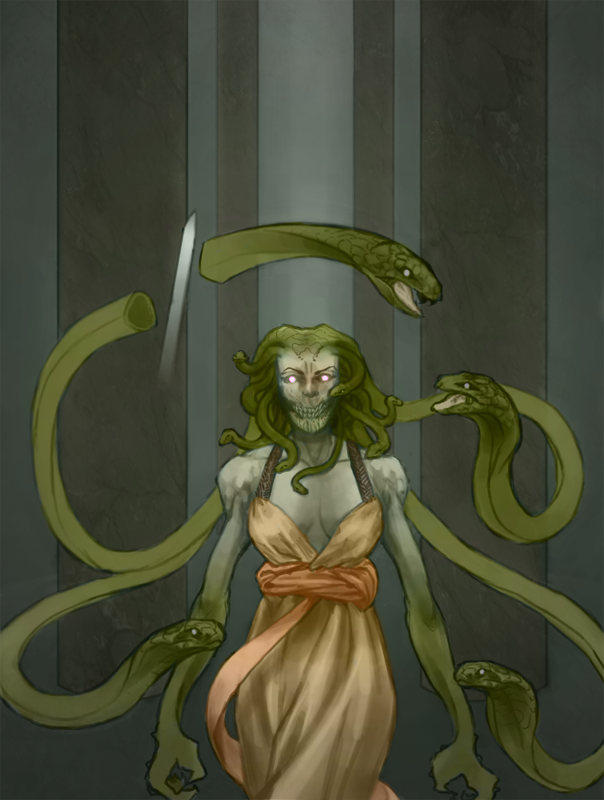
Actually.. color :p


Monsieur-Beefy
Unregistered
Holy crap. wrote a 12 page paper from scratch yesterday.. didn't sleep.. almost slept through ~today~

Monsieur-Beefy
Unregistered
More.. I love doing stuff like this ~

Monsieur-Beefy
Unregistered
replies tomorrow.. got no time.
Finals are tomorrow morning, so I leave you with a quick self portrait:

Monsieur-Beefy
Unregistered
@ AJCC : yeah, messed them up :blush: need to apply my brain more when drawing haha. Thank you!
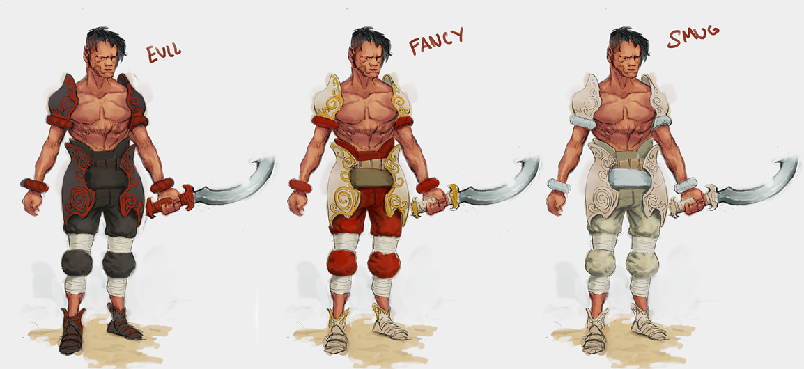
Colours? I like the one on the right the best.
also
HELL YESSSS DONE WITH MATH FOR LIFE!

Posts: 160
Threads: 3
Joined: Jan 2012
Reputation:
10
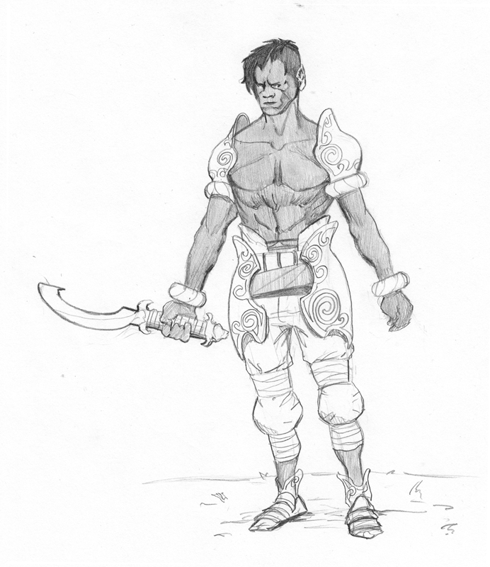
What up! I really dig the new designs. I think I'm partial to the middle one, mostly because I'm fancy myself. If I were to crit the design, the only thing I would question is how are the shoulder pieces being held up.Harness, straps, magic, etc. Fun shiz man. Congrats on finishing up your math core!
