Posts: 694
Threads: 14
Joined: May 2012
Reputation:
16
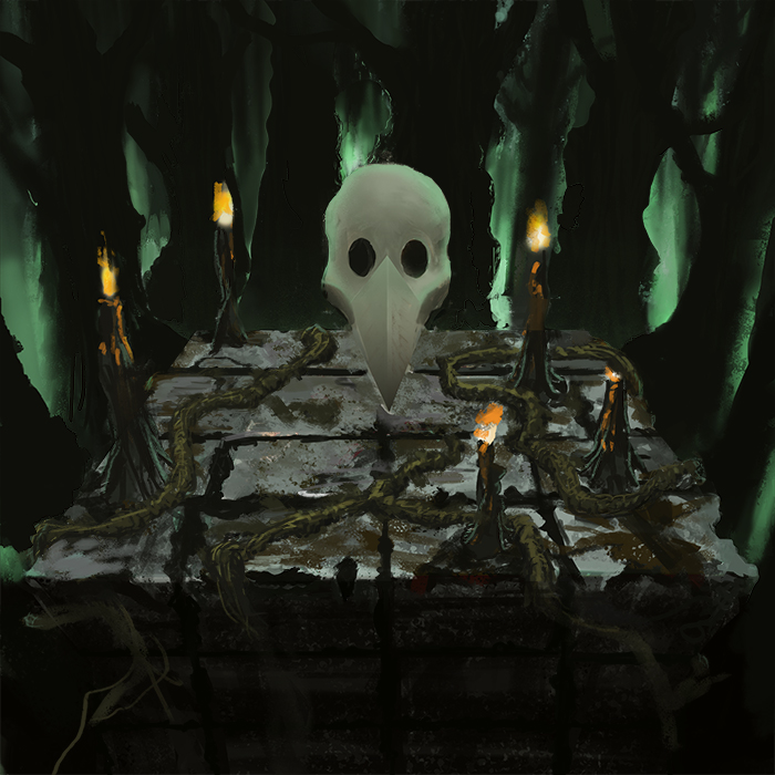
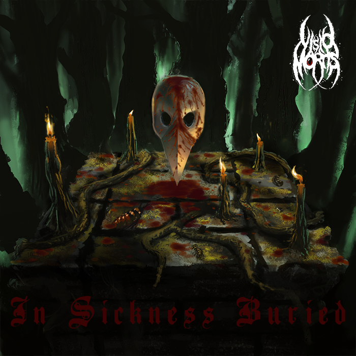
is this the only composition you've tried out? I think as its at a very early stage you could take the idea and try out some small thumbnail sketches with different perspective angles etc. As it is the image isn't too dynamic but i think re-adjusting your perspective could help with this and add a lot more interest for the viewer.
Also remember the album cover is going to have text on it so think about how it will fit in with your composition, the text element doesn't have to be just text added on top of an image you could use it to your advantage and incorporate it in some way that aids your overall image.
Posts: 87
Threads: 7
Joined: Oct 2012
Reputation:
2
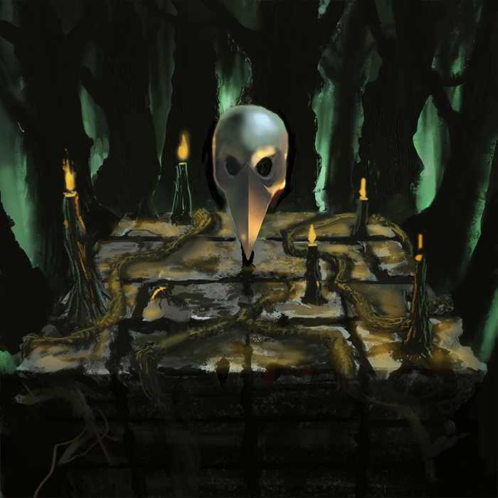
Cool piece. Be carful with your shadows, don't just burn the color or use black. Shadows have color and are a great opportunity to bring interest into a piece. Think about reflected light and the color of your light source. All these will effect the color of your shadows. Reflected light could bring out some detail in the lower part of the alter.
Can't wait to see more.
Posts: 905
Threads: 39
Joined: Sep 2013
Reputation:
51
That is some seriously tricky lighting... I'd suggest set up something like that in a dark room/corner somewhere to get it down. I don't even know what it should look like. Also have you tried toning down the green glows in the background so they don't fight for attention with the candle and the skull so much? A darker bg could really set the focus on the altar.
Posts: 1,970
Threads: 22
Joined: Apr 2012
Reputation:
243
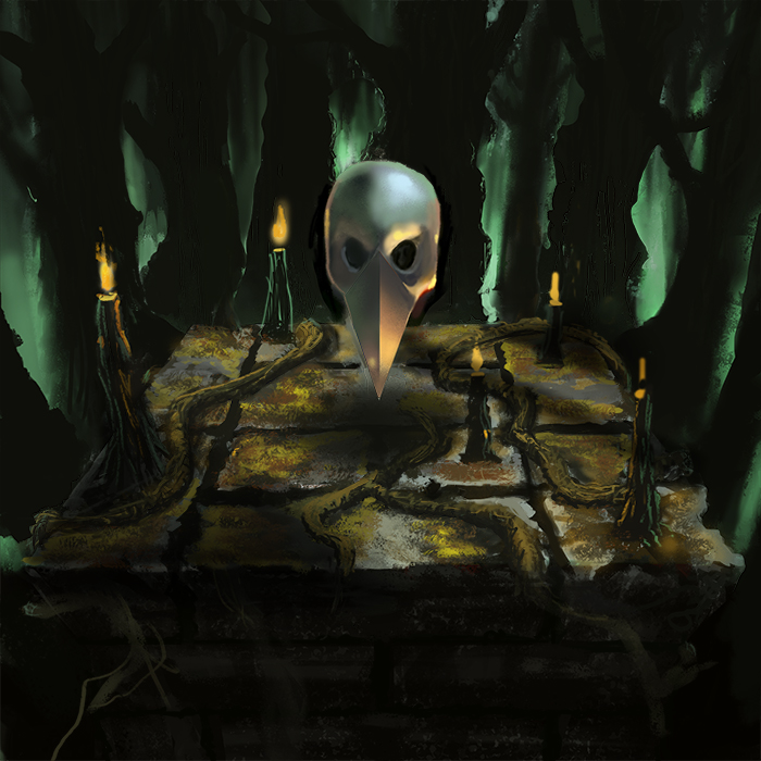
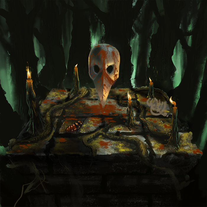
Nice work. For next time, I'd do more thumbs and nail the composition, values and lighting design a bit better. Looking at this piece technically, I'd say that you need to work on depicting volume using value changes, and how to make the best use of your edges to aid the composition. While you have the tighter edges at the focal point which is the skull, and is good, everything else has this wavery form, but with sharp, cut out silhouettes which I think really detracts from the sense of volume and depth in the piece. I also have very little sense of scale in the piece. Judging by the candles the mask looks less than full human sized, judging by the trees the candles and altar look huge. The mask material looks more like dull polished metal, than bone. Colour choices: I would recommend designing your colour palette with a bit more focus and intent, eg why that hue of green for the background, what is your gamut, and what are the base temperatures and accent (focal) colours? Perhaps pick colour palettes from already existing paintings, photographs or artwork to help gain harmony.
From a non technical point of view, think about what is going on here. There is a floating mask, some candles of unspecified scale, on an alter which is presumably bloodstained in a dark forest. You have managed to get across the sense of a dark metal album, which is a win. However, if I think about the scene, well I am left a little lost. I don't mean everything has to be explained, because that is just as bad, but perhaps a bit more clarity in narrative would help.
Hope that helps.
Posts: 24
Threads: 4
Joined: Jun 2013
Reputation:
0
Thanks for all the critique you gave! Im taking it all in! Havent tried a gamut, but i guess its time now.
I did take colour from a existing piece from the start but maybe it faded as i looked on different references on stuff.
The next piece will be much better!
Btw you got really cool stuff monkeybread!!
Posts: 24
Threads: 4
Joined: Jun 2013
Reputation:
0
Its okey! Im here to learn! That I will! :)


