07-10-2014, 10:12 AM
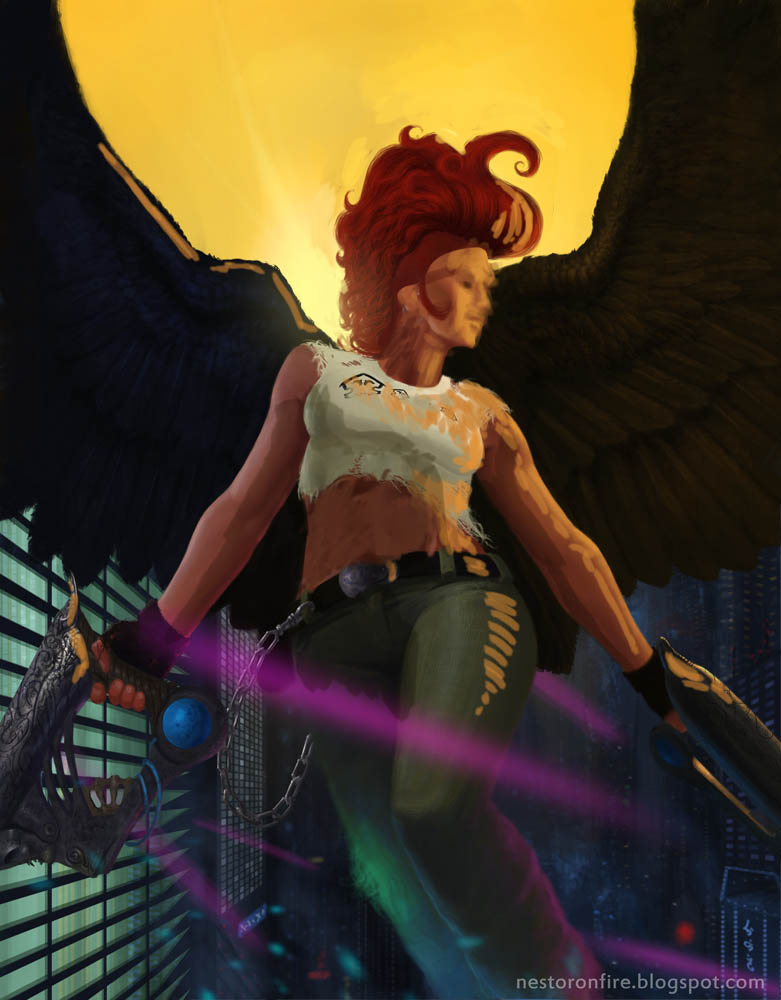
Hey Crimson Daggers! Here's a piece i finished recently. I would really appreciate your thoughts on it, anything you would have handled differently, mistakes etc.
![[Image: Angelina-sig_zps7bc88f26.jpg]](http://i1180.photobucket.com/albums/x412/nestoronfire/Angelina-sig_zps7bc88f26.jpg)
![[Image: Angelina-sig_zps7bc88f26.jpg]](http://i1180.photobucket.com/albums/x412/nestoronfire/Angelina-sig_zps7bc88f26.jpg)
|
Sci fi angel chick, i would appreciate some help.
|
|
07-10-2014, 10:12 AM
Hey Crimson Daggers! Here's a piece i finished recently. I would really appreciate your thoughts on it, anything you would have handled differently, mistakes etc.
![[Image: Angelina-sig_zps7bc88f26.jpg]](http://i1180.photobucket.com/albums/x412/nestoronfire/Angelina-sig_zps7bc88f26.jpg)
07-11-2014, 01:30 PM
Nice piece so far!
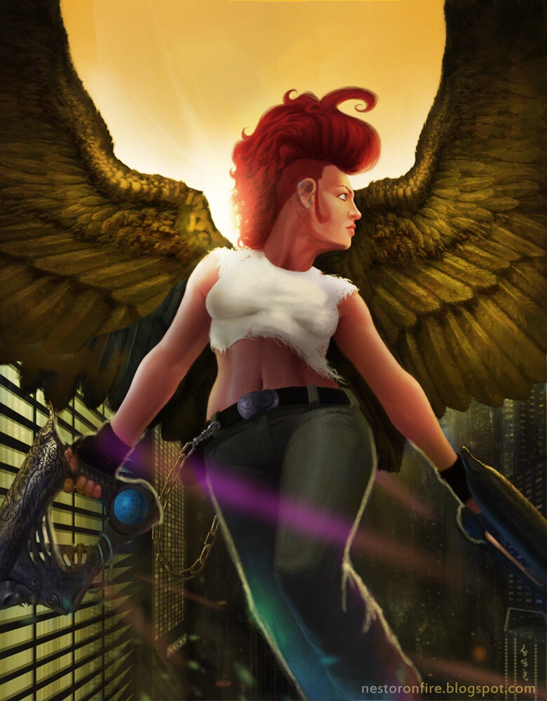
I would take a look at a few things. The viewers perspective is looking up at her but her head is painted is if you were viewing her at eye level. Stretch the cloth around her breast to separate them:). The color in the sky is bright yellow above the wings but is dark blue below the wings I would move the yellow of the sky around a bit. I also believe with that much color in the sky the wings would have more reflected light maybe even glow a bit around the edges. Have some fun with it. I did a quick paint over for you but the anatomy still needs work especially with her head. Hope some of this helps. 
Eric
Elmstreetart.com
07-11-2014, 01:42 PM
Hey Elmst, thank you so much for the paintover!
Yeah, i see what you mean. Especially the perspective on this one totally kicked my ass. :)
07-12-2014, 10:06 AM
You can google image search "James Gurney Color and Light" for a painting of back-lit feather creature for reference. Also, maybe try painted tattoo on her wings (kind of like painted war horse of North American Natives) for more punk-ness. Also: http://senshistock.deviantart.com/art/Sa...0-92207608
07-12-2014, 10:36 AM
Right, the backlit feathers from the cover! I actually own the book, i should propably keep it on the desk or something from now on :D
Thanks for the crit Meat, the tattoo is a great idea!
07-12-2014, 03:59 PM
Looks like someone already mentioned the face, but I noticed the lighting on too. You've got this orange light coming from canvas right and lighting up that side, but the lighting on the left (which would probably be obscured by the wing anyway) makes her abs look like they're two big tubes running down her midriff. Even crazy abs would be flatter, or she would be fat and not have visible abs. I know this doesn't cover quite as much as the other reply, but hopefully this still helps, even though it's a bit redundant.

07-13-2014, 09:44 AM
Thanks Niku, it's actually quite helpful. I didn't feel entirely comfortable with her ab area.
07-15-2014, 09:17 PM
Some thoughts:
Hope that helps |
|
« Next Oldest | Next Newest »
|