07-07-2014, 10:23 AM
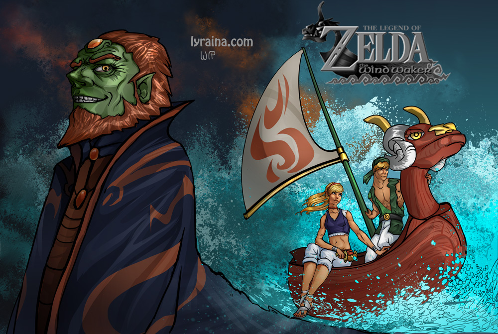
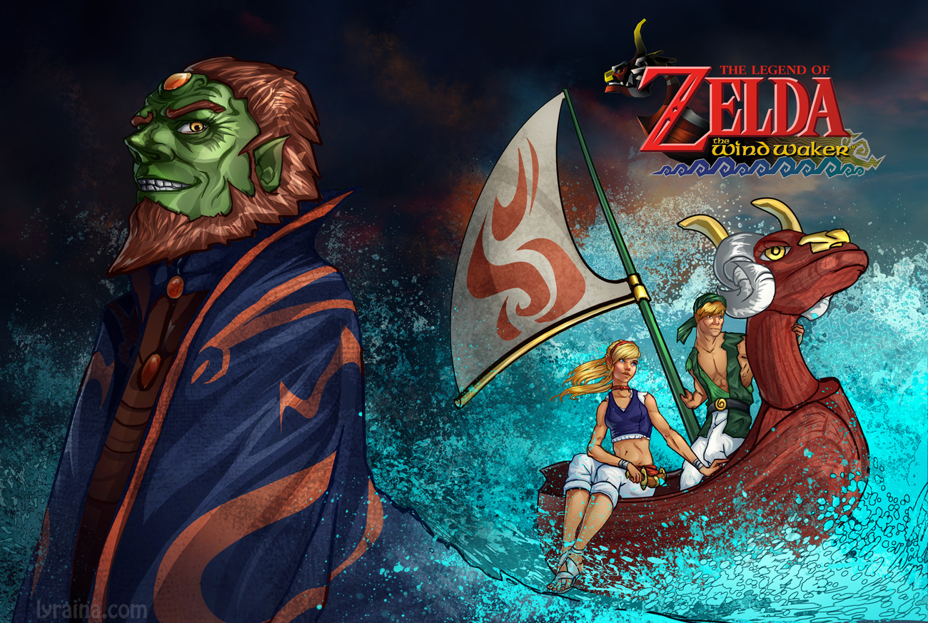
BLOODSPORT 7- WINDWAKER REWORKED!
Created by: Dan Warren
WHAT THIS IS!
This challenge is focusing on the power of art direction and what it can do for intellectual property. After the overwhelming success of nintendo's Ocarina of time, the eventual follow up, Windwaker, was released. whether one likes or dislikes the game, its impossible to ignore the effect the drastic shift in art direction had on its international sales and reception. many people argued it was 'too childish', while others refused to even play it. and all due to art direction. We're not saying the design for Windwaker was bad by any means <3.
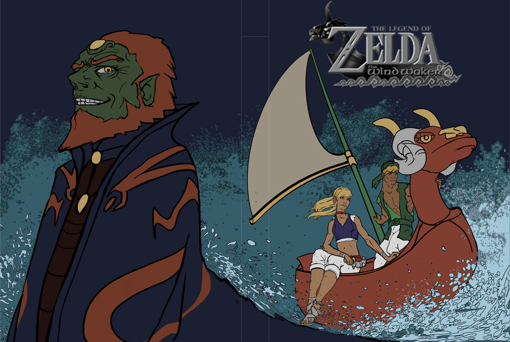
Your challenge is to pretend you got the job to take the series in a new direction! however, you cant do whats been done before, or whats been done since. take one of the most recognized franchises in gaming to a new place!
Requirements:
- Must contain all 3 of the series' standby characters. Zelda, Ganon, and Link.
- image must contain Nautical themes! though you are altering the visual style of the game, the plot and world settings remain the same! oceans!
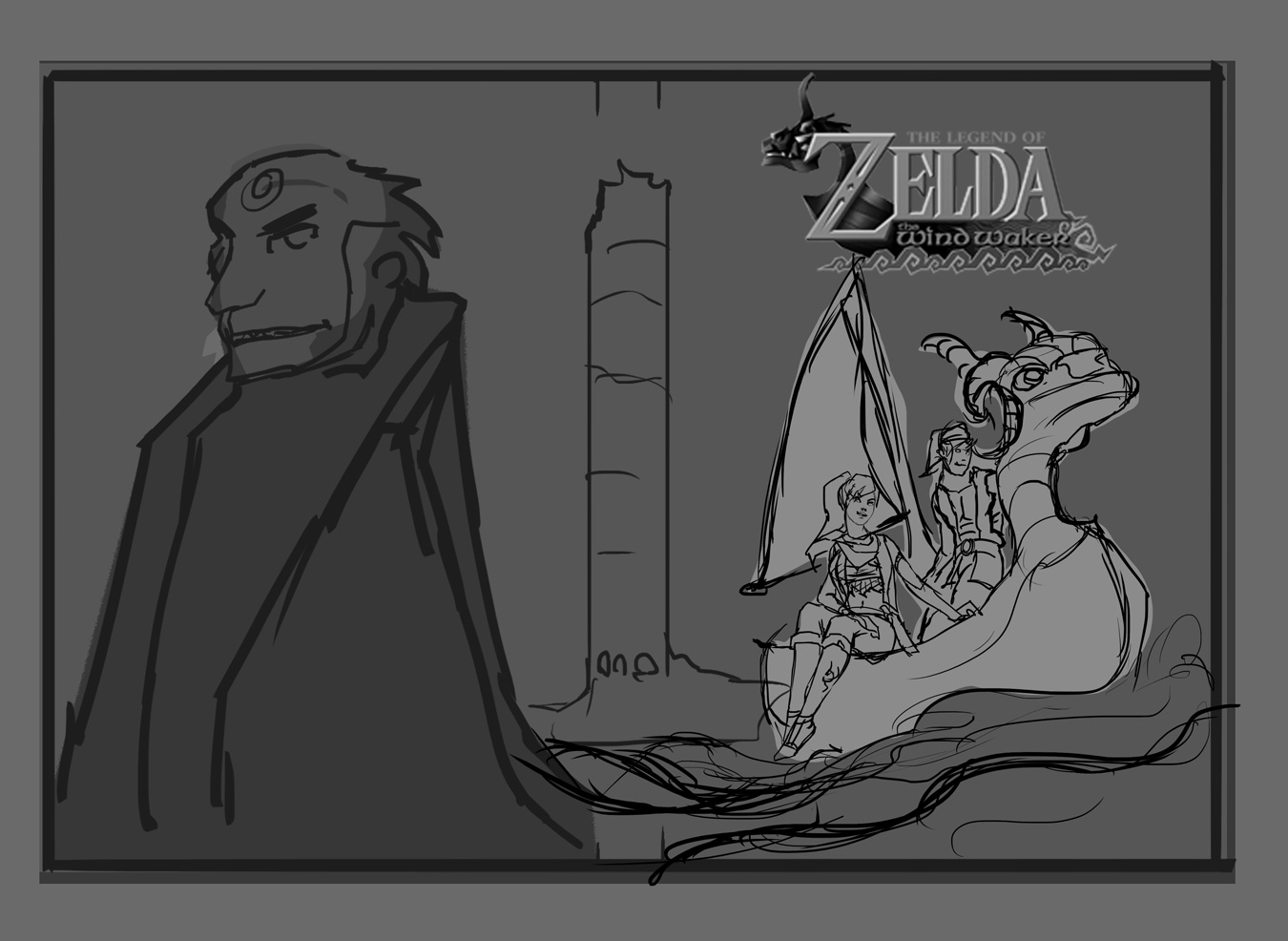
- Images MUST be planned on a horizontal! you can choose one of two options! split vertical images with separate vertical front and back designs, OR a unified, WRAPAROUND illustration, designed compositionally to work as two separate pieces when split down the middle. (EXAMPLES AND TEMPLATES BELOW)
- Leave room for TEXT! the title logo on the frontside as well as room for a paragraph size description on the back!
*****IMPORTANT*****
While this contest IS a type of fanart, you CANNOT use the art direction of windwaker or the other zelda entries! the challenge is to take it somewhere bold and new, just as nintendo tried to do at the games release! consider markets, thoughtful design, and visual themes!
so DONT look like THESE!
![[Image: The%20Wind%20Waker%20Front%20Large.jpg]](http://zeldadungeon.net/Soundtracks/The%20Wind%20Waker%20Front%20Large.jpg)
![[Image: IMG_3260.preview.JPG]](http://videogamemm.com/main/sites/default/files/images/IMG_3260.preview.JPG)
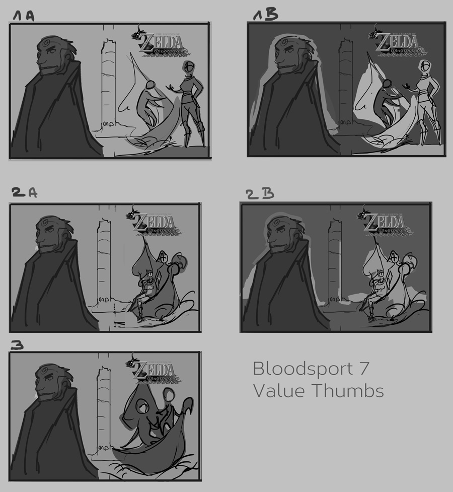
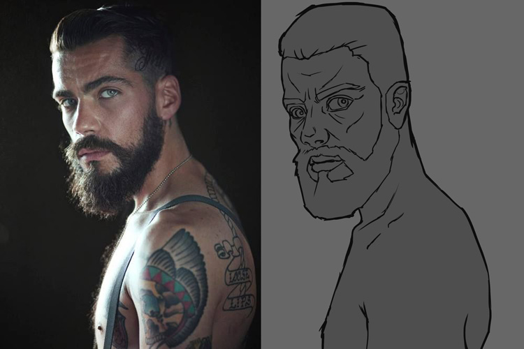
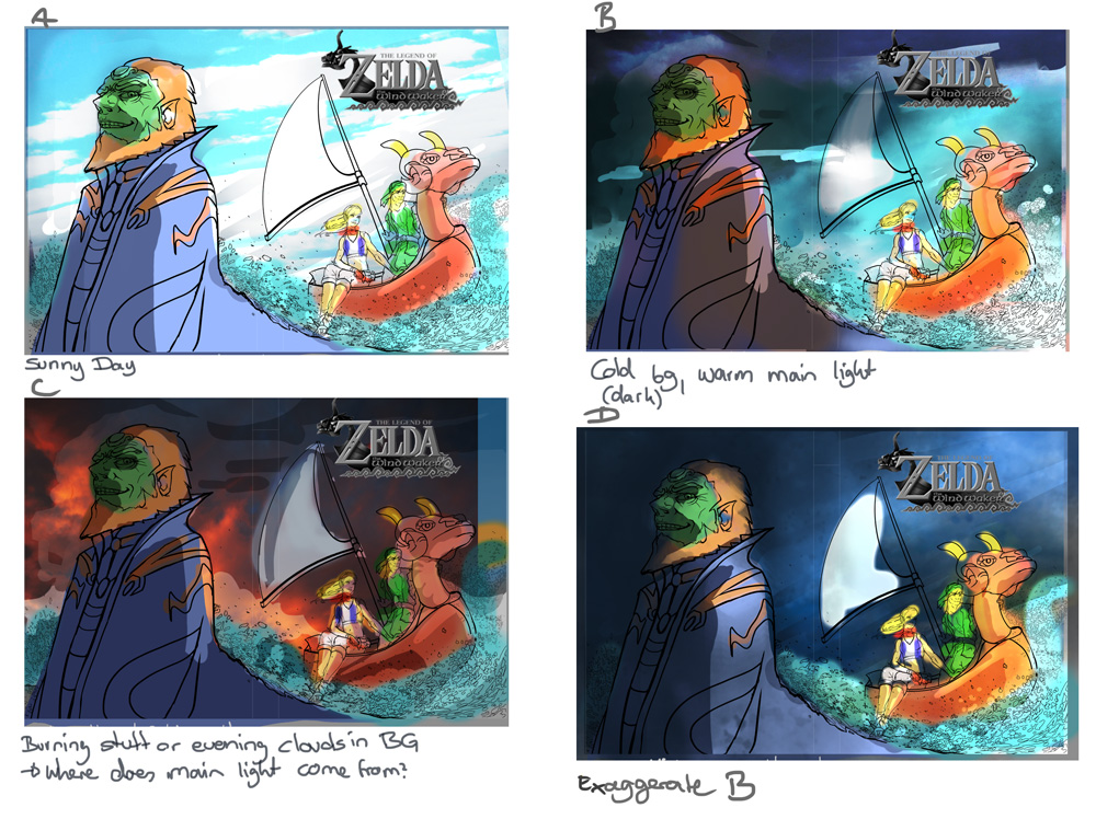
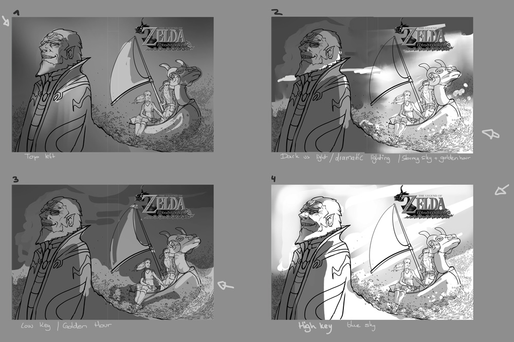
- Studies must be provided and must be relevant to the character design and elements used in the illustration. COMPOSITIONAL SKETCHES are also REQUIRED with studies in order to be eligible!
------
Been waiting a long time for this one. Same deal as always. No harsh deadlines or anything, just enter if you can and see how you go. This will be a lot easier for fans of the Zelda franchise, but it's pretty easy even if you are not.


![[Image: dvd-cover-art-1.jpg]](http://www.youthedesigner.com/wp-content/uploads/2008/08/dvd-cover-art-1.jpg)
![[Image: Fables_1001_Nights_of_Snowfall_000.jpg]](http://s7.postimg.org/5bcxyzrrv/Fables_1001_Nights_of_Snowfall_000.jpg)
