Critique
#1
Hi guys, i done this illustration 2 months ago. It was suppose to be a concept/illustration for a tribal shaman warrior (a female obviously :D). I was wondering can u guys help me, i really don't know what should i put more time and what should my focus be ? Whats the main thing that is not working, i am kind of lost in this period. SO if anyone can hep with anything i would be greatfull!
And i know this is probably a stupid question but ill ask anyway. What would u say which on which lvl would i be (form 1 to 10)? I cant really place myself anywhere!
TY
:)
http://sinapsa.deviantart.com/art/MIKO-466505760
Reply
#2
Hey there!
Really cool design you have here :D digging the pose and I see what you did there with the makeup... very Geisha-esque~
Hmm, well if your goal was to portray a more realistic figure - make sure you have a combination of hard/soft and lost edge in your painting.
Keep this in mind:
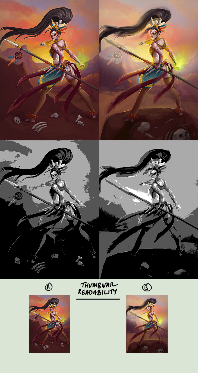
[Image: Paintover01.jpg]
I did a quick paintover to show you the importance of thumbnail readability, seeing as the audiences first look at your piece depends on this and whether or not they're been enticed to click on the thumbnail... I thought I'd make note of its significance.
In addition, I worked on tension areas in the original (such as the right leg), separated the foreground/midground/background and tried to emphasize the lighting to improve readability as well.


Also hahaha whaaaaat! I can't rate people! That's all on you :D!
If you know there are areas of your art you're unhappy with -- hunt down your weaknesses and try your hardest to beat them down one at a time :) also, if you compare your work to one of your favourite artists - how do you feel? Do you feel like you're on the same level? Or are you confused how they make their art look the way it does? Ask yourself these questions and try to answer them as you continue.

If you want to improve, remember to keep your mind open to new ideas... try to be curious like a child and seek knowledge in what you're unsure about. And that doesn't just have to relate to art ^ ^

Anyways haha
I hope this helps you in some way

Keep fighting! o/

sketchbook | pg 52
"Not a single thing in this world isn't in the process of becoming something else."
I'll be back - it's an odyssey, after all
Reply
#3
Hii Smrfeettee! :) Thank you so much for such a detailed critique! I can really see how the whole image pop when u did this with values and lights(looks like it has so much more volume), and the leg is much batter like u put it, looks more balanced. I would love to improve my realistic painting(rendering) but still keep this not so realistic feeling(fantasy or whatever that style is XD). I will try to practice more with lights and combination of hard and soft edges like you said :)
Yea i knew it was a stupid question, wont ask it again:) And in comparesnt to my favorite artists i think i am still soooo low, i still need A LOT of hard work. So no i don't feel like we are at the same level, but i will do my best to be one day! I think my weaknesses are 2 static figures(even when am trying to loosen them and put them in dynamic poses)-its like that because i have drawn static figures all my life and now its hard to move from what u have been doing for pretty much whole my life, but recently i have been trying to loosen up :D. Light as u can see is also one of my problems need to work on that more- think those are my 2 biggest weaknesses right now. U helped me a lot thank you again <3
I was wondering can i ask you about my other piece(that i am currently working on), if its not 2 much trouble?
Reply
#4
Happy to hear I've helped you out somewhat :) makes me all fluttery inside haha <3
Hmm, alrighty - so "static" figures ~ I feel you on that one! The best ways to overcome the stiff, static poses in your art is to do daily gestures. So, sites like:
> http://www.posemaniacs.com/ (click on the "30 second drawing" link on the right)
> http://www.quickposes.com/
I'm guilty of not keeping up with this daily practise and I can tell you it really does take a toll on your figure work. Then there are amazing reads like Michael Hampton's Design and Invention book:
http://www.amazon.com/Figure-Drawing-Inv...0615272819
Super helpful with anatomy, also webseries on anatomy like ProkoTV on YouTube.
But yes, anatomy studies, daily gesture warmups (and lots of practise of course) should help with a lot with loosening up and stuffs :)

Light, oh light ~
Well I can help you out a bit with that as well methinks:
http://gurneyjourney.blogspot.com.au/201...-1_15.html
^ this blog. This blog right here if you haven't yet heard about it. Is amazeballs ^ ^
I'm still going through it and finding gems of info I can't find anywhere else on light, form and colour. Although he also has his awesome book:
http://www.amazon.com/Color-Light-Guide-...0740797719
Which is also pure gold, I read over in when in doubt and it's a life saver!

Sure, I'd love to!

Send it through when you're readyyyyy guuurlll!

sketchbook | pg 52
"Not a single thing in this world isn't in the process of becoming something else."
I'll be back - it's an odyssey, after all
Reply
#5
Thank you for the links! :) They seem great, and helpful. I will try to do some loose sketches of those poses in my sketchbook :)
ill buy those books as soon as i earn some money :)
here is what i wanted to ask you, why cant i attach attachments?
Here are links since i cant attach files:
http://th07.deviantart.net/fs71/PRE/i/20...80gxs2.jpg
http://th03.deviantart.net/fs70/PRE/i/20...80gy07.jpg

was wondering what do u think? and hows the light and THE HARDEST thing is what to do with the background :/
I cant find something that works, i have tried but it always loos bad...do u have any suggestion or some advises ?(this piece should be colored more like comics and the main thing is on the line art, do u think that color is making line art less important? should i put it all in black and white?)
Looking forward to your replay! :D
Reply


Forum Jump:


Users browsing this thread: 4 Guest(s)