Dark Souls fan art
#1
Hi all,

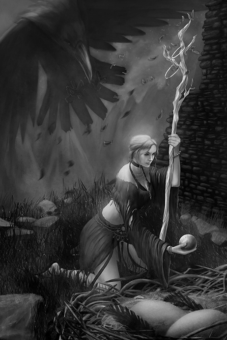
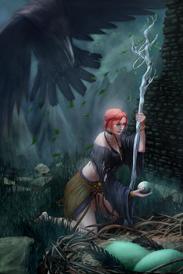
This is a fan art for the video game Dark Souls. If you're not sure what it's about, it's basically a dark fantasy game.

In my image I have the main character trading a stone with the Snuggly the Crow. The crow is actually the unhatched eggs in the nest, they talk to you in a strange voice and want to trade items with you. Yep, it's kind of weird but I love that about this game! The giant Raven in the background is coming to swoop in on the unsuspecting character as the trade happens. It's never made clear if the Raven is the mother/protector of the eggs. In the first game you find the raven nearby to the talking eggs but in the second game you do not. I chose to make them related.

I wanted to paint this as a night scene and give it a misty feel as I thought it would be cool to get some soft light effects going on.

I'd love to hear feedback. Thanks all!

Reply
#2
Hey Kyteki, welcome to CD.
First off, nice work on your rendering, you have some developed skills in this department. However as with the issues in almost any piece, it is the fundamentals that break it more so than the technical stuff.

Here are some of the issues I noticed. Feel free to ask for clarification if you need.

1. The lady's proportions are abnormal enough to make me think they weren't intentional. Her arms seem to be a third too long for her size (the front one especially)
2. The pose, while not too awkward, makes me wonder why she is leaning on that staff like she is.
3. The staff disappears behind her sleeve, but I think you need to show it continuing on into the ground because at the moment it ends quite abruptly.
4. I feel the weakest point in the piece is the raven. I can't quite put my finger on it, but I think that maybe it is the relative flatness of it compared to the way the rest of the image has been painted. It doesn't really seem to scream forward swooping movement. Perhaps more value depth to build volume and the use of foreshortening on it's feet would help the impending sense of calamity. Another thing with the bird, given it is in such bright moonlight, I would expect it to cast some shadow on the woman/ground or wall, perhaps even volumetric shadows given it is supposed to be in mist?
5. The background could use a bit more design in terms of the shapes they create in the composition and depicting what they are. I assume they are mountains, but it is a bit ambiguous.
6. There is a too-sharp distinction between the highly rendered areas and more abstract areas in the piece. Basically it transitions from uber rendered in the foreground/midground to loose in the raven/background, but it doesn't do it in a smooth natural way.
I understand that uber-render is a style choice but since you have chosen to render everything to the same level of detail in the foreground you should probably be doing the same with background just so it doesn't look out of place. The other option is to select with purpose what areas to detail and drop less important things like the wall and individual blades of grass out where they aren't needed. Either way, I think it would pay to make a decision what it will be before you get into the rendering.
7. The perspective of the piece seems disjoint. I think it is mostly the difference between the nest, the plane the woman is on, and how the wall and cliff edge meet. The ground plane seems to be viewed from higher up than the plane the woman is on.

Hope that helps!

 YouTube free learnin! | DeviantArt | Old Folio | Insta
Reply
#3
kyteki, love everything about this game. I believe that the crow is neither mother or protector, but Velka, Goddes of sin herself.

You did a great job! And Amit Dutta gave you super usefull tips to make it even better. There's nothing to add in words really, but I can try to do a paintover of this picture. If it pleases you.
Reply
#4
Thanks for the reply Amit. You hit on some things that I struggled with as I was working on this. Especially in the background area.

Caisne, the back story to Dark Souls is so expansive. I'm glad you clarified who the Crow is. It's one of my favorite games but I've often been confused on some of the lore. if you would like to do a paint over that would be awesome!
Reply
#5
Yes the lore of DS is deep. But it doesn't mean that the crow is Velka, only 'cause I say so. There s no direct answer or evidence in the game for that. So its just a speculation of me and some other players. Crow could be just one of the Velka's servants as well.

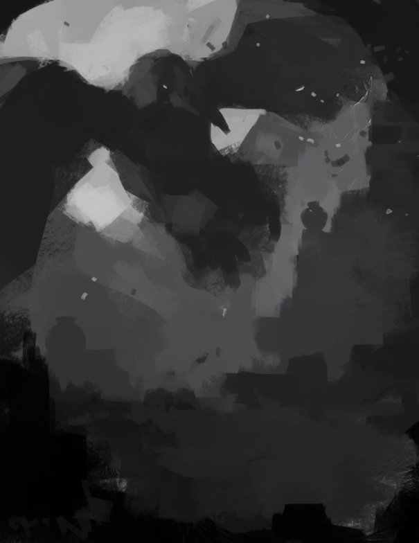
So here's what I did. And looking back I believe I should watch closely to keep more of the original image. Sorry for that, its not the way you should do a paintover. I don't think you have to repaint the image as I did, but I hope you'll learn a few tricks, and it would help in your future works.

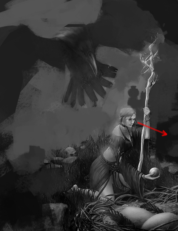
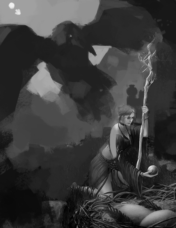
So. Firs I desaturated the image, since i'm a total noob in color and unable to judge a shit in this topic. What bothered me is that value all around the image is pretty much same. And I guess we should keep it in mind, that to have a successful image we have to divide our foreground, middle-ground and background. I also darkened the highlight haze clouds on the character. Its a meter of taste but I tend to keep as far as I can from things like this, as it does not happen in real life. Game engines use it pretty often though. Also it has place under water and in a very dusty/foggy environment.


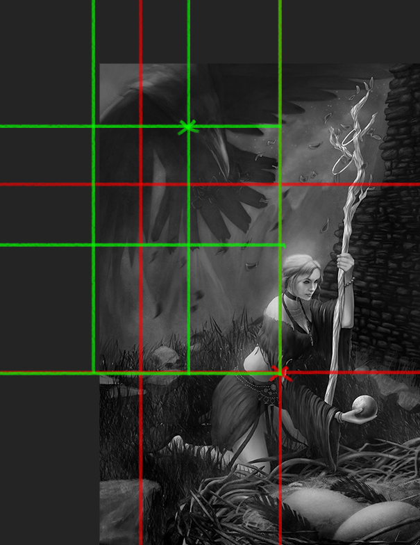
Second I expanded the image and used rule of thirds to improve composition.


I repainted the wings to create somehow interesting arc. Also is destroyed and repainted the wall on the right. The bricks and stuff, it was too detailed for me. Details lure attention, and as the brick wall is not a focal point of the image, we should keep less interesting for the viewers eye. Also the sight of the girl made me wander off the page. She wasn't looking on the egg, so i decide to change it later.


Next. I detailed the crow a little, keeping in mind the directions of light. And I also pushed back the background behind him.


I got rid of the character to focus on the middle ground.


Finally I painted the character and the nest back. changing its gesture and staff placement. I also made the girl more darker overall, so shell appear closer to the camera.

[attachment=58222]

I hope this stuff will help in your future works mate. And keep up the good work.


Attached Files Image(s)


Reply
#6
Thanks for the paint over Caisne. Your image looks much more dramatic and has a foreboding feeling. You've given me more to think about :)
Reply
#7
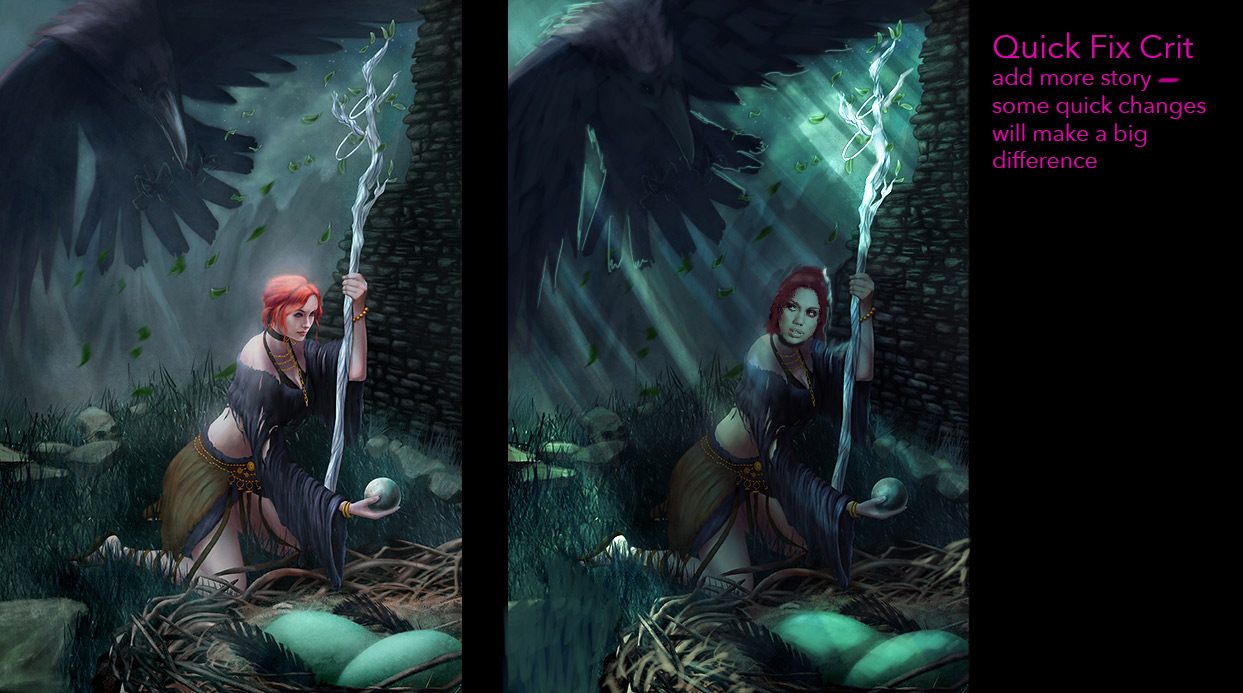
Some quick changes can be implemented, this is super rough, but I think it helps you get the idea.


Livestream Crits/Paintovers: www.twitch.tv/mike086
Loomis Study videos: http://www.youtube.com/user/mike086


My Facebook page: MCIII
Reply
#8
Another Souls fan chiming in. Cool pic but her right arm really stands out as being too long. Should be easy enough to fix though.

In terms of content - in the pic it kind of looks like she is stealing something under the angry watch of Snuggly...but Snuggly is a cool guy who does lots of nice things for you! Maybe not make it so ominous and threatening looking? Snuggly is a good bird!

Other than that its great. Have you updated it since?
Reply
#9
Information 
Mike086 the lighting in yours is very nice. I'll have to go back and revisit this more with some of your ideas. Thank you!

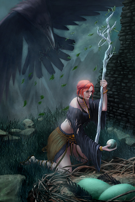
I have an update to the anatomy on the shifted around some things to help the perspective. I really want to move into to something else but you've all given me much more to think about on this.

Parus, happy to hear from another Souls fan! I know Snuggly isn't too mean of a character. I'm glad you brought the mood of the image up because it's making me really think about what I'm trying to do. I guess I wasn't trying to make a commentary on the nature of the characters. I was trying to have it play into the feeling of tension you get when you in the game, especially the first play through. Ominous is the overall mood I feel from the Souls world. When you don't know anything about the world and you discover it for the first time, it's kind of scary!


Reply


Forum Jump:


Users browsing this thread: 11 Guest(s)