Sea creature concept
#1
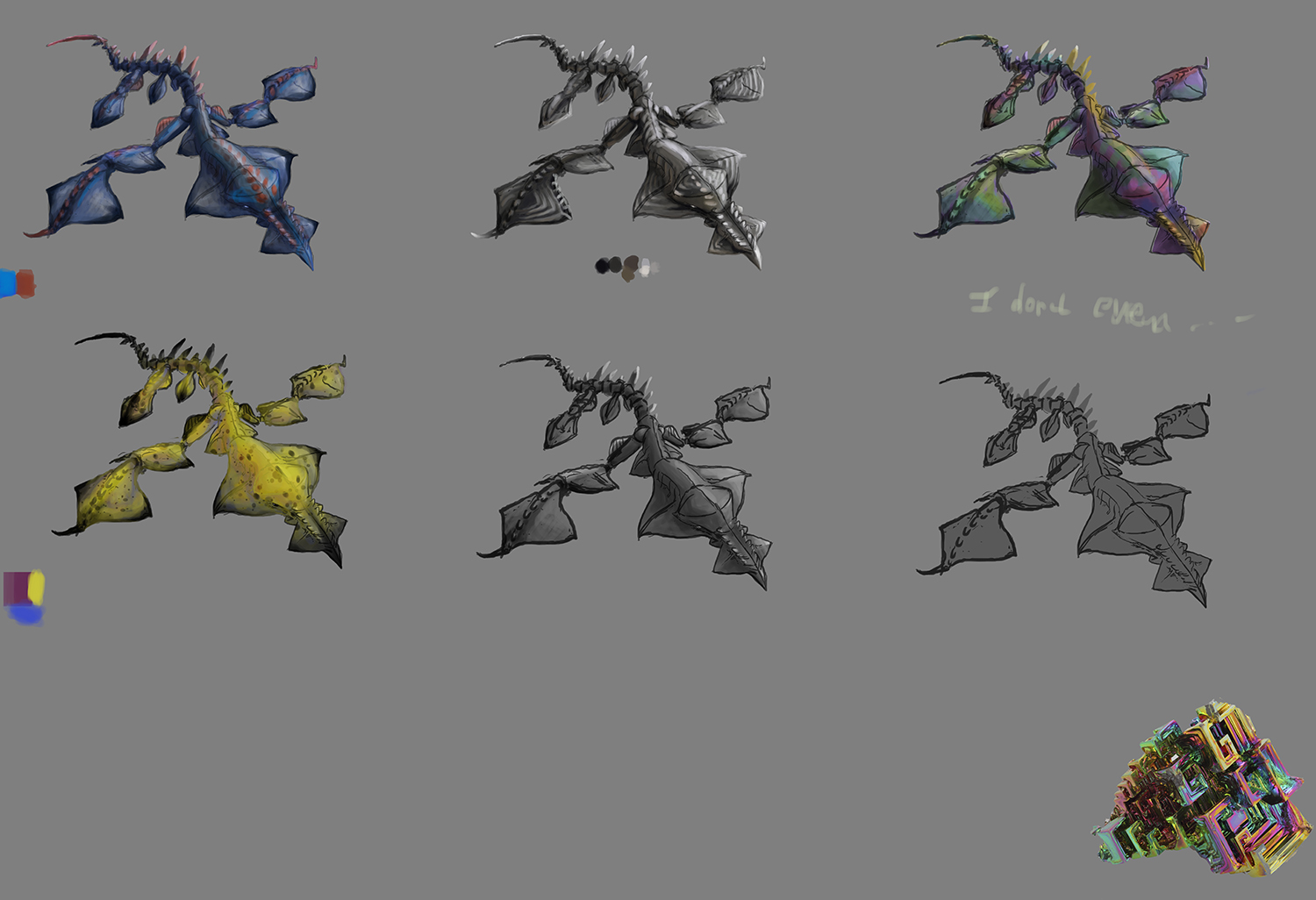
Hi all! I'm trying to design a sea creature concept. It's about 6 feet, regular shark size, but uses poisonous sting on tail and non-poisonous stings on end of biggest limb/fin as defense. So far I'm getting my ass whipped already at the "color 8 variations of thumbnail" stage. As you can see I crashed and burned at Thumb 4 the Skittle Disaster. I also have no idea how a creature concept page should look like, it seems to be all sort of formats from what I've seen. I'm also not that great at painting digitally, but I did learn the trick of Clipping Mask and Lock Pixel to keep things semi-clean.

Any crit on just about anything here (design, painting method, etc.) will be really appreciated!

I also lost the original PSD by flattening, reducing size, and saving over the whole thing, so any feedback I'll be incorporating them in a complete re-paint of new file (I don't even have the line art anymore, just a pencil thumb on paper). Not sure if that changes anything other than time-to-be-spent on my end?

Mucho gracias! Merci beaucoup! Meer Danke!


Focus.
Reply
#2
Hey there Meat! I do rather like this creature design, I think that it looks a bit like something you might see in you might see in a Studio Ghibli film. May I ask what it was based off, if anything in particular? It reminds me a lot of the nudibranch Glaucus atlanticus.

Anyway, onto the critique itself-I think one of the strong points about this design is the variation in shape. It looks somewhat loose, but is nonetheless convincing and looks functional. From a biological perspective, I would say your description of it works for the creature. Out of the attempts at painting over it, I would say that the two to the far left are your best attempts out of this batch. Both of them compliment the subject well, though I personally would go with the yellow palette you used for it. You know, seeing as its a poisonous organism, it could have a bright colouration to suggest to predators that it is poisonous. Just a suggestion.

One thing I would suggest is that maybe the texture you used in the top middle one could be applied to one of your coloured variations of the design, I just think that might help it look a bit more convincing.

Hope this has been helpful, Meat. Sorry that I don't have much more to say, it's pretty great from my stance.

Reply
#3
Nice job so far, I think if you mix the blue and the yellow color scheme and add in some orange it would work well as a poisonous creature.

My main issue is how many underwater creatures have a poisonous tail sting, I don't think it is that many (you can see some poisonous creatures here http://ocean.nationalgeographic.com/ocea...00x450.jpg ) I would suggest diong a little more research and building on your original thumbnail and incorporating what you learn about those creatures color variations and anatomy into it.

I think the head of your creature is very interesting so probably doesn't need changing in that respect but I think you could make the anatomy of the body more believable by studying the real life sea creatures more.

Reply
#4
Stardust: Ha! It IS partially based off of that Blue Dragon. It is also based off Goblin Shark, leaf mantis, and a photo of a chunk of metal. I'll try out mixing the texture, thanks!

JonHop: I was thinking vaguely of the stingray family for the tail, but not a whole lot since I wanted to do this within 1 day, before going to work. Yeah you're right the rear half of it doesn't look very swim-friendly. I'll look into that more.

Thanks for the crits guys! I think I'll let this one slide and give it a 2nd day to work on. ... Which is going to be a tricky one tomorrow...


Focus.
Reply
#5
I'm not much of a designer, much less when it comes to creatures, but I can offer a small crit for your presentation and some of the fundamental stuff that I think you could keep in mind or work on more for the next time

First off the presentation. Keep in mind this is my interpretation of presentation, I don't think there's a "correct" way to do it but there are things you can keep in mind.

I would direct you towards Feng Zhu's style of presentation (look at his videos designing things on a simple sheet of paper, check out how his students lay things out etc). Good clean presentation can go a long way to making a design feel better even if it's not great. Often times there will be simple lines running through the background to lead your around, to frame the designs on the sheet and to give it a sense of "completion". Putting in graphic shapes behind each design or behind groups of them, numbering/lettering them to refer to them easily and writing brief notes to help sell the function all help in that respect too, but if they're just thumbnails, lines and lettering would most likely do well.

Take a look at these galleries and also an example of a layout

FZD School perspective drawings
Creature sketches
Vehicle studies


Are there other variations on this creature? If you have more thumbnails or designs it would be a good idea to show them here as well. If not, well to be frank I don't think its a good idea to jump into colour variations so soon. In my opinion the colouring phase should be the last part of the process, especially if you're still not 100% comfortable with colour yet. At least then you will have a nice line drawing or a nice greyscale render to show in the event you need to show a design and you're not at the stage yet.

I'm not an expert on perspective however I do feel the foreshortening on the far wing/fin is off. if the creature is indeed only 6 feet long the foreshortening/scale is far too intense; at that scale they would be /almost/the same size. Watch out for the symmetry of the wings as well. You should essentially be able to lay a perspective grid over a symmetric creature and have it line up more or less, but at the moment it seems the fins are out of line. . If you're trying to show an action then you need to push that movement more, but I think you need to work out how to make the symmetry work well first before you can get to that. It works well on his head and the tilting of the spikes on his tail does a good job of showing the form there but the fins aren't working at the moment. Casting a shadow beneath your creature will also communicate the top view to your audience efficiently and simply, and for that reason I would also recommend using very simple top lighting to work out the forms easily there.

If you haven't already I highly suggest buying Scott robertson's "How to Draw" book and the soon to be released "How to Render" book. It covers /all/ the fundamentals you need to know about perspective, and the rules apply just as well to organic forms though somewhat looser! I've seen some of scott's rendering tutorials and they were excellent, so although I haven't read how to render yet I'm convinced it will be as great as his last book.

That brings me to your grayscale render. Are you familiar with the halfway to black rule? Its an excellent way to render matte surfaces, and from there you can expand it into more reflective surfaces. Basically its a rule of thumb that says that, for matte surfaces, the shadow side of an illuminated object (before any fill lights of reflected lights) is going to be halfway to black on the gray scale from the objects local value.

So if you have an object that's true value is 20% gray (or 2 on the value scale), then 10-2=8. 8/2=4, 2(local value)+4(halfway to black value)= 6. The shadow side for an object that's 2 on the value scale should be roughly 6, and the midtone would be between that, so 4. Its an excellent way to quickly knock out a concept in grayscale and I highly recommend it. Keep in mind its a starting point and not an absolute, so the values can shift slightly from there but its best to stay as near to those values as your design will allow you

Here's a picture that explains it visually


Hope that helps! Feel free to ask questions if I wasn't clear (it happens a lot lol)
Reply
#6
Thanks for the intense crit Beardley! I've never heard of Halfway to Black before. We all know FZD, but when in the action, I often forget what resources and reference are out there. Tunnel vision, maybe? So thank you for reminding me to look at FZD example for presentation! I'll switch to top lighting for better definition, but I won't be making variations of this design, since I plan on doing more than just this one creature.

I thought How to Draw is focused on stuff like cars and planes and trains, so I didn't look at it. I'll check it out again what it is about.

Thanks again for the crit!


Focus.
Reply
#7
(11-02-2014, 01:33 PM)meat Wrote: Thanks for the intense crit Beardley! I've never heard of Halfway to Black before. We all know FZD, but when in the action, I often forget what resources and reference are out there. Tunnel vision, maybe? So thank you for reminding me to look at FZD example for presentation! I'll switch to top lighting for better definition, but I won't be making variations of this design, since I plan on doing more than just this one creature.

I thought How to Draw is focused on stuff like cars and planes and trains, so I didn't look at it. I'll check it out again what it is about.

Thanks again for the crit!

No problem meat. And yes How To Draw mostly uses vehicles and environments to teach the fundamentals of perspective, but all the rules apply to organic forms as well, just a bit looser! If you look at the creature studies from FZD, all the lines working out the mirrored and foreshortened forms are still there

Reply


Forum Jump:


Users browsing this thread: 7 Guest(s)