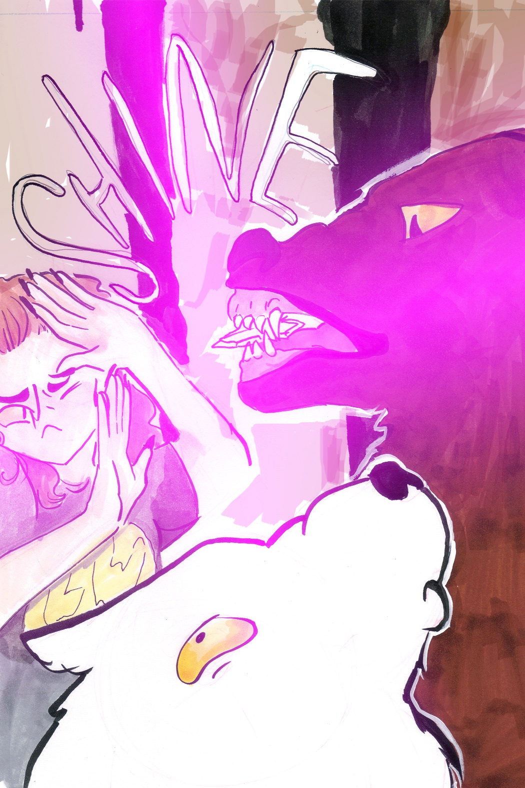
First attempt at comics (*whispers softly* help)
#1
So yeah. I'm new to making comics. I'm doing one right now for kind of like...an exercise in sequential art/storytelling. It's slowly getting better as I go I'm trying not to obsess about mistakes and just instead, working on making the next page better. (the first ones were just...um...very obviously done by a beginner--which I am--so I guess that's okay.)

Here are some of the pages I've yet to post yet. I need some feedback/ideas w/ coloring digitally which is hard for me. Thanks!

-V
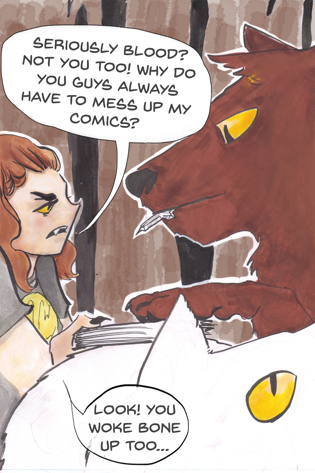


I was SUUUPER lost with this one. I want to get the "shine" without having to resort to doing what I did here. Might just move on though.
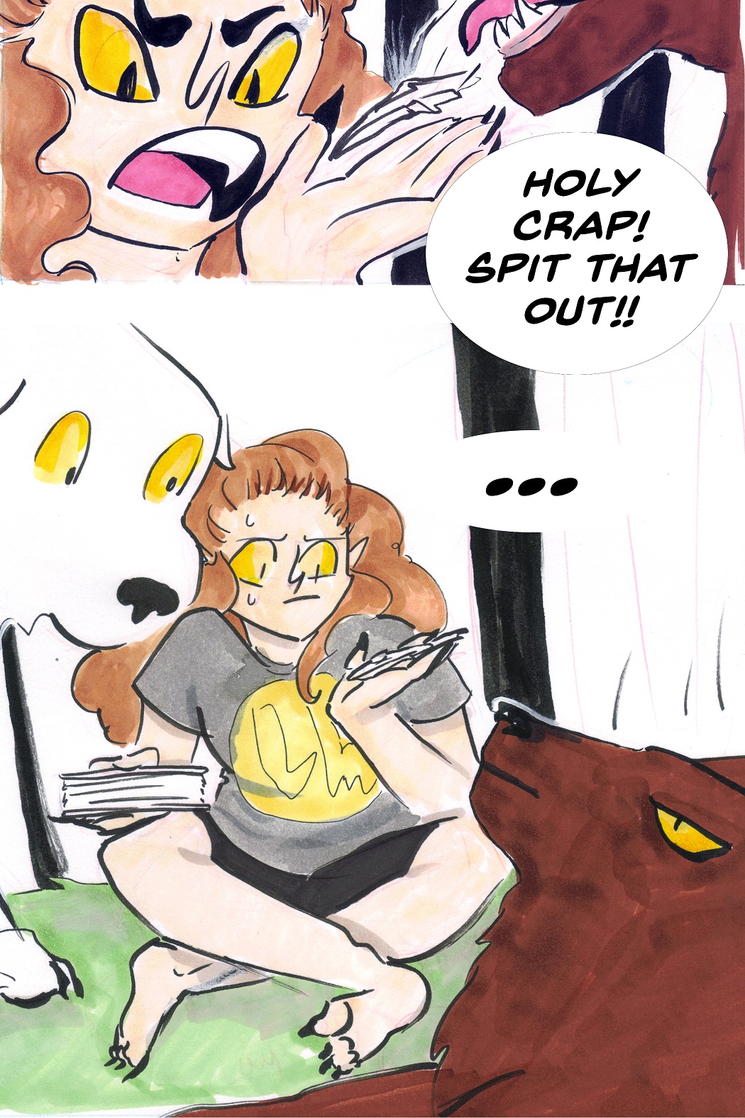

major WIP I'm regretting not traditionally doing those trees in the background. I had intended just to paint bucket them brown but then I realized how dumb that looked. Oh and speech bubbles aren't going the way I wanted them either my method so far has been lasso>fill>stroke but I hate the way the edges turn out.
Reply
#2
Hi Inkdulcet, you're doing great so far, some people say comics are the hardest kind of art so good job making the frames match, its clear they are part of the same scene. I'm just a novice but I'll give you my thoughts.

1) It wasn't clear that the bear had eaten the page, when I first looked at it I didn't notice the paper in his mouth, so the 'spit that out' line didn't make sense at first. Needs a more obvious image of him putting it in his mouth.

2) I didn't realise it was outdoors with trees until you said at the bottom. Could use a wide shot at the start of a scene to show exactly where the action is taking place.

I think the key to a good comic (art wise) is just having things consistent, which you did! You just need to look at newspaper 'funnies' to see that the art doesn't appear to be too complex (like this one: http://www.hs.fi/fingerpori/ ). Also the intro to this comic: http://floraverse.com/comic/flora/page/2-visionary/ has a rough kind of look but looks nice because it's all consistent.

As for speech bubbles, a lot of comic artists start with the speech bubbles and dialogue (either doing it themselves or from the writer) and fit the drawing in between, this can make it look more cohesive - so I'd say try doing them by hand before you work on the drawing. It's a real time saver being able to do comic lettering by hand, it's well worth practising. If you do want to go the photoshop route though, I use vector shapes, I don't remember exactly where I got them but google 'comic book speech bubbles vector' or something and you'll find some good ones. You set them in photoshop as auto shapes and can squash / stretch / size / edit them all you want. It's also another way to keep things consistent if you're always using the same set of bases for your speech bubbles.

Above all though, I'd recommend this book: http://www.amazon.co.uk/Making-Comics-St...060780940/

It's like the Loomis or Bridgman of comic book making, really worth it, it covers everything you need to get started and has practical exercises for you to do at the end of each chapter.

Also, read comics a lot and compare different scenes for study - don't just replicate the compositions but look for patterns that are used and then incorporate those into your work. For example, a comic panel often has something pointing towards the next panel in the sequence to lead the eye - a foot, a tree branch, a tilted horizon line etc., anything at all just to bring the page together as a whole and keep the reader immersed. The art isn't really meant to be appreciated for art's sake, at least not on the first read through, story is king here and keeping a good flow facilitates immersion into the story.

I probably went off track a bit and didn't answer all your questions but I hope that was useful all the same! Any questions let me know, anytime : )

Comic book creator
Sketchbook
Instagram
Abandoned Hideout Discord Server
Discord: JonR#4453
Reply
#3
(12-13-2014, 03:03 AM)JyonnyNovice Wrote: 1) It wasn't clear that the bear had eaten the page, when I first looked at it I didn't notice the paper in his mouth, so the 'spit that out' line didn't make sense at first. Needs a more obvious image of him putting it in his mouth.

2) I didn't realise it was outdoors with trees until you said at the bottom. Could use a wide shot at the start of a scene to show exactly where the action is taking place.

Thanks for the advice Jyonny!

I have a handful of these pages done and I wasn't sure if I should post ALL of them so I had decided to pick the three that showcased the issues I was having. Some of the clarification issues might be resolved simply by reading the other pages...but to be honest I'm not sure now-- so thank you for pointing that out, I'll take a look at that overall.

I love the links you gave and I'm defiantly looking at clarifying w/ some wide shots.

I've considering re-doing these (and about 4/5 more pages out of the 12 total I've done so far) but I'm not sure if its worth it and if I should instead just make these the best I can then just write more. Thoughts?
Reply
#4
Ah ok, yea it's good to see the whole sequence before making too many criticisms, although maybe look at what your goals are here; are you trying to improve your comic book writing / layout or your comic book art style? If it's the second one, it might be more beneficial to work on the artwork side in a different way, in single panels / drawings / studies / imaginative single drawings. If you want to improve the first one, I'd say to not spend time on nice lines and colouring and focus more on the whole page and how all the panels, speech bubbles and art work together as one. In Manga they call it writing a 'name' - it's a super rough version of a whole chapter, very loose and gestural done in graphite that has to be approved by an editor before the artist proceeds to doing the artwork properly. Like this, little changes (even big changes) can be made without too much time having been invested, you're also more likely to make those changes than if you've done a nice drawing that doesn't fit - the temptation can be to just leave it as it is even though you feel it's not the best or most appropriate panel.

The expression is quality over quantity, but quality only comes with a high quantity! I'd say to focus on generating as much as you can - rough, loose, think about the whole page, (try marking out the panels and speech bubbles beforehand), get the drawing down without working in too many details - thinking about the big picture really, like with drawing you start with big shapes, comic book page approach is similar - then sit back and see if it all works together, with the pacing and the pages before or after.

Couple more links that show some comic book making approaches:

https://www.youtube.com/watch?v=Csbgkb1vhp0 - Mark Crilley, very good narration and explanation of what he's doing

https://www.youtube.com/watch?v=P-wIdaWSqTE - Marvel artist, he's got years of experience so skips a lot of steps but really informative still

Such a great thing you're working towards though, to create your own worlds and stories and share them with others is really amazing and I'm intrigued to learn about the characters, so good job with that : )

Comic book creator
Sketchbook
Instagram
Abandoned Hideout Discord Server
Discord: JonR#4453
Reply


Forum Jump:


Users browsing this thread: 4 Guest(s)