02-28-2012, 08:39 AM
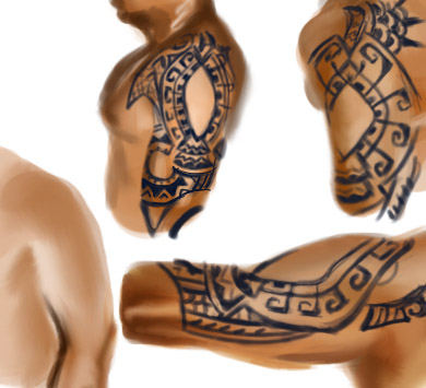
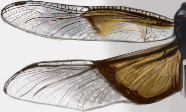
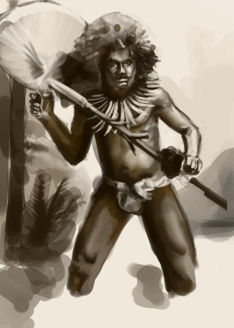
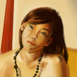
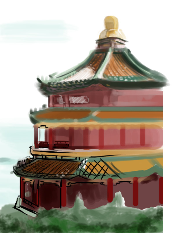

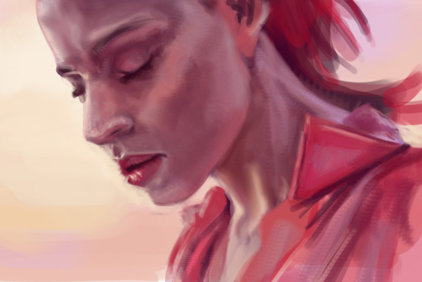
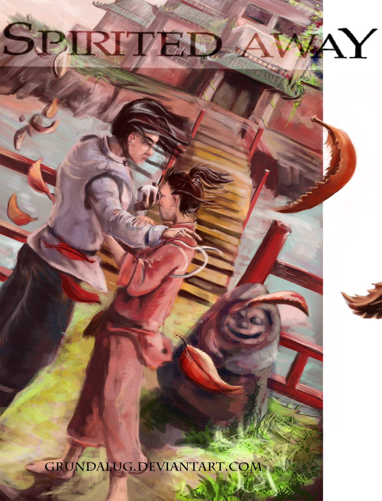
|
I'm doin' stuff?
|
|
06-28-2012, 03:53 PM
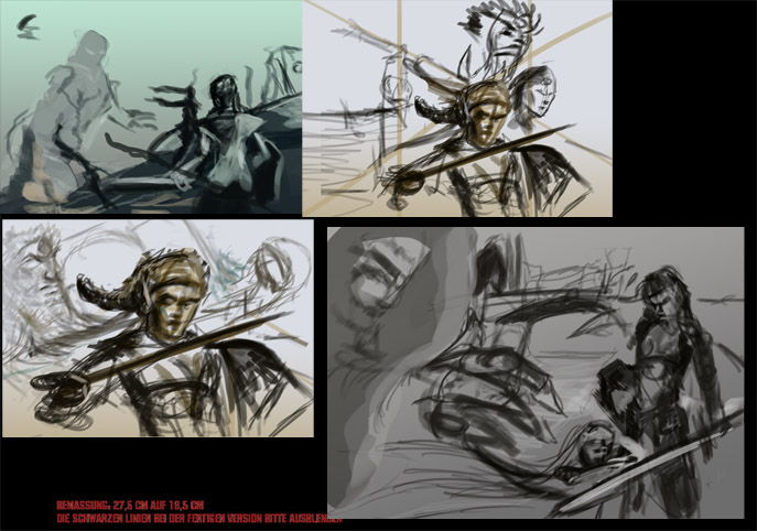
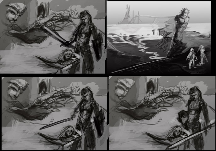
  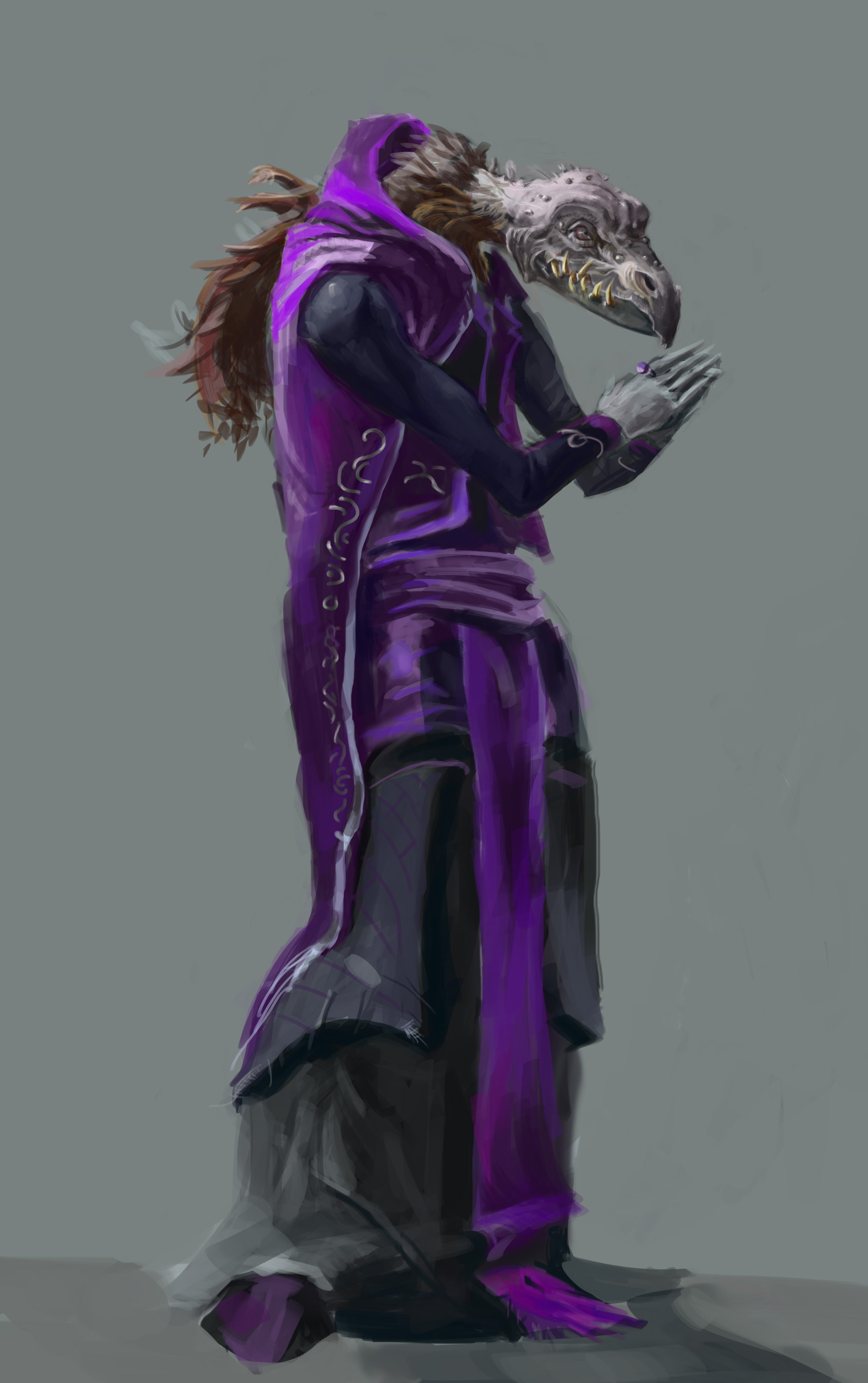 These are imaginative works trying to figure out what i know and what needs the most improvement. (lots of things i know)
06-28-2012, 11:03 PM
cool stuff man !
07-14-2012, 05:32 AM
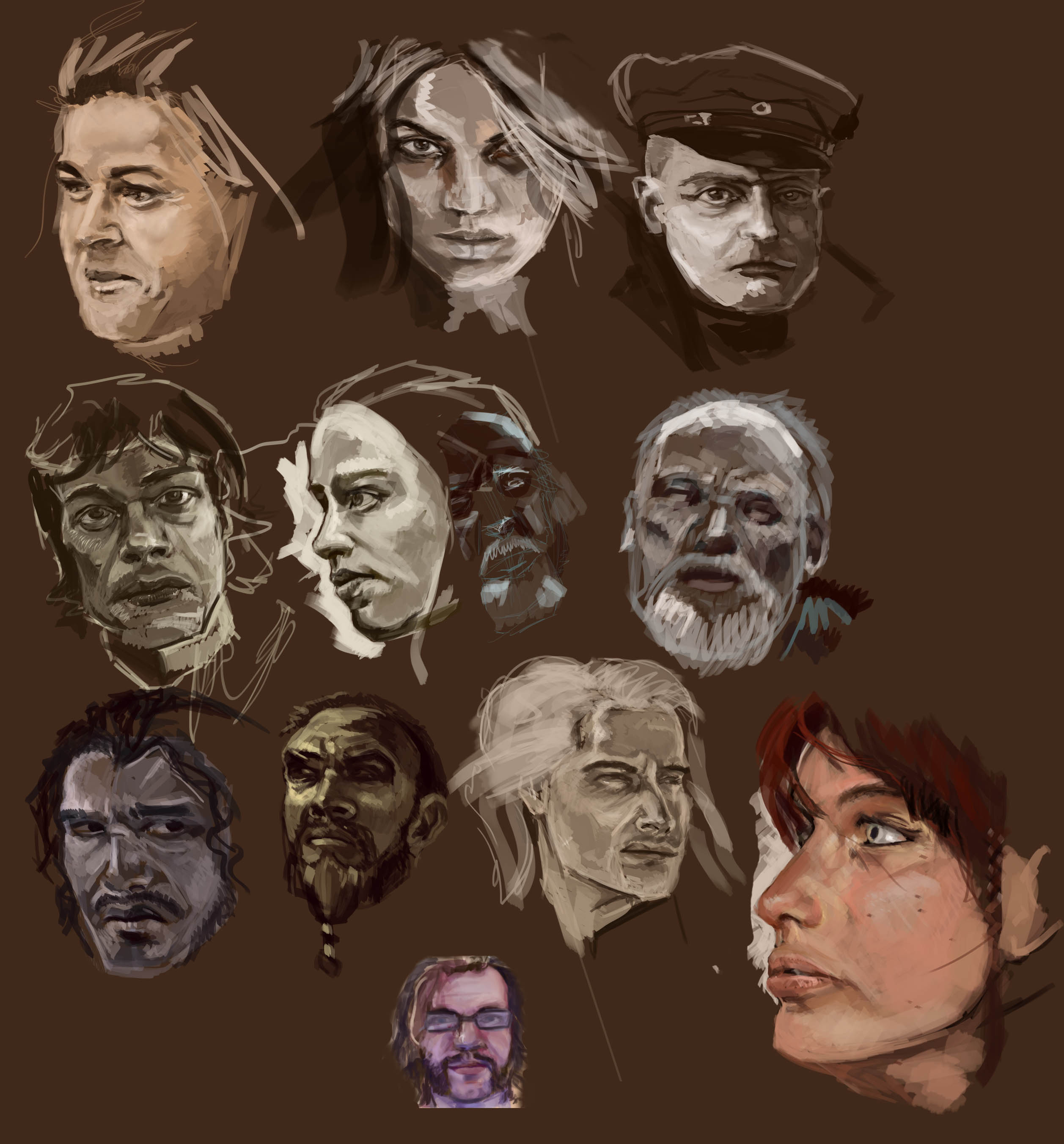
got a lot of studies to upload soon. most are shiiiiiiiiit but i like a few of these faces
07-14-2012, 07:59 AM
Totally digging those studies man! Awesome work.
08-14-2012, 04:27 AM
Thanks timtom
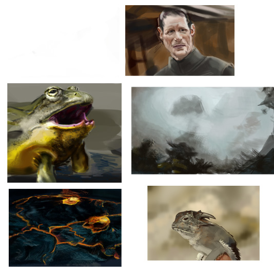
Been doing slimey things recently. Trying to learn texture and wet looks with regular ps brushes. 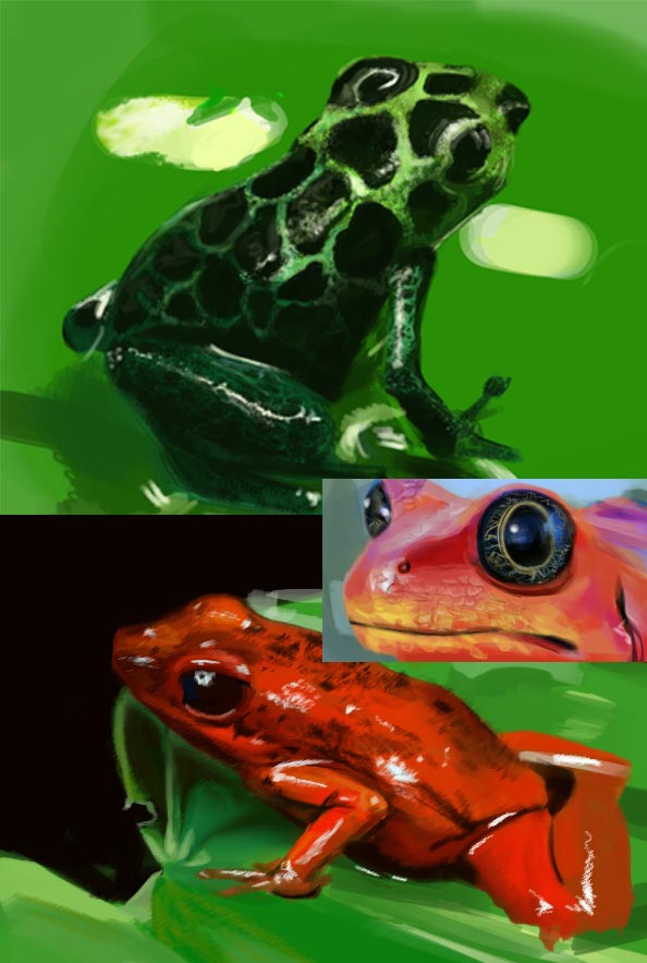 And a few screen caps 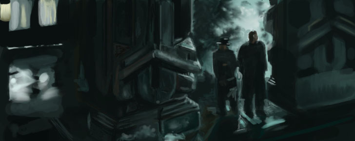 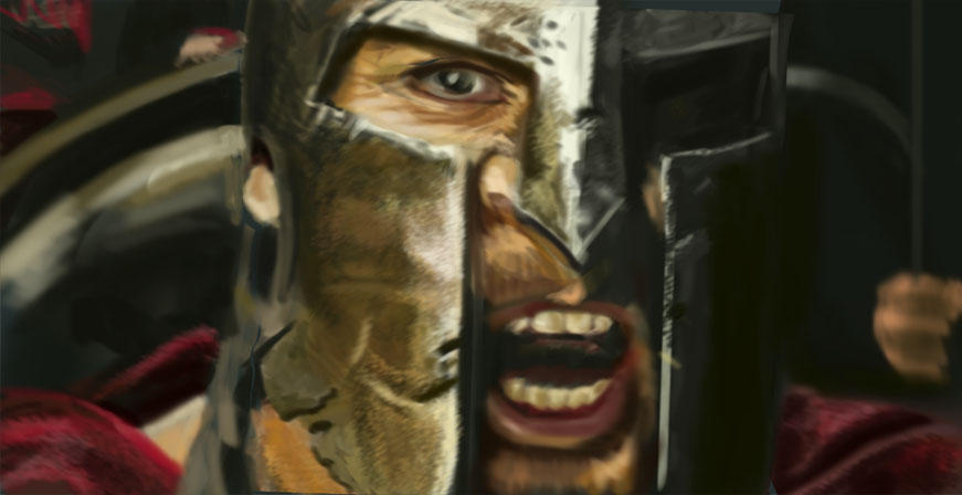 Still working on hard edges. They scare me, so does 100 percent opacity.  Does anyone have a particular favorite artist that can imply landscapes quickly? One of the many things I need to work on. I realize I should know how to render a landscape for realzies before I learn shortcuts, but I am hoping some insight might help me know what I am seeing. Don't know if that makes sense. 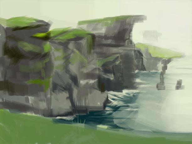
08-14-2012, 09:00 AM
Wow, you've done a lot of stuff. Great work. I wish I could help you with landscapes, they're a mystery to me, just another thing to learn I guess (sigh). Back to it then.
08-14-2012, 01:35 PM
Nice updates... seeing some improvement in all of the work. One thing I'd suggest is breaking your process from time to time. You may already be doing this, but I've found that for myself, if I've been doing a lot of stuff based off of starting with blocking in shapes and large values and refining from there, I can sort of feel a bit of a level up if I go the opposite approach for a while - as in hitting the line drawing side of things as my main basis for a while (weeks? months? just until you start to feel a little comfortable with it) and then come back to the shapes. It just forces you to keep on thinking about your forms, edges, values - everything, in new ways. Anyway, that's just my approach that I've been doing the past 6 months or so and I like the results every time I make the switch even though it can be a little frustrating at first.
Keep pushing it and post more!
08-15-2012, 03:01 AM
(08-14-2012, 01:35 PM)Pierce Wrote: Nice updates... seeing some improvement in all of the work. One thing I'd suggest is breaking your process from time to time. You may already be doing this, but I've found that for myself, if I've been doing a lot of stuff based off of starting with blocking in shapes and large values and refining from there, I can sort of feel a bit of a level up if I go the opposite approach for a while - as in hitting the line drawing side of things as my main basis for a while (weeks? months? just until you start to feel a little comfortable with it) and then come back to the shapes. It just forces you to keep on thinking about your forms, edges, values - everything, in new ways. Anyway, that's just my approach that I've been doing the past 6 months or so and I like the results every time I make the switch even though it can be a little frustrating at first. Thanks Pierce! That sounds like a great thing to do. I was getting away from doing line work. just seemed like a slower process than shapes. Guess I'll add it to my rotation. Trying to apply everything I think I know into things out of my comfort zone, which would be... character ports I guess. Thoughts? 
08-15-2012, 03:15 AM
At the moment your figure feels a bit awkward in his pose, his right arm eems to be the cause of this. Unless he's suppose to have it behind him, its going the wrong way if not have it overlap the cape more. he's head appear to be looking off to the left but the big building and such is more on the right? Also the lightsource for him seems differant to the buildings one. Hope this helps a bit this looks to be the start of a cool piece, I like doing mountains and clouds when I do enviros so hope you have fun
08-16-2012, 01:08 PM
(08-15-2012, 03:15 AM)kidult Wrote: At the moment your figure feels a bit awkward in his pose, his right arm eems to be the cause of this. Unless he's suppose to have it behind him, its going the wrong way if not have it overlap the cape more. he's head appear to be looking off to the left but the big building and such is more on the right? Also the lightsource for him seems differant to the buildings one. Hope this helps a bit this looks to be the start of a cool piece, I like doing mountains and clouds when I do enviros so hope you have fun Thanks for the sketchbook love and the input. That arm was giving me a rough time. One of the things I was trying to address was placing a figure in an enviro. Just need a better understanding. My thought process behind him looking the other way- initially I wanted to try to convey the feeling that he had a ways more to travel (besides the distant castle). Not trying to make excuses, just let you know there was a reason, even if I failed. I will get back to this and make the changes you suggested. :) Today's studies 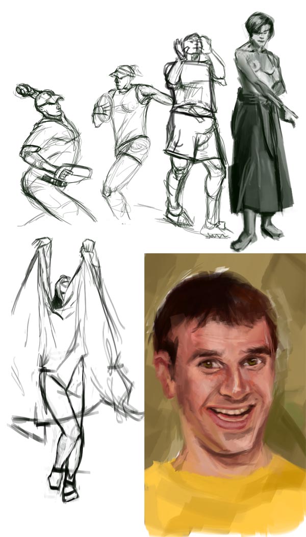 I enjoy making people look like retarded versions of themselves.
08-16-2012, 01:51 PM
Hey you!
I didn't realise you were hiding out on here, just wanted to say keep up the studies - you're improving loads! Study and apply, study and apply :):)
08-17-2012, 03:12 AM
Definitely seeing improvements in leaps and bounds, keep up the good work!
08-18-2012, 04:00 AM
Thanks guys
And Laura, I've been a lurker of the daggers since early on. And groped blindly through the darkness when our messiah, Rapoza disappeared from his stream only to be reborn with more skill than ever. I'll admit, I lost hope of our leaders eventual return. Those were dark days. I don't know exactly what he was doing during his absence. I can only imagine he was killing off other artists and siphoning there power highlander style. But I digress... Don't know why I am not more active. I always enjoy my visits here and learn from everyone. I like that people aren't afraid of giving helpful advice. Fiddling with a face from my imagination. Probably gonna need some refs to fix the issues I am having. 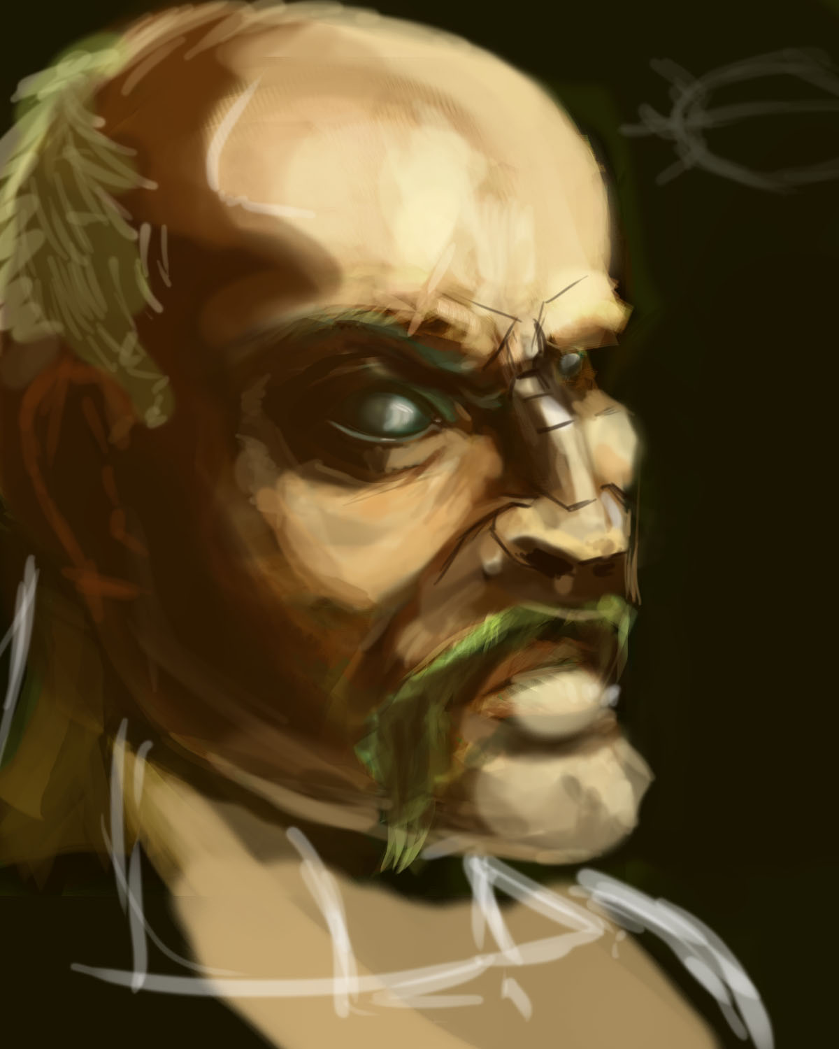
10-03-2012, 08:39 AM
45 min speed paint. From a ref.
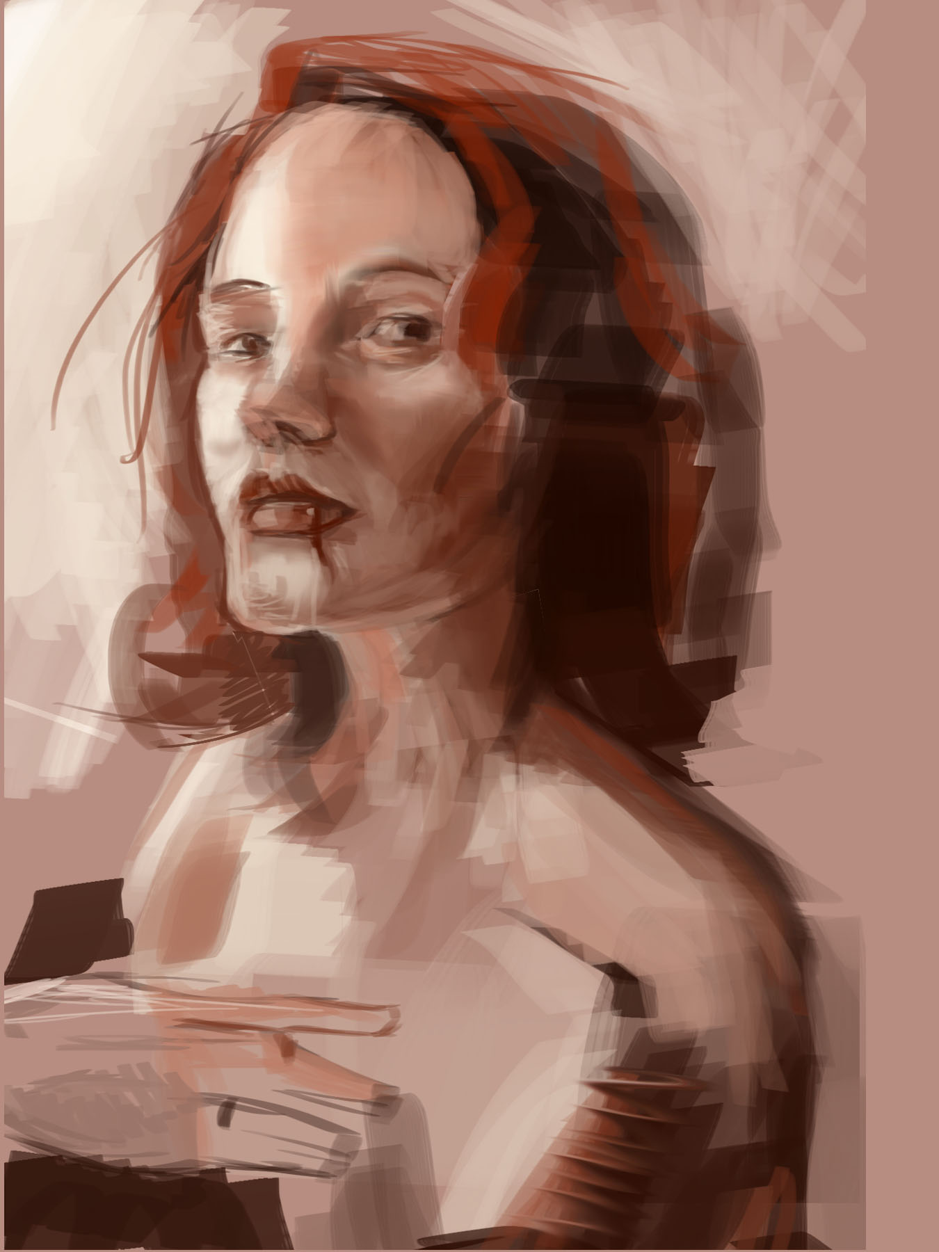 Need to work on likeness a lot.
10-03-2012, 09:43 AM
great stuff! also for the likeness, if a portrait doesnt resemble the subject thats mainly because the structure under the paint its wrong. So i would focus on the structure first and then, the painting.
Hope this helps!
"Stand tall, and shake the Heavens!"
Tumblr for my comic!: http://rainfallcomic.tumblr.com/ Sketchbook: http://crimsondaggers.com/forum/thread-1227.html Facebook: http://www.facebook.com/eduardogarayart Deviantart: http://eduardogaray.deviantart.com/
03-14-2013, 06:56 AM
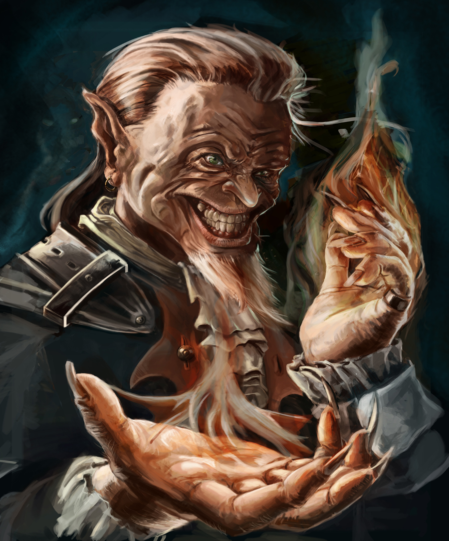
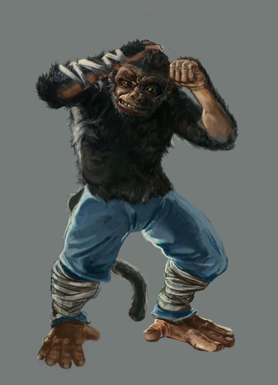
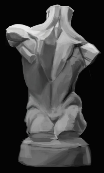 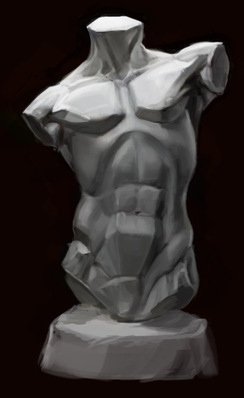 Did something not related to my bloodsport, or any projects I'm workin on. Focus...What's that? |
|
« Next Oldest | Next Newest »
|