Posts: 905
Threads: 39
Joined: Sep 2013
Reputation:
51
While I replied Hristov via PM, I just realized I never replied to you Warburton, how rude of me!
Been studying anatomy and some shadows, like you said, but the over-saturating of texture is still hard to control. I'm still doing some studies, but will take more stabs at finished designs soon. Thank you so much for your thoughtful reply!
Posts: 23
Threads: 1
Joined: Aug 2015
Reputation:
1
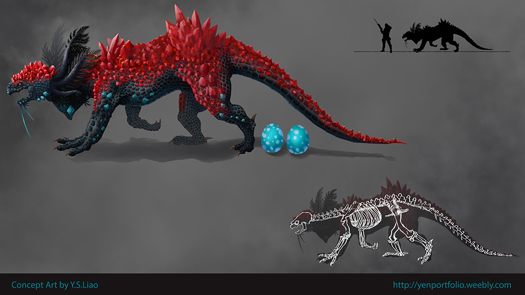
I prefer the original crystal creature. There's no reason for it to be aerodynamic, it isn't that fast. It may also exist in a grassland. Even in a forest, you won't often find branches that are stout enough and low enough to snag a creature that size. I've never even seen a deer get caught in branches, outside of Bambi, which was cute but not informed by reality.
The original looks as if it can walk on its hind legs if it wants to. That's totally lost in the redraw.
Posts: 23
Threads: 1
Joined: Aug 2015
Reputation:
1
I would give special consideration to any creature with crystals growing off of it. If I were writing the back story for it, it would be magical in origin and the crystals would store energy for a ranged attack.
The mouth isn't detailed, but from what I can tell it doesn't have the teeth of a predator. It looks a lot like the skull of a turtle, which also has claws. Almost everything has claws. This guy looks like a magician derived him from a turtle, a hadrosaur, a fern, and a bunch of magic crystals. I think he keeps the grass around the magician's tower mowed, until a knight rides up. Then he zaps the knight and scavenges the corpse. Very tidy.
It's all shadows.
Posts: 37
Threads: 7
Joined: Jan 2012
Reputation:
1
Hey meat!
I think it's a pretty cool idea, you definitely have a good physiology/ skeletal system thought out for it. What sticks out to me a lot is what you mentioned above, where the overall story of the creature hasn't been thought out. Not like you have to have a 300 page document thought out for it, but to imagine it really living in it's environment. Does it swim in lava? How does it reproduce? What do male/female versions of it look like? What mating styles does it have? What do alpha/beta versions of the creature look like? What do the babies look like? If it wanted to protect its young in a volcanic environment, would the eggs be that color? What texture would they be to withstand growth in that environment?
These questions aren't to beat down your idea at all, but to inspire a lot of wonder in your work. And it's not a complete overhaul of your idea, but a cool embellishment of the ideas behind it. Because when you think these little ideas out and make sketches/concepts conveying these ideas and behaviors, that's what's going to make an art director be like "I can trust this guy with making my IP that much more appealing to my audience." Just like in How to Train Your Dragon, Toothless acts like a cat. But it's well defined HOW it acts like a cat, belly petting, using light as a laser pointer, (something about striped snakes causing the dragons to freak out?), all of that. It adds to the behavior and the world of the creature, since in a way, the creature is a character in and of itself.
Let your love of the content show through. Advice that admittedly I need to take more often than not :D


