Looking for critique - 3 characters
#1
Hi guys!

I made these characters last May and I would like to know what you think. What is good, what is not, how I could make them better. I used reference only for the poses.

I don't know if I could make it clear but here are some points about them:

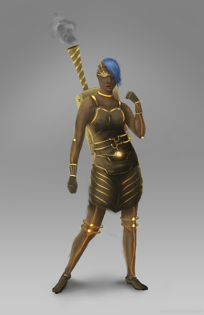
First character: she has some kind of exoskeleton.

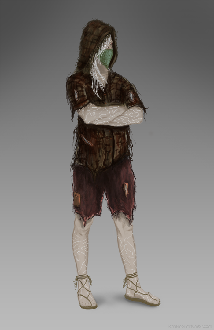
Second character: he is albino / pale skin and his clothes are old 

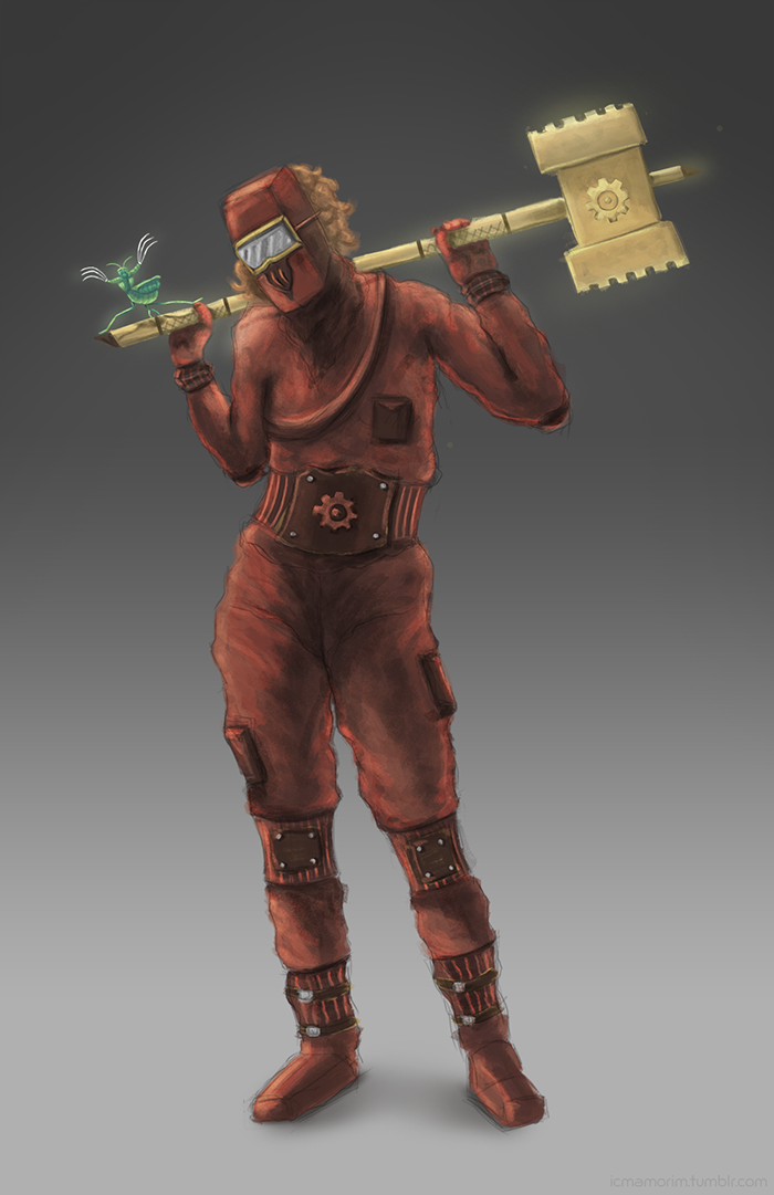
Third character: she is supposed to be an engineer with a big hammer.

Any critique would be great. Thanks! :)


Reply
#2
Hi man ! The only advice I can give you is work anatomy. These characters look cool, but we stop looking as soon as we know anatomy doesnt look real.It looks like you know the general poses, now go deeper and understand how everything move it will give more life :) The hands and feet particulary. Do some studies, it may be boring but will drastically increase your skillz. Keep it up :)
Reply
#3
Hey Buzuuk, thanks for the advice! I think I lost some anatomy structure when I start painting them :(

Thanks again and I will keep working :)

Reply
#4
Hey there iamorim! You have some interesting designs here. I have some tips for each one, and I hope you find them helpful.

First, I'll say this for all of them: the painting is a little muddy. Your brushstrokes seem somewhat hairy, and I think you would benefit from using a 100% hard round brush more often and do do more contrasting values all around.

For the first one, the face's proportions could be revisited, as the jawline seems to low. The hair could also use work, since it doesn't have much form. Pull up some references for it to see how the hair should fall across the face.

[Image: 1451512_10152024074563707_1483884726_n.jpg]

The shoulders/neck area could also use some work, with a thinner neck that meets the jawline where the ear is, and a stronger drop shadow under the chin. The anatomy on the rest of the figure conveys the best with this one, though, and just needs a few though-ups here and there.

For the second one, you should revisit the clothes. You're trying to make them look old and raggedy, but they just look hairy. Erase 90% of the fuzzy lines around the outside of the clothes, and keep the tears and holes. I think that would convey enough to make it look old without it looking fuzzy. And again, revisit the values to make them more distinct and clear. Try not to over-blend them.

The third one is nice, and the anatomy isn't too bad, but the belt should be moved farther to the left of the image so that it's actually in the middle of her waist, instead of slightly to the right. The lines around the arms should be less shaky, too, and looking up some references for how the fabric would look would benefit you. The hammer looks good, though, and the costume design is well-done.

Hope that helps! Your characters are very interesting and I'd like to see what you do with them.

Reply
#5
Thanks a lot ZombieChinchilla. I agree 100% with your tips and maybe I will take some weekend to work on them again. That was the first time I tried to push a character to a more finished step so I knew I would fail in a lot of things :D

Thanks again!

Reply


Forum Jump:


Users browsing this thread: 2 Guest(s)