Guile Crit
#1
I'm working on a picture of Guile from Street Fighter. I have worked on several sketches and I'm pretty happy with the latest one in terms of posing but I think I could use a crit on lighting, or anything you might see wrong with this picture so far.

Be as direct as you want, I can take it.   Party


Thanks in advice!


Attached Files Image(s)


twitter  |  facebook  |  instagram  | comic  
Reply
#2
First paintover, so tell me if there's anything I should be doing differently, be it with the painting or the explanation.

The lighting in this was pretty weird. I couldn't really figure out where it was coming from, but I think it works so whatever.
I tried to make use of lost and soft edges to make Guile look less 'cut out', changed the way the torso was bent so it  implies that he's standing in a way that makes sense.  The hands looked too square-ish to me, but I think the way I went about correcting that ended up fucking up the right one instead. Lastly, I made the angle of the face and the angle of the hair match up and changed the placement of the ear.


Attached Files Image(s)


Reply
#3
Hey there,

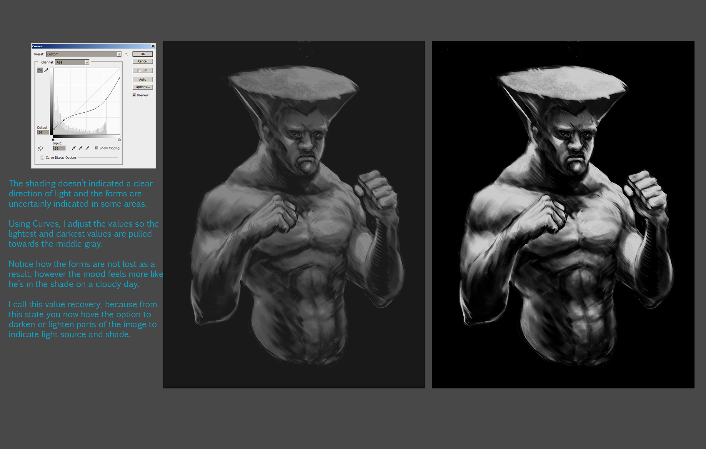
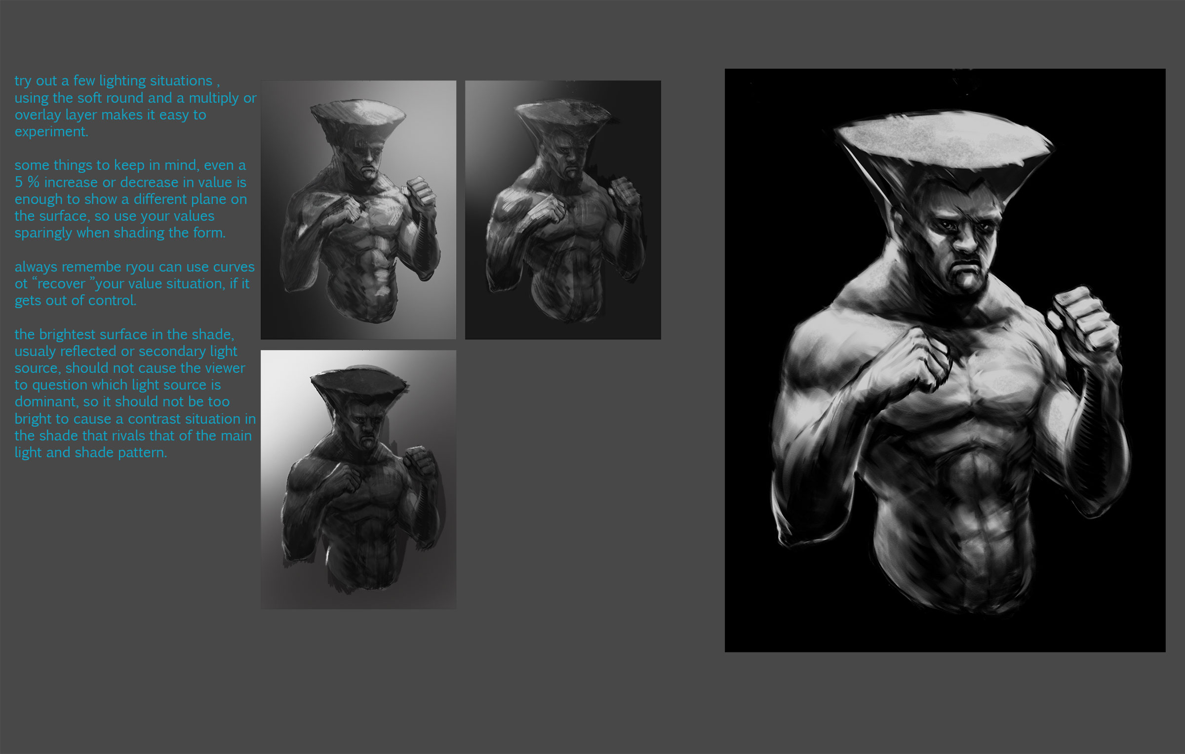
Some ideas you can try using to  push your lighting further :)


Keep truckin'
Reply


Forum Jump:


Users browsing this thread: 4 Guest(s)