08-11-2015, 09:06 PM
Hello hello,
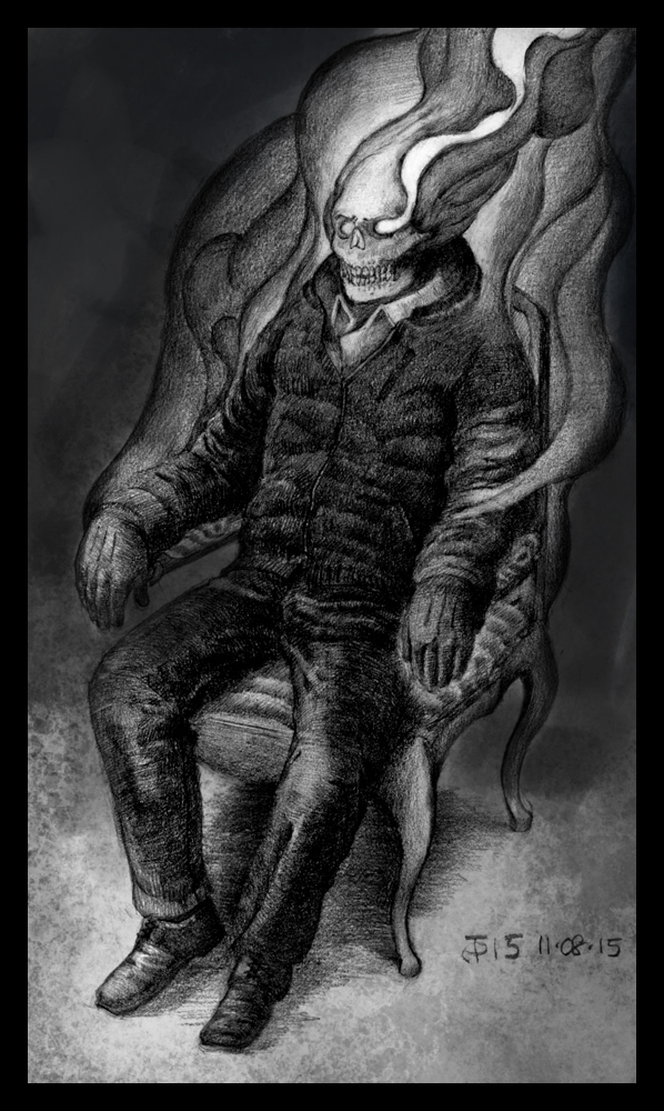
I've been working on this one for a few days now, and I've finally brought it to the point where I'm not going to nudge it any more. The goal here was to draw an anatomically and proportionally correct figure sitting in a chair, whose head was on fire. I'm not the most imaginative person, I know.
I've sprayed fixative on it so I'm not going to be able to make any changes to it, but I will write down any critique you can offer. Thanks in advance, I'm looking forward to what you think. I know I have some work to do on drapery and foreshortening, but any specific advice is highly appreciated.
Cheers!


