Hey there,
Nice theme!
Here is what I think on improving depth of the image as well as lighting harmony.
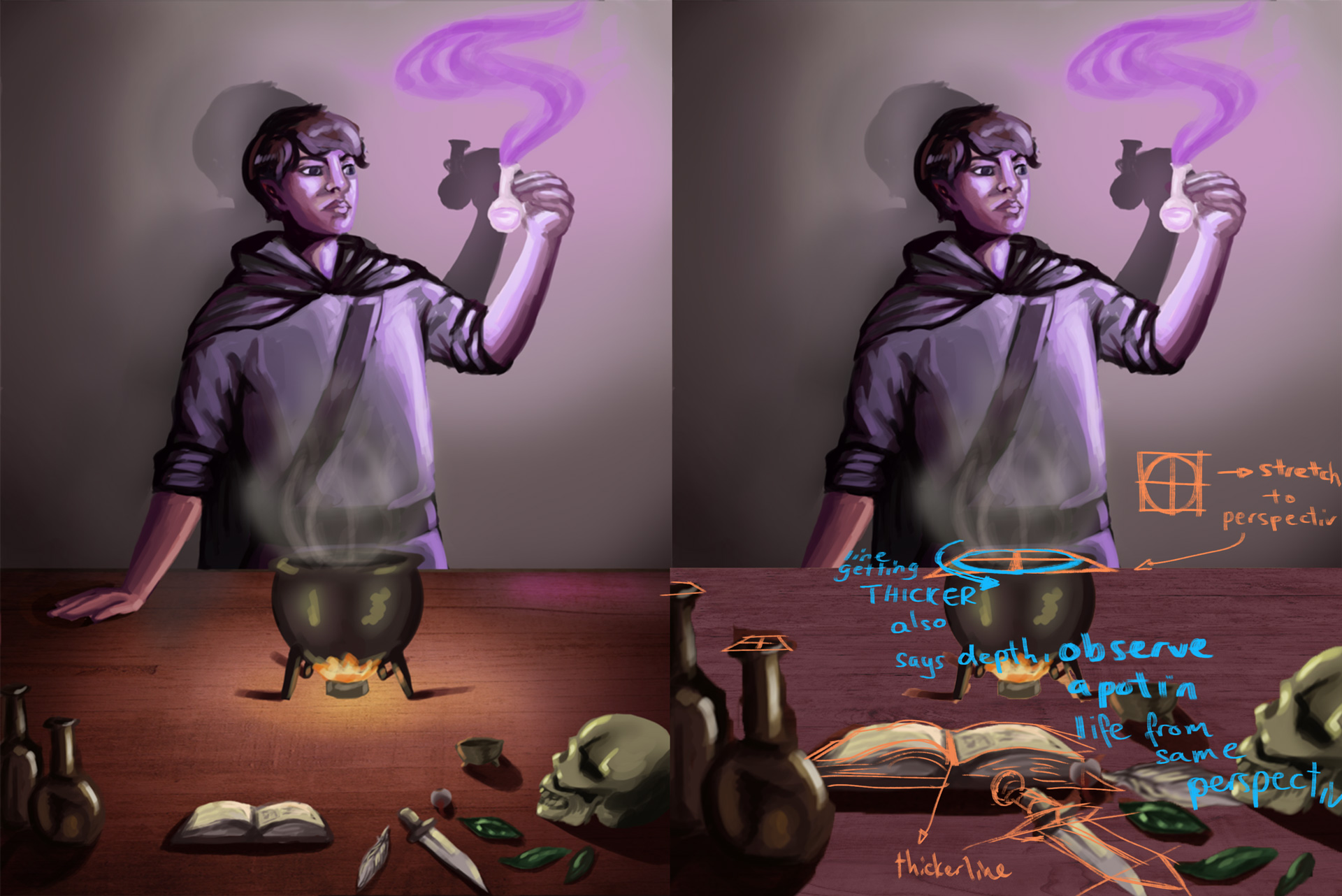
01: you can stretch out the texture on the table in perspective more till it almost seems ridiculous, then pull it back to a reasonable amount. It should be good enough to make the viewer feel that one edge of the table is closer to us than the other.

02: use difference in scale of objects to create depth. since we already know things in the foreground are larger than things in the mid ground or background.
Also, once we’ve scaled stuff up we realize somethings.
1. some perspective looks odd with the newly sized texture.
2. the lighting needs to be adjusted to harmonize.

03. Correcting the drawing of the ellipse on the top of the pot to harmonize with the big going to small idea of depth. also some guides on the other objects.

04. to harmonize the lighting , i remove the false highlights on the objects on the table. for instance the highlights on the potion bottles point to another light source from behind and to the right of the viewpoint.
that is possible of course but to relate the bottles to the scene its best to use rim highlights from the fire.
also i darken all surface above the height of the flame, so areas like the top of the bottles, the top of the skull should be fairly dark. these can later be shaded with the cool light from the potion int he alchemist’s hand. but should remain in the shade still.
to harmonize the colours/lighting in the image i shade the image using darker values and conserve my darkest and lightest colours for last. with the exception of the light sources.
note that all the shading is still being done with consideration for which surfaces the light can get to and in what intensity.
Suggest using a table lamp and some props and placing them in space to see how light gets to the objects.

05: With the previous image, everything is slightly darkened and lighter areas indicated using mid values. You can now selectively brighten up the areas of focus and refine the rendering on those areas. Lastly, you can blur the edges of the shapes in the foreground, or leave them roughly rendered to suggest that they're out of focus.

Hope it gives you ideas to better control your image. Keep truckin'!
![[Image: akjfd_zpsxzqr2yqm.png]](http://i233.photobucket.com/albums/ee268/Charlie342/akjfd_zpsxzqr2yqm.png)
![[Image: akjfd_zpsxzqr2yqm.png]](http://i233.photobucket.com/albums/ee268/Charlie342/akjfd_zpsxzqr2yqm.png)


![[Image: potions5_zpsq1mmusui.png]](http://i233.photobucket.com/albums/ee268/Charlie342/potions5_zpsq1mmusui.png)
![[Image: 52_zpsbkkgbdwz.png]](http://i233.photobucket.com/albums/ee268/Charlie342/52_zpsbkkgbdwz.png)
![[Image: 54%20copy_zpshegsdse7.png]](http://i233.photobucket.com/albums/ee268/Charlie342/54%20copy_zpshegsdse7.png)
![[Image: potionsfinal%20copy_zpstpbvx9wn.png]](http://i233.photobucket.com/albums/ee268/Charlie342/potionsfinal%20copy_zpstpbvx9wn.png)


![[Image: potionsfinal2%20copy_zps4ggpfcfp.png]](http://i233.photobucket.com/albums/ee268/Charlie342/potionsfinal2%20copy_zps4ggpfcfp.png)