Posts: 12
Threads: 1
Joined: Oct 2022
Reputation:
1
Hi! Thanks for checking out my sketchbook, here are some of my recent studies, some life drawings and a small house (and character) for a wee game mockup I'm working on slowly.


Usually I love to draw characters and atmospheric scenes, I'll try to show that in the future.
I hope to post here more and figure out where I'm going while improving my art!
Posts: 9
Threads: 3
Joined: Oct 2022
Reputation:
0
Those are some beautifully backgrounds, can't wait to see more of work
Posts: 3,361
Threads: 37
Joined: Aug 2013
Reputation:
234
Good ability to capture mood and versality of style.
Posts: 12
Threads: 1
Joined: Oct 2022
Reputation:
1
Thanks to you both!
Today I sketched my muse Kubo:


and wanted to share this wip from a little while ago, Alyx fanart. I tried to make something a bit out of my comfort zone but I kind of gave up because something wasn't quite working, not sure.... so I'd love some feedback if possible


Posts: 12
Threads: 1
Joined: Oct 2022
Reputation:
1
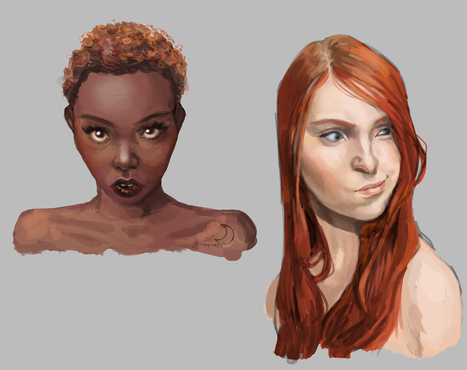
A couple of studies of womens' portraits. I rarely do black and white values and then colour, but I did here, and I liked using this method! Cool to see how much life is added when you colour it in.

and a couple of objects, dabbling in drawing props. Themed teacups that would be annoying to drink from:


Posts: 852
Threads: 6
Joined: May 2018
Reputation:
116
Massively impractical! But I like them, they are very cute and appealing.
The only thing is I think you could push the materials a little more. There could be more study of specific materials you want to capture and how they work, like the gems and gold could be more reflective, glass and liquid could show more of the background color through it and so on. But It looks good as is as well
Posts: 25
Threads: 8
Joined: Oct 2022
Reputation:
0
I can not give you technical advice, but I can tell you, what I found most appealing:
the Game-indoor-environment and the study of two girl portraits.
Both of them look appealing enough to be some kind of finished product - nothing that bothers a viewer.
The Game-House can easily be in a game and nobody would complain about the Art.
Posts: 12
Threads: 1
Joined: Oct 2022
Reputation:
1
Thanks for the feedback :}
(11-21-2022, 03:49 PM)JosephCow Wrote: Massively impractical! But I like them, they are very cute and appealing.
The only thing is I think you could push the materials a little more. There could be more study of specific materials you want to capture and how they work, like the gems and gold could be more reflective, glass and liquid could show more of the background color through it and so on. But It looks good as is as well
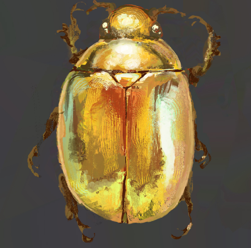
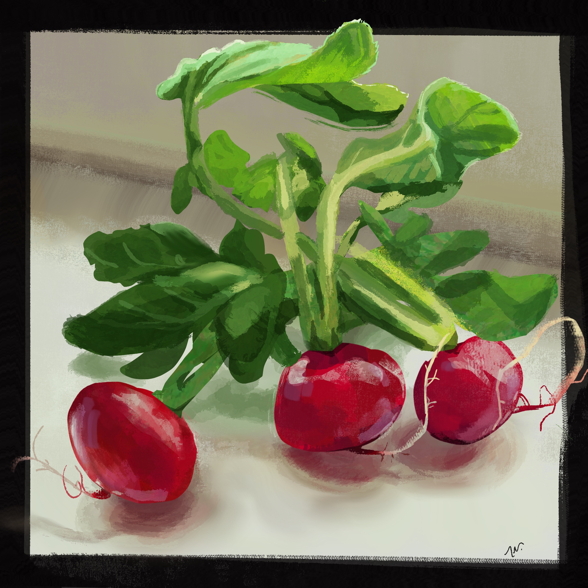
Agreed on the materials!
I painted a couple of quick things to practice with this in mind


For the beetle I got a bit carried away testing the heavypaint app, really reccommend it! Especially if you're into changing up your markmaking.
Posts: 1,076
Threads: 4
Joined: Jan 2016
Reputation:
43
Nice work here! You have an appealing style and your figure work is generally very solid. Only feedback would be to maybe try to push your shadows a bit more as some of your paintings could be more dynamic in terms of values/lighting. Keep it up!
Posts: 316
Threads: 3
Joined: Sep 2019
Reputation:
23
Hi and welcome.
It's good to see all the variety of styles you've shared from cartoony to studies etc. I'm more attracted to your pieces with a bit more polish like the portraits and interior concept — but with that said I also really respond to the tea cups, silhouetted kitty and Alyx fanart piece.
Hope you'll share more of your journey with us
Posts: 12
Threads: 1
Joined: Oct 2022
Reputation:
1
Posts: 105
Threads: 1
Joined: Apr 2021
Reputation:
18
Great sketchbook, I loved your material studies, and those vegetables are so vibrant!
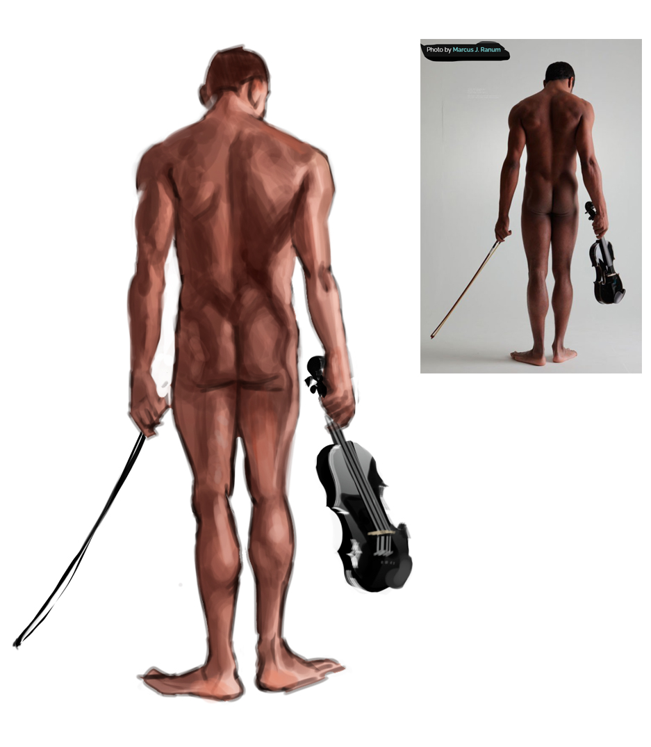
In that second study the gesture is great, but you deviated from the ref for the head and I'm not sure if it's just a landmark placement mistake that you had to run along or if you're struggling with head construction. If the second, it might be helpful to think of it not as a head growing out of a face but as a ball with a face attached on it.
Well, not a ball, most faces work better with an egg (in green).

For this angle it's easy then to bring a central line down to the chin and connect it with the jaw. You can then locate other landmarks (eye sockets, nose base, bottom of the cheekbone, and ear hole there) and start to add features and mass from there.
Posts: 12
Threads: 1
Joined: Oct 2022
Reputation:
1
(03-03-2023, 06:23 AM)dimensional-knight Wrote: Great sketchbook, I loved your material studies, and those vegetables are so vibrant!
In that second study the gesture is great, but you deviated from the ref for the head and I'm not sure if it's just a landmark placement mistake that you had to run along or if you're struggling with head construction. If the second, it might be helpful to think of it not as a head growing out of a face but as a ball with a face attached on it.
Well, not a ball, most faces work better with an egg (in green).
For this angle it's easy then to bring a central line down to the chin and connect it with the jaw. You can then locate other landmarks (eye sockets, nose base, bottom of the cheekbone, and ear hole there) and start to add features and mass from there.
Thanks so much for taking the time to sketch this out! You're right - I did struggle there. For some reason it's much harder for me to draw a head attached to a figure study than in isolation, and I keep resorting to shorthand I know for faces, so these eggs are really helpful.
Posts: 12
Threads: 1
Joined: Oct 2022
Reputation:
1


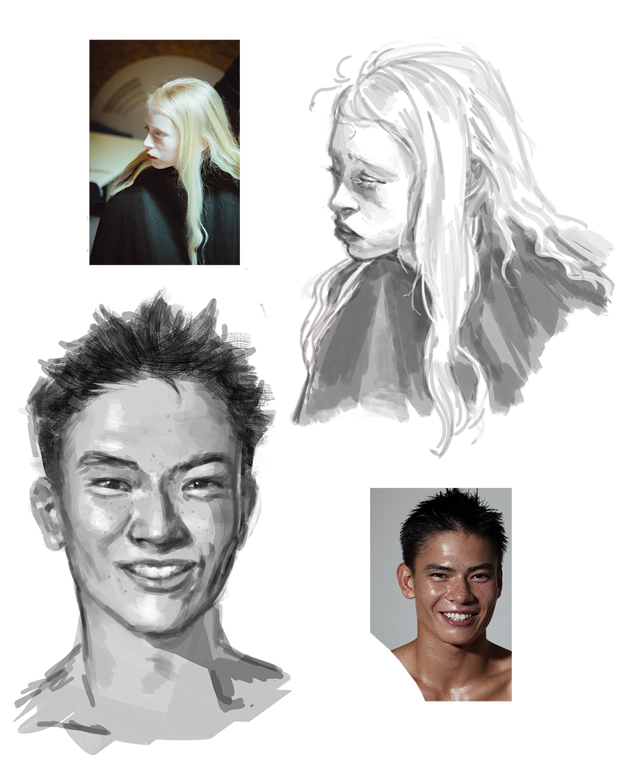
some quick gestures and practice drawing faces/expressions.
Posts: 105
Threads: 1
Joined: Apr 2021
Reputation:
18
I love the rhythm in your gestures! I wish mine were anywhere as dynamic as yours. xD
And the expressions study is also great, you captured the girl's facial structure very well. It's a challenging angle, but you managed to express it through the cheekbones in a way that's just *chef kiss*. The guy expression is also great.
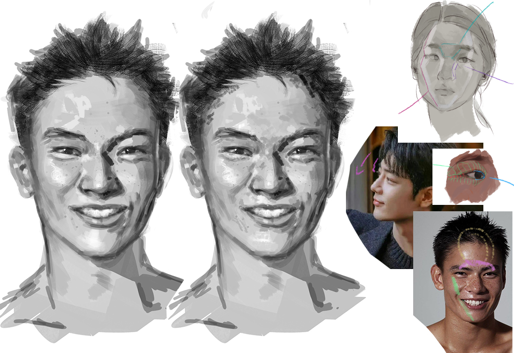
I don't have critiques, you're doing great, just assorted tips. May I give a couple of them for drawing Asian faces? They're silly tricks and traits I like to keep an eye out for picked through studies, nothing you must do but that I find useful in portraying this kind of gentler facial structure.

- I don't know why — maybe it's great sinkcare + skin tone + facial structure — but this kind of face tends to pick some very pleasant reflections in certain areas going to forehead to chin. They're not only very nice to look at but helpful in depicting the face's curvature.
- I find the area at the top of the nose, between eyes and eyebrows very characteristic in this kind of facial structure. Sometimes giving extra love to the shadows here, thinking about how they connect on the planes on the top outer side of the brow does a lot of heavy lifting in terms of likeness or just believability.
- Some people have epicanthic folds making the outer area of eyelids curve down towards the eyes rather than up to the eyebrows. That'll change how the light falls in this area, creating a very characteristic look. It connects to the rim of the eye sockets then changes direction, blending with the sides of the face rather than being a hollowed break from it.
This is why such eyelids are fuller, by the way. Extra fat and the lack of a ligament that would pull they back into the eye sockets, so they mostly gently nest over the shallower crease:

Posts: 12
Threads: 1
Joined: Oct 2022
Reputation:
1
@dimensional-knight Wow, thank you!!! I really appreciate all the tips <3 it encourages me to think of/study the face more thoroughly as I've mostly drawn from intuition.
speaking of which, I did this a while ago but really enjoyed the process. Moody doodle and brush test that just kept going.

I hope to have more to show soon, I find it kinda hard to self-lead with the overwhelming amount of things I could possibly practice, I have no real strategy. But at least still feel like I get something out of every drawing. That being said I'm going to be starting a mentorship soon which I'm excited for! I've been needing a push for some time and would like to finish some portfolio pieces.
|


