Digital art noob looking for critiques!
#1
[Image: tumblr_o47w7uNfAr1v8x9jbo1_1280.jpg]Hi everyone! I just joined this forum! I have been having a hard time finding active art forums, but this one looks like it has quite a bit of activity!

I was wondering if anyone could critique this latest painting I did! I am very new to digital painting (really just started a few weeks ago). I have done sketching and cell-shaded pieces, but never painting. I'm not going for full realism, think Blizzard games promo art or something like that.This is my best attempt! I know of some issues, like the meh background and the light too strong on her hands. This was the first time I've ever done anything with a background, so critiques on composition would be lovely!

Any constructive criticism would be wonderful! I really want to improve.
(Apologies if the attached image is too big, I kind struggled with attaching the thing)
Reply
#2
I think it looks pretty cool. What you could do for your image size is (assuming you're using photoshop) File > Save for web...in that window you can set up a percentage for your image size, for example you could save it at 50% of the original size.

As for the image, imo some parts look flat, I have this problem aswell and I think it's a value thing and controling your edges. Perhaps render out the linework that is still showing, that might help aswell, some of them are to ''hard''.

Btw, I hope you're not alliance hehehehe :P FOR THE HORDE!

Reply
#3
(03-21-2016, 10:05 AM)BrushNoir Wrote: I think it looks pretty cool. What you could do for your image size is (assuming you're using photoshop) File > Save for web...in that window you can set up a percentage for your image size, for example you could save it at 50% of the original size.

As for the image, imo some parts look flat, I have this problem aswell and I think it's a value thing and controling your edges. Perhaps render out the linework that is still showing, that might help aswell, some of them are to ''hard''.

Btw, I hope you're not alliance hehehehe :P FOR THE HORDE!

Thank you! Oh, and thanks for the tip, that is helpful. Re-sizing stuff has been too dang confusing.

Oh yes, values. I will definitely work on that! And, I hadn't really thought about the lines, I will do some editing on that, thank you.

Hah, no, Horde for life! I just have a soft spot for Tyrande. Sylvanas is my true queen.<3
Reply
#4
I agree with BrushNoir, the values are little lacking (super cool piece though, you've got a nice harmony of colours!). Something else that might help is adding more hue variation. If the light in your piece is cold, try using warmer toned shadows (and vice versa). Try painting with a large soft brush on multiply and a low opacity with a warm hue selected for the shadows, and on a separate layer, use the same large soft brush/low opacity, but this time on overlay or soft light, paint in some cold highlights. It really helps add depth!
Reply
#5
(03-21-2016, 08:48 PM)Primeillus Wrote: I agree with BrushNoir, the values are little lacking (super cool piece though, you've got a nice harmony of colours!). Something else that might help is adding more hue variation. If the light in your piece is cold, try using warmer toned shadows (and vice versa). Try painting with a large soft brush on multiply and a low opacity with a warm hue selected for the shadows, and on a separate layer, use the same large soft brush/low opacity, but this time on overlay or soft light, paint in some cold highlights. It really helps add depth!

Thank you!
Seriously, that is really some good advice. I had never thought about doing that!! Thank you so much! I am gonna go try it out!
Reply
#6
(03-21-2016, 08:45 AM)lilith-lion Wrote: This was the first time I've ever done anything with a background, so critiques on composition would be lovely!
Hi! Welcome to the Crimson Daggers. On to the critique! (Which are really just opinions and I could be very wrong about them.)


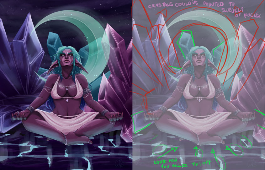
I love how you rendered the crystals and the moon. It might help with the composition to change the angles of your background elements. I took the liberty to mark over your work (sorry!), and kinda demonstrated how it would look if the crystals were spread out. It might be a nice idea for them to point or suggest towards the intended focal point, the bikini-elf. I also took the liberty of turning the moon as such, so the tips point toward the subject, plus framing the bikini-elf better..

Love the your use of perspective on the cracks of light on the floor.

I hope it helps even just a pinch and hope you'll have a nice stay in the forums!

If you are reading this, I most likely just gave you a crappy crit! What I'm basically trying to say is, don't give up!  
----
IG: @thatpuddinhead
Reply
#7
(03-28-2016, 12:28 AM)John Wrote:
(03-21-2016, 08:45 AM)lilith-lion Wrote: This was the first time I've ever done anything with a background, so critiques on composition would be lovely!
Hi! Welcome to the Crimson Daggers. On to the critique! (Which are really just opinions and I could be very wrong about them.)

I love how you rendered the crystals and the moon. It might help with the composition to change the angles of your background elements. I took the liberty to mark over your work (sorry!), and kinda demonstrated how it would look if the crystals were spread out. It might be a nice idea for them to point or suggest towards the intended focal point, the bikini-elf. I also took the liberty of turning the moon as such, so the tips point toward the subject, plus framing the bikini-elf better..

Love the your use of perspective on the cracks of light on the floor.

I hope it helps even just a pinch and hope you'll have a nice stay in the forums!
Thank you!! Love, love the crystal idea. I would have never thought of that. Seriously, it would have looked much better if I had done that! I will have to keep it in mind for other pieces!!
The moon is in a specific position, though I agree it'd look better the way you put it~
I'm glad you liked the ground- I was really proud of that part, and it was really a learning experience for me! xD
Reply
#8
I second what Primeillus said about the colors of the lights and shadows and I did a quick overpaint for further emphasis. Hope you don't mind ;)

The lights and darks were actually just brighter and darker version of the base skin color, which flatened the character.
I gave the main light source a blueish tint and added reds to the shadows. This can be pushed quite a bit further, but you get the idea. When painting skintones, I find it helps having making a palette beforehand from a basecolor and the color of the light sources, and keeping that close at hand.

The background was taking a bit too much attention away from the focal point, so I toned those down a little bit too. I know you are proud if the shape of the cracks, but they are forming an almost straight line from one side to the other, and I feel that looks a little unnatural and takes away from the composition.

Overall, I think you've done a great job! It'd bee nice if you kept posting in the forums. :D


Attached Files Image(s)


Reply
#9
(04-08-2016, 12:02 AM)Baoto Wrote: I second what Primeillus said about the colors of the lights and shadows and I did a quick overpaint for further emphasis. Hope you don't mind ;)

The lights and darks were actually just brighter and darker version of the base skin color, which flatened the character.
I gave the main light source a blueish tint and added reds to the shadows. This can be pushed quite a bit further, but you get the idea. When painting skintones, I find it helps having making a palette beforehand from a basecolor and the color of the light sources, and keeping that close at hand.

The background was taking a bit too much attention away from the focal point, so I toned those down a little bit too. I know you are proud if the shape of the cracks, but they are forming an almost straight line from one side to the other, and I feel that looks a little unnatural and takes away from the composition.

Overall, I think you've done a great job! It'd bee nice if you kept posting in the forums. :D


Hey,

first off this isnt bad for just painting digitally for a few weeks :)

secondly, here are my remarks:
*Crystals are too prominent, I'd push them more backward, like they're some huge crystals in the background.
*I'd add a bit more sky, to add more to the feeling of 'zen' or meditation. It`s quite busy and crammed now.
*Try and work on the values before colors. Take my img and yours in photoshop and make them greyscale, you'll see what i mean.
* i didnt like the droopy ears, so i turned them around :p

hope this helps, keep on painting!


Attached Files Image(s)


Reply
#10
Hey lilith-lion o/
Haha, I know that you probably already have enough crits for this piece, but some more can't hurt ;)

Ok so, for like your first digital painting... Can I just say... Holy crapoli 0_0 if I could paint even half as good as this when I first started out digitally... I would be legit so proud!!

It's not that bad a piece at all, I just have some pointers for ya as requested n_n

So firstly, the painterly side of things - you wanted to get a Blizzard-y kinda of promo art style happening - I don't think I managed to hit the nail on the head with the kinda look you were going for, but here are some tips for getting better at digital painting/art in general I can offer you:

*drawing traditionally is imho crucial to levelling up. Draw from life, draw from your head, study with a pencil, in your sketchbook, sketch on the bus, in the train, in a cafe. You probably already draw quite a bit, but it can't hurt to draw s'more ;)

*perspective = the most fundamental drawing skill and will help you visualise ideas + more with ease <3 if you give it attention. Trust me, it'll make everything a little easier if you study this daily.

*focus on observational study e.g. from life/photo/master > not only will you get your mileage in with painting digitally, but also whatever you're focusing on while studying. I personally found still life and self portrait studies under various lighting conditions to work best for me. Find wht works for you.

*in terms of getting better at seeing colour > I would recommend choosing 50 master paintings, (environments work really well) turn them to thumbnail size and place them in a PS document. Then, without using the colour picker, use a hard round brush and try your absolute hardest to recreate the master paintings within your own ruled up thumbnail. This is such a great exercise, I cannot recommend it more.

*for getting better at composition (and even values somewhat), do the same exercise as above, but instead of just environments, include other subjects too - and instead of using colour, use a maximum of 1-3 values. 4 if you must. That's it.
You will see how shapes work within a thumbnail. Detecting what makes an artwork pop! ;)

Oh!
*never disregard the importance of edges. They. Are. Everything lmao
I'll leave this here: http://muddycolors.blogspot.com.au/2015/...s.html?m=1

So I did a thing for you:
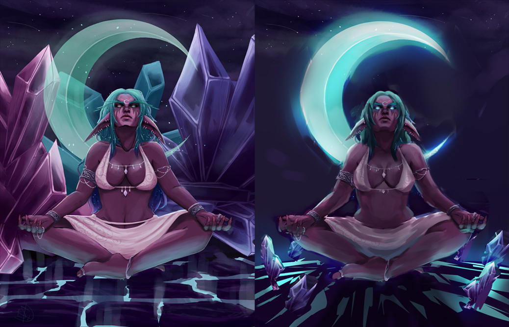


*I tried keeping your original elements, just pushed them back a bit to give rise to the central figure. I feel as though the crystals -  although a great storytelling element - were a bit too overpowering, so my interpretation was to surround the figure with smaller crystals, as a means of aiding the focal point, as opposed them fighting for prime time.

*the crescent moon is super important, so that was another reason to make the crystals smaller, to let the moon breathe. Then brightened it with a colour dodge layer. (This layer adjustment is fantastic for final a /touch/ - never overdo it though!!)

*the ground  - I felt that making the ground kind of like a summit, with a nice curve to it would make for a nice contrast to the curvature of the crescent moon.
>> Aaaaaand contrast (on a whole) is what makes an image interesting to look at, so that was my thought process behind that.

* I changed her hair a bit to account for the skull looking upward

*overlay layer > colour dodge layer = to brighten eyes a lot more + create engaging eyes. Eyes are the window to the soul, etc.

*went over your figure adding more colour and built upon her form in doing so. Added rim light from the moon somewhat, but not so much as to overpower her. It was only after I finished this that I added a multiply layer and with a soft brush, went over the figure with a darker tone, closr to black, then lowered the opacity of the layer to finish the rim-lighting setup. If that makes sense.

*the marks on the ground, although crude, were another compositional element I added to draw the viewer to the focal point.
I ran out of allocated time working on this paintover but I hope I managed to help you out, at least a bit.

I wish you the best and I swear to Hex you better keep at this art thing !!!!! <3

sketchbook | pg 52
"Not a single thing in this world isn't in the process of becoming something else."
I'll be back - it's an odyssey, after all
Reply


Forum Jump:


Users browsing this thread: 1 Guest(s)