04-04-2016, 05:52 AM
The 'eldritch abomination rising out of a pool of blood'- pitch is clearly the only acceptable choice this time around!
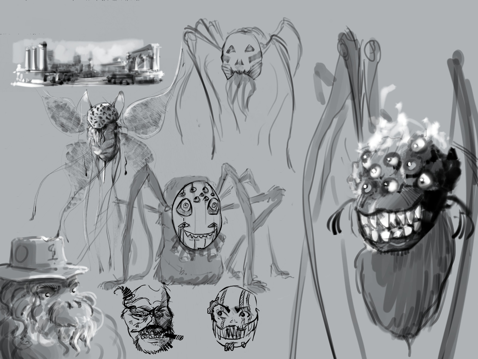
After watching the lore summary video and doodling around for a bit I've come up with an idea that might be unique enough to be intersting, while still working in therms of feel... if I can get the color scheme right, and make the design sufficiently asymetrical and gooey.

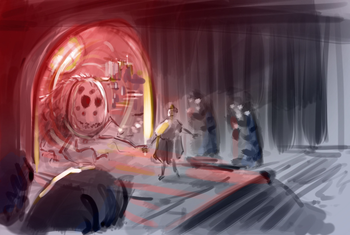
Designing bloodbornes protagonist as an ascended old one.
There's a few questions I want to figure out the answers to for the next update. What would a human (chose to?) look like after ascending? Should the Doll still be their companion? Why would they come out of a bloodpool in some ancient dungeon? Maybe the pool of blood is like a way of going from dream worlds to the real world, and one day, when the New Old One decides to leave the hunters dream for good, they would pass through there into ancient labyrinth under Old Yharnam. Just with that it's already a key frame, but what could be done to make it more impactful? Maybe the next games protagonist could witness the scene, or maybe it could be part of the beginning narration so you could use a non player-perspective angle. I think once I've figured out the circumstances I should be able to make it work.
Some examples of gooeyness and asymetry:
After watching the lore summary video and doodling around for a bit I've come up with an idea that might be unique enough to be intersting, while still working in therms of feel... if I can get the color scheme right, and make the design sufficiently asymetrical and gooey.

Designing bloodbornes protagonist as an ascended old one.
There's a few questions I want to figure out the answers to for the next update. What would a human (chose to?) look like after ascending? Should the Doll still be their companion? Why would they come out of a bloodpool in some ancient dungeon? Maybe the pool of blood is like a way of going from dream worlds to the real world, and one day, when the New Old One decides to leave the hunters dream for good, they would pass through there into ancient labyrinth under Old Yharnam. Just with that it's already a key frame, but what could be done to make it more impactful? Maybe the next games protagonist could witness the scene, or maybe it could be part of the beginning narration so you could use a non player-perspective angle. I think once I've figured out the circumstances I should be able to make it work.
Some examples of gooeyness and asymetry:


![[+] [+]](images/collapse_collapsed.png) Spoiler
Spoiler![[Image: original.jpg]](http://images.pushsquare.com/news/2015/04/how_to_kill_ebrietas_daughter_of_the_cosmos_in_bloodborne_on_ps4/attachment/0/original.jpg)
![[Image: latest?cb=20151013153820]](http://vignette3.wikia.nocookie.net/bloodborne/images/0/05/Bloodborne%E2%84%A2_20150517221325_-_1.jpg/revision/latest?cb=20151013153820)


