Sooo, its been two years.
I'm back because... I don't know yet. I think I need something other than work.
I spent a year doing master studies and some painting, mostly working on my fundamentals. Most of this year was spent reading books, expanding my "mind" on life, trying to understand what I really wanted to do, what I needed, searching for some work in the game industry (which I didn't find) etc.
I'm not gonna post my studies, but there were... a lot. Master studies in b&w, some in colours, skull studies, ethics faces studies, perspective exercises, architecture studies.
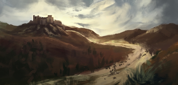
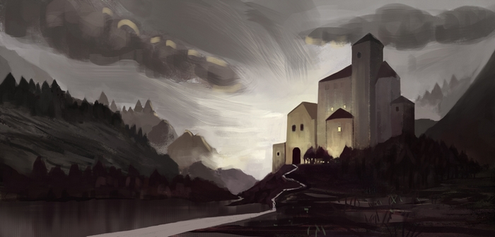
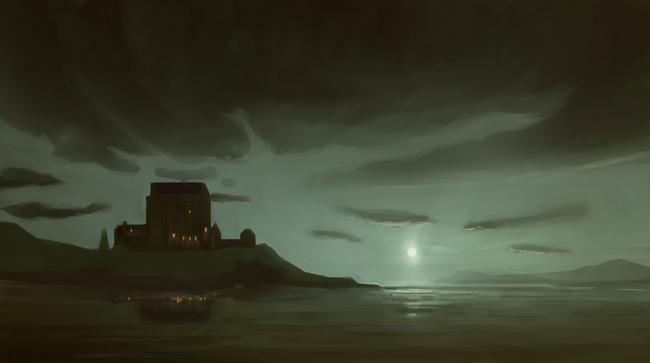
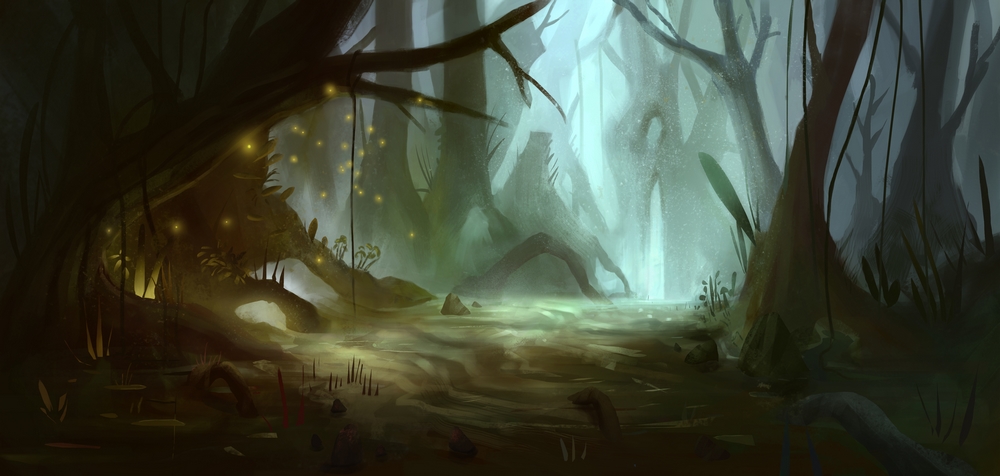
Here are some paintings I made while doing master studies :


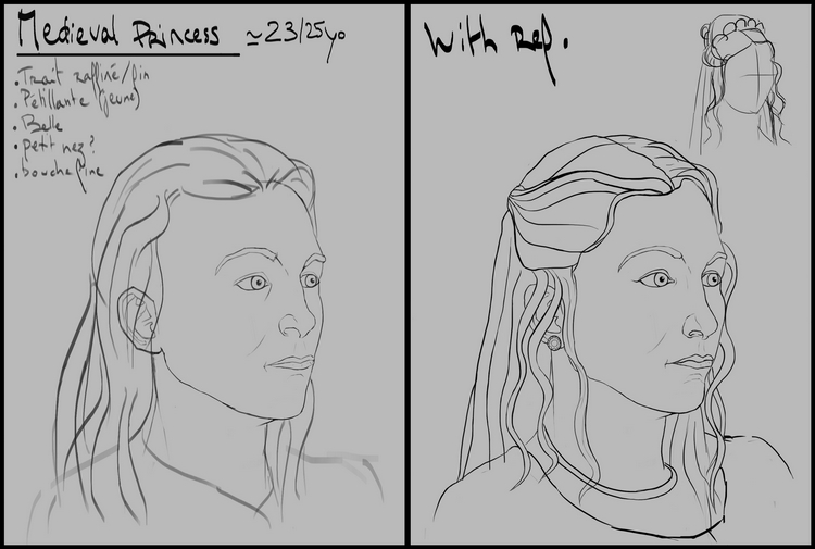
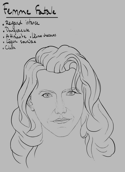
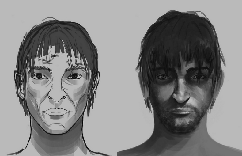
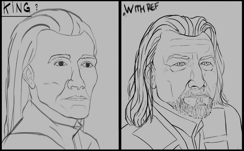
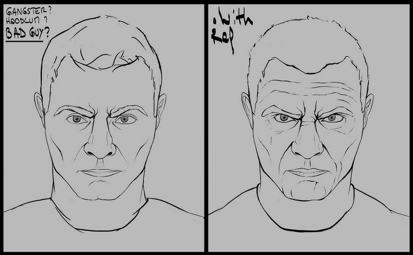
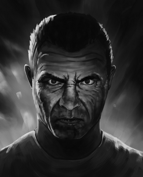
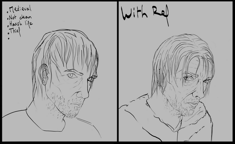
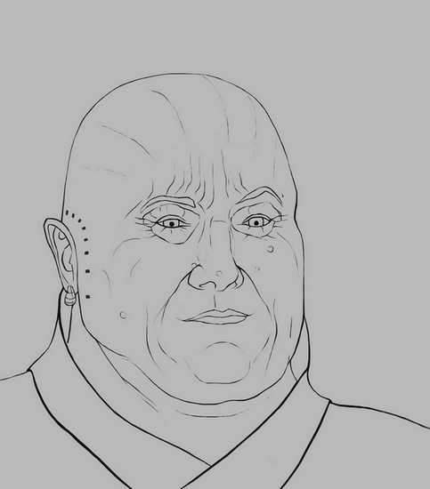
Some portrait I made while doing face studies :


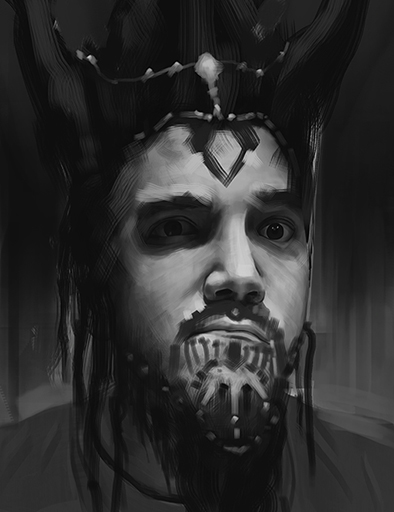
Modifed self portrait

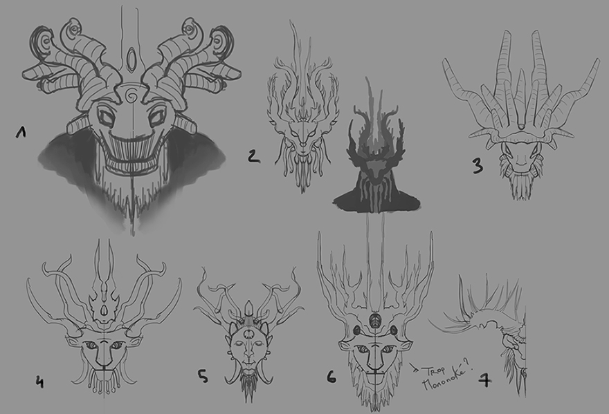
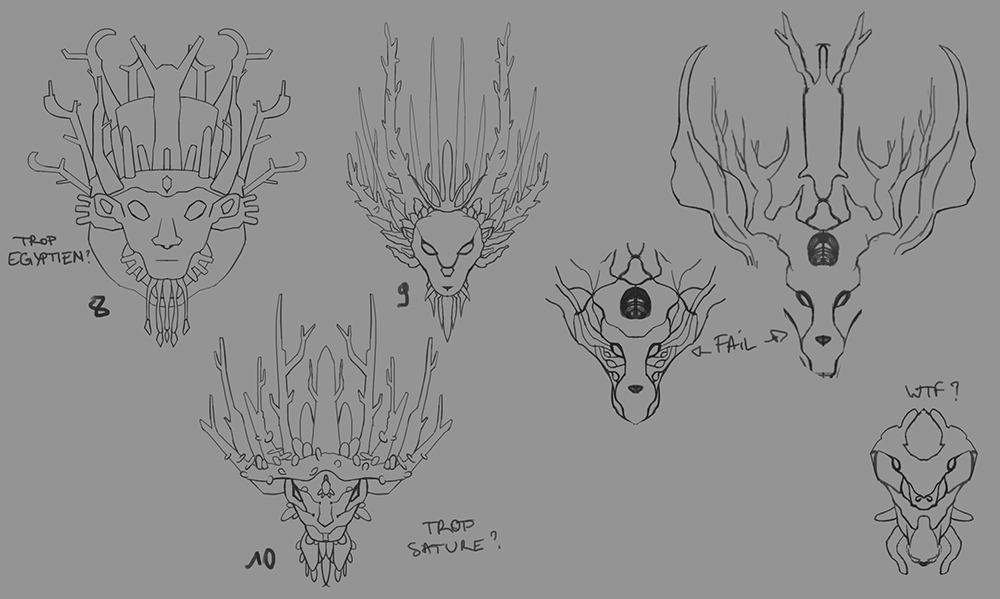
A little project that... was never finished of course :B
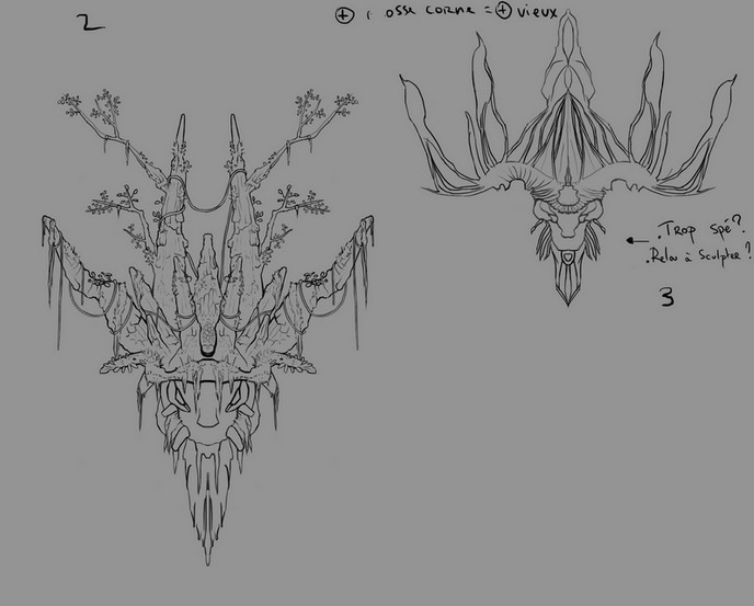
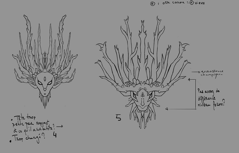
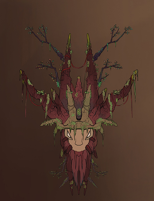
This was supposed to be the design of the sculpture of a deer god in a temple.


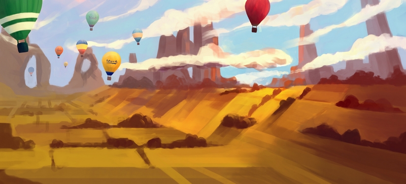
An attempt at colour.

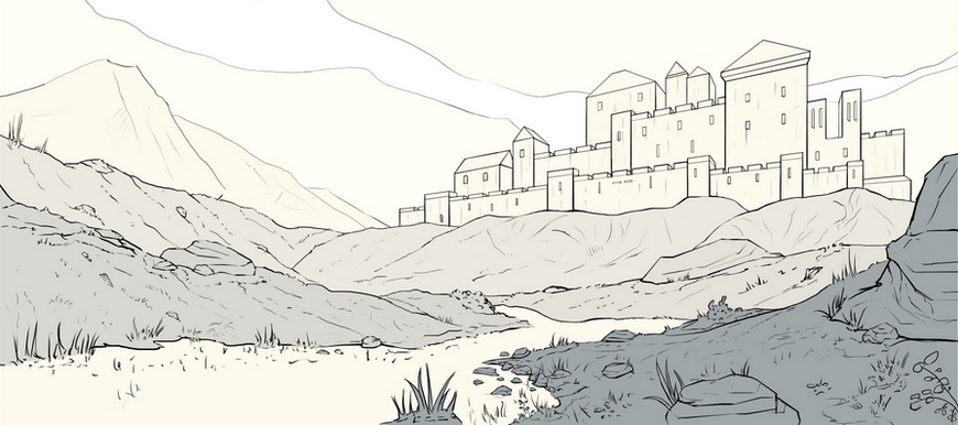
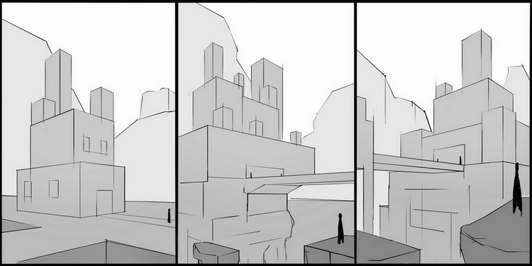
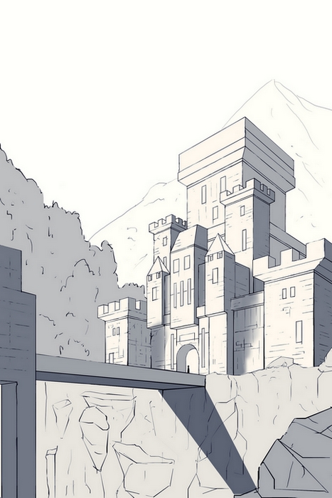
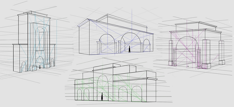
Around the beginning of 2015, I stopped all my master studies/paintings exercises and I started to focus only on perspective drawing as I understood that this was what I wanted to do in concept art. Environment heavily focused on architeture. I won't post all the perspective thumbnail and my architecture studies.


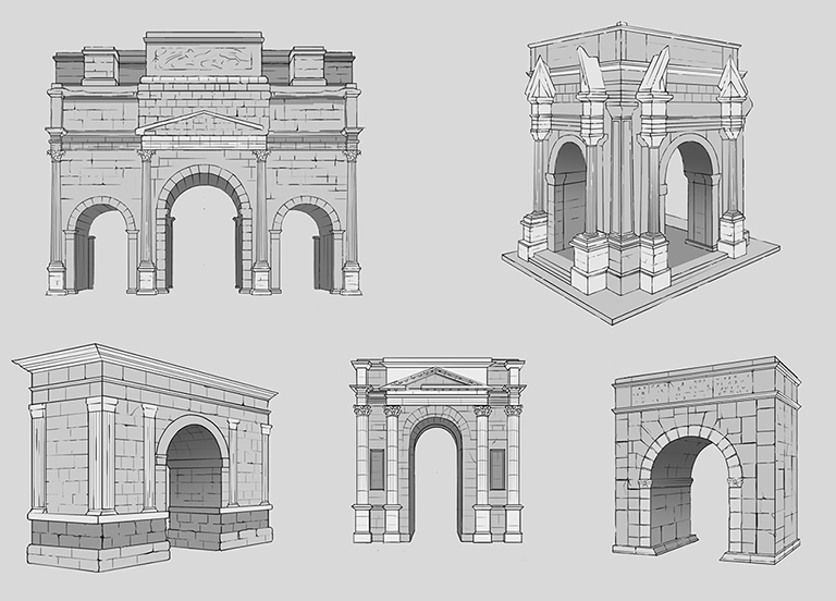
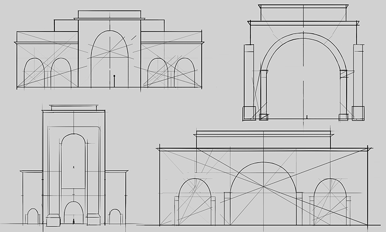
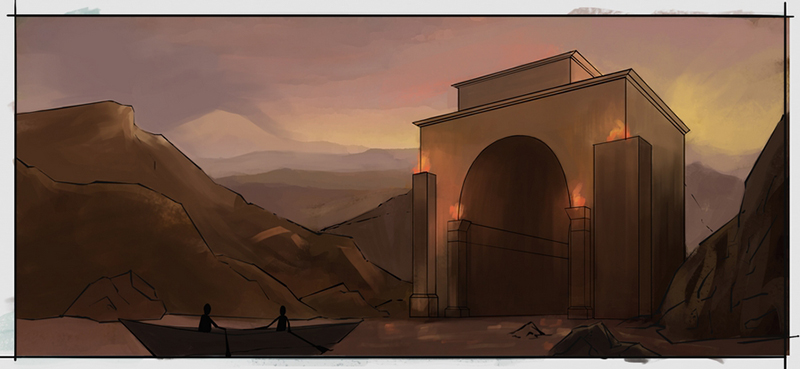
Studies of som Triumphal Arch and sketches based on them. I was going to make a lot of "paintings" based on this work process, as I realized that I needed to really make everything step by step. This had always been my problem, and thanks to this year I finally understood why I felt like I couldn't improve in concept art.
But that's when the second year started and I went on a "new adventure"


It's weird as I thought I had finally grasped what I was searching this whole year. I had found the path I needed to take to improve my art, but I joined a studio a friend of mine created to make a game, gain some experience/cv in a real game production as this is what I really want to do . (my parents were starting to pressure me to find a work too ahah)
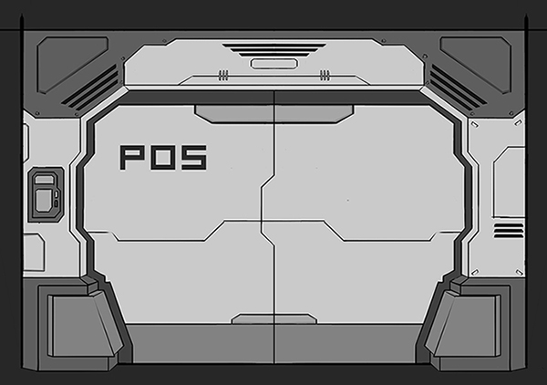
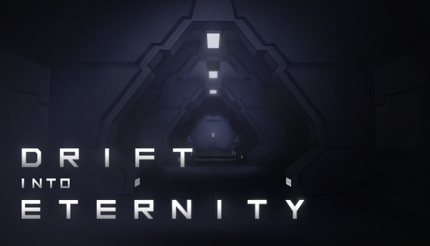
We made a little game in two month with our little team of amateur to gain experience, and this is probably the only "artwork" I've done on this game.

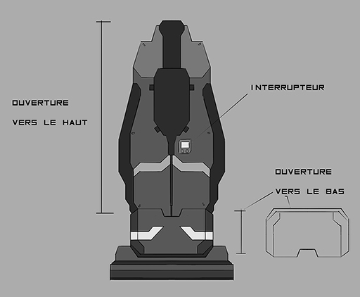
And for the game we've been making for more than 10 months, this is as close as an artwork I've made ahah. At first I had a little team of 3/4 graphist I was managing, now I'm alone, doing everything art related.


I'm not sure I'm here to draw/paint again on my free time (don't really have any). Improving my 2D skills isn't really my priority rigth now. I'll hang around and see if something inspires me.
Alright, I hope this wasn't too boring to read. See ya!
![[Image: 658890MasterStudy6.jpg]](http://img15.hostingpics.net/pics/658890MasterStudy6.jpg)
![[Image: 308928MasterStudy7.jpg]](http://img15.hostingpics.net/pics/308928MasterStudy7.jpg)
![[Image: 637454MasterStudy9.jpg]](http://img15.hostingpics.net/pics/637454MasterStudy9.jpg)
![[Image: 913622163.jpg]](http://img15.hostingpics.net/pics/913622163.jpg)


![[Image: 886194thumbs130203.jpg]](http://img11.hostingpics.net/pics/886194thumbs130203.jpg)
![[Image: painting_7_by_fincks-d76qnrs.jpg]](http://fc08.deviantart.net/fs71/f/2014/047/3/a/painting_7_by_fincks-d76qnrs.jpg)
![[Image: rA6ID.jpg]](http://www.hapshack.com/images/rA6ID.jpg)
![[Image: SkF83.jpg]](http://www.hapshack.com/images/SkF83.jpg)
![[Image: abeFG.jpg]](http://www.hapshack.com/images/abeFG.jpg)
![[Image: mgT8s.jpg]](http://www.hapshack.com/images/mgT8s.jpg)
![[Image: QTlEd.jpg]](http://www.hapshack.com/images/QTlEd.jpg)
![[Image: SYPbw.jpg]](http://www.hapshack.com/images/SYPbw.jpg)
![[Image: 7Oxla.jpg]](http://www.hapshack.com/images/7Oxla.jpg)
![[Image: CHZg.jpg]](http://www.hapshack.com/images/CHZg.jpg)
![[Image: R4IJC.jpg]](http://www.hapshack.com/images/R4IJC.jpg)
![[Image: wQdfu.jpg]](http://www.hapshack.com/images/wQdfu.jpg)
![[Image: h81DG.jpg]](http://www.hapshack.com/images/h81DG.jpg)
![[Image: OhTZt.jpg]](http://www.hapshack.com/images/OhTZt.jpg)
![[Image: wj4MC.jpg]](http://www.hapshack.com/images/wj4MC.jpg)
![[+] [+]](images/collapse_collapsed.png) Spoiler
Spoiler![[Image: M05og.jpg]](http://www.hapshack.com/images/M05og.jpg)
![[Image: JpGDT.jpg]](http://www.hapshack.com/images/JpGDT.jpg)
![[Image: Epje.jpg]](http://www.hapshack.com/images/Epje.jpg)
