Posts: 1,970
Threads: 22
Joined: Apr 2012
Reputation:
243
Cool sketches and concepts :) Looking forward to more
Posts: 742
Threads: 28
Joined: Jan 2012
Reputation:
44
Really cool concepts and great face expressions :)
Posts: 1,109
Threads: 18
Joined: Apr 2014
Reputation:
68
yo! I missed a few updates, starts to look awesome now! she 's a real bitchy princess, love it X)
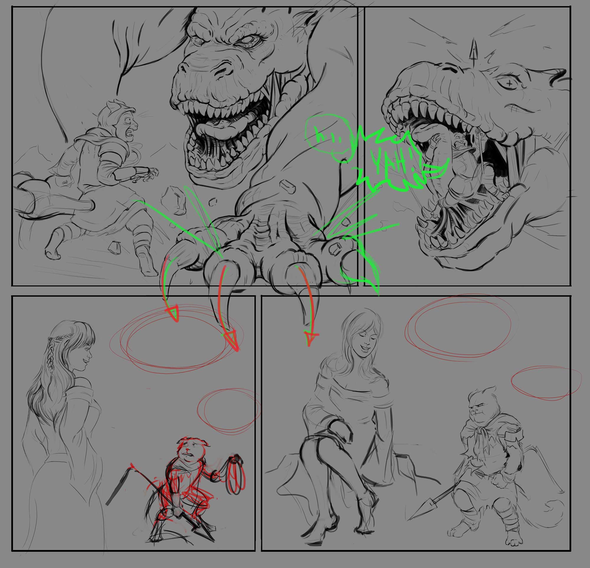
John's advice is good, but I think it would work either way since the speech bubbles will steer a lot of the flow. It's nice to have some kind of big breakout of the panels somewhere, especially with a big thing like a dragon!
Posts: 1,970
Threads: 22
Joined: Apr 2012
Reputation:
243
Love the story, and the execution. I don't have a preference one way or the other with the breakout...except to say I like breakout panels if used well. Nice one mate keen to see it done! *EDIT and what BadWoolf said below about the text. You can afford to enbiggen the text...might even help filling some of the negative space in your panels.
Posts: 101
Threads: 6
Joined: May 2016
Reputation:
10
This looks awesome! The story and execution are great. I kinda wonder if the text size is a little small - you'll probably have anyone of a certain age whipping out the reading glasses and/or magnifying glass, but for the rest of us, I guess it's all good! Great great stuff and I'm excited to see it coloured if you get round to that.

![[Image: IU3msyr.jpg]](http://i.imgur.com/IU3msyr.jpg)
![[Image: 1ssvRdv.jpg]](http://i.imgur.com/1ssvRdv.jpg)


![[Image: IU3msyr.jpg]](http://i.imgur.com/IU3msyr.jpg)
![[Image: 1ssvRdv.jpg]](http://i.imgur.com/1ssvRdv.jpg)


![[Image: p5em6Z4.jpg]](http://i.imgur.com/p5em6Z4.jpg)
![[Image: RoZDbor.jpg]](http://i.imgur.com/RoZDbor.jpg)
![[Image: uRHgKWv.jpg]](http://i.imgur.com/uRHgKWv.jpg)
![[Image: qkN2tmB.jpg]](http://i.imgur.com/qkN2tmB.jpg)

![[Image: EHGWZd6.jpg]](http://i.imgur.com/EHGWZd6.jpg)
![[Image: V8X5swz.jpg]](http://i.imgur.com/V8X5swz.jpg)