How to be more realistic?
#1
hey guys, my first post on this site! I may be doing stupid things, do not know right post kkk but finally I did this illustration and would like some tips, some advice and such to my painting becomes more realistic!
I'm not knowing how to ask for help, tell me, why in addition to being new digital painting, I am new in this forums and through digital!
I hope to help you because I have a critical look and it is us!
Thanks for watching!

[Image: milena-mantovani-buzzinaro-pt16-escolha-...1470157749]
Reply
#2
Hey, welcome to the forum. I did a quick paint over. The main thing you arnt thinking about is separating the light and shadow side. Think of the direction the light is coming from and what plains would be facing toward the light. I did a bad job painting over but I hope you see what I mean.


Attached Files Image(s)


Reply
#3
(08-03-2016, 11:00 AM)Adam Lina Wrote: Hey, bem-vindo ao fórum. Eu fiz uma pintura rápida sobre. A principal coisa que você arnt pensando é separar o lado da luz e da sombra. Pense em direção a luz está vindo e que planícies estaria enfrentando em direção à luz. Eu fiz um trabalho ruim pintar sobre, mas eu espero que você veja o que quero dizer.

wooooow, it was very cool! thank you :) From this thought about how the light will fall on objects I have to mature yet haha but his vision was much better! thankful
Reply
#4
Hey! Well the mans hands look very good, very well drawn and you did a fantastic job on the mood, lighting and color; If you want realism, i'd reccomend you read this thread i wrote a while back about drawing.

http://crimsondaggers.com/forum/thread-6923.html

The characters faces are okay, but the proportions of their bodies and limbs, especially the mans feet, need a lot of improvement. Other than that, you have a good grasp on color and mood, and even a good sense of material coming along :)

70+Page Koala Sketchbook: http://crimsondaggers.com/forum/thread-3465.html SB

Paintover thread, submit for crits! http://crimsondaggers.com/forum/thread-7879.html
[color=rgba(255, 255, 255, 0.882)]e owl sat on an oak. The more he saw, the less he spoke.[/color]
Reply
#5
(08-05-2016, 12:52 AM)Fedodika Wrote: Hey! Well the mans hands look very good, very well drawn and you did a fantastic job on the mood, lighting and color; If you want realism, i'd reccomend you read this thread i wrote a while back about drawing.

http://crimsondaggers.com/forum/thread-6923.html

The characters faces are okay, but the proportions of their bodies and limbs, especially the mans feet, need a lot of improvement. Other than that, you have a good grasp on color and mood, and even a good sense of material coming along :)

weeeeee, thanks Fedodika! I took a look at his text and his work, very good evolution! enjoyed his studies, I will do a few things similar heheh

well, that's true I improve my drawing even. I think we should focus on the design, makes it 100% and there then go for painting. The thing that I have more difficulty is faces jesuis hahaha and hands and feet right, of course </ 3
Reply
#6
Hello Milena, welcome to CD and great job if you are just starting out with digital. You have done very well!

Adding onto what the others said, I also did a paintover thinking mostly about more realistic lighting and contrast but also a little bit of compositional tweaks
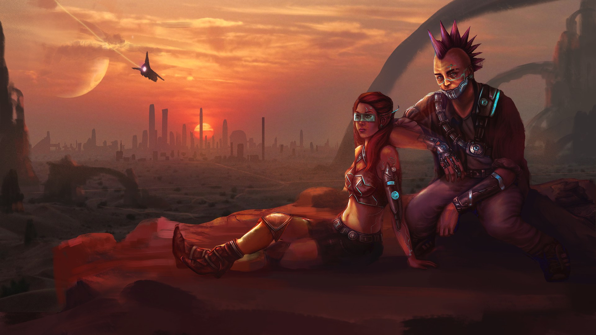


First thing I noticed was how contrasted and overly saturated your image was. Generally things are not as saturated as we think they are. The highest contrast and saturation should generally be kept for focal points. It's not a rule but you can see this working in almost any great image or painting.

Other things I tweaked were the perspective of the shadows of the characters and foreground didn't quite feel right with the rest of your scene, so I flattened them out a bit. I added more atmospheric perspective and more layers of dark and light going off into the distance to accentuate that suggestion of depth. Nailing the values of your piece first is the most important thing to get things to read well.

Realistic depth is mostly controlled by the accurate amount of contrast and detail at the various layers. An example is the arch to the right was too contrasted and similar in values to the characters and totally destroyed depth and closed off the composition a bit too much, so I pushed the idea of arched rocks going back into the distance and to also drive the composition back from that edge into the image again rather than loop around the main guy completely.

The lighting was way too intense and overblown in general in the environment, but the characters didn't have enough obvious lighting on them as Adam mentioned.

There were some issues with the figures and poses, but I didn't change much. The biggest issue is the guy's right leg, which I don't think is foreshortened correctly and makes it seem like it is cut off. I didn't address this, but it should be done.

In terms of narrative, I think it would make more sense to have the girl look off into the sunset or at the ship rather than just looking off to the left. Same for the guy. Perhaps they are both looking at the view which creates a connection between the character and what is going on in the scene.

I have attached some ref below to show some decent photo ref. Notice how much more desaturated and cooler the hues are especially in the ground. The bottom right one I included because it is definitely too manipulated as I mentioned and isn't the best reference if realism is your goal. I did the paintover using the other 3 as reference. Note I did use the photos directly in the image as a base for speed, but I would recommend you do studies and try and paint things first before doing any kind of photobashing.

I recommend doing some quick but focused studies before or as you do your illustrations to figure out these appropriate contrast levels between the darks and the lights to fit your lighting and mood.

Photo reference is very useful but you have to be very careful to pick your photos well. Often with sunset desert scenes in particular you will find that they are manipulated to be overly saturated and contrasted which isn't really an accurate reflection of the way things might look in real life.
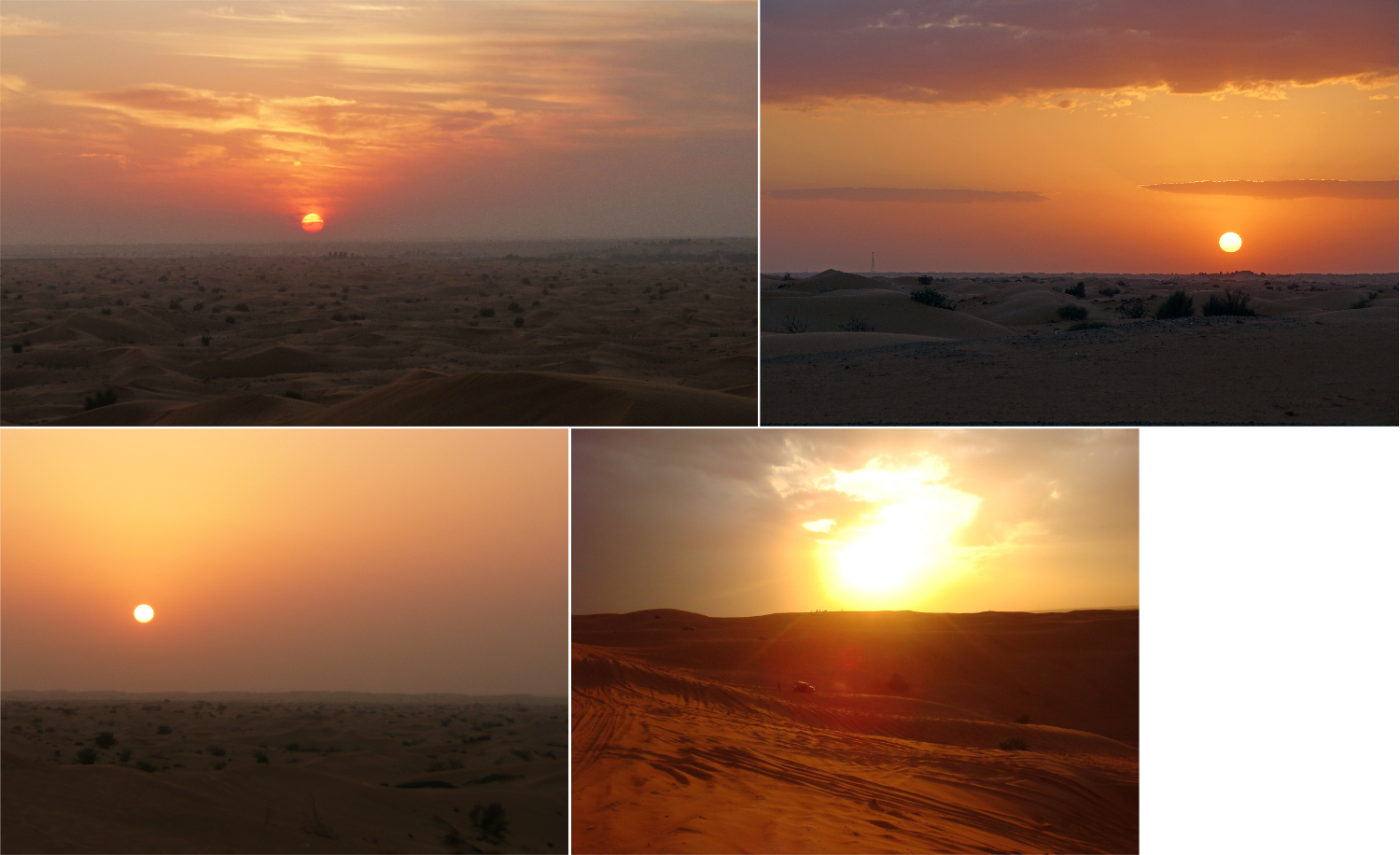


It's a good idea before you even start, to take the photo reference and with a colour picker just go around the image and analyse the hue/saturation/values of lights, shadows, anything you want to understand and see what is actually going on. In general you will see there is a big difference in saturation and contrast levels between yours and the reference. Photos aren't true to life at all, even if done well, so don't rely on them alone. If you study real lighting by doing still life studies, your understanding of realistic lighting will improve drastically.

Hope that helps

 YouTube free learnin! | DeviantArt | Old Folio | Insta
Reply
#7
(08-05-2016, 02:54 PM)Amit Dutta Wrote: Hello Milena, welcome to CD and great job if you are just starting out with digital. You have done very well!

Adding onto what the others said, I also did a paintover thinking mostly about more realistic lighting and contrast but also a little bit of compositional tweaks


First thing I noticed was how contrasted and overly saturated your image was. Generally things are not as saturated as we think they are. The highest contrast and saturation should generally be kept for focal points. It's not a rule but you can see this working in almost any great image or painting.

Other things I tweaked were the perspective of the shadows of the characters and foreground didn't quite feel right with the rest of your scene, so I flattened them out a bit.  I added more atmospheric perspective and more layers of dark and light going off into the distance to accentuate that suggestion of depth. Nailing the values of your piece first is the most important thing to get things to read well.

Realistic depth is mostly controlled by the accurate amount of contrast and detail at the various layers. An example is the arch to the right was too contrasted and similar in values to the characters and totally destroyed depth and closed off the composition a bit too much, so I pushed the idea of arched rocks going back into the distance and to also drive the composition back from that edge into the image again rather than loop around the main guy completely.

The lighting was way too intense and overblown in general in the environment, but the characters didn't have enough obvious lighting on them as Adam mentioned.

There were some issues with the figures and poses, but I didn't change much. The biggest issue is the guy's right leg, which I don't think is foreshortened correctly and makes it seem like it is cut off. I didn't address this, but it should be done.

In terms of narrative, I think it would make more sense to have the girl look off into the sunset or at the ship rather than just looking off to the left. Same for the guy. Perhaps they are both looking at the view which creates a connection between the character and what is going on in the scene.

I have attached some ref below to show some decent photo ref. Notice how much more desaturated and cooler the hues are especially in the ground. The bottom right one I included because it is definitely too manipulated as I mentioned and isn't the best reference if realism is your goal. I did the paintover using the other 3 as reference. Note I did use the photos directly in the image as a base for speed, but I would recommend you do studies and try and paint things first before doing any kind of photobashing.

I recommend doing some quick but focused studies before or as you do your illustrations to figure out these appropriate contrast levels between the darks and the lights to fit your lighting and mood.

Photo reference is very useful but you have to be very careful to pick your photos well. Often with  sunset desert scenes in particular you will find that they are manipulated to be overly saturated and contrasted which isn't really an accurate reflection of the way things might look in real life.


It's a good idea before you even start, to take the photo reference and with a colour picker just go around the image and analyse the hue/saturation/values of lights, shadows, anything you want to understand and see what is actually going on. In general you will see there is a big difference in saturation and contrast levels between yours and the reference. Photos aren't true to life at all, even if done well, so don't rely on them alone. If you study real lighting by doing still life studies, your understanding of realistic lighting will improve drastically.

Hope that helps

hey Amit! Wooow, your paintover it's incredible! I decide choose your mood for change my painting. I did some changes and copy literally the image you sent hahaha. but now i go end this painting and study more about illumination. But men, this opened my mind and was totally different that I though find here. Thanks so much!

Check out my process how are now:
[Image: jvJh2wK.jpg]
Reply


Forum Jump:


Users browsing this thread: 5 Guest(s)