Hey, man. So you gotta excuse the general sketchiness but I think it gets the idea across.
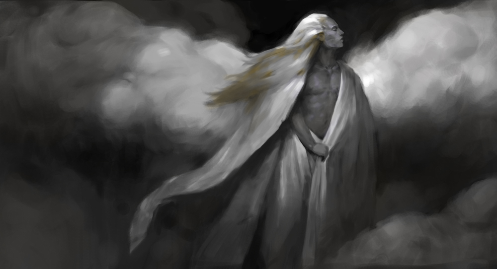
Generally I think the image looks good. I think the thing that bugs me about the image is the design. Now I say design rather than composition because I feel as if it a better word to be used when talking about how what certain shapes do to an image.
This is gonna sound weird at first but hear me out on this. When talking about shapes in an abstract sense, we can sort of place different shapes on a continuum from one point of being very unified and on the other having a lot of variation. Straight lines and circles are very unified because they do not vary in character, curvature or symmetry. Scribbles are very varied with constant changing character and curvature and no symmetry. We have emotional reactions to these things and we often find more unified shapes to be more beautiful than very varied ones. That being said, there is a quality in variation that isn't found in perfect unity, and that quality is the feeling of life. Unity has stillness and variation gives a feeling of motion. There is a danger to variation and that is the feeling of ugliness or chaos, so these two aspects of design need to be balanced carefully in order to design a good image. Harold Speed writes about this at length in his book The Practice and Science of Drawing so I'd recommend reading it for a better explanation of the subject.
So how does this relate to your image? Well I would say that you have too much unity and looses that sense of life and contrast. Take the contours of shapes as a first example. Each section of cloud has almost the exact same, very unified curve, making it appear artificial and lifeless. The curving of his robes are almost identical to each other, making them also appear lifeless, especially when you're using similar curves for the clouds. We can also look at the transitions between shapes. This image contains very few hard edges. Everything has been treated to a kind of blurry gradation and I think this contributes to the lifeless nature of a lot of the shapes. A perfect gradation is almost as unified as a flat value. A lot of the minor shape design is also this way. An example would be if you looked at the curvature of the top of his head. It is the same as the curvature of the cloud next to him. These things Might sound like nit-picking but they are to illustrate an essential principal in shape design.
All these elements, when being pointed out individually aren't necessarily bad for an image. A lot of religious imagery uses strong unity in their design however it is often offset by something like a figure, full of variation, example would be the a lot of crucifixion paintings. In these images the artist is presented with an extremely unified symbol to work with and they balance it by introducing a figure that is always full of variation in design. This contrast is what makes this kind of imagery very powerful, and in context communicates a strength through unity of design in the symbol and an appearance of frailty in the human body in relation to it. So artists throughout history have been very careful about this kind of design, be it through conscious efforts or intuition.
So on to the paintover. One of the primary things I've introduced is variation in shape design. I added character to his robes as well as the clouds. I've clearly defined the clouds in major value groups, allowing me to use value as an indicator of depth with the clouds in the background. I also grouped the values in the robes because I just didn't get why they had a gradating value on them. Whenever you have a change in value, you have to justify it somehow. It is either a change in surface value, a change in light (cast shadow) or a change in form. None of these appear to be the reason so I'd assume it was because you wanted to force the composition. if so, just use a cast shadow or something.
I added a cast shadow over the clouds in the background and this adds to the volume of the space this image takes place in by suggesting other objects around the image, and it also adds to the form of the clouds.
I added an arm to him. This breaks up the front plane of the body and adds a slightly dynamic element to the image. Also, things tend to look weird when hands are awkwardly hidden so it's often best to include them if you have the option.
There was a compositional tangent by his head where his hair sort of shared a general motion with the cloud behind him. I re-designed it and I think the negative space, as a result looks more natural. There was also this kinda forced contrast going on with that same cloud. You already have a strong contrast between his hair and the black background, you don't need to add more by having a super bright cloud in the same area.
I re-arranged the cloud on the bottom right to be above him, again adding to that sense of depth in the image.
There were a few other drawing related problems I wanted to cover. His torso was too small for his head, and it was relatively kinda narrow. I also think his neck was fairly long so I shortened it a bit, however long-ish necks tend to be more elegant so I kept it kinda long. His pectorals major muscle appeared a little rounded in yours, I think this is due to the core shadow that was hugging it. I flattened it out to give him a bit more of a normal torso.
When it comes to color, I wouldn't try too much. Adding color after a painting is done kind ruins it for me. I tend to think that you design with what you see and if you're not seeing color, your image isn't designed for it. I added a little gold and purple to sort of create minor hot-spots around the focal point but I don't think it's needed.


![[Image: JJPj35u.jpg]](http://i.imgur.com/JJPj35u.jpg)