NikitaDrizhenko
Unregistered
![[Image: 7vxi2yItD1M.jpg]](https://pp.userapi.com/c638820/v638820306/274ff/7vxi2yItD1M.jpg)
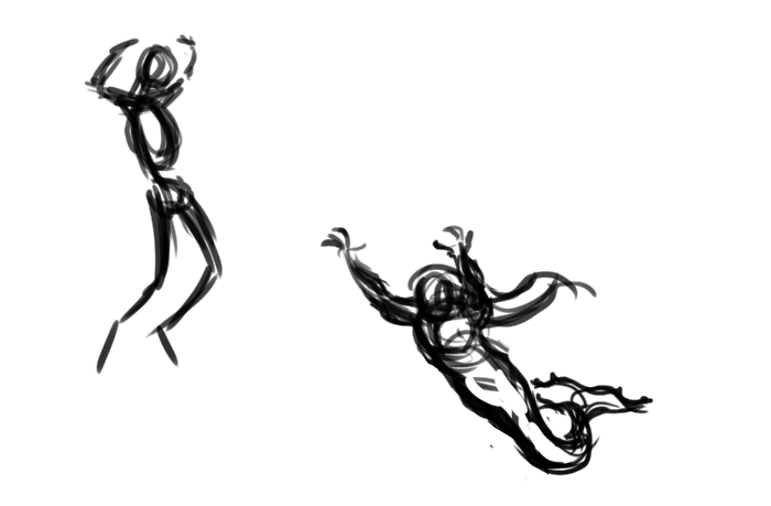
Hey guys. I new here, on CrimsonDaggers forums. I'd like to hear your critique towards my last artwork, because I totally stucked and feel exhausted. I started a Mermaid art like a two weeks ago, and the main idea was a show mermiad, who jumps from the water, during a shipfight in the ocean, and catches the sailors, who are falling over the ships. First sketches showing the scene from underwater, but I throw out this idea during the work process. Don't know why I did this, as I see now, they were not so bad as last attempts. I can't find appropriate pose for mrmaid, or deal in the composition dunno. Hope for your help.
Cheers .
![[Image: cKgBnq4MN7I.jpg]](https://pp.userapi.com/c638820/v638820306/27509/cKgBnq4MN7I.jpg)
Posts: 1,970
Threads: 22
Joined: Apr 2012
Reputation:
243
This is one of those instances of too much scope creep not being a good thing. I think your initial thumbs and ideas up to #5 were great, with some improvement that could be made, but....then it all went downhill really fast.
Go back to that #5 sketch if you can. It will be painful but it will teach you a lesson and be worth it in the end. You have tried to change the idea and other things on the fly while also starting to detail render, but your skills haven't been able to keep up with that shift. You need to settle on something you are happy with and then stick to it, mostly like glue unless some blinding divine inspiration hits.
It's natural of course to do this. I know because I have done this countless times.
So, ALWAYS check back regularly with your original sketches if you start to get different ideas that you want to try, and make sure they aren't turning out worse than the original idea. If you can't telll; take a good break, then look at both again. Always better when testing new ideas, to branch off the current railtrack quickly for a short time, then backtrack and get on the original track if you are heading towards a cliff. Better that than thinking you are on a one track train steaming onwards towards oblivion, because either the train steams off another cliff, or ends up circling all the way around a LOOOOONG time later.
I'm not going to comment on how to improve the current state, until you decide what you'd like to do, given my feedback :)
NikitaDrizhenko
Unregistered
Thank you kindly, Artloader, your idea with horizontal orientation of the composition will comes in handy in the near future, I am sure of it. Frankly speaking, I don't know why I chose vertical composition, I robe myself of dinamics in the art alot with that decision. Amit, your feedback was also so useful for me. Useful and important at this point of my improvment. Because, as you rightfully admitted, I am frequently wait for some kind of inspiration hits, marking my time for something that doesn't really making my artwork better in any way. I'd like to hear from you about flaws and mistakes of the stage №5. I am ready to return to that point, and I'd like to hear what do you guys think. And thank you again. I really didn't expect that quality of the feedback.
![[Image: oM9IE9qYbRw.jpg]](https://pp.userapi.com/c638820/v638820306/27949/oM9IE9qYbRw.jpg)
Posts: 1,970
Threads: 22
Joined: Apr 2012
Reputation:
243
Yep this one is way better! Given the story you are going for, I wonder if you can make it a little clearer that the mermaid is basically trying to pull down sailors to their death. Her pose is cool, but her arms are a bit like she is doing a scary pose or trying to catch a ball or something. :)
You could play with the arm positions and pose, perhaps she could be grabbing someone's leg who is mostly offscreen above with one of her hands while reaching menacingly for the guy in the foreground? It's easier to do some quick line drawing on top of this to test some things out, rather than pushing more paint around.
Work on the silhouette of the Foreground character more...it's a bit loose and distracting so hard to critique. It could work where it is, but making it a bit tighter would help judge it a bit better.
At the very least make it clear that the same is happening with the background figures, because that is great context.
In general for finishing the rendering, a bit more murky atmospherics and water particle and bubbles and stuff like that will help give more of an impression of being underwater. It's pretty good, but could be pushed.
![[Image: 7vxi2yItD1M.jpg]](https://pp.userapi.com/c638820/v638820306/274ff/7vxi2yItD1M.jpg)
![[Image: cKgBnq4MN7I.jpg]](https://pp.userapi.com/c638820/v638820306/27509/cKgBnq4MN7I.jpg)


![[Image: oM9IE9qYbRw.jpg]](https://pp.userapi.com/c638820/v638820306/27949/oM9IE9qYbRw.jpg)