Posts: 17
Threads: 1
Joined: Oct 2025
Reputation:
0
I'm having trouble constructing and painting clothing - and I think this has to do with my drawing/ sketching skills as well as my painting skills. I think a higher volume of sketching and drawing would be beneficial, as well as painting studies.
Posts: 3,357
Threads: 37
Joined: Aug 2013
Reputation:
234
Fabric and folding are pretty logical when you are taught the variation but if you have no concept of what are the different type well it seem more like trial and error. It still a complex subject because of tension, twisting and folding that can really require a good deal of observation.
Drawing cloth from observation is not a problem once you master value control it doesn't even really need logic... but it does really start to become a complex subject when you make subject matter from imagination because that where if you leak the logic you cannot make inform decision.
Posts: 1,076
Threads: 4
Joined: Jan 2016
Reputation:
43
Nice update! The values are on point as always, and it's very well drawn and painted. Regarding the hair, something I learned was to think of them as 'ribbons' first before detailing them, so group them accordingly and don't focus too much on each individual stran too early in the painting process.
Keep up the great work!
Posts: 559
Threads: 6
Joined: Jul 2015
Reputation:
68
B-elated Welcome!
You've got a very strong foundation of skills already, and you'll do just fine if you continue to identify areas for discovery and improvement. Personally I find myself separated from the concept art world now more than ever, and there will be others with more insight into industry demands and direction. But, Great work.
Posts: 17
Threads: 1
Joined: Oct 2025
Reputation:
0
Right then! It's been a little while since I've posted on here, I've been spending my time letting my brain cook in some good old fashioned artist's anguish, and I think it's just about done. It's been tough, a lot of my work and study just feels so hopeless, and my sense of direction has just been shitty in general, but I'm glad to say that I'm starting to pick up the pace and enjoy what I do again :).
Reminding myself why I'm doing this has helped a lot. I find that I was holding myself directly up to the standards of artist far better than me, and it was destroying my self esteem, and I have found a better route to be taking inspiration from all the artists I love, as much as I can, and just making stuff that I like after drawing from all the amazing works. I am no longer trying to copy one artist to try and be good.
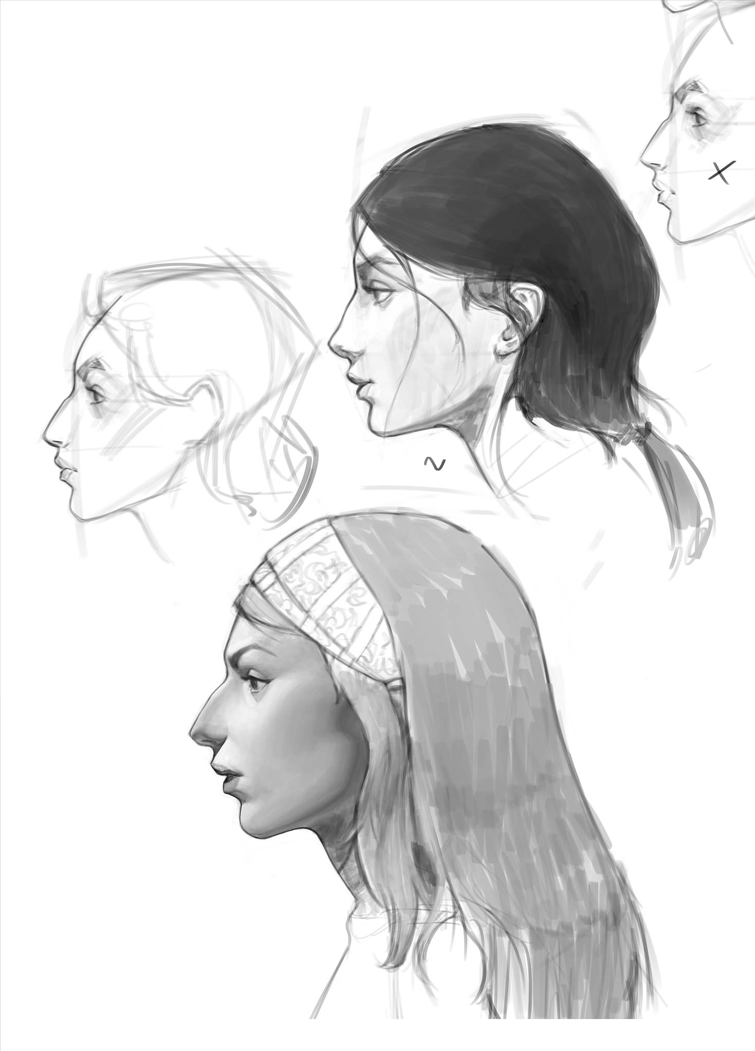
I've also started spending much longer rendering - really figuring out how light hits form and bounces around and creates the illusion of 3 dimensionality. That, combined with good shapes, is really what I love doing, and seeing in the work of others. That being said, here are some sketches and paintings from recent times. Also drawing and painting the female form/face is very satisfying atm - dunno why, maybe its because of the more graceful rhythms and forms generally found there!


Posts: 17
Threads: 1
Joined: Oct 2025
Reputation:
0
(12-05-2025, 06:29 PM)RottenPocket Wrote: B-elated Welcome!
You've got a very strong foundation of skills already, and you'll do just fine if you continue to identify areas for discovery and improvement. Personally I find myself separated from the concept art world now more than ever, and there will be others with more insight into industry demands and direction. But, Great work.
Hello and thank you for the welcome - yes, it can be hard to have an 'objective' view of your art and what needs improving, especially without a physical community, which makes it so important, and is why crimson daggers is great! You have some wonderful work on your profile!
Posts: 17
Threads: 1
Joined: Oct 2025
Reputation:
0
(11-15-2025, 02:44 AM)cgmythology Wrote: Nice update! The values are on point as always, and it's very well drawn and painted. Regarding the hair, something I learned was to think of them as 'ribbons' first before detailing them, so group them accordingly and don't focus too much on each individual stran too early in the painting process.
Keep up the great work!
Hi mate - yupp I'm learning quick that things really need to be simplified, hair is classic example, gonna keep on studying it :)
Posts: 17
Threads: 1
Joined: Oct 2025
Reputation:
0
(11-14-2025, 12:51 AM)darktiste Wrote: Fabric and folding are pretty logical when you are taught the variation but if you have no concept of what are the different type well it seem more like trial and error. It still a complex subject because of tension, twisting and folding that can really require a good deal of observation.
Drawing cloth from observation is not a problem once you master value control it doesn't even really need logic... but it does really start to become a complex subject when you make subject matter from imagination because that where if you leak the logic you cannot make inform decision.
Man cloth is such a tough one for me - observation is ok, but imagination makes my mind boggle haha. There are so many different options and ways the cloth could fall, and so many different variables affecting all that. I feel like my brain starts smoking when i try and solve it 
I appreciate the advice :)
Posts: 852
Threads: 6
Joined: May 2018
Reputation:
116
Wow great work! The portraits look solid, I love the distinctive profiles. Also impressed with what you can do with the falling cloth. For something imagined it's really good!
Posts: 3,357
Threads: 37
Joined: Aug 2013
Reputation:
234
Beautiful control of volume in here
Posts: 170
Threads: 2
Joined: May 2022
Reputation:
6
Damn your froms feel so solid
Posts: 316
Threads: 3
Joined: Sep 2019
Reputation:
23
Wow! Exception designs and rendering. That last figure is my fav!
Posts: 1,076
Threads: 4
Joined: Jan 2016
Reputation:
43
Fantastic updates! Your values and brushwork in particular are quite impressive, keep it up!
|


