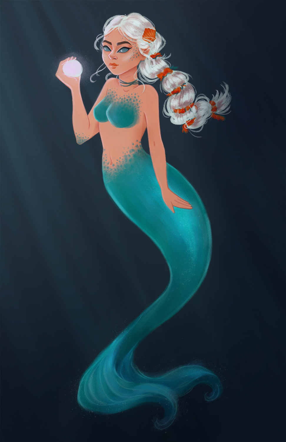
mermaid
#1
Smile 
Hey everyone  

This is my mermaid for the Mermay challenge, but I have problem with the light coming from the ball. I can't decide how much light is just right or too much to her face and body. Any suggestions? Also if you have more critique  I''ll be happy to hear it too! 


Reply
#2
Hey! Cool mermaid :)

I think the right amount of light is the light that conveys the emotion you want to convey and that depicts the form more clearly. If the light is stronger, it will define the forms more and the scene will become more dramatic, for example. That's something you have to decide.

I like the anatomy of the arms, but the anatomy in the neck seems odd. That occlusion shadow caused by the head is probably flattening it, and it's left defining line is breaking the gesture of the body.

I say beyond that, recheck your lightning scheme. From the forms, i'm guessing there's a white frontal lightning coming from the front, because there's very little modeling in the skin, but the highlights in the hair would be in those places if the light was kind of coming more to the left. Make sure your light is consistent across your forms, otherwise it will not look real to experience.

I hope i was clear / helpful :)

Reply
#3
Hi Bobby, I like this piece, nice colours.

I think you could try being more dramatic with the lighting.  Try having more light on the front of her torso and head but at the same time darkening the areas hidden from the orb in her hand e.g. her back and her pony tail.  You could also set up a reference photo of yourself in a dark room holding a mystical glowing orb (or a soft table lamp :)).  Also check out other artist's work e.g. James Zapata does a great job with lighting figures dramatically in my opinion:

http://orig06.deviantart.net/2605/f/2013...6y669b.jpg

Hope that helps :).

“Today, give a stranger one of your smiles. It might be the only sunshine he sees all day.” -- H. Jackson Brown Jr.

CD Sketchbook


Reply


Forum Jump:


Users browsing this thread: 1 Guest(s)