Rain's Sketchbook: Some Illustration
#21
(09-14-2017, 04:56 AM)Vicianus Wrote: Your cloth and armor is very very cool. I like your work a lot, it has a very solid feel to it!
I think your faces are bringing you down, though. Compared to your poses and the realism of your clothing and armor, your faces have a "dull" feeling in addition to being constructionally incorrect. It would be good to sit down and practice drawing several faces; your characters where the faces are covered feel very dynamic, but since faces are such automatic focal points, they really mute the other nice qualities in your drawings.

Keep up the good work!

So ya, last mounth i've tried to improve my portrait-drawing skill. Maybe in the next few artwork i'll show a knights with more impressive faces. But i don't promise the ideal emotions on them :D. 

Thanks for comment!
Reply
#22
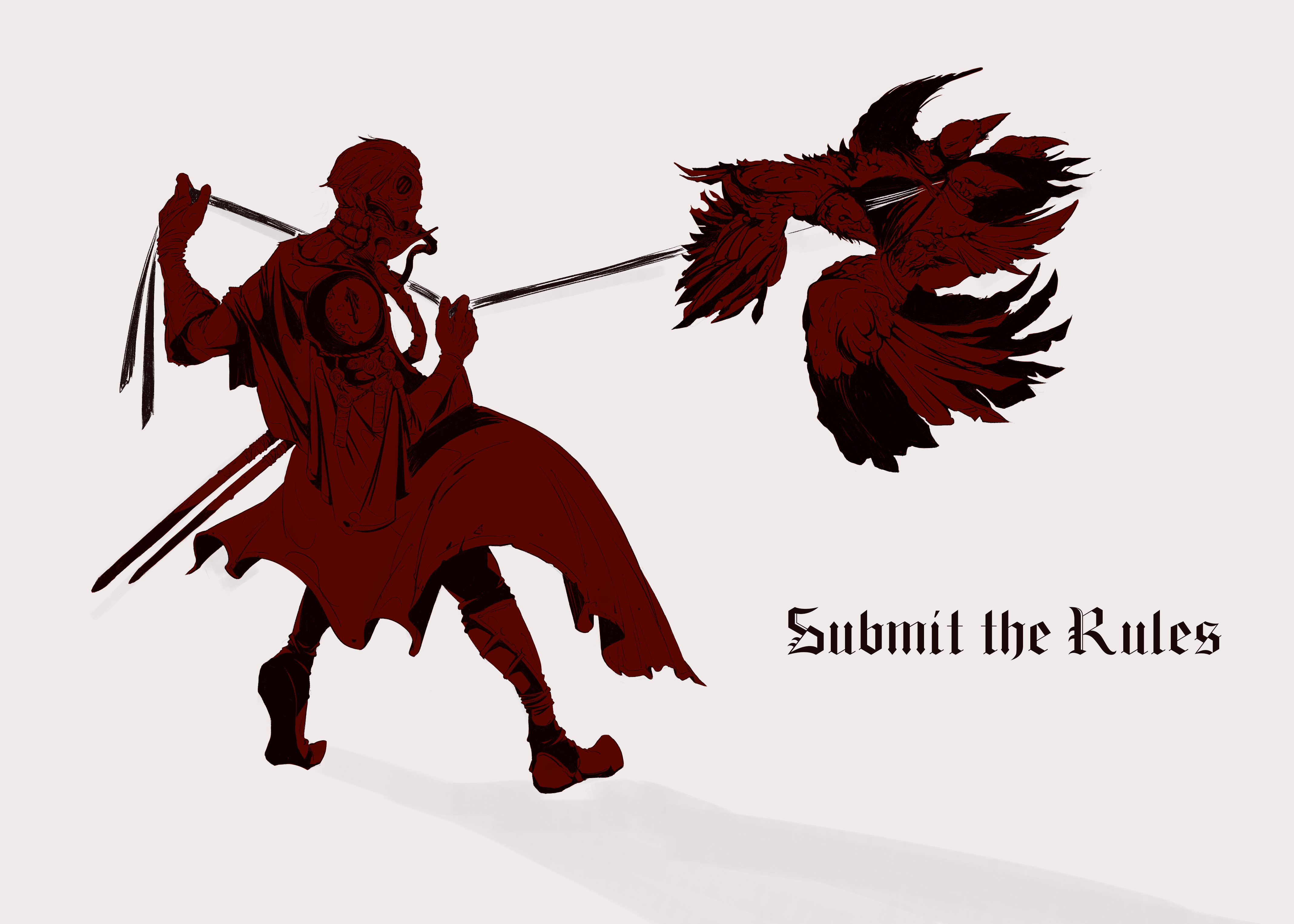
[WIP] Knight of the Eclipse


Reply
#23
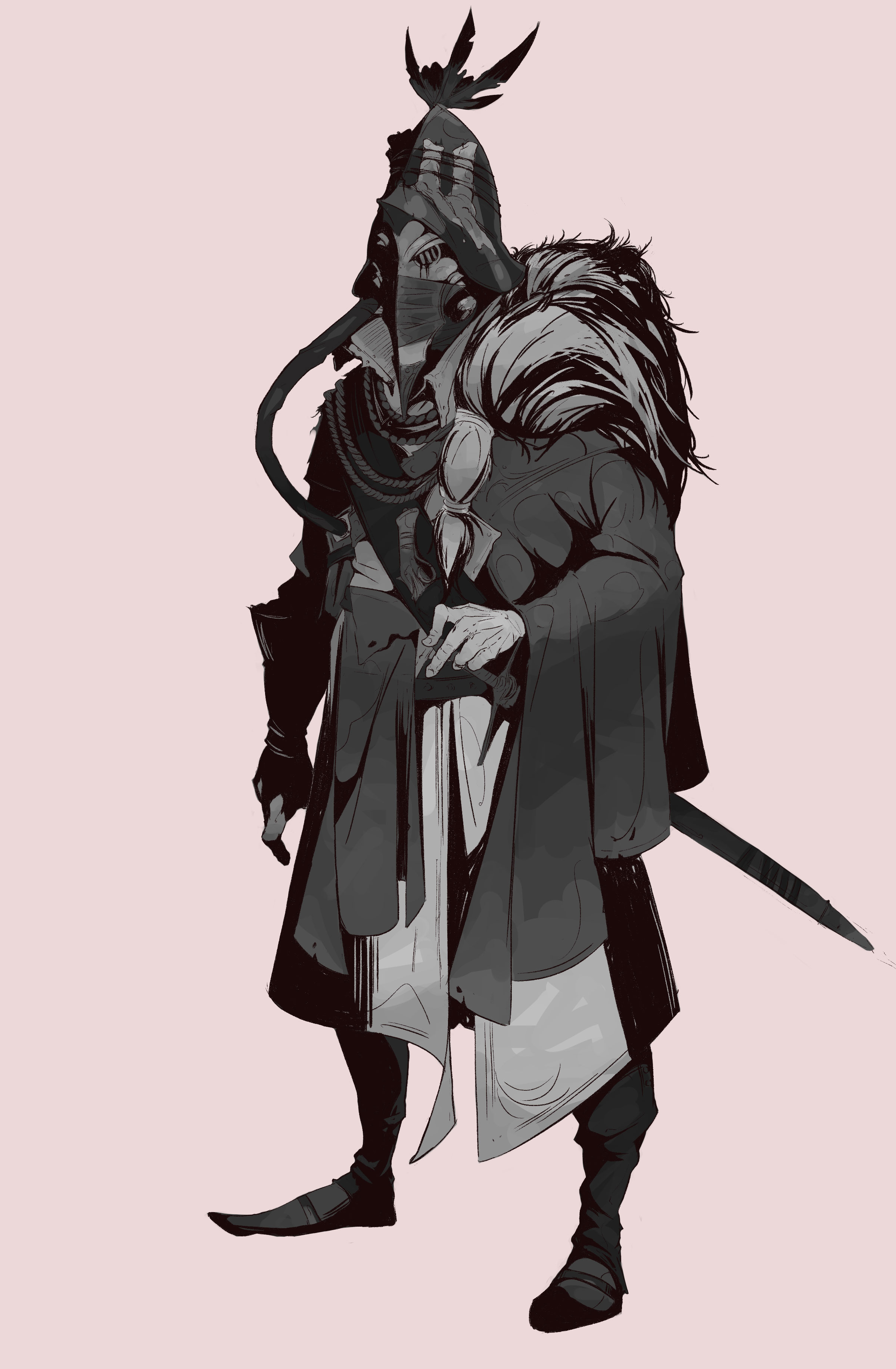
First concept of the Eclipse knight 
Reply
#24
Second

Reply
#25
Awesome work, you're really very good for someone who started last year!
The weakest aspect in my opinion is your faces. You could work more on perspective and construction in relation to facial features and. Figures with closed faces are very cool.
Also, I'm very happy that I learned about Timofey Stepanov's art from your sketchbook.
Hope to see more of your art!

Reply
#26
(10-28-2017, 04:44 AM)neopatogen Wrote: Awesome work, you're really very good for someone who started last year!
The weakest aspect in my opinion is your faces. You could work more on perspective and construction in relation to facial features and. Figures with closed faces are very cool.
Also, I'm very happy that I learned about Timofey Stepanov's art from your sketchbook.
Hope to see more of your art!

Thanks! 
I have been unsuccessfully trying to improve the face drawing skill last time. 
He is cool artist. Hope you enjoy!
Reply
#27
Another design searching


Reply


Forum Jump:


Users browsing this thread: 7 Guest(s)