08-25-2017, 05:42 PM
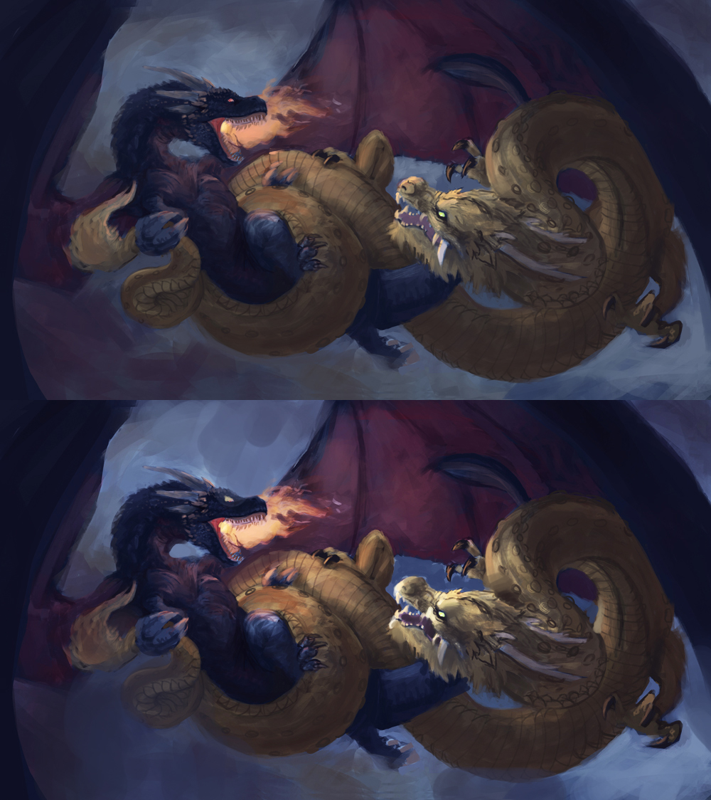
Just like some feedback about the composition and overall impact before I render more heavily
Thanks for your time
![[Image: dragon_brawl_zwip_by_andrew_gibbons-dbl8d4q.jpg]](https://orig10.deviantart.net/82cf/f/2017/237/8/6/dragon_brawl_zwip_by_andrew_gibbons-dbl8d4q.jpg)
Thanks for your time
![[Image: dragon_brawl_zwip_by_andrew_gibbons-dbl8d4q.jpg]](https://orig10.deviantart.net/82cf/f/2017/237/8/6/dragon_brawl_zwip_by_andrew_gibbons-dbl8d4q.jpg)
|
Dragons composition thoughts
|
|
08-25-2017, 05:42 PM
Just like some feedback about the composition and overall impact before I render more heavily
Thanks for your time ![[Image: dragon_brawl_zwip_by_andrew_gibbons-dbl8d4q.jpg]](https://orig10.deviantart.net/82cf/f/2017/237/8/6/dragon_brawl_zwip_by_andrew_gibbons-dbl8d4q.jpg)
10-03-2017, 09:43 AM
I like the overall design and movement you have in these. One thing I think could help is pushing the values around the two focal heads and softening the contrast in non-focal areas. Here's a quick paint over (bottom) to demonstrate that idea. Hope this is useful, can't wait to see the final!

10-03-2017, 02:35 PM
(10-03-2017, 09:43 AM)ubem Wrote: I like the overall design and movement you have in these. One thing I think could help is pushing the values around the two focal heads and softening the contrast in non-focal areas. Here's a quick paint over (bottom) to demonstrate that idea. Hope this is useful, can't wait to see the final! cheers for the paint over, spot on about the focal point contrasts, i tend to work pretty dull and push and pull things forward and back in the later stages, the thing im still really unsure about is the wings, ive tried a bunch of variants and havent come up with a satisfying one. also not sure if the overall perspective is dramatic enough.. anyway i put this piece aside for a bit to come back fresh later but it will get finished in time. its just a personal piece so i dont mind taking the time haha thanks again for taking a look :)
10-03-2017, 05:59 PM
Hey dude. A couple of quick comments.
First off dragon wings are a b*tch. SO easy to go generic shapes or not think out the form of them well and use the out of view frame/hiding connection points to gloss over the difficulty of the anatomy. I recommend lots of studies to figure out the anatomy of various types of configurations for best effect. I know you can get away with a lot here and many dragon related art hide/gloss over this area, but I think you would be best served with getting dirty with it if you haven't already. Couple of links to stuff I found useful https://www.facebook.com/media/set/?set=...867&type=3 ![[Image: The_Hobbit_The_Desolation_Smaug_Unleashi...n_MA01.jpg]](http://conceptartworld.com/wp-content/uploads/2014/04/The_Hobbit_The_Desolation_Smaug_Unleashing_the_Dragon_MA01.jpg) ![[Image: NaturalHistory_2560x1600.jpg]](https://3.bp.blogspot.com/--MgxawCVxcc/UFqVdSKAPDI/AAAAAAAADHc/UVs3l7mzjRc/s1600/NaturalHistory_2560x1600.jpg) ![[Image: 451cf5255f5e52848396900d54fe3a1c.jpg]](https://i.pinimg.com/originals/45/1c/f5/451cf5255f5e52848396900d54fe3a1c.jpg) Obviously all made up. I just found it really handy to think about it those terms even when it came to composition. Having said that, I think your wings don't hold up to anatomical scrutiny very well which might also help you determine how they orient and curve in 3D space. Seems like you have used them almost like an afterthought really. I did a bunch of dragon studies and stuff for a recent book cover and those bloody wings did my head in. I think you would benefit from looking at the anatomy of the wings and connections to help you determine their position better. I think compositionally the foreground wing could curve down and from left to mid bottom right of canvas diagonally more than it does and into the foreground more to give the comp more movement and more depth. Other than that I have trouble understanding the placement of the legs and the hidden arm. Might be a shorthand issue, but I think as you go it definitely needs resolving. Good luck!
10-03-2017, 06:31 PM
(10-03-2017, 05:59 PM)Amit Dutta Wrote: Hey dude. A couple of quick comments. Thanks Amit, yeah Jae min kin has some of the best dragons i definately dont wanna shortcut the anatomy, i dont have a deadline so i ill work it till im satisfied i had some further rendered wings but i scrapped them cos the shape composition wasnt doing it for me.. ill keep trying and ill get there. thanks for the support! |
|
« Next Oldest | Next Newest »
|