01-18-2025, 08:16 PM
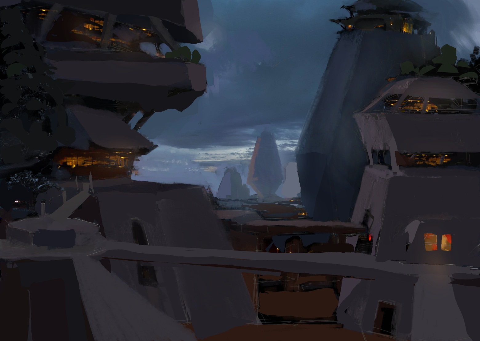
New entry. Cleaned up the previous sketch and started a new one
Anvar's Sketchbook till I get better
|
01-19-2025, 11:25 PM
New update of yesterday's sketch. Can push this one further, but the piece is almost all solved so I will to another one. Thanks everyone!
01-20-2025, 03:37 PM
Awesome updates! The lighting, colors, and brushwork are all aces. Curious to see how much you refine it further but it already look very solid and defined. Great work!
01-23-2025, 06:49 AM
(01-14-2025, 09:15 AM)Anvar Khamidov Wrote:Hi Anvar, it's only very recently that I've started to draw out ideas I've had in my head for a while. I was always in the mind set of 'I need to learn anatomy, perspective, form, value, colour theory, composition, etc, before I can draw what I actually want.' Coupled with the cognitive distortion that using references, including gleaning from favourite artists was akin to 'plagiarism', with all the opprobrium that comes with that. Mark making was mentally exhausting, because I never felt done, therefore the bar to clear just gets higher, and higher and higher... I'm trying to cleanse myself of this mentality. Doing studies towards a larger goal is always better, I find they I slow down too, and my focus doesn't wander. I guess that's great for long time retention. And, most importantly, you learn whilst having fun. Sometimes a study can feel like 'pulling teeth' if that's not what you want to be good at or create. It's a procrastination barrier.(01-13-2025, 06:00 AM)Dominicque Wrote: Hi Anwar and welcome to the forum! I think I can concur on doing straight master copies. It can help, but it can also get pretty boring. I was recently doing some studies of people sitting for an image I wanted to do and felt my productivity wander. I was only when I used that image as a basis for an OC did the enjoyment start to spring back up. Informative and fun. To add onto Darktiste's comment as switching it up, by drawing the same thing and making (un)conscious choices helps to get things to stick and also a good creative flow if you're in a creative rut. Pretty much agree with the rest of your reply.Hello Dominicque and thank you for your warm welcome. As I draw now, I get flashes of ideas in my head, so I either note them down or jot down a quick, perfunctory sketch. I always used to get super upset of /not/ being able to draw things super correctly, and used that (amongst others) as a 'value judgement' on myself as an artist, especially since drawing from imagination was/is the ultimate goal for mine. So, I'm super impressed my you. Especially, your seeming innate knowledge of lighting scenarios. I could really use advice. I decided to try and buckle down and actually do a family 'lookbook' of a fandom I'm apart of, after putting it off for so long. I actually got PureRef to work for me. I was so reluctant to use a pose from a photo, even though it fit perfectly for what I needed. However, I did it yesterday and found myself really enjoying myself, and going through the process of finding the right poses , outfits and compositions. It came out so easy, I was so surprised! I have more to go, but I think it's best for me to really lean in to the process and the research part rather than the final image.
01-24-2025, 04:39 PM
(01-23-2025, 06:49 AM)Dominicque Wrote:Hello, Dominicque. I am always glad when another artists gets a breather and regains the pure enjoyment we are always chasing. I absolutely understand the situation with not being able to put anything on the canvas because every step, including the first stroke of a brush is calculated as wrong and inaccurate. I've been there and done that many, many times and have been fighting this mental pattern since I've gotten somewhat better at art.(01-14-2025, 09:15 AM)Anvar Khamidov Wrote:Hi Anvar, it's only very recently that I've started to draw out ideas I've had in my head for a while. I was always in the mind set of 'I need to learn anatomy, perspective, form, value, colour theory, composition, etc, before I can draw what I actually want.' Coupled with the cognitive distortion that using references, including gleaning from favourite artists was akin to 'plagiarism', with all the opprobrium that comes with that. Mark making was mentally exhausting, because I never felt done, therefore the bar to clear just gets higher, and higher and higher... I'm trying to cleanse myself of this mentality. Doing studies towards a larger goal is always better, I find they I slow down too, and my focus doesn't wander. I guess that's great for long time retention. And, most importantly, you learn whilst having fun. Sometimes a study can feel like 'pulling teeth' if that's not what you want to be good at or create. It's a procrastination barrier.(01-13-2025, 06:00 AM)Dominicque Wrote: Hi Anwar and welcome to the forum! I think I can concur on doing straight master copies. It can help, but it can also get pretty boring. I was recently doing some studies of people sitting for an image I wanted to do and felt my productivity wander. I was only when I used that image as a basis for an OC did the enjoyment start to spring back up. Informative and fun. To add onto Darktiste's comment as switching it up, by drawing the same thing and making (un)conscious choices helps to get things to stick and also a good creative flow if you're in a creative rut. Pretty much agree with the rest of your reply.Hello Dominicque and thank you for your warm welcome. The problem of not being able to put a mark on the canvas because of all the imperfections stems from a vast difference we have in two skills: Observing art vs Making art. See, I am of the opinion that our eye, our perception gets better when we look at good and highly-skilled pictures all the time. The more we look, the more we understand how things are supposed to look like and we start to recognize what is possible in art. Then, after looking so much and taking that information in, we sit down and start painting, and nothing we put on the canvas looks even remotely as good as the works of art we consider to be good. Art making skill didn't improve, it is only our critic that did. And mind you, I think it is very important to have a very good cognitive critic, but that has to come with a comparable skill of art making to match it. Concerning your second paragraph, it is like I am reading something I would write. I think you are on a very good path if you enjoy researching and collecting references. It is crucial to have them so that you can create something more than what your visual library allows you to currently. But more importantly, I wanted to note on your willingness to go through the process itself. A couple of years ago, I had a talk with Clint Cearly, if you are into MTG, you probably know this guy, and his advice to me was to create a process for yourself that will allow a better quality of a picture at the end of it. There is great value in having that structure when you know what steps to take to achieve an image that you have in your mind. I will, however, say one thing that is very important. Once you are on the other side of this approach that relies on structured process, (and I am talking about years of implementing it) I would really ask you not to devoid yourself of spontaneity that sketching without much preparation brings you. I realized recently that I suffocated myself with a process and painting became a set of rules to follow on each and every step instead of this great and fun process of trying things out as you go. I am sure you will get through it successfully, and the only that will make painting more fun without much preparation is studying art. By the way, I commend you for having such a difficult goal in mind. Mine is the same. Painting from imagination, I think, is the truest show of your skill in art. And if you have any questions about lighting and just generally, I am always open. Also, PureRef is the best.
01-24-2025, 04:40 PM
(01-20-2025, 03:37 PM)cgmythology Wrote: Awesome updates! The lighting, colors, and brushwork are all aces. Curious to see how much you refine it further but it already look very solid and defined. Great work! Thank you! Yeah, absolutely, I would love to paint something more finished in the future. So far, most of the sketches I have here aren't very well suited for a full illustration, but I am hoping I will make a sketch soon that will have that foundation
01-26-2025, 03:11 PM
New entry. My goal for this one was to become more familiar with interior environments since I almost never draw scenes that are inside smaller rooms. I knew that it was not because I did not like the closed environments, it was only because I am not yet comfortable with them.
Overall, a very okay picture. Not great, not bad. I lost a lot by not paying attention to composition more. In fact, I have noticed that when drawing a single figure on a simple background (specifically, background, not an actual environment!) composition is mostly done by altering the shape that the main figure makes and everything else secondary. In a scenario like that it is not so hard to make an interesting composition because of how few objects you have to manipulate. When it comes to zoomed-out illustrations, then every piece of the image matters that much more. Immediately you are stricken with hard questions like "How do I make my figure the focal point?" All in all, more attention to composition next time for sure. If not talking about composition, color would be the next problem that I have to more mindful of. This particular piece presents a problem that I frequently have: dull color that lacks a lot of intrigue. My previous sketches do not show this problem, but it is there in my finalized illustrations. Color in my case is a harder problem to solve than, say, composition since I do not know the answer to a very prescient question: "How do I make colors work in an exciting way without saturating everything through the roof?" My best guess is making master studies that are aimed at color only. Other than that, the piece has some nice qualities. First and foremost, I have to say that my objective was accomplished: I got a convincing enough interior environment. That is great and that has to be recognized by yours truly. Of course, the main figure ended up quite satisfying to look at as well, though I will say that the shapes that I use on him are boring, this needs to be fixed in next entries. All in all, I am happy with it, and that matters a lot. Thank you for your attention!
01-27-2025, 01:16 PM
Wow love how the dragon one turned out! Beautiful, firey sunset light on it.
On the boar one, I like the concept of the painting, and overall the vibe is cool. I think you could spend more time on the big picture stage with the values and colors before detailing, though. On this one I see a lot of smaller details, like the gun and the wallpaper pattern, which while interesting, kind of draw my attention, meanwhile the lighting feels a bit unfocused. With the color, there's a bit of murkiness to it around the walls. Just since you said you want to improve color, I did a bit of a sketch over, kind of going back to the big flat shapes stage to see if the color relationships can be more powerful. I liked in yours how there were touches of blue mingled with the yellow of the wall around shadows and edges. So it's starting to look interesting, but the 'rules' of where blue should be and exactly what color and value everything needs to be to read, are maybe a little shaky. So idk, I'm sure it's not exactly what you're going for but my suggestion is just to play around with each piece of the image, and figure out what reads, and if you start to get something that works, keep going to see if there's any adjustments to an area that work even better. Once you have well established what color each different thing is in light, and what color it is in shadow, you can paint really powerfully. Like here, I think I have established pretty well what the color white looks like in this context by playing around with it and getting it consistent across the image. So if I wanted to add another white object, or start detailing his tusks, for example, it would be pretty much guaranteed to work out. And then another suggestion is try a filter or something to reduce the values to masses. Mess with levels in photoshop, whatever works for you. But like side by side paintover with filter, we get a pretty good 3 value comp, though could maybe be better if the dark shapes on the wall in back were lightened. Original: wallpaper pattern sticks out a lot, mass of the boar feels like it's fighting the gradient on the wall behind a bit. And yeah it's just a filter, so it can be flattering or unflattering, but I do it a lot just to look at it a different way and get an idea of what could be stronger. Keep it up though, I'm honestly loving all your sketches!
01-27-2025, 03:20 PM
(01-27-2025, 01:16 PM)JosephCow Wrote: Wow love how the dragon one turned out! Beautiful, firey sunset light on it.Joseph, man, this is so awesome. Thank you for this paintover, it looks so much better, I better start learning from you. So, I have a couple of questions: 1. You mentioned color murkiness on the wall. How do I avoid that altogether? You seem to have a very coherent palette for this piece, it all works together, seems like all colors share something. Is it just that they are all close-ish on the color wheel? I usually try to keep the palette limited and not go too far unless there is a need for it, but that seem not to be the rule at play here. So how exactly do you harmonize colors? 2. Those sparks of blue I have are an interesting subject. I noticed that adding these sorts of elements almost "burns" an area, in a good way. However, as you mentioned, the "rules" of where to apply them are shaky. So what do you think a rule might be here? I see that the edges between light and shadow are places where you would want to add the poppy color, but is there anything else? 3. As I understand, you are suggesting that I should play around and find consistent value-color combination for each color that is present in the painting. Does that mean that you group your colors mentally by proximity? Say, if the tusk is some desaturated yellow and the wall is some beige they are in the same group and would obey the same value-color structure? It seems like you have groups for these things, and I know about value grouping, but I am not really knowledgeable on color grouping. I suppose this question is a lot like the first one, phrased differently, but if this is phrased better, it works too. 4. Finally, how do you practice color and value relations? It is clear to me that not everything we do in a painting is a conscious decision and a big portion of it is our eye just knowing what do as a result of repeated practice. How did you practice it? And while practicing, what questions were you asking, what answers were you looking for? It would be great to know since I am realizing that for me, there is still a lot of work to be done on a macro level - composition, color comp, and big picture value. Even though I am quite proud of some of these sketches, I am not consistently hitting that level I would like to be at. Again, thank you very much for this paintover. I hope I will be able to give you a feedback with the same level of gravitas soon enough
Yesterday, 05:30 AM
Sure, these are good questions
1. I think you just need more of a shadow/light mass. And more of a warm/cool relationship built between them. The light gradient on the back wall I think would logically reach further, and be more even and smooth, so that helps that area. The corner in shadow, I paint over all parts in shadow with a orangeish tone to bring them all together and make all shadows related. The bluish bits on the wall make me thing a cool window light makes sense, and that usually makes the shadows look relatively warm. So I think it's just has a little more clarity as to what the light hits, what it doesn't hit, and gets it away from the yellow-grey color with dark shading. 2. Yeah I agree, the touches of color burn in a way. They add energy or life. But what I mean is that they should appear in somewhat consistent places and situations. Like in real life, you can often see in natural light, the edge between a cast shadow and the lit part has a color, or that part of a highlight on an object has a color. maybe a nice blue, if the sky is blue, but it's going to always appear in its respective place, like maybe it's only in the transition on the tops of shadows, or the color gradates from left to right. Or if the blue were for instance like an impressionist broken color effect on the mass of the wall, you might want to scatter it very evenly throughout, but make sure the value is the same as its surroundings. That's not to say that your painting should be exactly like life. you can paint whatever you want, but your painting should follow it's own rules, like life does. So for example I put little touches of blue on the bottom of some cast shadows, and some purple on reflections seem to look good. If I kept going I might keep that consistent throughout the piece and that would be my soft rules for where pops of blue go. 3. Yeah, just thinking about how, since color is relative, we know the local colors based just on read, and context clues. Not really grouping on proximity, but on similarity across the painting. So if the wall and tusk are basically the same local color, you could make them the same, even though they are not touching, because they have the same lighting. In this case the reason I suggested this is I messed around with the book, and when I felt like I made the white pages in shadow read well, I picked that color and applied it to the tusk in shadow. As a baseline I just think this works really well, and it does build consistency and harmony. Though of course you may later need to add more shading or factor in bounce light, or differences in their material, but those are actually pretty nuanced considerations. 4. I think what you're doing is really good already. I can really just recommend doing a healthy combo of work from your imagination, like you are: so experimenting with color, trying to form things on the canvas. And also working closely with reference, trying to be accurate. This way you can learn laws of how things look, as well as build intuition. For me that's been doing still life, whether digital or traditional, I try to every so often paint from actual reality. Anything that just has an interesting material, or lighting, or whatever, I just think it helps me. Mostly the type of study that revolves around asking "what is this color compared to this color? "is this value lighter or darker?" So pretty detached from the subject matter actually. Everyone is kind of different though. Doing master studies make a lot of sense for color relationships, as well as drawing and a lot of other things. |
« Next Oldest | Next Newest »
|