06-24-2019, 09:16 PM
I suggest you work on a grey background to help yourself be more aware of the value of your character.
|
Zodd Sketchbook
|
|
06-24-2019, 09:16 PM
I suggest you work on a grey background to help yourself be more aware of the value of your character.
06-24-2019, 10:03 PM
@darktiste
How does working on a grey background help someone be more aware of values?
Discord - JetJaguar#8954
06-24-2019, 11:14 PM
(06-24-2019, 10:03 PM)Tristan Berndt Wrote: @darktiste Because the grey background act as a mid value by itself and you only have to deal with the shadow and the light.People tend to focus heavly on mid value and light and they tend to avoid the darker value because in traditional it can be hard to erase them down once there on the paper it why people tend to not push there value or forget to push them.Sometime this problem follow them even after transitioning from a traditional medium to a digital medium.
06-25-2019, 08:09 AM
06-25-2019, 09:50 AM
Sketches
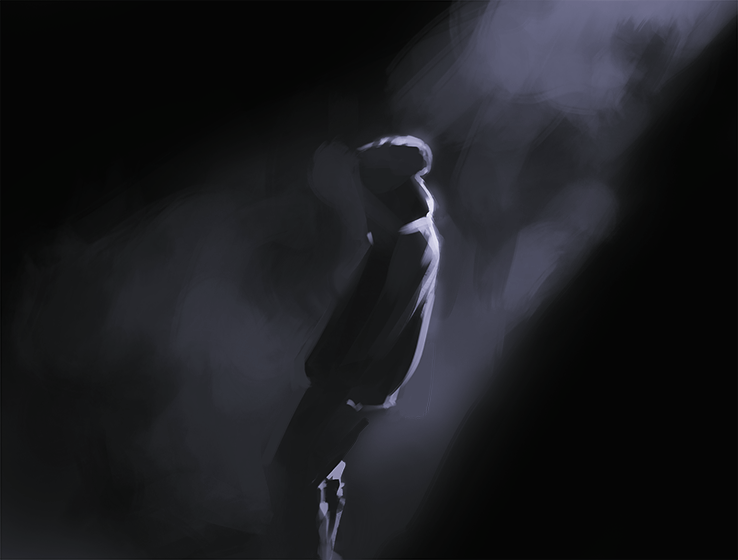 
06-26-2019, 03:36 PM
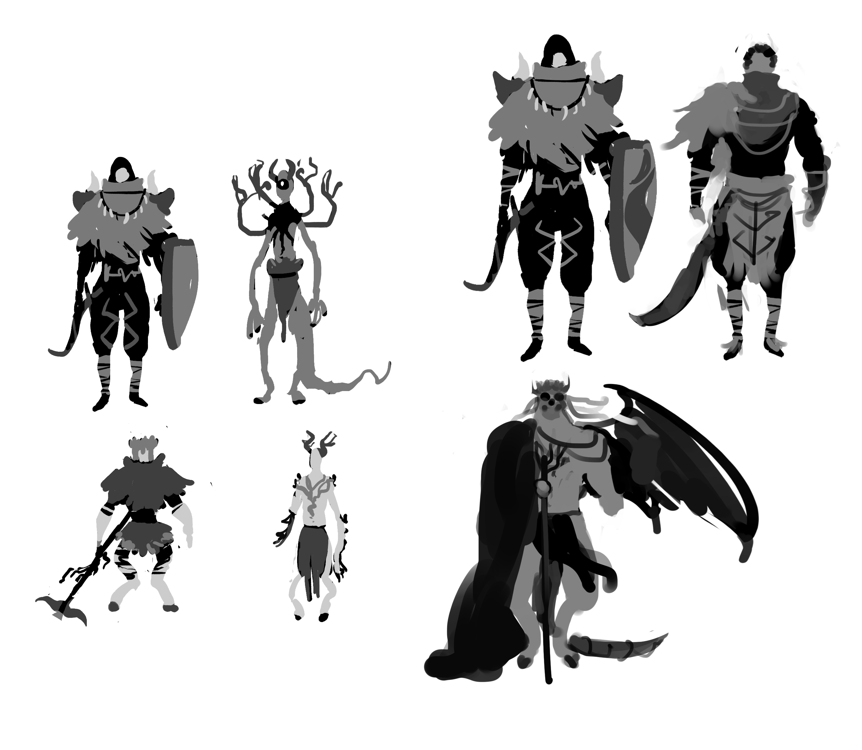
Character design exercises:
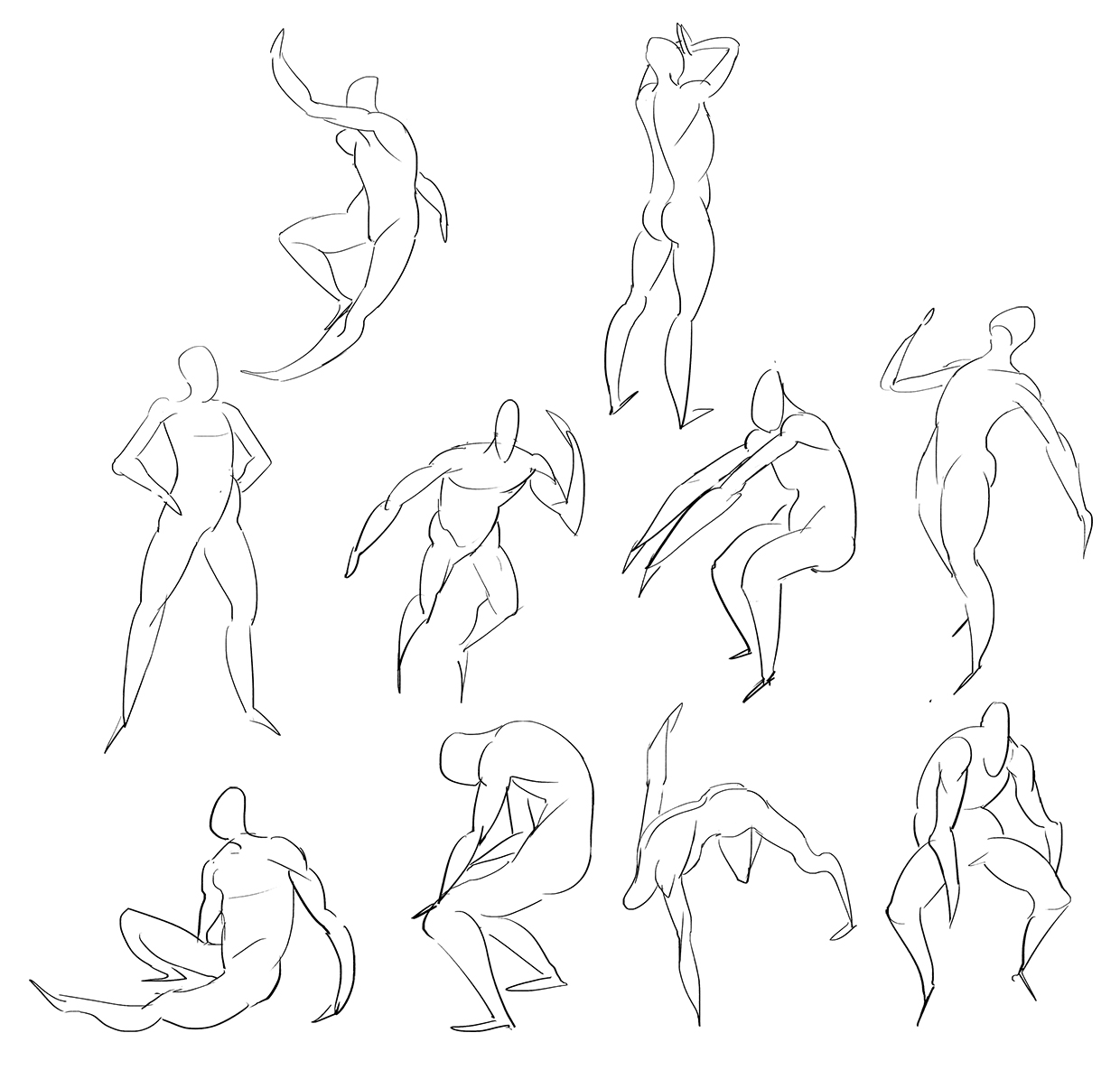
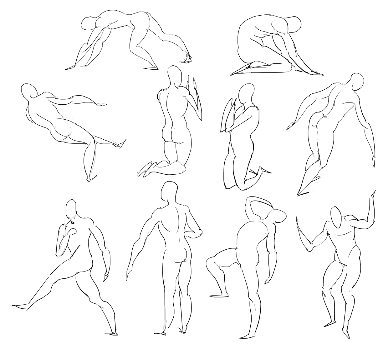
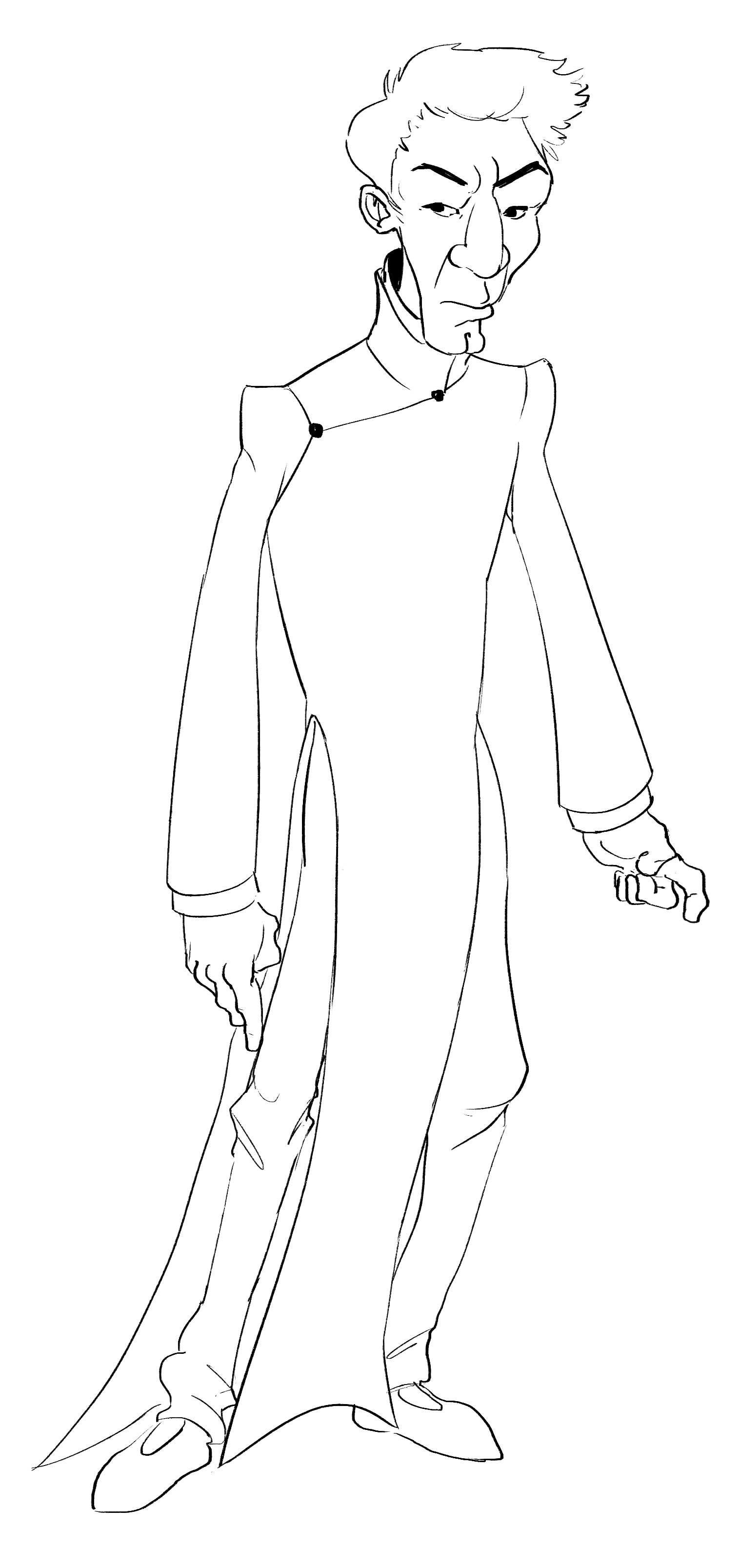 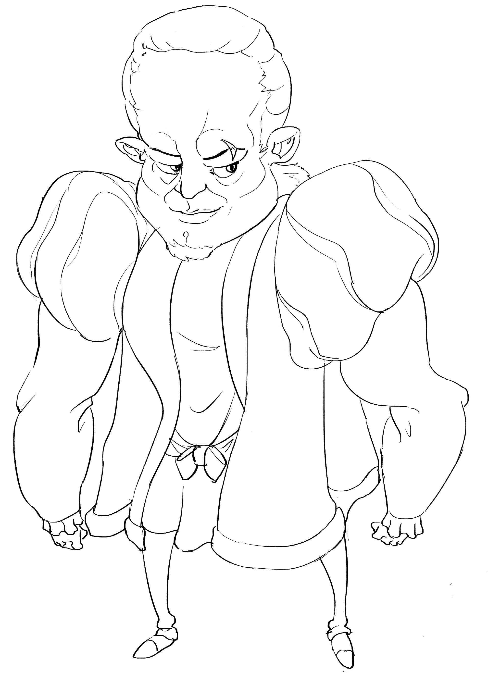  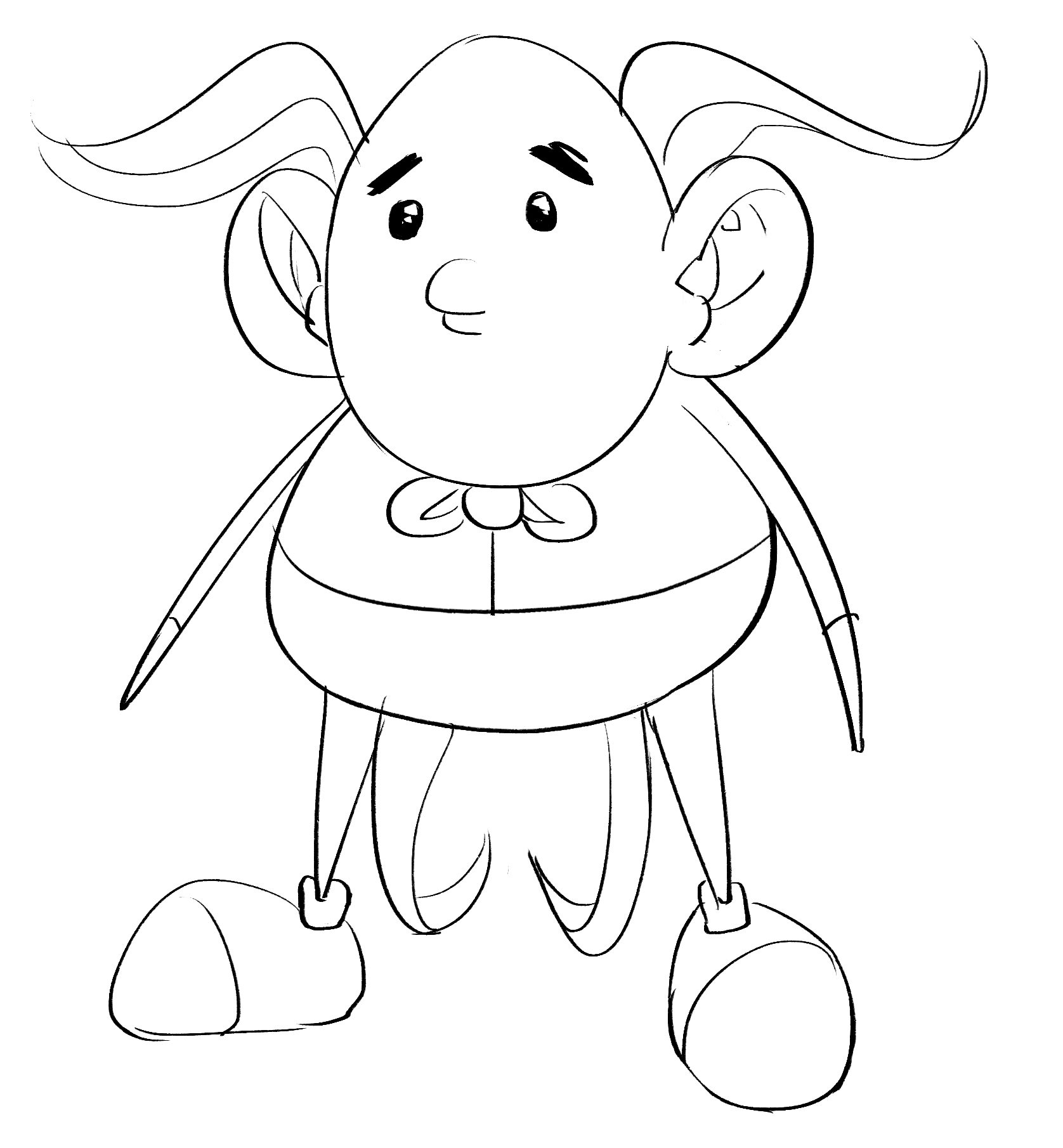 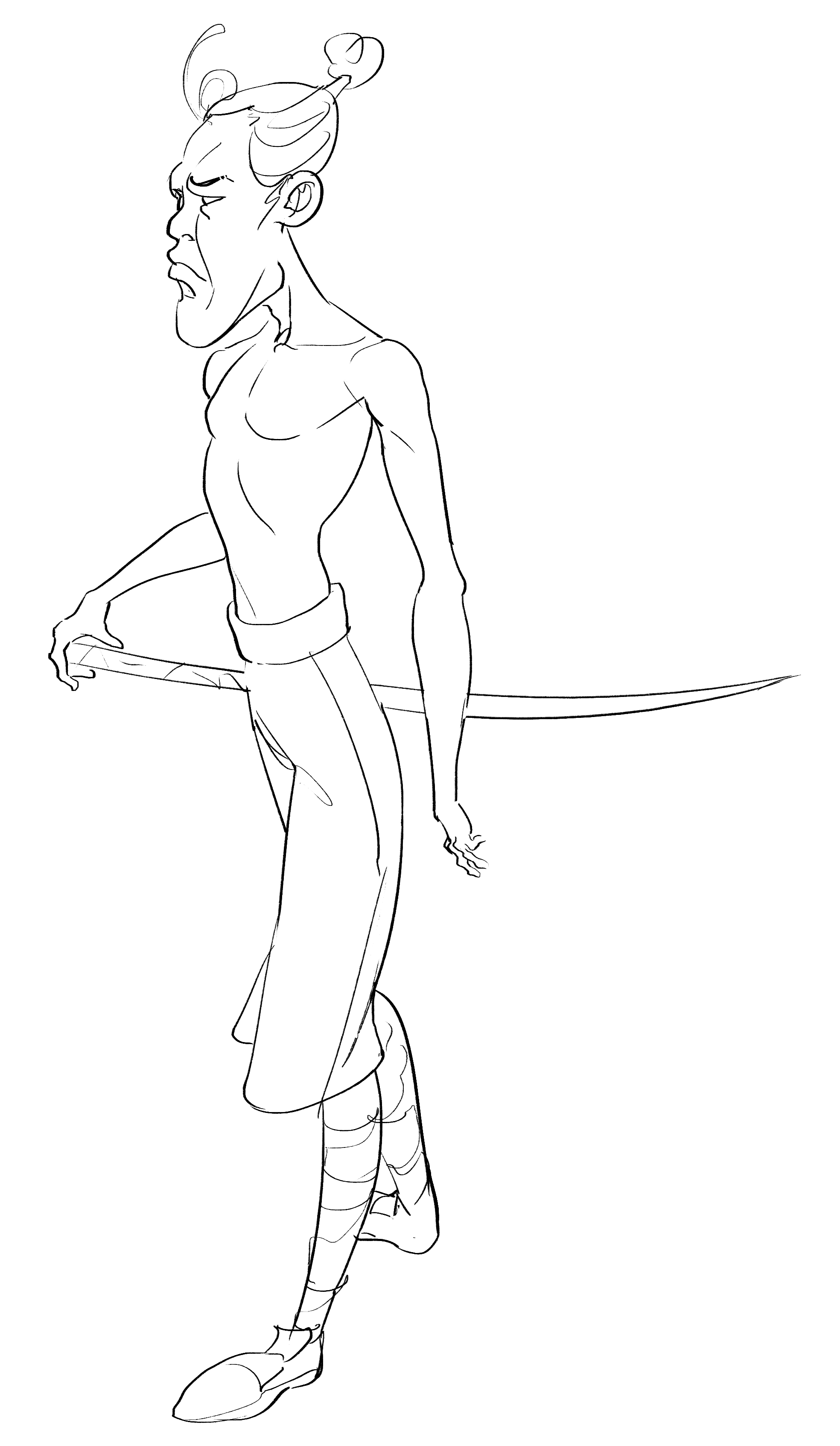 Gesture: 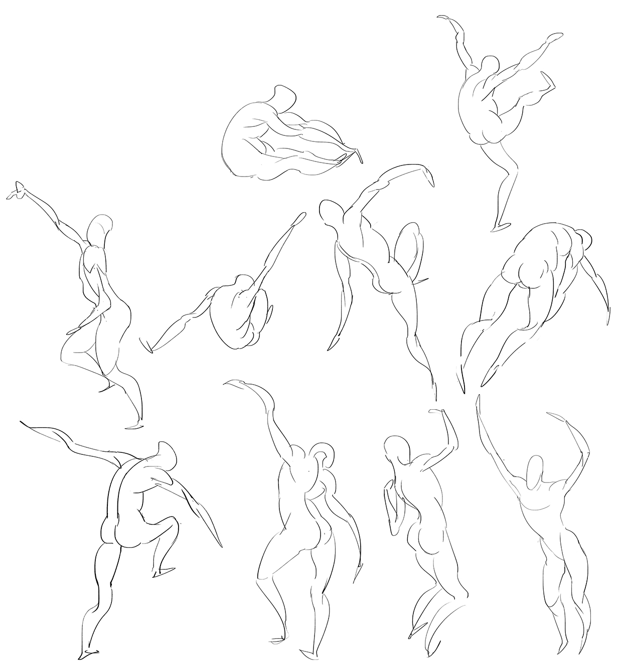
06-27-2019, 01:27 PM
Render test, damn, i'll work hard on the values tomorrow...
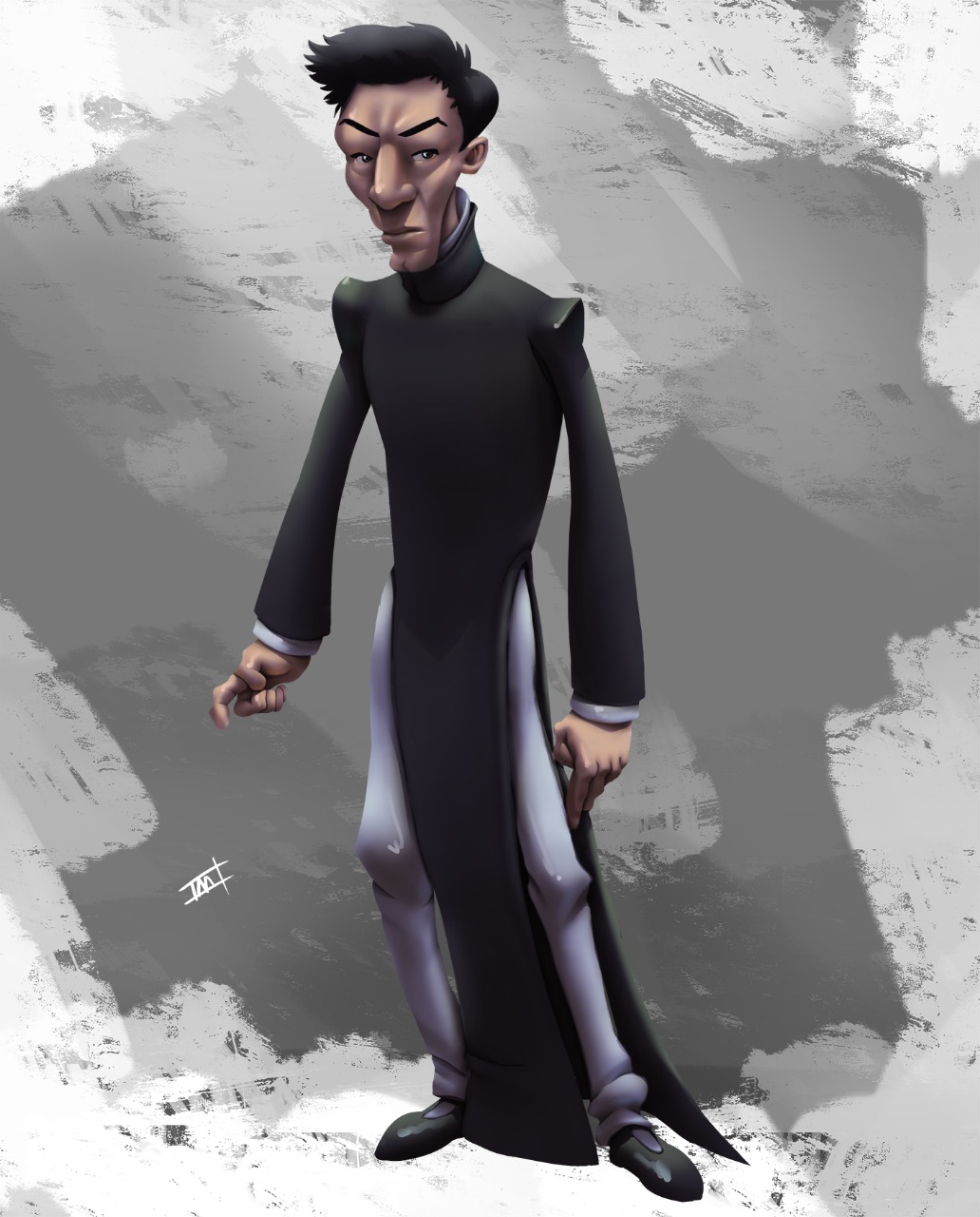 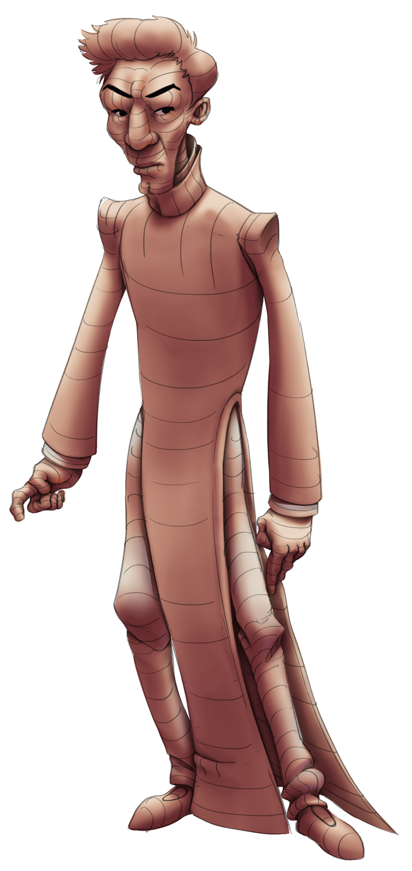
06-28-2019, 12:34 PM
Render test
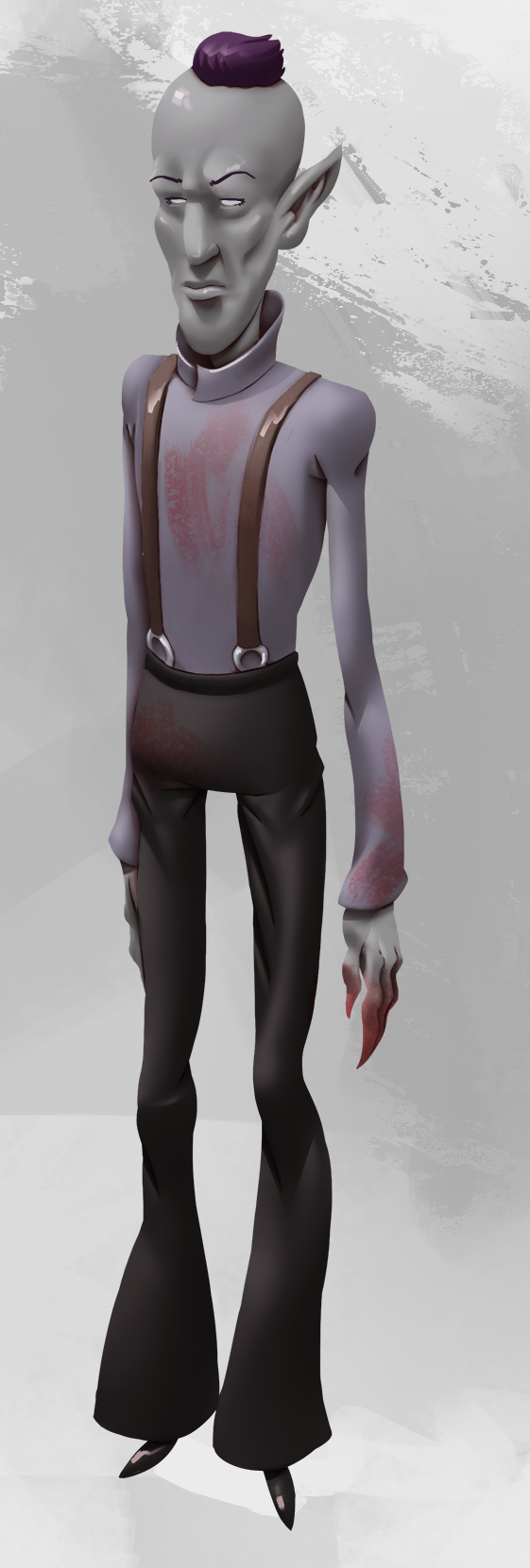 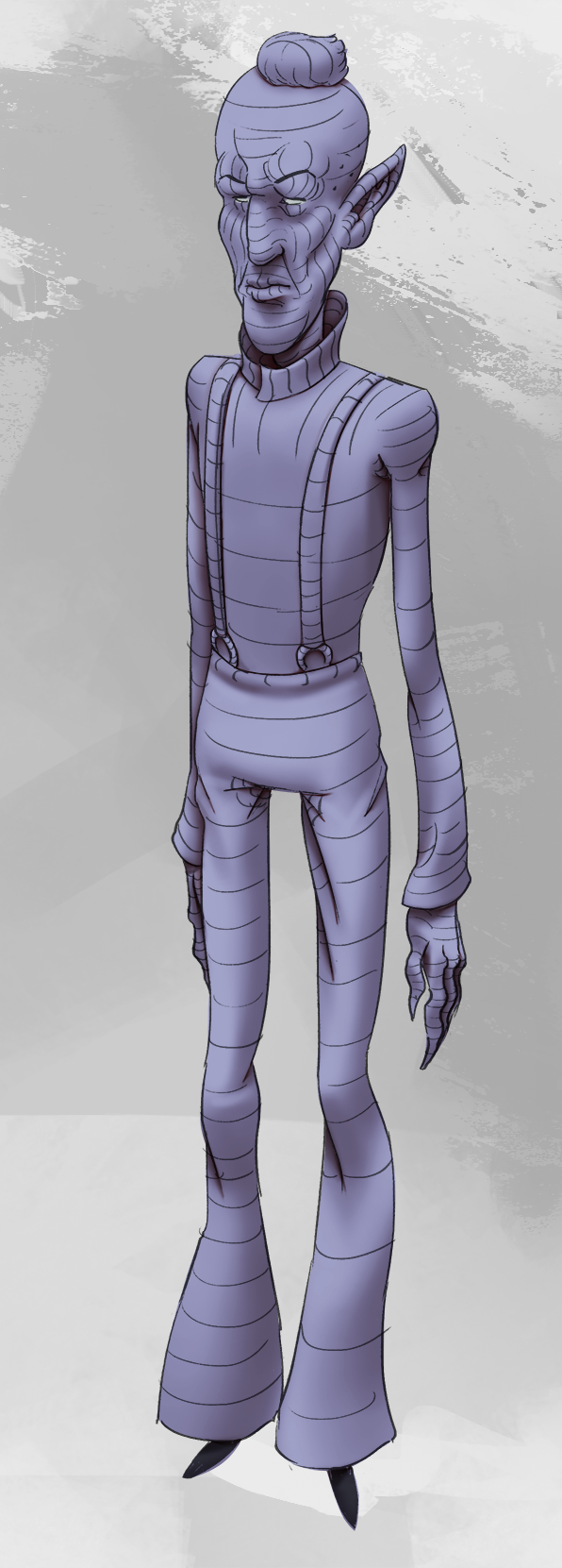
06-28-2019, 02:23 PM
Some gesture, already done 420+ of this exercise this year LOL
06-29-2019, 08:49 AM
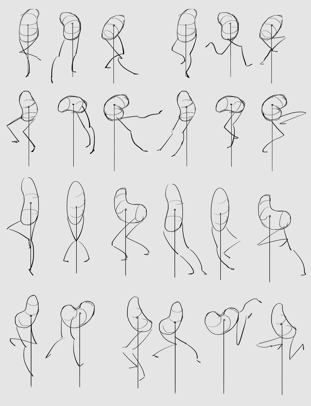
More studies, some from Wouter Tulp lesson about center of gravity
 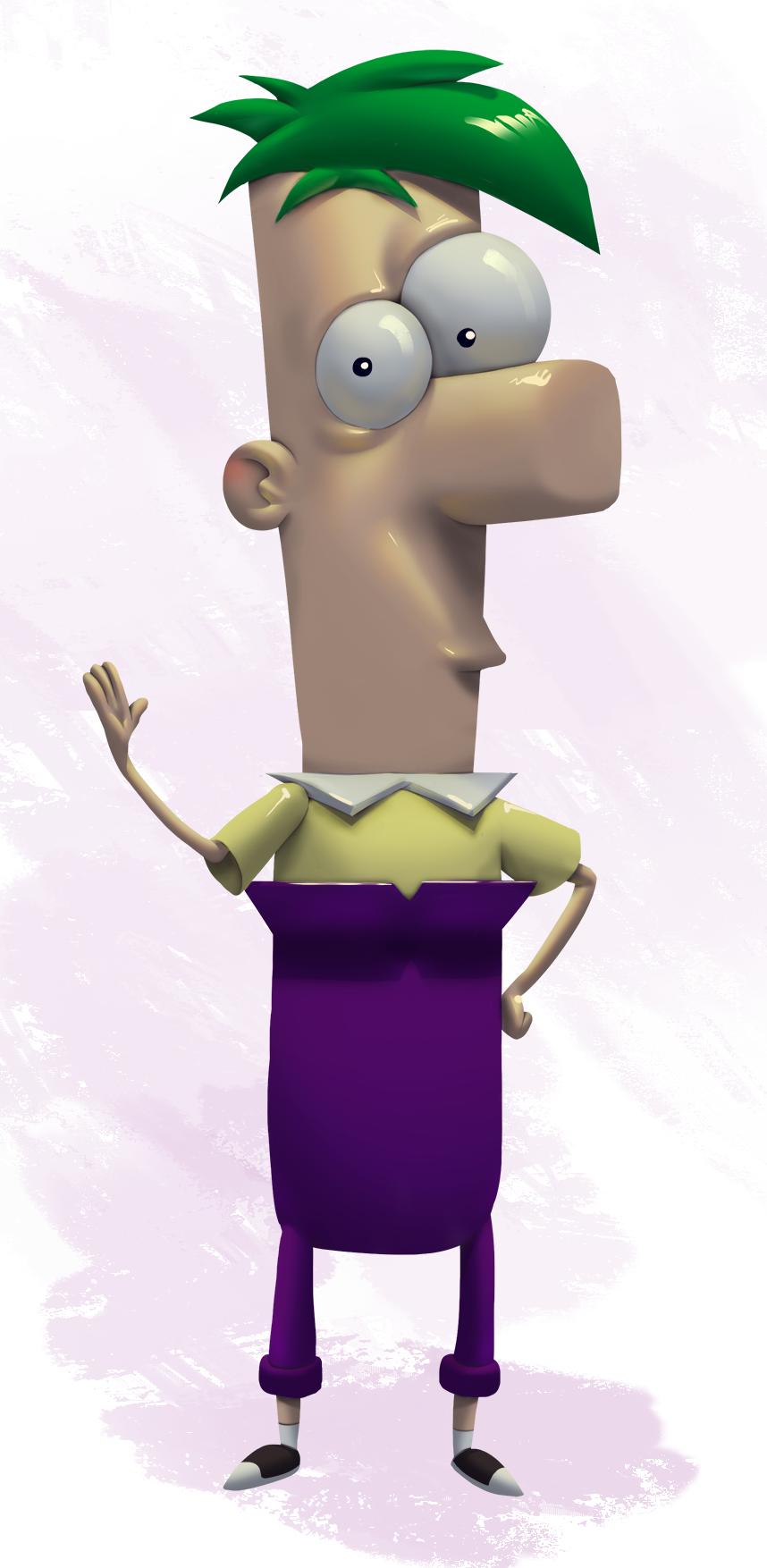
07-01-2019, 04:11 AM
Sketches from imagination
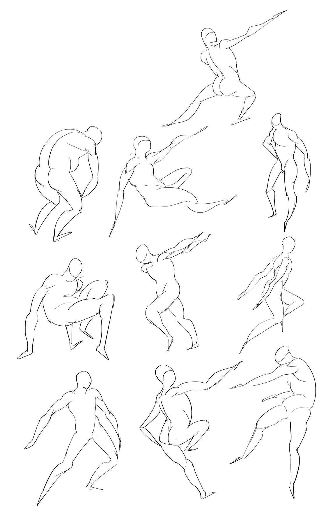
07-05-2019, 01:28 PM
Color experiment:
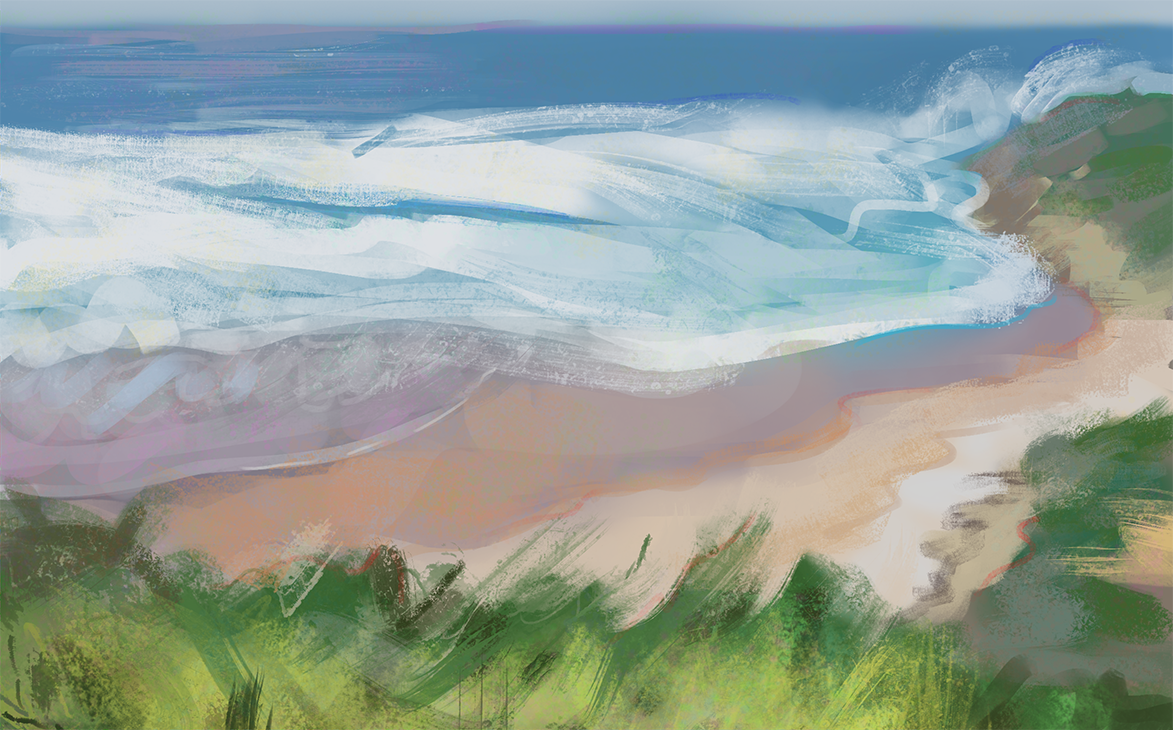
07-07-2019, 04:33 AM
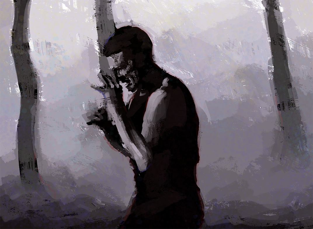
Testing more painting process using 3 values:
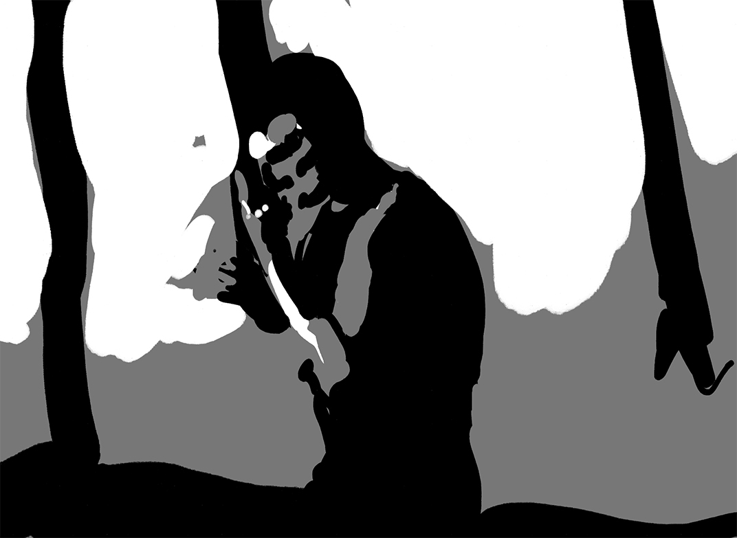 
07-07-2019, 10:39 AM
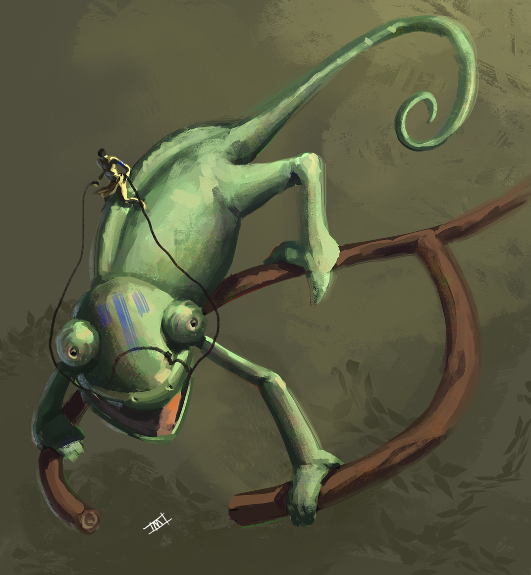
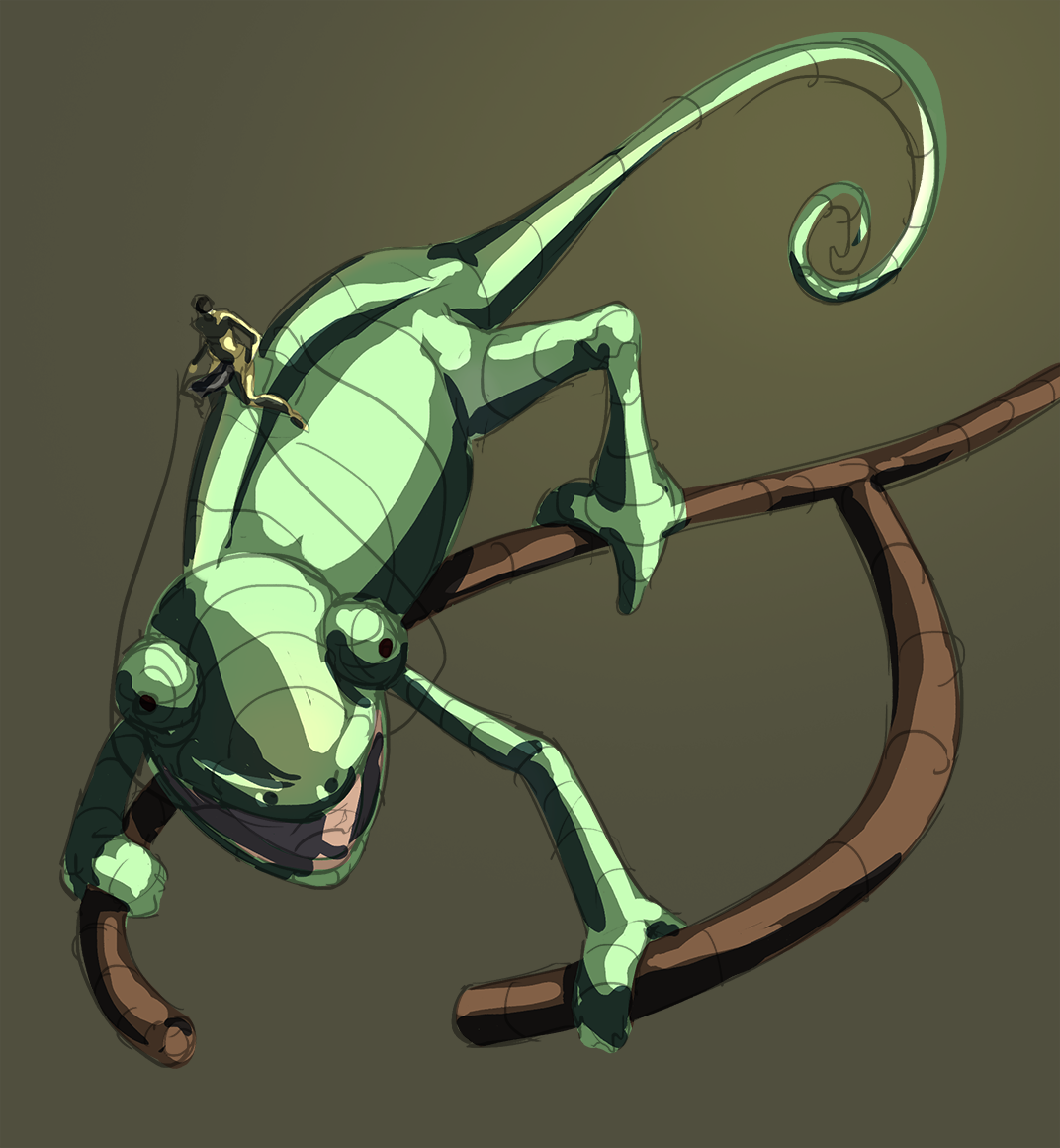
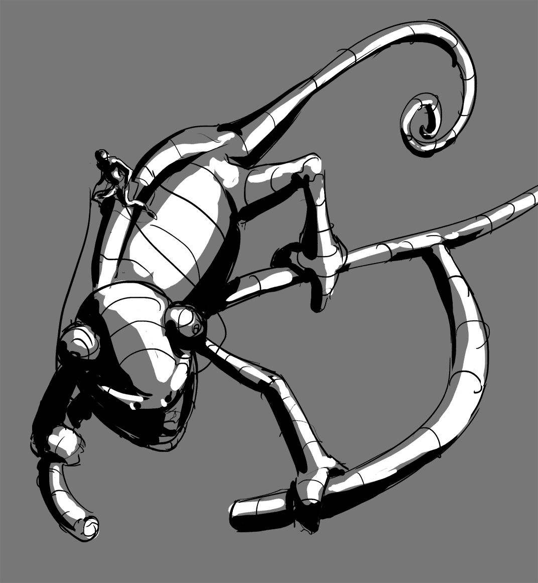
Color test with 3 values process:
07-07-2019, 01:27 PM
Crazy stuff
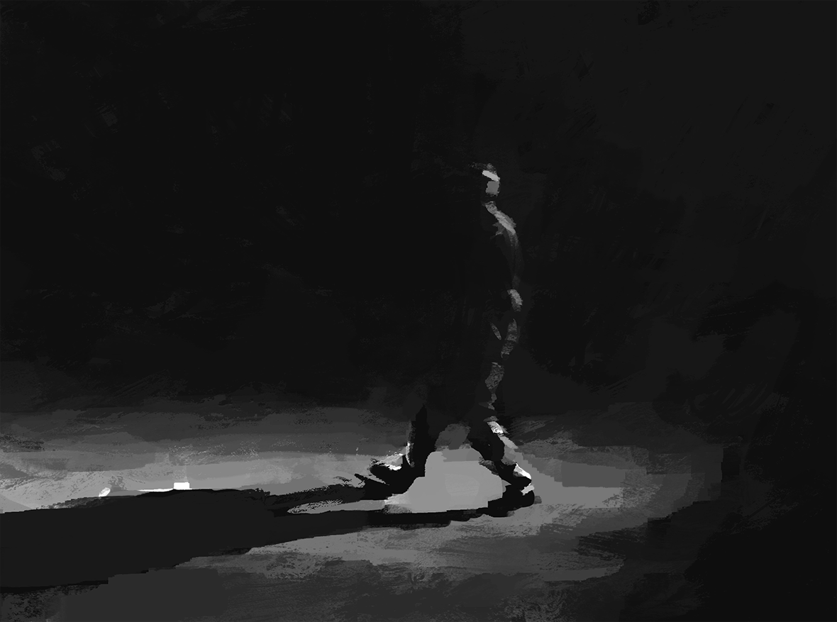
07-08-2019, 03:33 AM
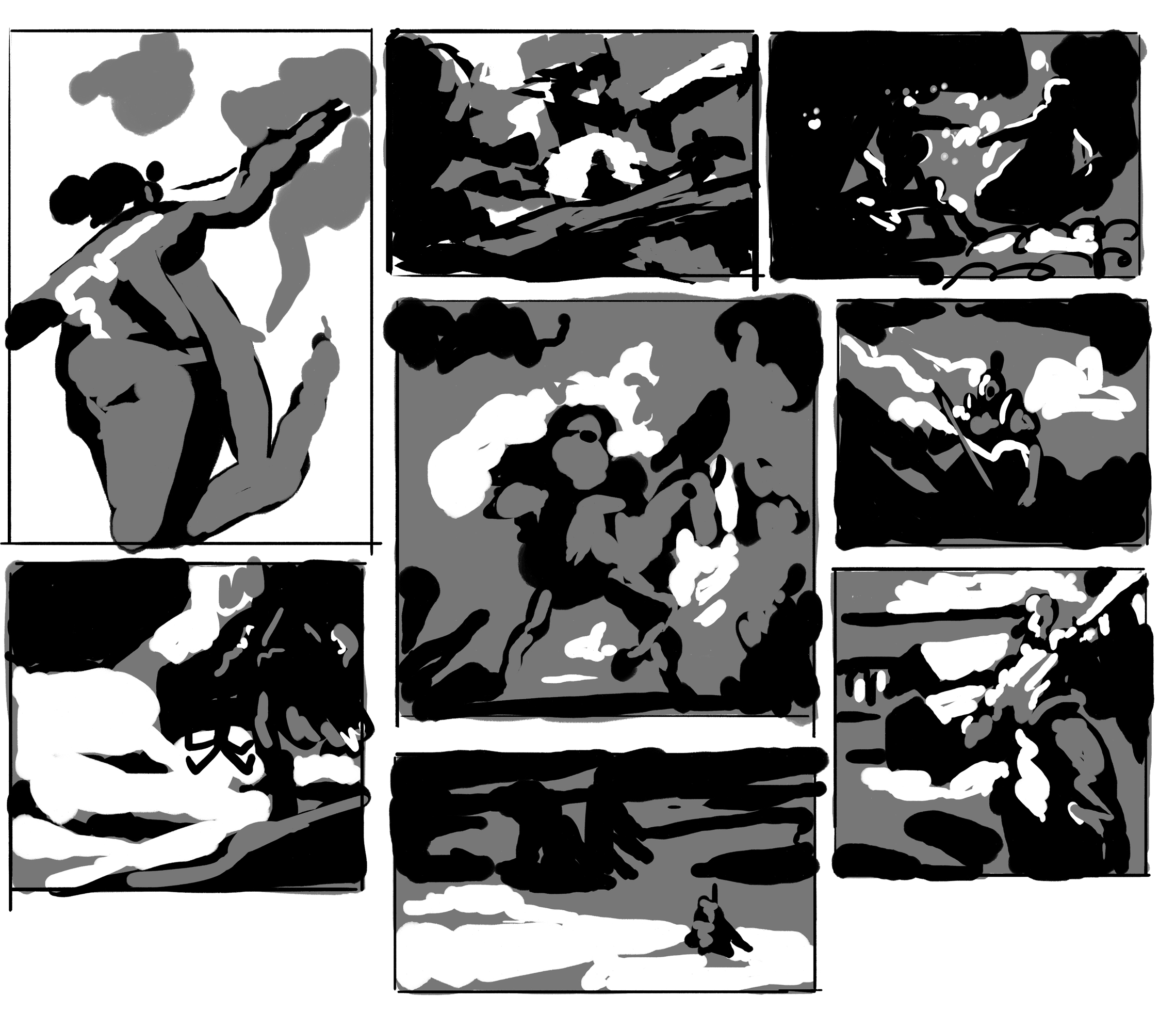
Thumbnail exercises
07-08-2019, 06:56 PM
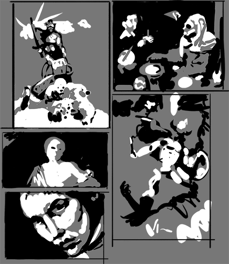
What is fun with thumbnail is you only need 2 layer.One you fill with a 50% gray and an other where you add your dark.
So how do you add highlight i heard you say you simply erase from the 50% gray layers Voila you have a simply 2 layers and 3 value simple process.Just sharing in case this might help you or anyone reading in the future. I suggest a few thumbnail study where you take a few master and try to simplify there value between 3 to 5 value.I think it will help train your eye to see difference in value and also it will help you be more aware of the importance of contrast in illustration.
07-09-2019, 02:20 AM
(07-08-2019, 06:56 PM)darktiste Wrote: What is fun with thumbnail is you only need 2 layer.One you fill with a 50% gray and an other where you add your dark.This is really useful, i'm doing in this way too! i'll start making thumbnails from masters again, its a good way to learn.
07-09-2019, 11:54 AM
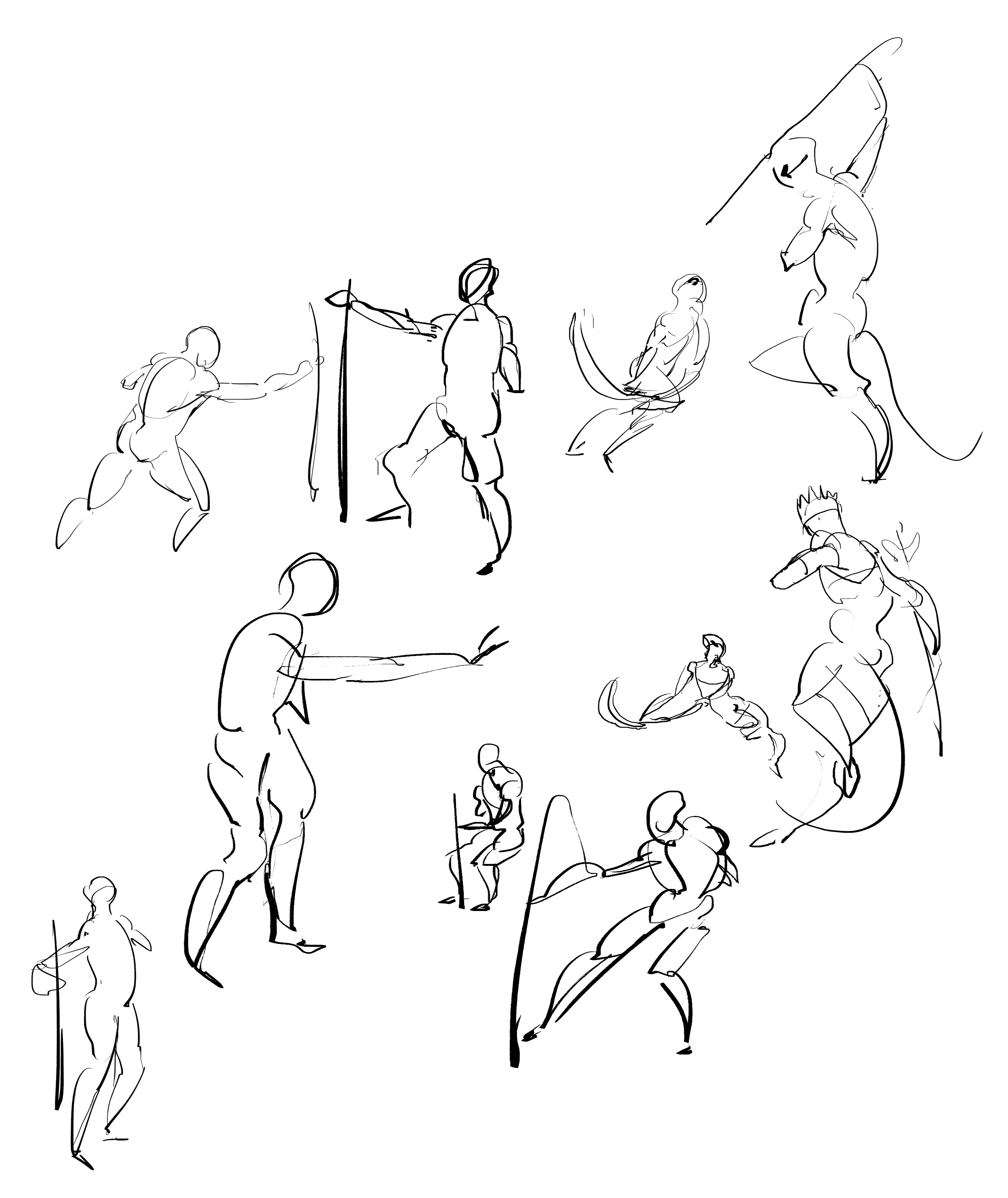
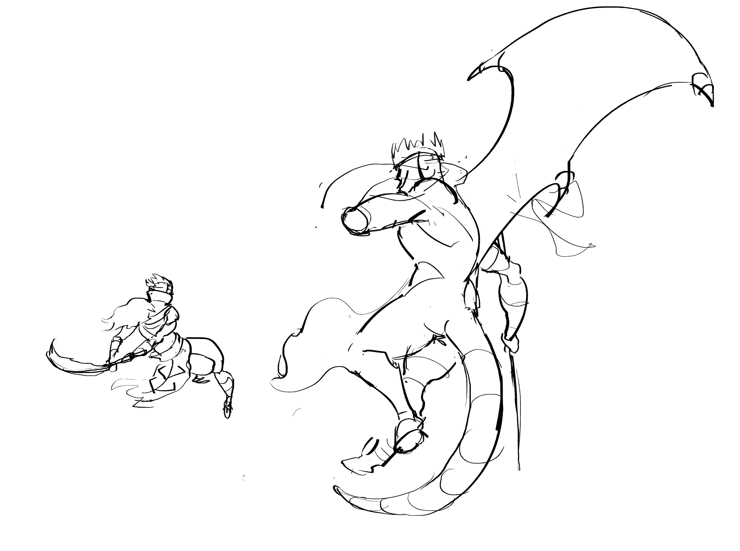
Wip
07-09-2019, 12:23 PM
Thumbnails from the masters
 |
|
« Next Oldest | Next Newest »
|