Posts: 374
Threads: 16
Joined: May 2013
Reputation:
59
I’m making a painting.
Since there are a few people on the forum interested in or curious about traditional art/oil painting, I figured I’d make a thread for it. Thought I’d go over whatever seems relevant or interesting throughout the process and maybe it will be helpful to those new to it or those who haven’t gotten very in-depth into painting. I’m not some super big-brained guy that knows everything or the most amazing painter in the world, but it can maybe be helpful to someone and point in the right direction.
Just as a disclaimer. There are a bunch of different ways of painting and it would be impossible for me to cover everything. What I’ll do is to mostly focus on how I paint but try to include anything extra that may be interesting. I'm also not going super in-depth on every topic because that would way too much for just a forum thread. I'll maybe link to or reference books that expand on anything I bring up.
Feel free to post questions and whatever comes to mind in the thread. It’s good to know what someone is interested in, confused about or struggling with so there’s a better chance that I say something helpful.
So as I’m in the process of setting things up, I can talk about that. First up, the canvas.
Discord - JetJaguar#8954
Posts: 374
Threads: 16
Joined: May 2013
Reputation:
59
Canvas
The canvas I’m using is a Belgian linen, that has been sized and primed with an oil-ground. The reason I use oil grounds is threefold. One, they’re more stable and provide better long term adhesion than modern acrylic grounds. Two, they are much less absorbent so the the painting will sink-in less so I don’t need to oil it out as much and introduce more oil into the painting than necessary. And three, oil grounds are slippery and this lets me paint a the underpainting fluidly as if I was using medium without having to use any. When there’s an underpainting in place, it will be less slippery and things stabilise more.
The choice of texture or weave can come down to a few different qualities. If a painting is very small and people are meant to view it up close, it can be wise to have a tighter weave canvas as it will distract less. If you want very distinct brush marks but keeping things somewhat thin, smoother canvases can help with that, perfectly smooth canvases have a habit of making brushwork very sharp.
The canvas itself can convey materiality and when painting more coarse subjects, it can add to the overall effect to have a more textured canvas. Weathered looking men tend to look more weathered on rougher canvases and young women tend to look smoother and prettier on a smoother canvas.
More textured canvases are often materially stronger and are more appropriate for larger paintings. Coarse canvases also preserve a texture through several layers of paint. The reason you’d want this is that the texture breaks up the edges of brush marks making them appear somewhat softer or more integrated. It also stabilises the paint, giving it more grip when working. The pores of the canvas give a relief that the paint can fill, giving a mechanical attachment between the ground and paint layer, reducing the chance of flaking with age. Smooth detailed work can be achieved on coarse canvases but it often needs to be approached a little differently than on a smooth canvas.
Personally I like coarse canvases but there are some thin effects that can only be achieved on smoother canvases so I use both. For tighter canvases, the surface should still have a bit of bite to it so it properly grips the paint. Oil grounds are usually thinner and have a bit more tooth than acrylics. In general, I like a thin ground so you can feel the weave of the canvas more. Thin grounds are often more flexible with age although they do become more transparent, so darkening can be an issue. Many modern oil grounds are made with titanium so transparency shouldn’t be as big of an issue as they age, making thin grounds more viable.

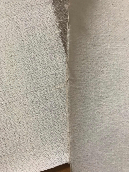
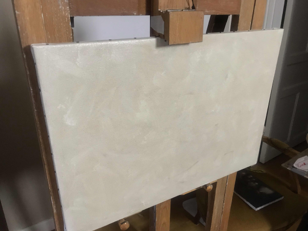
This is an example of the two canvas types I’ve been using the past year. The right is a tight and smoother canvas, good for smaller paintings or when painting more thinly. The canvas on the left is more coarse and can be considered a “medium” or “medium-heavy” texture. In the future I will be experimenting with even coarser canvases, hopefully using them for larger paintings but for now, I’ll be using the medium canvas.
Stretching
While you can buy ready made canvases fully stretched, I’ve always preferred stretching my own. It gives me full freedom of the size I want to work with, it leaves me with small bits of extra canvases I can use for sketches and studies, it also is just part of the work of art, being a crafted object by the artist. The more I do myself, the more of my object it becomes.
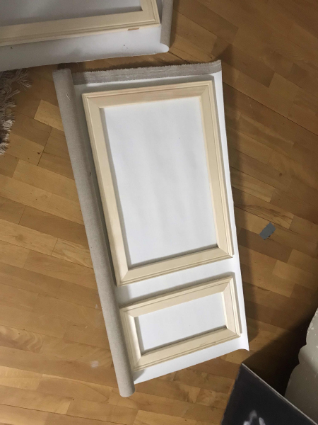
Before I cut my canvas to size, I often measure out more than one painting. Playing a little game of tetris to see what the most optimal layout is for the paintings I want to make. I then cut the canvas with a margin that will cover the width of the stretcher as well as enough for the stretcher clamps to hold on to. This depends on your materials and tools and you get a feel over time. It’s always better to add a little extra in the margins than you think you may need.

(ps, with the small canvas, I may do a post for going outside and painting landscapes)
I like thick stretcher bars. The ones I used in my student days were too thin and behaved weirdly on larger paintings. These have a bit of girth and are much nicer without being too expensive.
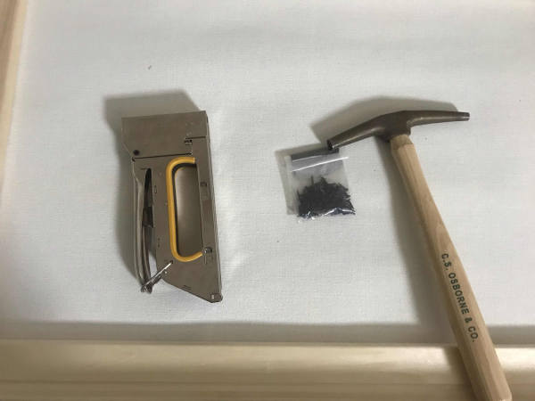
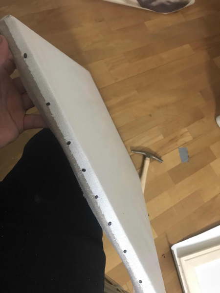
There are two primary attachments when trying to stretch a canvas. Staples and tacks. Staples are more common now, they’re quick, convenient, easier to aim etc. Tacks are the traditional way of attaching a canvas to the stretcher and I personally prefer it. It takes more time, is a hassle but the end result is an overall nicer, more handmade canvas. Tacks also damage the canvas less, as the staples can rip more easily and can puncture through the canvas entirely if the wrong kind or wrong power setting is used.

When stretching, I always start in the middle with one tack on each side, then progressively move out from there, centre out, stretching and tacking one bit at a time. It’s time consuming but ensures an even stretching with no trapped waves or uneven tension. If there are tiny waves in the canvas, they’ll most likely relax after a day as the canvas gets used to being stretched. Bigger waves often need to be re-stretched but which isn’t a huge issue.
The stretcher is just the support for the painting. If you make something great and someone wants to maintenance the painting in 100 years, it can often happen that they re-stretch it and replace the old stretcher bars with new ones. It’s also common to add canvas along the edge when the work is being re-stretched. I used to worry about re-stretching canvases but it’s fine if you have to, the part with the paint is what people want to preserve. That being said, don’t be needlessly reckless.
(oh and remember to have the white part on the outside, unlike in the pictures above, this was just for measuring)
 Imprimatura
Before I begin painting, I like toning my canvas just a little bit. In the past I used to tone my canvas to a medium value but lately I’ve enjoyed lighter grounds. There isn’t any rule for this, it’s really down to personal preference and your own techniques. At times I’ve liked trying to tone my canvas to a general halftone in my subject and attempting to never having to touch in throughout my painting, leaving an area of pure, un touched canvas.
In general, painting over lighter grounds will make the paint appear warmer and painting over a darker ground will make them feel cool. This can of course be overcome by painting more thickly but it is a quality that can be used in interesting ways.
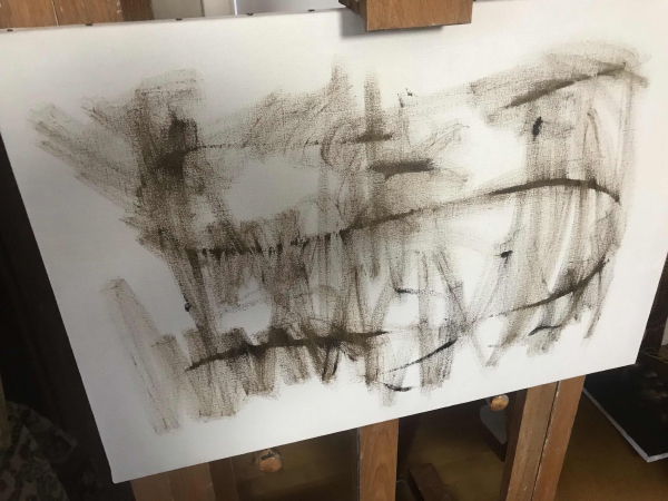
To start I select the pigments I want to use for my imprimatura. It’s a good idea to select strong and fast drying pigments for this. I am using mostly raw umber and a little bit of mars black to cool it down. This forms a brown green grey that I first spread over my canvas somewhat haphazardly. Then I take a paper towel with some solvent and wipe it across the canvas, evenly distributing the pigments. I then begin to try to use my paper towels to rub off the color, lightening it until it’s the desired tone and texture I want.


I like to try and disrupt any pattern in the imprimatura, as to not bias me when I begin my painting.
I wait for this to dry fully, often just a day unless it’s very cold or humid. When working pure alla prima this can be done and directly worked into but then it’s best to use turpentine and be conscious of how to handle the surface if you don’t have the time to wait. There’s nothing wrong with starting on a white ground but I often find myself spending a bunch of time just trying to get rid of all the white instead of focusing on the actual painting. By toning it down a little, it’s easier to focus on the painting rather than all the pure white canvas.
Alright. That’s enough for today.
Next up I think I’ll talk about pigments/colors, what my palette is like and some brushes.
Discord - JetJaguar#8954
Posts: 852
Threads: 6
Joined: May 2018
Reputation:
116
Cool! Thanks for sharing, will definitely be following the thread. What are you going to paint?
Posts: 374
Threads: 16
Joined: May 2013
Reputation:
59
Joseph -
Just making a little still life. The morning light here is very white/cold and I wanted to make a painting that isn't dark and moody. Feel like I'm wanting to explore more bright things. I think a lot of art has this tendency to get dark because people like the comforts of their dark studios and I feel like I maybe want to get away from that.
Alright,
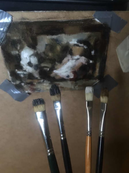
So I was going to just jump in and get started on the painting but I was convinced to do a little study first. Was probably the right choice. So here's my little color sketch. It's really small, just trying to get the overall impression. Had to balance this board on my knee because my easel was holding my canvas, but it's fine, was a fun experience.

Some advice when doing color studies.
You don't need medium. Medium is generally there to make the paint flow more, to cover things more easily etc. If you're doing a color sketch, you're working on such a small scale that even very stiff paint moves just fine. Paint with more body is also easier to control, at least for me it is, so it's appropriate for color sketches.
Detailed drawing is for the final painting, just get the proportions down and it's fine.
It's easy to start with your dark colors, put them in as the base for the drawing and overall shadows, then build up the light on top. Even if you're working on a dark ground, the shadows and dark values contain a lot of "drawing" related information so establishing it early is a good idea. Most of the time you want to block in the biggest differences between your work and the subject, but you can also pace yourself by working from the darkest value, to the half-tone and then to the light. It's good to always refer back to the dark values as they often need to be adjusted once all the colors are in place, at that point you want to spend time altering all the big values/colors until they are correct.
There doesn't need to be any "rendering" but getting some of the illusion of mass is good. One way I do this is by working from dark-to-light in any kind of "rendering". This way my light brush marks overlay the dark ones and the light feels like it's approaching the viewer and the shadows receding. Some times of course you need to paint dark over light, but as a general rule I try to layer my brush marks this way. This was something Ilya Repin would do in a lot of his work.
When it comes to the thickness of paint, in general try to have the light passages be thicker but also just the things you want to have a feeling of mass should be thicker too. So things in the background can often be thinner than things in the foreground.
In this painting I used a chromatic transparent dark made out of ultramarine and transparent red oxide. I also have some mars black but I used it more for my other mixtures, to keep my shadows a bit deeper. Mars black and ivory work fine for shadows too but they aren't as transparent and if you want them to feel transparent you need to paint them much more thinly.
You don't need small brushes, even when painting small things. These are the brushes I used for the entire painting. To get all the small marks, I either painted into other shapes, picking up some of the paint on the canvas when doing so (something bristle brushes are good at), or I just used the sides and tips, got creative in how I make my marks.

The brushes in the pic are my scrappy old brushes I use for most paintings. I have a lot of very nice brushes but it's often easier to use my more worn down ones because mentally I relax more when using them.
Using big brushes helps keep things feeling natural. So many of the nice effects in painting are lost when you scale down your brushes because most edges have to be manually painted rather than just form from the placing down of paint. I really try to seek a sense of naturalness in my work so I always try to avoid that kind of synthetic feeling you can get when you try to paint something very directly rather than suggestively.
I've got new years stuff to get to so this isn't a super in-depth post. Will do a longer post about color and stuff later.
Discord - JetJaguar#8954
Posts: 374
Threads: 16
Joined: May 2013
Reputation:
59
Color
The selection of pigments is in some ways important. They often influence the mood of your work. A palette utilising cad red, cad yellow and ultramarine blue while very broad in range, often lacks a lot of nuance and character that you’d get form a more earthy palette. Every pigment has its own character and some pigments tend to be more useful for painting than others. Pigments also differ in their permanence as some are more likely to fade, darken or crack over time.
In general, I prefer resting more weight on color mixing rather than having perfect pigments available. I like lower chroma painting and I like trying to do more with less, rather than trying to always chase the most chromatic color possible. Many artists throughout history have advised to use as few colors as possible, particularly earth colors and it's something I try to follow and encourage in others. With fewer colors, paintings tend to be more harmonious and if mixed carefully, still colorful. Earth colors are also to be preferred as they are all very permanent and have a sense of dignity to them that more chromatic colors rarely have.
In Solomon's book he writes “It is wiser in every respect to restrain your selection than to attempt extraordinary effects which are not likely to last, and which may tempt you to overstep the proper limitations of your medium”.
Speed writes in his book on painting "Always do as much as you can with the earth colors, particularly in the early stages of a picture" and "The more brilliant colors have a fascination for the younger student. Prone to messy handling and dirty brushes, they rush to the brighter pigments in the hope of getting themselves out of a mess; whereas with cleaner handling what is wanted could better be got by simple earth colors, the use of which give on an excellent training in clean handling."
There are a lot of new ideas about how someone should construct a proper palette but modern theory doesn’t always translate well intro practice while good practice is good regardless of someone’s theory. It’s generally best not to worry too much about these very technical systems people come up with.
If your particular palette can’t match a color 1:1, you can shift all other colors in a direction to make room for the color you have less range in. Can’t get a strong blue out of your palette? Make everything warmer and the blue will feel more chromatic. If you don’t have room for a high chroma color, you can also lower the chroma or other things and make it feel higher in chroma in a relative sense. When colors are approached relatively, even very limited palettes become very functional and a lot of room for creative color expression opens up without having to deviate from the appearance of nature. A popular example is Zorn, finding ways to work with very limited colors.
I tend to use a similar palette for most things but I do enjoy experimenting. What I use is not all that fancy, it's very limited but it works well for all kinds of painting and it harmonises very well.
My general palette is:
Titanium white
Yellow ochre (sometimes called gold ochre, the darker version).
English/Venetian red, (Cad red when needed)
Transparent red oxide
Ultramarine blue
Mars black
Overall it's a very simple and limited earth palette with two transparent colors for deeper shadows and a little bit more range in the blue-green zone.
I use titanium white because it’s practical. Lead is better for many reasons but if you work carefully with your color mixtures, it isn’t as huge of a problem as a lot of people make it out to be. I suspect a lot of people dislike titanium white because they brush mix a lot and in those cases I can entirely understand disliking its tinting strength. When mixing colors with a palette knife and you don’t brush around so much, it’s very manageable. It is less stable than lead and takes longer to dry which is an issue but it’s still a decent color.
Yellow ochre is a great earth color, very stable with a very nice body. It can be used in large quantities in any mixture just fine. It’s great and I rarely see a reason not to have it on the palette unless I’m doing a grisaille.
English and Venetian red are earth pigments and very stable. They have a strong tinting strength so very little is needed in a painting. I can’t tell the difference between the two, I suspect it’s just a slight tint difference and not much more. You just need one of them. They're a little cool and dark, so if you want a very bright red, cadmium can be a better choice.
Transparent red oxide is what it sounds like. It’s a dark transparent red that can often be very practical for darker tones or when you want to gently warm a color mixture.
Ultramarine is to expand my range in the blue and green zone, helping a bit with landscapes and some of my still life paintings. It has a strong tinting strength so very little is needed when cooling down some mixtures. The other benefit of it is that when mixed with transparent red oxide, it forms a very transparent black that can be used for glazing or as I use it, as a way to make my dark tones more transparent. I often mix it with a little mars black just so it forms a more medium transparent paint to help with deeper shadows.
I use mars black instead of the more common ivory black for two reasons. The primary has to do with the paint film. Mars black, like many other iron oxides, forms a strong paint film whereas ivory forms a weaker, more brittle layer. Cracking in dark passages is often the worst because if it shows the ground underneath it will appear light and if the edges of the crack turn slightly, it will catch light, drawing in attention. So avoiding cracking in dark passages is very important to me so Mars is preferable. The other reason to use mars is drying time. Mars requires much less oil and also dries faster. When working on a painting day after day, faster drying time is good, especially for dark passages as painting over half-dried paint tends to sink in much more. Mars black does have an aggressive tinting strength but cutting it with an ultramarine and transparent red makes it much more mild and manageable.
It is trendy to exclude black from painting but it’s not really something I do. While black isn’t a “color”, the negation of light exist in reality so there is no reason to exclude black if we care about the impression of reality. The impressionists were mostly just being edgy by excluding it completely. It can be wise to think about the transparency and chroma of your black and this is where the ultramarine and transparent red comes into play. Some people think the the chromatic transparent black doesn’t count as black but functionally it's black.
If you find your paint to be very soft or a bit too oily, you can mix in a little bit of powdered chalk and it will give it more body. It won’t cause any change in color as the tinting strength of chalk is almost non existent. You can even mix it with black workout any issues. You can also make a putty out of chalk and linseed oil and use it as a medium or a paste to change the feel of the paint. Chalk is inert so it won't react to any pigment or oil, so there are no worries about poor ageing. I've seen the good condition of Rembrandt paintings attributed in part to the use of chalk in the paint but I haven't done much research on that particular example. Velazquez is another example of an artist using chalk when painting.
The brand of the oil paint can at times be a big deal. Some brands try to sneak in other pigments into their tubes, like I found some Rembrandt blacks had blue pigments, I think ultramarine, in them. I had some Lefranc ochre colors and they were completely different from other ochre colors. I found out when looking at the pigment number that it was a different pigment, I think a synthetically manufactured version of the color, even when calling it the same as other brands. Companies do this to try and impress people with having pigments that seem deeper or higher in chroma than other brands.
Generally, pigment quality has improved greatly since the 17-1800’s, and the need for the best most perfect quality pigment is less important now as most things are adequate. There are however different individual qualities, like for example the amount of filler and handling-altering materials included. Everyone says they try to make it as pigment dense as possible but many actually add other things. Old holland is a good example for comparison because as far as I know, they have very pure paints but the way they feel is often very different from something like a winsor newton paint that has more fillers in it.
You can also have pigments that have gone through different levels of grinding. Old holland’s yellow ochre is very coarse, you can hear it make sand-like noise when you mix it with your palette knife. Becker’s yellow ochre (they call it gold ochre) is very smooth and has gone through more grinding. The amount of grinding changes what the paint feels like, sometimes even alters how stable the paint film is.
Overall tubed paint tends to be on the softer side and something I recommend is to let the paint sit on some cardboard for a few minutes before using them. Some paint tubes are overflowing with oil and literally drip from the tube. With these it is very important to remove the excess oil. You want a nice creamy paste to work with, at least as a default.
Mediums
I won’t use a lot of medium when painting. The most sound way of painting from a material and archival perspective is with paint about the consistency it comes in the tube (depends on manufacturer it can vary, often a little less oily than most commercial tubed paints is the best). I use some solvent when painting but the amount is very little, only enough to make the paint a little more willing to move, but much less than many modern techniques.
The reason I only use solvent as a medium is because of a few reasons. I want to limit the amount of oil that is in my painting as it contributes to yellowing and darkening. It will also evaporate as I work, allowing me to more easily paint over earlier layers. Oil remains wet and makes it difficult to work over thinly painted areas without causing a mess, so solvent is often preferable. I generally use mineral spirits as it evaporates a little slower than turpentine and is less hazardous to breathe. Historically turpentine was favoured but great artists like Repin used everything from mineral spirits to kerosine, they all function very similarly when painting.
I have to be cautious to not use too much solvent as a paint film that has been too diluted can become weak and cause colors to be fugitive when varnishing (meaning that they leave the oil film and can stain the other colors). Some modern artists are on the border of solvent abuse and I suspect some of their paintings will be more fragile and difficult to clean in a hundred years. A simple rule to follow is that if the paint still feels like a paste and not a liquid, it probably has enough oil in it to form a strong and healthy paint film. Thinned down paint also looses a lot of character and can make a painting come across as a mass produced copy of a painting. If you want to move the paint around with brushy marks, sometimes it’s better to select a very stiff brush and physically push it around rather than diluting the paint with medium.
Some people may be familiar with the term “fat over lean”. This is a kind of “rule” that has been developed for painting that is often treated as a must for all artists but the reality of the situation is that it’s a bit more nuanced than that. The reason the rule came about is because paint thinned down with turpentine can become so lean that it doesn’t have enough oil to hold on to all the pigments and when re-varnishing the painting some pigments can come loose and be a big problem (fugitive colors as I mentioned before). The reason you don’t only paint in fat layers is that fat paint layers don’t adhere to each other well and the more oil there is, the more the painting is susceptible to darkening, yellowing and wrinkling.
There's a state between these two points often referred to as the "critical pigment volume concentration" or cPVC. This is where the paint has just enough oil to saturate all the pigment but no more as to cause issues with darkening or adhesion. This is close to the consistency paint comes in the tube, but can vary as some paints are much softer than others.
There’s a good article on the natural pigments blog about this https://www.naturalpigments.com/artist-m...over-lean/
I think that's enough about color for now. I'm writing a forum post, not a book, so it's probably best that I limit myself. I can go more in-depth on particular palettes of certain painters or movements throughout history, as well as more in-depth about other mediums to use when painting, but that's if people are interested in it.
Discord - JetJaguar#8954
Posts: 1,428
Threads: 12
Joined: Dec 2015
Reputation:
139
Thanks for sharing this stuff dude, really interesting.
I'm still finding my feet with traditional painting (I use acrylics) and I haven't really explored the different pigments yet but I got my first tube of titanium white after having used some really cheap white and the titanium is so opaque compared to the other stuff!
I might also pick up some stiffer brushes as you mentioned because I have trouble pushing the paint around and have to resort to thinning it down with water which I know is bad for the longevity of acrylics.
Happy New Year dude!
“Today, give a stranger one of your smiles. It might be the only sunshine he sees all day.” -- H. Jackson Brown Jr.
CD Sketchbook
Posts: 374
Threads: 16
Joined: May 2013
Reputation:
59
Artloader -
I haven't used a lot of acrylics, I'm not a fan of the fast drying time, so I don't have any good comments on it.
Maybe you were using zink white. It's a pigment not used much anymore in oil painting as it gets very brittle, although it's probably fine in acrylics as it will remain somewhat flexible. If I could, I'd honestly use it but my paintings wouldn't be materially sound. You can get very pretty and sensitive light passages with it. You have to be careful with titanium as it has a tendency to pollute other paints. This maybe isn't a big problem in acrylics because it dries so fast, but in oil you can really screw up your transparent dark mixtures if it gets in there.
I'm very fond of stiff brushes and paint with a lot of body. A lot of paintings done historically were done this way, especially in the lights, although darks were usually painted with more soft paints. I think the look of it is very nice and it gives you a lot of good control when you're more familiar with it. Fluid paint can easily look like those canvas prints rather than a real painting if you blend too much or detail things too fluidly.
Hope the thread is somewhat helpful if you're looking into oils.
---------------------
(I think taking pics helps break up the post, making it easier to read so I'll try to include some to make it more appealing)
Studio Stuff
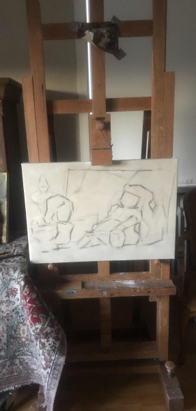
So the easel. Having a good easel is nice but you can make do with very little. When Repin painted Modest Mussorgsky in the hospital, he had to balance the canvas on a chair while painting. I've often gotten away with balancing the canvas on my knee for smaller sketches but if you're doing something large, you'd ideally want to prop it up against something so you can compare the painting and the subject from a distance.
I would recommend an easel that stands vertically for studio work, giving a lot more stability than many tripod easels. Tripod easels are good for landscape paintings as they're very easy to carry but they are less stable and can tip over or twist on larger paintings.

(you can see me blocking in the big proportions of my painting with charcoal)
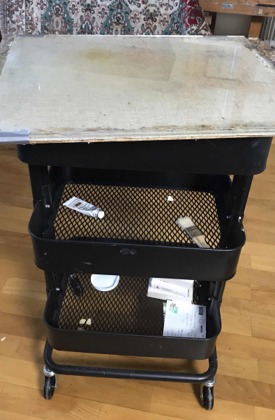
If you're working in a studio space, a painting table is vey very nice. What a painting table is, is essentially a table that holds your palette so you don't have to. It lets you work without having a heavy weight on your arm. In school we had these trays from Ikea that are perfect as they can also hold your paints and brushes in the trays. Something a lot of us did was to tape Pringles cans to the side and they are just tall enough to comfortably hold long-handle brushes. After I left I bought one for myself and it's very nice. (I did some cleaning so it's empty right now)

The palette I generally use is a glass palette. This one is very old and I should probably replace it, but it's fine. I recently flipped it and now there are no scratches on the surface. You can make your own out of picture frames, removing the picture and frame and just using the glass and backboard.
Cleaning any palette is very simple but it should be done thoroughly. First you just have to scrape off any paint with your palette knife. Once that's done, you can wipe of as much as you can with a paper towel. Then pour a very little solvent on the palette, turpentine or mineral spirits, then wipe it around with a paper towel, saturating any remaining paint so it becomes very easy to clean off. Once you wipe the surface and no paint is on the cloth, it's fully cleaned. If you don't fully clean it, small amounts of paint will build up and cause an uneven surface, making future cleaning harder as the palette knife will have a harder time pulling off the paint.
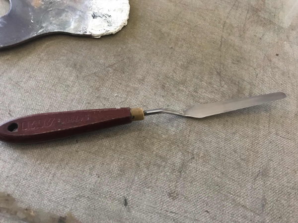
Palette knives are very useful. Many people are tempted when starting out to only brush mix because using a palette knife can be tedious, but working from mixtures promotes cleaner colors. I like thin palette knives as it makes it easier to mix up small amount of half-tones. The tiny palette knives that are very short don't work well for mixing as paint gets stuck on top and they aren't flexible enough to easily get it off.

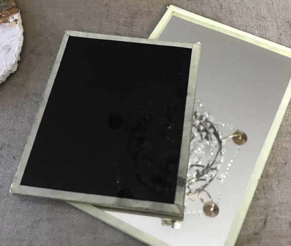
Mirrors are good to have. It's a very common way to get a fresh look at a drawing or painting and very useful to avoid skewed work and avoid missing things you naturally gloss over. I have a normal mirror but also a black mirror. The black mirror technically welding glass but it's not really see through. I use it to look at the subject mirrored in it, and it shows me everything but keyed down a lot in value. It shows the hierarchy of light in a very useful way.

When you have painted for a day and you realise that it doesn't quite work and there's a fair bit of paint on the canvas, you may want to scrape it off. You can use your palette knife to do this but there's a problem. Using the palette knife flattens out the texture of the canvas, pushing paint into the pores and scraping off just the top surface, leaving a flat surface.
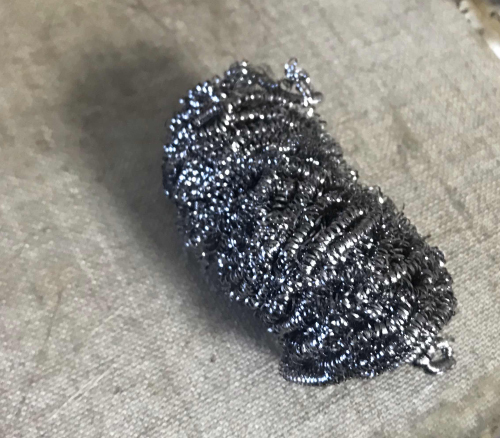
To get around this, Solomon J. Solomon recommended what he called a steel plush mat. What this means has changed over the years and today the closest thing similar to it are these steel scrubbers used for cleaning metal pots and pans. These will dig into the pores of the canvas and pick up that paint, so your canvas preserves its texture. You can use a paper towel but then you smear the paint so much it's hard to see the general impression of what you previously painted.

Wasting paint is never fun but using half-dried paint also sucks. There is however a way to preserve paints very well that wasn't available to most painters throughout history. If you have a glass palette or you take the piles of paint and fold it into some baking paper, you can put it into the freezer and it stays basically the same. The drying process of oil paints is sensitive to temperature and paintings in very warm days dry very fast whereas if they're left in the cold, it takes a much longer time. Some artists used to place their paintings next to a fireplace when they wanted them to dry enough to paint on the next day. We on the other hand can use temperature to delay the drying of our paints so we don't have to throw any extra we have after a day's use.
Now don't save muddy mixtures, when working don't pick up more paint with a dirty brush or palette knife. Try to work very clean and you can save your paints for a few days.
Basic Brush Care
Cleaning brushes is something a lot of people mention but it's very important. Poorly maintained brushes make painting much harder, paint naturally rise into the ferrule of the brush and once dry, the hairs stick together near the base. This functionally shortens the length of the hairs and looses the sensitivity of the brush. Poorly maintained brushes can also cause the hairs to splay which is difficult to correct.
When you clean your brush, you can begin the process by wiping off as much as possible with a paper towel. Then dipping it in a bit of solvent so the remaining paint becomes softer and easier to remove with a paper towel. Finally you want to wash the brush with water and soap. The type of soap makes a difference and in general you want something mild, unperformed and simple. There is soap made from linseed oil that works well but I prefer something called "grön såpa" here in Sweden which is a very common and simple soap made from pine trees. I think it's a norther European thing so maybe it isn't available everywhere.
The way you'd wash your brush can vary but in general avoid having it directly under the stream of the water and don't push against the hairs. Constantly pull away from the hairs almost as if you were making a brush stroke. This prevents the hairs from bending and getting splayed. The easiest way to clean them that I have found is to get soapy water inside of them and then move the brush in a circle on my palm, making the hairs massage each other, getting the soap deep into the brush to remove any paint. Using this method you can be more firm as you're always pressing with the length of the brush so it doesn't harm it. You do this until the soap foam remains white and you're confident there's no paint left. If you've used a black with a strong tinting strength, it is possible that a brush may be slightly stained in parts but it doesn't harm the brush and if it can't be removed, it's not a big deal.
You want to wash your brush immediately after use. When you're out doing landscapes, bring some plastic wrap and wrap it around the tip of the brush bundle. It is possible to removed dry paint from brushes but every process harms the brush to some degree. Bristle brushes swell in water and this swelling can cause it to splay when attempting these methods.
You can store the brush in oil as to not have to clean it and while it works, I did that when I was a student, it's not something I'd recommend now. Oil penetrates the hairs and will change the feel, making them a little less spring. Some like this, others like myself don't. It causes you to introduce more oil to your painting, even when you try to wipe them off well before painting. The oil you often use for this is poor quality oil and if that gets into the painting, it can darken more than the type of oil you use in your mediums. When traveling, you have to take extra precautions with your brushes as over an hour, some more oil will seep out of them and if you've left them somewhere you may stain something with oil. It is also difficult to reverse the process. I've done it with my old brushes, but even after cleaning them very very thoroughly, some of them dried sticky and I had to go through a lot to remove that dried oil.
Now there's a secret to very nice brushes. This is a secret that is widespread among artists but not really spoken aloud all that much. The reason is because this thing is really weird but works stupidly well. When you've cleaned your brushes and they're wet, the hairs naturally splay a bit and if left to dry, their shape stays a little splayed. Now the way you get around it is by using something to coat the brush hairs, that let you shape them while they're wet and dries hard without introducing materials hazardous to paint. The thing you use is spit. Saliva has the right properties to allow the brush to be shaped into its original state and when it dries, the hairs are a little hard, holding the hairs in place firmly. It is brittle when dry and once you start to bend the hairs, the dried spit breaks and the brush is nice and springy again. It's weird and gross, but it works super well to preserve your brushes. When I was a student, at the end of the day you could see people in the corner of rooms spitting in their palms to coat their brushes. It was endorsed by the instructors but it never stopped being weird doing it around other people. I've heard milk also being used but nobody I know has actually tried it. Oh and don't suck on your brush if you've been using lead white. There are accounts of artists throughout history doing this, assuming their brush was totally clean and getting lead into their system.
That's enough for now. Have stuff to do tomorrow but will probably jump in with the underpainting the next day.
Discord - JetJaguar#8954
Posts: 374
Threads: 16
Joined: May 2013
Reputation:
59

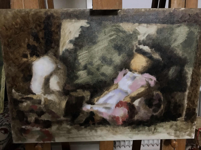
So I started my underpainting today. The goal of an underpainting can be really different depending on technique/approach. Some prefer to have it focus heavily on the drawing, so that the later painting stage can focus more on colors and values. Others find that they want their underpainting to be a stage where they can explore and experiment more before settling in on the direction they want to take things. Some take the material handling very seriously and set up the underpainting to slowly glaze in their lights/darks over several sessions.
In my case, the underpainting is just to set up context for the paint that goes on top. To establish all the fundamental qualities without going into details or overly defining them. It's also important for me to keep things thin and stable, so as to make a painting that is materially strong and archival. I want the end painting to be something made wet-in-wet so I'm trying to set things up so that later I can go section by section, painting it to a finish without feeling like doing that radically changes the appearance of the painting. If I were to start in one spot and paint it to a finish before the overall impression is established, I'm essentially moving blindly, not being sure where the painting will take me. So that is why this kind of underpainting is important to me, to figure out where I want to take things.
The underpainting isn't done, the light got dark quicker than I expected, but it's not a big problem. Working wet over dry isn't a problem if you later intend to paint over everything anyway.
Something to note, I strongly believe that in order to judge values/contrasts properly, we have to eliminate all lines from our work. Lines are a conceptual tool that is often used to define the contours of things, but it's also used to emphasise the contrast. If we for example have a painting but things are outlined in a black line, every place where one color meets another is divided by a line that increases that sense of contrast. So the line tells us that what we see has a much greater contrast than maybe the colors would naturally have when next to each other. So unless we're planning to have lines in our final painting (which is fine if you want to do it), including them will mislead us to what the visual contrasts are actually like, making it harder to judge things properly.
Now when looking at my painting, we can see that it's very rough. There's not much of a "drawing" going on, the edges of things have all been painted in a patchy, almost vibrating way and there's not much of an attempt to make things pretty. This is intentional and I'll try and explain why things are the way they are.
The broad idea of the approach to this painting is that by painting the big visual impression I see, I am going to end up making something that has all the fundamental qualities of the subject, so the overall form, the proportions, the gesture, the overall sense of light etc. Then once I feel like the big impression is solid, the details will be very easy to put in. In a sense, it's following the idea of working general to specific. (now while I do talk about the visual impression a lot, I do think about the form too. The things go hand in hand but I try to get the light and color down first, then try to turn the form)
By painting in patches of color rather than long brush strokes along the form, I make the painting vibrate and I've found that it's much easier to correct and work on a painting when it has a sense of vibration and dither rather than when things feel too solidly connected. When I was a student doing all my charcoal drawings, I would refine the shapes to be super tight and once they were very clean, I found it very difficult to correct, change or further develop the image, it all felt so "locked in". The technique I developed then was to essentially hatch with my charcoal or eraser over the area I wanted to work on and it introduced this vibration/dither that made it much easier to work.
This idea was very important to me and it's something I've always tried to keep in mind when drawing or painting, as I have a natural tendency to tighten things up over time, eventually making it feel "locked in".
I think this idea of locking in a drawing or painting is one a lot of people share and I think we've all experienced the times when we've attempted to really carefully start with tight a drawing and then developing it into a painting and things go very poorly, it's all dull and underwhelming, and we don't really feel as free to change or correct thing as we are when we just start from very rough sketches and kind of wing it. I think this has to do with how locked in we feel and we don't have this vibration/dither that we do when our work is much rougher.
If we look historically, we actually find a lot of very rough techniques being used when developing very fine paintings. Coarse bristle brushes creating rough textures, big brushes are used to avoid modelling too much of the small finer shapes, the broad impression is more scrubbed in than it is painted. I think these things were done this way, in part because it's easier to work on something when it has that vibrating roughness to it.
All this is to say that the mess I'm creating, is in part intentional.
I think I'll spend one or two more days painting the overall impression before starting to paint it section by section. Next session will be more about correcting the values and colors, today was more about getting it going and finding the proportions of things. I sometimes feel like you need to throw yourself into things rather than hesitate too much at the start.
Discord - JetJaguar#8954
Posts: 1,428
Threads: 12
Joined: Dec 2015
Reputation:
139
Hey man this is really interesting - at one time I wasn't sure if alla prima painters did underpaintings but I then read that Richard Schmid does an underpainting and now I see you are doing one here using it to almost map out your way forward?
Also the whole question of starting with a really tight drawing and then going in with paint has perplexed me for ages - I love doing line drawings and have been exploring ways of starting with a tight drawing and then going to paint but it often ends up with me losing my way during the painting stage. Your approach here seems to dispense with line drawings and so you draw as you paint. It makes me feel that line drawings and painting are mutually exclusive?
Thanks for sharing man - looking forward to the next episode :).
“Today, give a stranger one of your smiles. It might be the only sunshine he sees all day.” -- H. Jackson Brown Jr.
CD Sketchbook
Posts: 374
Threads: 16
Joined: May 2013
Reputation:
59
What exactly alla prima painting is can be different depending who you ask. Some people believe it has to be the first session of a painting and it has to be completed after one day. Others consider it more a technique rather than a time constraint and in those cases underpaintings work. Because of this confusion I tend to not use the term too much. I prefer the term direct painting because it is more broad in description focusing on the particular technique of painting opaquely and solidly which is what I do.
The thing about oil painting is that you generally want to work wet-in-wet. When the paint is still wet, you can paint into it in a way to make the brushwork merge together with itself. If you let it dry, you can no longer merge the brushwork into the surface (well you can but it requires using a technique called oiling out and that's its own thing) so in order to make solid well-merged brushwork you essentially have to re-paint the whole "thing" in one session. So like if I'm painting the doll's head and I don't like some part of it and want to adjust it, I have to re-paint that section in order to correct that one thing, I can't just paint the small correction as the brushwork won't merge. This is why setting up a kind of underpainting is good. It gives you a chance to see where the painting is going before getting too far into it, so I don't spend time working on something that I later discover to be in the wrong value range or something like that. It also sets things up so I can work section by section, keeping the areas I'm working on wet as they're finished.
When you're having trouble working from a drawing, what can happen is that if your lines aren't correct, they cause troubles in later stages. Like if you draw the contours of something, then paint the stuff inside of those contours and realise things don't connect properly, that can be because the contours were wrong and you weren't able to see it without that internal information in place. When making preparatory drawings for a painting, it can be good to fully explore the internal stuff so you don't end up with those problems (example http://lcweb2.loc.gov/service/pnp/ppmsca...23058v.jpg You can often tell what is a preparatory drawing for a painting as they often have a grid pattern drawn over them to make transferring it on to a canvas easier)
Lines and painting aren't necessarily mutually exclusive. Lines aren't a visual thing, they don't exist in the way values exit. They're usually there to represent a contour of form or a change in contrast. When you have a painting, the colors/values themselves represent that form and contrast, so by having lines, you have two things representing the same thing. This can be fine if it's the kind of image you want to make, but if you intend to make a painting of only masses of colors (the way reality looks), the sooner you get rid of the lines, the sooner you'll be able to judge the contrasts of what you're looking at. When you have both going on, it's hard to judge the proper contrasts, you'll often find your colors/values underestimated because the lines increase what the contrasts looks like. You can get around this a bit by having very thin and very light lines, as they don't add too much contrast.
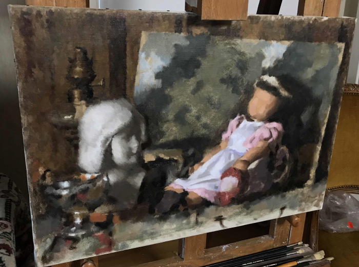
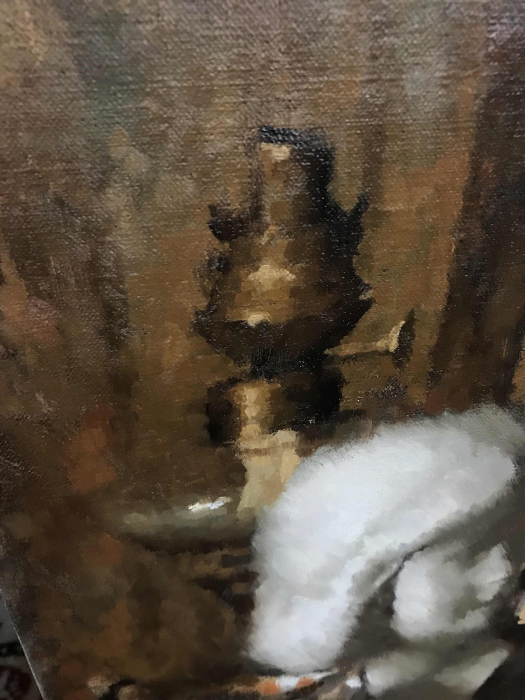
So update. I've been letting things dry, but I've gotten some work done. Defined more of the overall painting. Also today was an extra bright in the afternoon so I decided to work on a little section for a bit. So I worked on the upper left corner, painting the oil lamp and part of the background.

To go over how I paint, it's really simple. The idea is to put the right color in the right spot. So no blending, just patches of colors, mixed up on the palette and placed on the canvas. Some colors blend naturally as you work but the idea is to not intentionally blend colors but to paint transitions manually. This is often contrasted with brushier styles of painting where you brush paints into each other more. A good way to think of it is like Sargent paints more in the latter style whereas Repin paints more in the former, although it's something of a spectrum. Harold Speed talks about this some and it shows up here and there in his discussions on various topics.
Some areas I tend to let things be a bit more flowing, where I want things to feel a bit more relaxed, like clothing in portraits, but it really depends on the painting. I this painting will probably be more straightforward there are no real areas I'd want to do it too much on, however it may change once I have things closer to a finish.
The areas I brought forward like the lamp/background will get another pass later on but I'll paint other sections before getting back there, making sure it's well dried. When it comes to details, I'm of the opinion that things should be as detailed as they need to be and not more. I often find that there's a point where more details distracts from the overall impression and at that point it's probably best to simplify things back. You also loose some material and artistic qualities when all your brushwork is destroyed for the sake of more details, and that's not so nice. The big impression is the important stuff and if you paint that well enough, you don't need details. We will talk more about that when the time comes to finish things.

The painting is made under very blue light so the colors look a bit different when working on it. These pics are under white studio light and it flattens the image and dulls the colors a lot, so it often makes things look much worse, which can be an advantage. Seeing something under perfectly neutral light makes flaws in color jump out, letting me know what to fix. Looking at this now, it's clear that I have to key down the painting in the background and to add more color variation to the bust. The bust was just roughed in quickly with diagonal marks to get something there as I knew it was something I wanted to dedicate an entire session to so I could figure out what I wanted to do with it. The chalice thing also needs better colors in the highlights, but that will be fixed when I dedicate a session to working on it.
I'm really excited about painting the carpet because it has an intricate pattern and if I can paint it well, things are going to look nice. It's also a carpet so I can paint things kind of messy and thick and it should give a carpety material feel.
I think I'll paint the chalice tomorrow, part of the carpet and if I have time get started on the bust. This way I can develop the painting from left to right.
I hope this shows a bit about the colors I'm using, how even though it's a very limited palette, I have more than enough range to paint reds, yellows, greens and some blues. Just mixing things carefully and keeping my brushes clean makes limited palettes fine.
I stretched my smaller canvas and I think I'll make a landscape painting some time soon. I'm waiting to see if we get some snow which would be very nice to paint. That painting I'll probably finish "alla prima".
Discord - JetJaguar#8954
Posts: 1,428
Threads: 12
Joined: Dec 2015
Reputation:
139
Yeah so I guess you are saying - if you're making a painting then you'd rather not do a tight line drawing - you'd rather refine your proportions by refining the shapes and edges as you paint?
I see what you mean when you mentioned painting with a dither in an earlier post - your marks look quite vibrational - it will be interesting to see how you work into this.
Also does your paint dry overnight? Or is it still wet the next day so you can still blend?
“Today, give a stranger one of your smiles. It might be the only sunshine he sees all day.” -- H. Jackson Brown Jr.
CD Sketchbook
Posts: 374
Threads: 16
Joined: May 2013
Reputation:
59
If I use lines it's only to block in some proportion at the start, and soon after I paint over it. The goal of my paintings is to essentially match the visual impression and the closer I get to that in my mark making, the easier the process is. So yeah, in general it's just "mass drawing" rather than line drawing.
I use paint ground in linseed oil so it generally dries after a day, although it dries hard after like 3 days. You don't want to work over half-dried paint as it can cause tensions in the paint layers and it also causes what is painted over to sink-in.
Sorry I've neglected the thread. Been busy with other stuff so I haven't worked much on the still life, will get back to it tho.
I thought I'd make a post about something I'm very interested in and something I think is poorly understood, even by competent artists today, and that is paint consistency.
Now we're all aware that paint is a mixture of oil and pigment. We generally purchase our paint in tubes and if we want to change its consistency, we thin it down with oil, solvent or a mix of the two. Some artists are interested in certain complex mediums that change the feel of the paint, but the frame of reference is always the commercially available paint tube. Yes some people grind their own paints but in general, we use the paint tube as a frame of reference to paint consistency.
Now the assumption many artists make is that the paint in a tube is the "stiff" paint, and from that point artists are expected to thin it down to their preference. That assumption is in some ways incorrect from a historical point of view. Modern paint tubes are not designed to be at one end of the spectrum in terms of consistency, rather they are generally designed to be in the middle for the broadest appeal.
The average purchaser of a professional quality artists oil paint is not a professional artist. It's just someone who can afford the higher end paint. The amount of professional artists is proportionally very small and even in that group, the amount of artists in that want paint on the stiff side of the consistency spectrum is even smaller. This makes it very hard to find paints with a more traditional consistency. Old Holland is the closest but even then, to emulate many historical painting techniques, the paint needs to be yet stiffer.
Going back to the latter half of the 1800's where oil paints were being manufactured at a larger scale and put into tubes, many brands tried to appeal to the professional market as it was significant during that time. Even then, we can find in the writings of Charles Moreau-Vauthier that even then, manufacturers would frequently put too much oil into the paint tube. The stated reason was that a lot of artists liked softer paints but Moreau-Vauthier doesn't take this reason seriously and he points to the fact that paints with proportionally more oil in them have a longer shelf life than paints with less oil, allowing them to have larger stocks of their products without them going bad. That being said, the good professional range of oil colors during this time, was fairly stiff, more so than todays W&N paints for example.
My main point is that the standard for what the consistency of paint is has changed over time and this change in consistency has at times caused us to misunderstand historical art and painting practices. Take mediums for an example. Artists today are often very confused by mediums, should you use them? How much? these are reasonable questions because often the point of a medium doesn't make itself clear. The paint is already so soft you can emulate most fluid painting techniques, so why do we need medium? Well if we change our perspective and think that the paint artists in the past had were very stiff, and needed stiff bristle brushes to move this paste across the canvas, then medium starts to make more sense. It then becomes a very clear that if we want to broadly block in for example someone's coat in a portrait, we need to thin down the paint more to allow us to do so. This thought doesn't come up as much with modern paints because we don't have that absolute need for medium that used to exist.
Now of course many artists historically would use softer paint. Artists had their own preferred medium, sometimes even considered it a secret to be closely guarded. The point is that the paint that they chose to thin down, was very stiff. If we today were to try and emulate their practices by adding similar amounts of medium to our modern paints, we'd end up with a very fluid mess. This was an interesting thing to note when reading Speed's book where he says that the paints he purchases is too stiff to paint freely with and you often need medium. We then see artists like James Gurney being confused by this, suggesting the opposite that he finds paints to be too oily. This is a case of our reference points being different due to the changes in paint consistency.
We will also get visual clues that paints were historically stiffer. Take for example this Arkhipov painting https://i.pinimg.com/originals/47/ba/5d/...b53129.jpg
Notice how thickly it's painted yet the paint remains very tightly controlled. It's clearly all painted with a bristle brush yet it remains very thick. We will often find that painting with a bristle brushes on modern tubed paints, they are so aggressive that they cut right through the paint, causing the painting to be very thin. If however the stiffness of the paint matched the stiffness of the brush, bristle brushes can be used to create this type of a painting. It is very rare to see this look of brushwork in modern paintings, just because the materials are different. Another example is this Velazquez painting https://upload.wikimedia.org/wikipedia/c...1zquez.jpg . This painting has a range of consistencies from very fluid in the darks to very stiff highlights. The stiff paint in the light passages allows the artists to model very soft tones while also preserving that sense of mass, as well as place very distinct marks on top for the highlights.
Now if you're like me, you like the look of older paintings and want to emulate some of this brushwork. What do we do? Well I first found a very good answer when translating some Russian Writings about Nicolai Fechin. Now Fechin used paint tubes however he'd always prepare the paints before he began working. What he'd do was to spread the paper out on an absorbent material and some of the oil would over time be sucked out of the paint, into the surface. This left him with a stiffer paint that he preferred to work with. We can do the same with our materials. Now, Fechin worked with paint that was moderately stiff already in the tube so he took this much further than most artists, but the idea works fine. You can use any kind of absorbent surface like cardboard, paper. I've been using coffee filters lately. I've found that to get a nice stiff paint, I've often had to blot off the oil two or three times by placing it on a fresh area of the coffee filter but it can vary depending on how long you let it sit and how much you spread it out. After about 10 minutes, the rate of absorption generally slows down and to make things go faster, you can then place it on a fresh area to blot off more. I've since found reference to this practice in many many different books from the 1800's.
All this is just to give a bit of context to understanding historical practices and materials. While many artists use medium, the paint they start with often effects how that medium interacts. A medium of 50/50 oil and turpentine acts very differently with stiff paint compared to paint that already has tons of oil mixed into it. I personally think it's good to expand your range in the type of marks you can make as an artist, rather than being limited by what paint manufacturers provide. I think many artists today have switched over to things like meyer's medium and very soft brushes just because of the consistency of commercial paints. It's like compensating for a problem rather that trying to remove the problem to begin with. Not to say that's bad, but it should be a choice made with knowing the full context.
Anyway, hope it maybe helps someone struggling with painting and trying to emulate historical techniques.
Discord - JetJaguar#8954
Posts: 852
Threads: 6
Joined: May 2018
Reputation:
116
I'm interested in what you're talking about, and I find it curious because the tendency is usually to want to make the paint flow more, rather than make it stiffer in contemporary practice. But of course the onus is still on the painter to create good paintings, isn't it? not the paint and brush.
It seems like the approach of painters of the past in terms of drawing, modeling form etc. makes a bigger difference in quality than the paint itself. Like the forms of finished paintings from 17th-19th centuries often look fuller, more solid (possibly due in part to stiffer paint), than what you see even from good, trained painters in the 20th/21st centuries, which often look more insubstantial.
For example: https://imgur.com/a/rGNkiNf (No offense to Elliot, I know it's a really old painting). Obviously you can't really compare using photographs, but maybe you see what I mean. Do you have any thoughts?
Posts: 1,428
Threads: 12
Joined: Dec 2015
Reputation:
139
Interesting write-up on paint consistency dude. I would like to be able to see the brushstrokes in my work much like in Jennifer Gennari's work: https://www.instagram.com/jen_art/
Does that mean I need stiffer paint? And therefore stiffer brushes?
I purchased some stiffer brushes a few weeks ago and I like using them a lot with stiffer paint as it shifts the paint around more easily.
Looking forward to more Tristan, thanks for sharing.
“Today, give a stranger one of your smiles. It might be the only sunshine he sees all day.” -- H. Jackson Brown Jr.
CD Sketchbook
Posts: 1
Threads: 0
Joined: Dec 2023
Reputation:
0
I love the idea of a thread on oil painting. I'm no expert either, just a fellow art enthusiast. Setting up the canvas is always a vibe. The anticipation before that first stroke is magical. Curious, do you have any favorite canvases or prep rituals? I usually play some chill tunes and stare at the pictures in old-style frames I got them at Picture Framing Online. What about you?
Posts: 2
Threads: 0
Joined: Aug 2025
Reputation:
0
It's really cool that you decided to share your process! I especially like that you approach the topic without unnecessary pathos and simply tell how you work yourself. I'm also trying to paint with oils, but I'm still looking for my own style. Sometimes it helps to just look at interesting works or new materials for example, in the WiliArt Store you can find very unusual things that motivate you to experiment. It would be interesting to know if you yourself look for inspiration in similar places?
|


