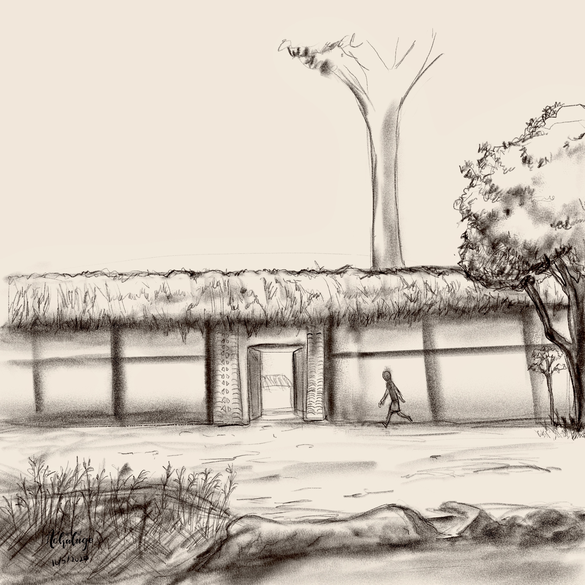
I’m challenging myself to do backgrounds and I made this last night. I’d like feedback on the draftsmanship, values and any tips on improving it.
Thanks!

Thanks!

|
Seeking critique on environment sketch
|
|
I’m challenging myself to do backgrounds and I made this last night. I’d like feedback on the draftsmanship, values and any tips on improving it.
Thanks! 
05-19-2020, 02:30 AM
Well your killing all the depth you could had by having alot of object show that you understand perspective by having line that lead toward vanishing point.Overlapping element isn't enough to create depth and it can actually start to look like a collage instead if you only rely on this trick to create depth.There nothing interesting to look at frankly i am gonna have to be truth to myself and say that sometime your best solution is to start over.Composition is really important and here the story telling is weak in my opinion.My tips is own the craft learn perspective instead of using what i see as a cheap trick that actually pull you down.It will pay off.
05-21-2020, 08:52 PM
(05-19-2020, 02:30 AM)darktiste Wrote: Well your killing all the depth you could had by having alot of object show that you understand perspective by having line that lead toward vanishing point.Overlapping element isn't enough to create depth and it can actually start to look like a collage instead if you only rely on this trick to create depth.There nothing intesting to look at frankly i am gonna have to be truth to myself and say that sometime your best solution is to start over.Composition is really important and here the story telling is weak in my opinion.My tips is own the craft learn perspective instead of using what i see as a cheap trick that actually pull you down.It will pay off.Thank you! I really appreciate your dissection. To be honest I wasn’t really concentrating on telling a story, I’ve never really done an background before. I’ll definitely brush up on perspective and make corrections to this image as I learn further. Thanks a lot! |
|
« Next Oldest | Next Newest »
|