Posts: 58
Threads: 7
Joined: Jun 2020
Reputation:
2
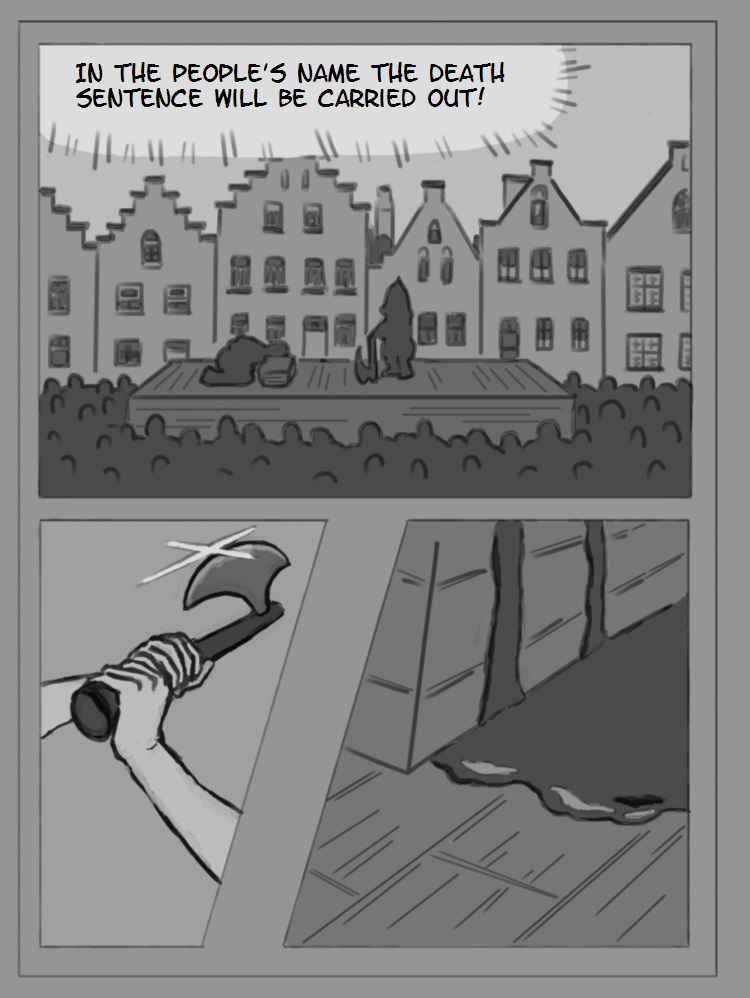
I am making a graphic novel / manga. (i know for manga i have to change the order of the pictures.)
Either it will become widely famous and everybody loves it or more likely only I like it and I will put it on my bookshelf and be very happy with myself for having done it.
I want to do one book at least.
Here is my first page
(i dont know what is better - post it here or in the critique section, I think ill do both)
Feel free to tell me what I could improve in the next pages.

EDIT:
By now I made a Youtube-Channel for the project.
I post Studies there and also each new page.
So here is the Channel itself:
https://www.youtube.com/channel/UCXIq7za...g/featured
And here is the playlist of these pages, starting with page 1:
https://www.youtube.com/watch?v=tYEg--cU...qJ&index=2
Posts: 19
Threads: 1
Joined: Jun 2020
Reputation:
1
One part of a hanging often forgotten about is that the crowd is there for entertainment purposes. Jeering could be added, laughter,...
Depending on the tone of the story, these could be an alternative caption:
"In the name of the people // I pronounce you... // DEAD!!"
In short, more pages/storytelling is needed if we are to advise.
Posts: 181
Threads: 0
Joined: Oct 2017
Reputation:
41
Welcome to CD. Good start to your sketchbook. It's great to see you are pursuing a passion and making a graphic novel. I have just jotted down a few thoughts below to give you something to think about.
In terms of the first panel, the size relation to everything feels off. Like there's a weird sense of scale to everything. We are supposed to be far away from the stage, however the figures feel quite large for how far away we are supposed to be. That's or the crowd's heads are too small.
There is also this juxtaposition between the first and second panel with the executioner. The first panel they look to be kitted out, it's quite a large 'padded' silhouette. However in the second panel, you have these thin, almost feminine, arms.
I think a main thing to work on is consistency (which is a million times easier said than done lol).
Anyway, it's a great start to your graphic novel. Keep it up! :)
Posts: 58
Threads: 7
Joined: Jun 2020
Reputation:
2
(06-18-2020, 02:30 PM)chubby_cat Wrote: In terms of the first panel, the size relation to everything feels off. Like there's a weird sense of scale to everything. We are supposed to be far away from the stage, however the figures feel quite large for how far away we are supposed to be. That's or the crowd's heads are too small.
There is also this juxtaposition between the first and second panel with the executioner. The first panel they look to be kitted out, it's quite a large 'padded' silhouette. However in the second panel, you have these thin, almost feminine, arms.
I think a main thing to work on is consistency (which is a million times easier said than done lol).
1. you mean the figures on the stage have to be smaller? could be, i can try it.
2. you are right, i should make his arms bigger.
3. yes, "consistency" would be important, I am at page 5 and I can already tell this will be really hard. when in the future you see that the drawing style is inconsistent and when you know how to change that, tell me. I already expect, that this will be an issue.
@Fickleflame:
regarding the story theres not much to see, yet, thats true. I already have a rough plan, more will be seen on the following pages. Just scream when you see major flaws that have to be corrected.
Posts: 58
Threads: 7
Joined: Jun 2020
Reputation:
2
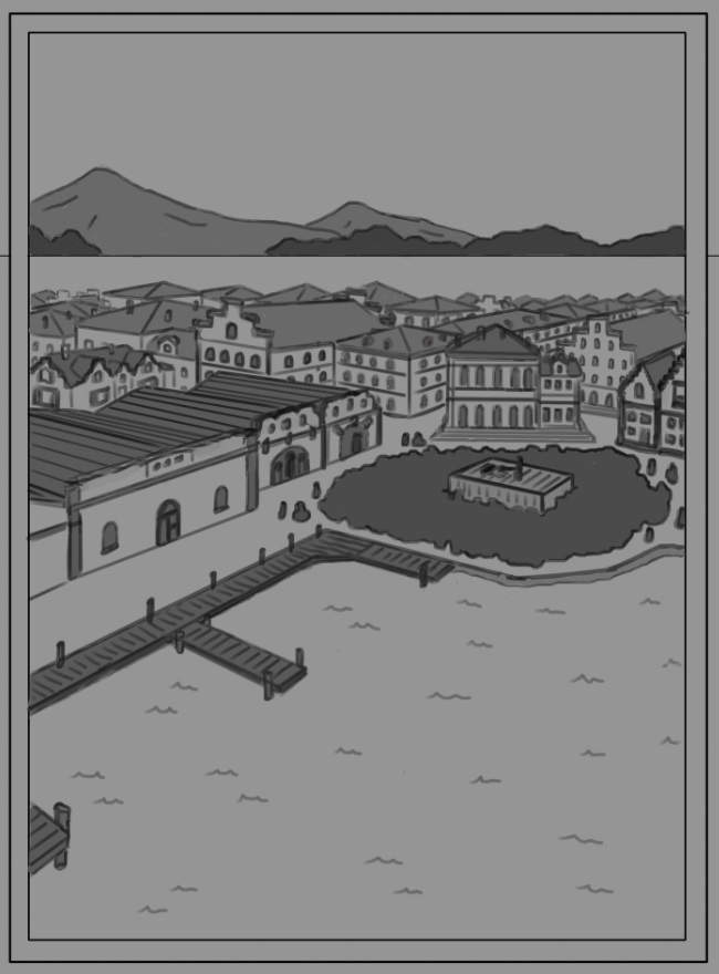
Page 2
(might contain a "table of contents" later)

Posts: 19
Threads: 1
Joined: Jun 2020
Reputation:
1
There's a flaw with the floor ^^
My initial interpretation of the water was that it was ground. Maybe you can do something to make it more sea-like? If this is going to be coloured you need not bother.
Posts: 58
Threads: 7
Joined: Jun 2020
Reputation:
2
(06-19-2020, 05:48 AM)Fickleflame Wrote: There's a flaw with the floor ^^
My initial interpretation of the water was that it was ground. Maybe you can do something to make it more sea-like? If this is going to be coloured you need not bother.
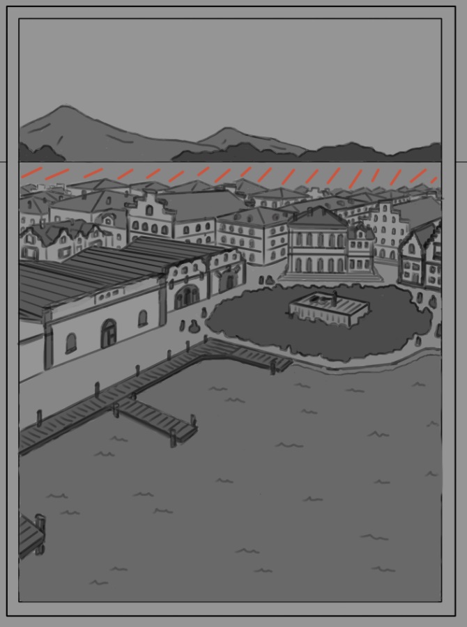
Do you think this coloring is better?
I am unsure about sea white and ground grey or ground grey and sea white.
Also, did you mean with the first sentence that the horizon line is wrong? (I made a correct perspective grid, so the perspective can not really be off, but maybe the mountains are wrong if I set them on top of the horizon line?)
Is the part i marked in red wrong somehow??

Posts: 432
Threads: 70
Joined: Mar 2020
Reputation:
69
There's nothing wrong with the perspective I think. The mountains (or at least part of them) would be on top of the horizon line as long as they're above the level of the viewer's eyeballs.
I think making the water darker than the city street was the right choice. I suggest making the water in the distance darker as well, and/or add reflections of the mountains to make it obvious that it's water. The only issue is that the distant water is almost the same gray as the city street, and there are no details to tell us that it's water, so it reads as being part of the city. Alternatively, add details to the city street so that it's obviously not part of the distant water. But just making the water consistently darker would be an acceptable solution.
Posts: 58
Threads: 7
Joined: Jun 2020
Reputation:
2
(06-19-2020, 10:52 AM)Pubic Enemy Wrote: I suggest making the water in the distance darker as well, and/or add reflections of the mountains to make it obvious that it's water. The only issue is that the distant water is almost the same gray as the city street, and there are no details to tell us that it's water, so it reads as being part of the city. Alternatively, add details to the city street so that it's obviously not part of the distant water. But just making the water consistently darker would be an acceptable solution.
In the background there is no water. Its more like grasslands or something. So maybe I should indicate that by putting some trees here and there, okay!
Here is Page 3:

Posts: 369
Threads: 6
Joined: Sep 2019
Reputation:
23
(06-20-2020, 11:11 PM)graphicnovelist Wrote: In the background there is no water. Its more like grasslands or something. So maybe I should indicate that by putting some trees here and there, okay! The straight line looks like the horizon on the sea. Make it more natural, slightly hilly maybe?
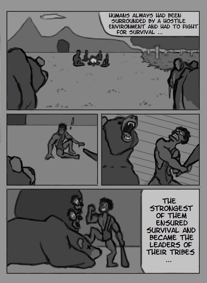
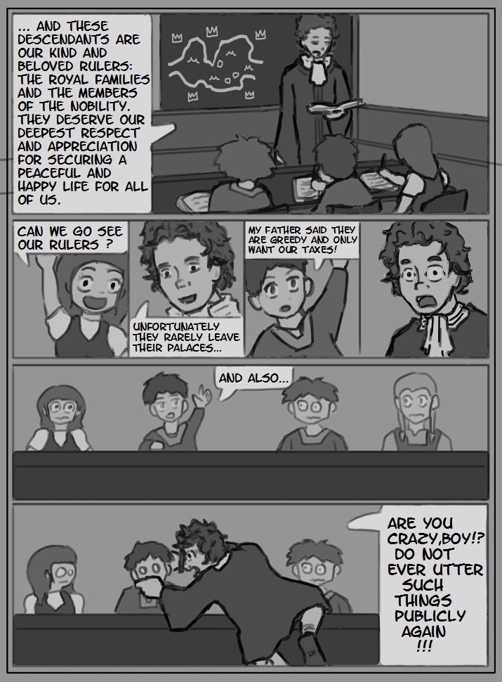
I like the humorous tone of page 3 - I hadn't guessed it from the previous pages. If this is the tone of the whole story, you may want to consider making it clear from page 1?
Posts: 58
Threads: 7
Joined: Jun 2020
Reputation:
2
(06-22-2020, 10:54 AM)Leo Ki Wrote: (06-20-2020, 11:11 PM)graphicnovelist Wrote: In the background there is no water. Its more like grasslands or something. So maybe I should indicate that by putting some trees here and there, okay! The straight line looks like the horizon on the sea. Make it more natural, slightly hilly maybe?
I like the humorous tone of page 3 - I hadn't guessed it from the previous pages. If this is the tone of the whole story, you may want to consider making it clear from page 1?
Its probably not the tone of the whole story. I am imagining the story as an anime, so thats why I made the "fighting scene" look that way. Most likely there are 100 other ways to do the same thing slightly better.
(06-22-2020, 07:55 PM)LaurieWesson Wrote: [quote pid='127372' dateline='1592251090']
steroids blog
[/quote]
I would guess that this user is a bot.
_________________________________________
Here is Page 4:

_________________________________________
Also, I made a Youtube Channel for the project, possibly not the most fitting format to present pictures, but YT is the only one I myself use to look at stuff. I am not very social media.
I post Studies there and also each new page for this graphic novel.
So here is the Channel itself:
https://www.youtube.com/channel/UCXIq7za...g/featured
And here is the playlist of these pages, starting with page 1:
https://www.youtube.com/watch?v=tYEg--cU...qJ&index=2
.
Posts: 58
Threads: 7
Joined: Jun 2020
Reputation:
2
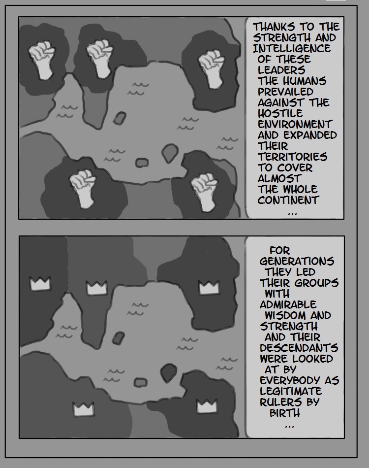
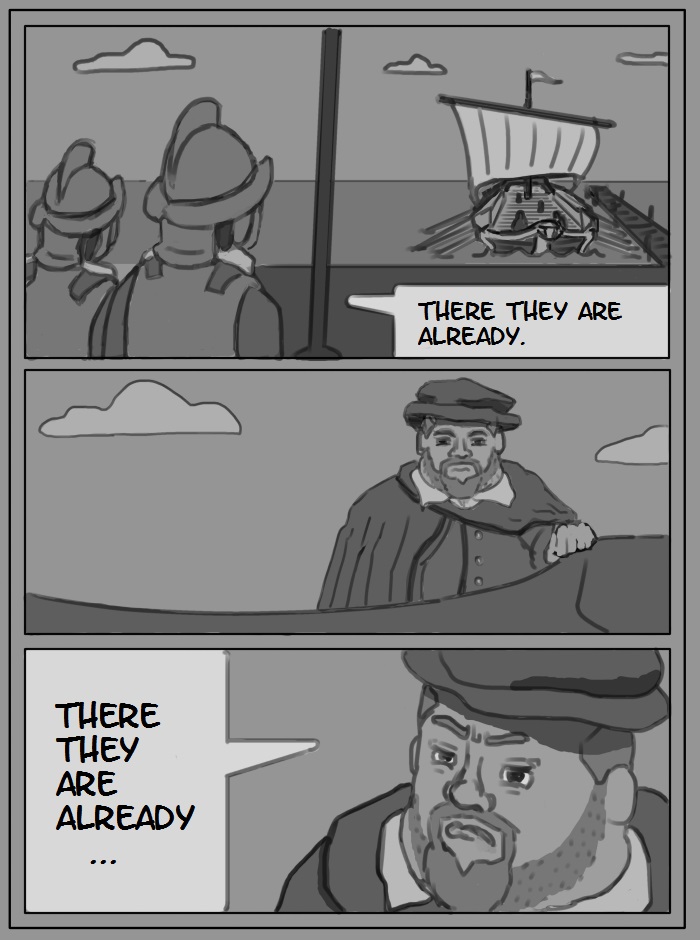
Page 5:

Posts: 58
Threads: 7
Joined: Jun 2020
Reputation:
2
Do you think, that the drawings are "good enough" for a reader to not lose interest while reading the story?
Posts: 58
Threads: 7
Joined: Jun 2020
Reputation:
2
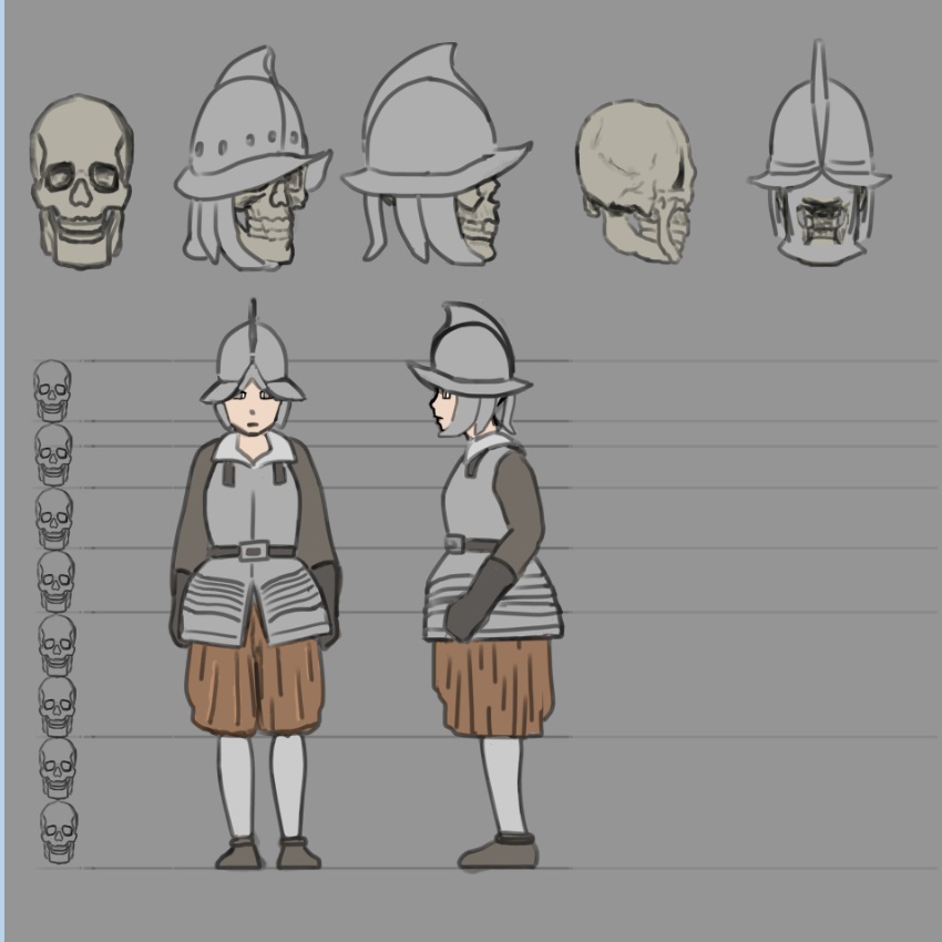
This is a study for the next page.
I was struggling to draw these helmets in different perspectives and angles, so thats why I made this.
I find it hard to maintain their shape from different views...

Posts: 432
Threads: 70
Joined: Mar 2020
Reputation:
69
(07-01-2020, 07:36 PM)graphicnovelist Wrote: Do you think, that the drawings are "good enough" for a reader to not lose interest while reading the story?
It depends on the story. The original One Punch Man webcomic, for example, had EXTREMELY crude art, but it was still very popular because the art was fitting for the comical tone of the story.
Your comic also has some comedic overtones, and I think the drawings do the job well enough. You're definitely better than the guy who drew the One Punch Man comic. Also, you'll improve over the course of drawing it. One question: Are these the final versions of the panels? The grey tones on everything give it a washed-out look. It doesn't really grab one's attention this way, in my opinion, but if that's your preferred style, feel free to stick with it.
Posts: 58
Threads: 7
Joined: Jun 2020
Reputation:
2
(07-06-2020, 09:43 PM)Pubic Enemy Wrote: One question: Are these the final versions of the panels? The grey tones on everything give it a washed-out look. It doesn't really grab one's attention this way, in my opinion, but if that's your preferred style, feel free to stick with it.
I thought of them as pretty much "final" versions. But of course its always possible to do more polishing?
What do you mean exactly, just not give a general grey background or not having colored everything or what exactly does keep the viewer from having "his attention grabbed"?
___________________
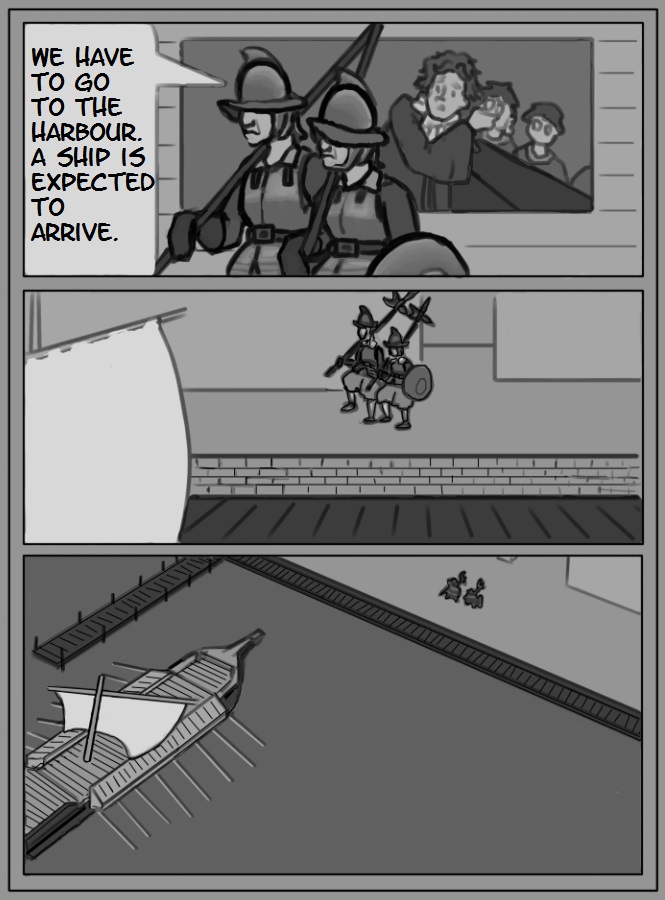
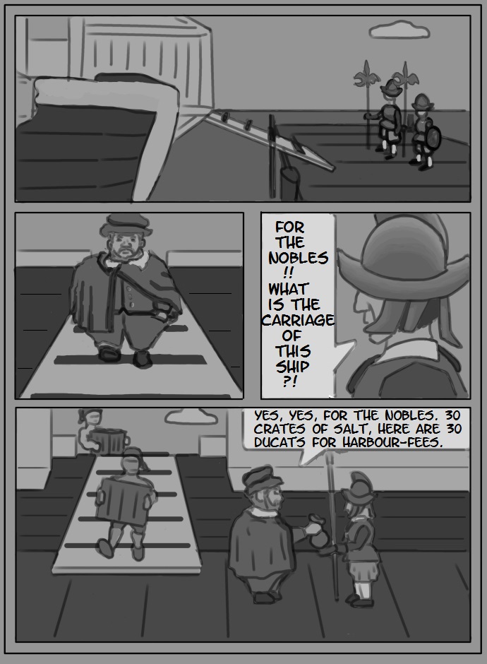
Page 6
(could easily use a bit more polish..)

Posts: 432
Threads: 70
Joined: Mar 2020
Reputation:
69
(07-12-2020, 05:23 AM)graphicnovelist Wrote: What do you mean exactly, just not give a general grey background or not having colored everything or what exactly does keep the viewer from having "his attention grabbed"?
Having grey tones on everything means that you'll always have relatively little difference between the darkest and lightest values, I.E. you'll be lacking contrast. Having areas of high contrast is one of the easiest ways to draw the eye, so a uniformly gray comic panel kind of fades into the background. That's all I meant.
That said, it's only my opinion. If you don't think it's a big deal, I don't suggest changing anything. There's no one-size-fits-all approach to anything in art, so keep doing your thing.
Posts: 58
Threads: 7
Joined: Jun 2020
Reputation:
2
(07-12-2020, 08:13 AM)Pubic Enemy Wrote: Having grey tones on everything means that you'll always have relatively little difference between the darkest and lightest values, I.E. you'll be lacking contrast. Having areas of high contrast is one of the easiest ways to draw the eye, so a uniformly gray comic panel kind of fades into the background. That's all I meant.
Yes, you have a point, in the end I might have to polish everything anyways and then I can optimize that, too. So, no, the pages might not be "finished", but just my "finished draft".
_____
page 7

Posts: 76
Threads: 2
Joined: Mar 2013
Reputation:
3
"Either it will become widely famous and everybody loves it or more likely only I like it and I will put it on my bookshelf and be very happy with myself for having done it. "
You have no idea how much respect I have for you to say that. Doing something for yourself and not to impress anybody. That' s rare nowadays.
I wish you best of luck with your comic.
In the past I really wanted to do my own comic as well.Maybe some time in a future..who knows.The style would be more like a manga, because I never liked comics all that much. But I love manga.
Keep updating, I want to see how you are getting better at this and your comic grows.
Posts: 58
Threads: 7
Joined: Jun 2020
Reputation:
2
(07-16-2020, 02:57 AM)Shuty Wrote: In the past I really wanted to do my own comic as well.Maybe some time in a future..who knows.The style would be more like a manga, because I never liked comics all that much. But I love manga.
Thanks for saying what you said, and: Do it! I want to see it!
____
Page 8
(I hope I used proper English..)

|
