Posts: 181
Threads: 0
Joined: Oct 2017
Reputation:
41
Hi, Dan. Welcome to CD! Great start to your sketchbook. I particularly dig the characters in the last image (and also the lineart version of them above). The candles are a nice touch and add a lot of interest. It's great to see you are doing so many studies as well. Keep up the hard work! Looking forward to seeing more
Posts: 67
Threads: 1
Joined: Apr 2020
Reputation:
8
Hello Daniel, this is exquisite indeed!! Good job, very nice painting studies : D
Drain gang
Posts: 119
Threads: 3
Joined: Dec 2012
Reputation:
4
Nice figures and studies! Looking forward to seeing what you do next!
Posts: 852
Threads: 6
Joined: May 2018
Reputation:
116
Wow, I really like the last image. You have a really appealing painting style. It is a little sketchy in areas, but I like it. Also those owls are really cute!
Posts: 51
Threads: 2
Joined: Nov 2018
Reputation:
1
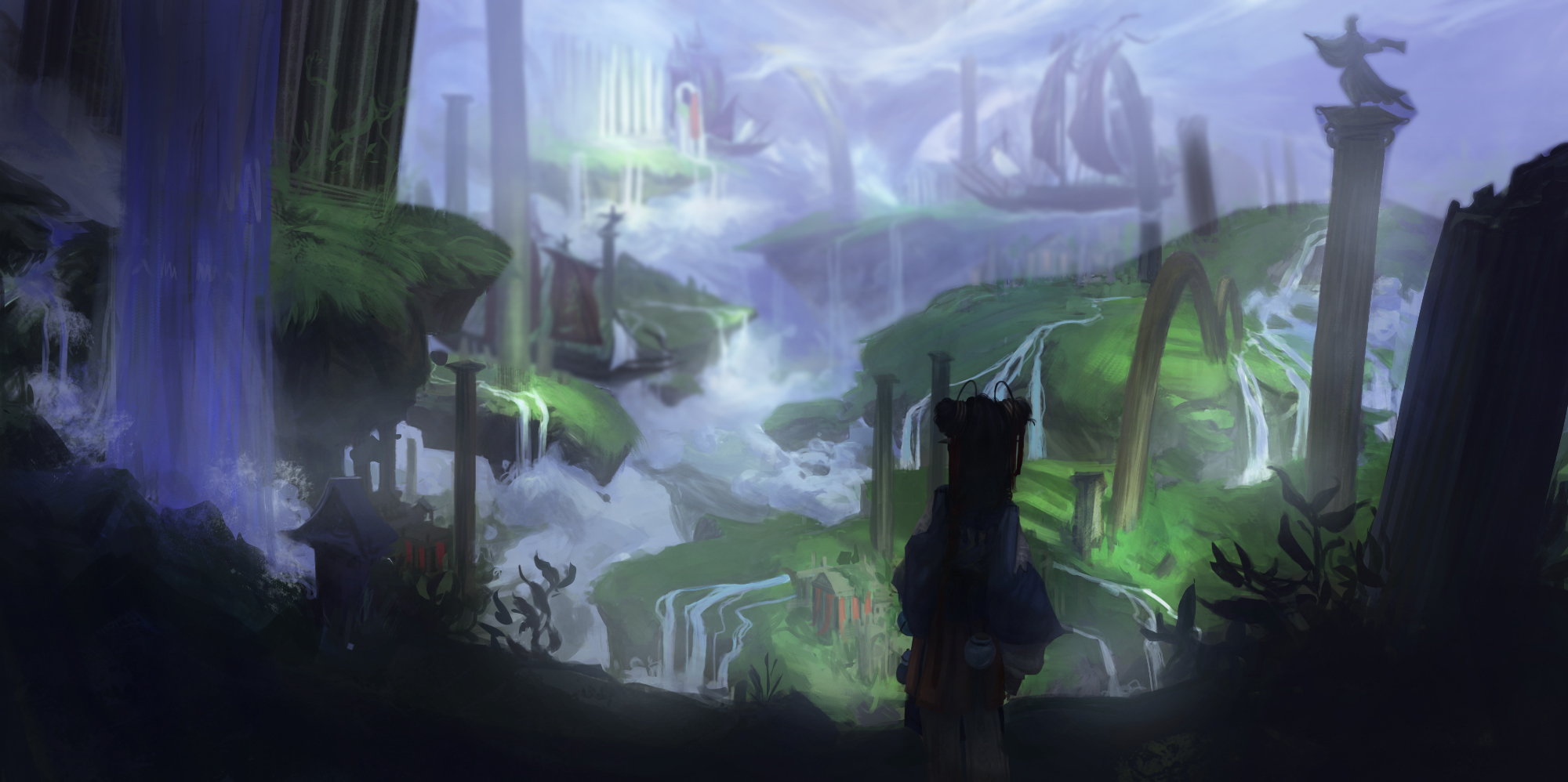
Hey man! Nice studies and balance on them. On the pieces you create I see to much information on these clothes etc, remember that the details from a object come with the half tones! everything on a really dark shadow doesn't have detail, same for the highlight side. Give your audience a little bit of clue of what material you're working on and leave the rest for interpretation, you can see that on Mike Azevedo's painting work on his artstation. Search for Mateus Lins, João Bragato, TCK, Pedro Kruger, Filipe Pagliuso and Even Amundsen art work on artstation and give them a look on what they simplify and what they show to us, maybe give you some idea and more solid understand of what I'm trying to bring to you! Hahaha! Good lucky! You're going to the right spot!
Posts: 99
Threads: 1
Joined: May 2018
Reputation:
1
very beautiful work as always!
![[Image: zekonje.jpg]](https://cdn.discordapp.com/attachments/744893579822104648/744895412061601892/zekonje.jpg)
![[Image: 44.jpg]](https://cdn.discordapp.com/attachments/744893579822104648/744896853824372786/44.jpg)
![[Image: gggg.jpg]](https://cdn.discordapp.com/attachments/744893579822104648/744895134872764477/gggg.jpg)
![[Image: edwin_henry_landseer.jpg]](https://cdn.discordapp.com/attachments/744893579822104648/744895263490965544/edwin_henry_landseer.jpg)
![[Image: kupoid_.jpg]](https://cdn.discordapp.com/attachments/744893579822104648/744895301004820540/kupoid_.jpg)
![[Image: rockwell.jpg]](https://cdn.discordapp.com/attachments/744893579822104648/744895310156791869/rockwell.jpg)
![[Image: value.jpg]](https://cdn.discordapp.com/attachments/744893579822104648/744895409536893088/value.jpg)
![[Image: 20200814_174312.jpg]](https://cdn.discordapp.com/attachments/744893579822104648/744896580246700032/20200814_174312.jpg)
![[Image: 20200815_195515.jpg]](https://cdn.discordapp.com/attachments/744893579822104648/744896594477973545/20200815_195515.jpg)
![[Image: 20200814_174336.jpg]](https://cdn.discordapp.com/attachments/744893579822104648/744896626501353502/20200814_174336.jpg)
![[Image: skica.jpg]](https://cdn.discordapp.com/attachments/744893579822104648/744895418231422986/skica.jpg)
![[Image: postari.jpg]](https://cdn.discordapp.com/attachments/744893579822104648/744896873621356574/postari.jpg)


![[Image: 44.jpg]](https://cdn.discordapp.com/attachments/744893579822104648/751071620163960903/44.jpg)
![[Image: i.jpg]](https://cdn.discordapp.com/attachments/744893579822104648/751071628015697940/i.jpg)
![[Image: t.jpg]](https://cdn.discordapp.com/attachments/744893579822104648/751071636370882570/t.jpg)
![[Image: 20200903_151347.jpg]](https://cdn.discordapp.com/attachments/744893579822104648/751071640271716352/20200903_151347.jpg)
![[Image: 20200903_151336.jpg]](https://cdn.discordapp.com/attachments/744893579822104648/751071649411104891/20200903_151336.jpg)
![[Image: 20200903_151605.jpg]](https://cdn.discordapp.com/attachments/744893579822104648/751071652829200414/20200903_151605.jpg)
![[Image: 20200903_151541.jpg]](https://cdn.discordapp.com/attachments/744893579822104648/751071653391237120/20200903_151541.jpg)
![[Image: 20200903_151518.jpg]](https://cdn.discordapp.com/attachments/744893579822104648/751071654775619614/20200903_151518.jpg)
![[Image: 20200903_151554.jpg]](https://cdn.discordapp.com/attachments/744893579822104648/751071658868998184/20200903_151554.jpg)
![[Image: 47_enviorment.jpg]](https://cdn.discordapp.com/attachments/744893579822104648/751071576677679246/47_enviorment.jpg)
![[Image: 47_bakuta.jpg]](https://cdn.discordapp.com/attachments/744893579822104648/751071587767156856/47_bakuta.jpg)
![[Image: 47_girl.jpg]](https://cdn.discordapp.com/attachments/744893579822104648/751071770282557531/47_girl.jpg)
![[Image: 47merchant.jpg]](https://cdn.discordapp.com/attachments/744893579822104648/751071643551531069/47merchant.jpg)


![[Image: 20201012_131728-1.jpg]](https://cdn.discordapp.com/attachments/744893579822104648/765173284936613908/20201012_131728-1.jpg)
![[Image: 20201012_131700-1.jpg]](https://cdn.discordapp.com/attachments/744893579822104648/765173286161350666/20201012_131700-1.jpg)
![[Image: 20201012_131716-1.jpg]](https://cdn.discordapp.com/attachments/744893579822104648/765173283372924968/20201012_131716-1.jpg)
![[Image: 20201012_131622-1.jpg]](https://cdn.discordapp.com/attachments/744893579822104648/765173258458103828/20201012_131622-1.jpg)
![[Image: goletete2.jpg]](https://cdn.discordapp.com/attachments/744893579822104648/765169882177732618/goletete2.jpg)
![[Image: goletete1.jpg]](https://cdn.discordapp.com/attachments/744893579822104648/765169859679748116/goletete1.jpg)
![[Image: 3_masters.jpg]](https://cdn.discordapp.com/attachments/744893579822104648/765169853962125322/3_masters.jpg)
![[Image: 4_lica.jpg]](https://cdn.discordapp.com/attachments/744893579822104648/765169842373525534/4_lica.jpg)
![[Image: 47promotionalala2.jpg]](https://cdn.discordapp.com/attachments/744893579822104648/765169824115589130/47promotionalala2.jpg)
![[Image: 47_cuvari.jpg]](https://cdn.discordapp.com/attachments/744893579822104648/765181238523854848/47_cuvari.jpg)
![[Image: 47_enviorment2.jpg]](https://cdn.discordapp.com/attachments/744893579822104648/765181231976677386/47_enviorment2.jpg)
![[Image: 50dinner4.jpg]](https://cdn.discordapp.com/attachments/744893579822104648/765169780767981608/50dinner4.jpg)
![[Image: 50dinnerskic.jpg]](https://cdn.discordapp.com/attachments/744893579822104648/765169766952075284/50dinnerskic.jpg)
![[Image: 51_famsco_2.jpg]](https://cdn.discordapp.com/attachments/744893579822104648/765169748597145601/51_famsco_2.jpg)


