Posts: 3,359
Threads: 37
Joined: Aug 2013
Reputation:
234
I think there a misconception about posting unpolish stuff you absolutely can but it hard for people to know your level and how much restraint they should apply in the critic it much easier to tell an artist level when it there polish piece.
Study should be mention when you post them if not there a risk that people will assume there is no clear intention
W.ip should be mention to possibly invite critic
Finish piece normally speak for themselve no need to mention it.
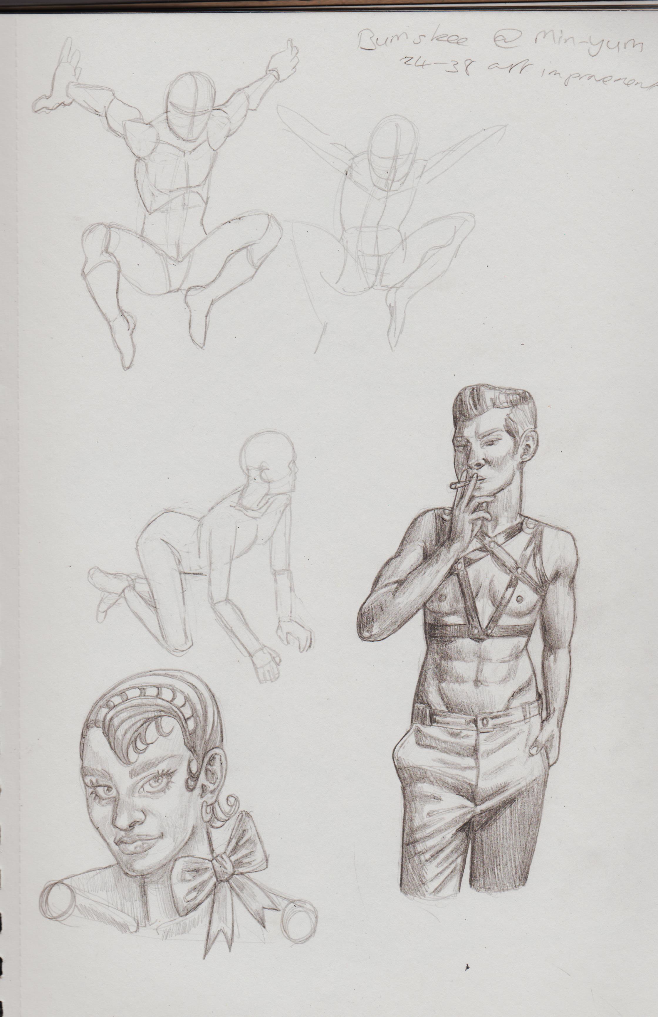
The problem of studying throught piece is that it as not the repetitiveness aspect drill in it to improve quickly if improving is necessary to you.If you don't care about fast improvement i understand why it might be a chore. But if you prefer that approch you might hit a plateau where you might get frustrated because your eye is picking up on aspect you didn't address throught what we will call corrective study.
I certainly don't advocat for drill like study for the more advance artist where you hammer certain subject just to avoid rust i think corective study is where it at specially when you start to learn your own weakness.But if you have a problem to be honest or you leak self critic ability with yourself it perhaps better to do drill study just to avoid weak spot but at the same time you can't be strong at everything you have to find your strenght it doesn't mean you should be negligent with certain area of your work.
For example i would say you have a weak spot for perspective but you have a good level for face.
I hope this will help you feel comfortable i just happen to take art a bit to seriously from time to time... gotta remind myself we ain't all like that.
Posts: 201
Threads: 3
Joined: Jan 2021
Reputation:
3
(01-04-2023, 04:37 AM)darktiste Wrote: I think there a misconception about posting unpolish stuff you absolutely can but it hard for people to know your level and how much restraint they should apply in the cirtic it much easier to tell an artist level when it there polish piece.
Study should be mention when you post them if not we will assume there is no clear intention
W.ip should be mention if it a piece that is unfinish but you need some direction
Finish piece normally speak for themselve no need to mention it.
The problem of studying throught piece is that it as not the repetitiveness aspect drill in it to improve quickly if improving is necessary to you.If you don't care about fast improvement i understand why it might be a chore. But if you prefer that approch you might hit a plateau where you might get frustrated because your eye is picking up on aspect you didn't address throught what we will call corrective study. That's fair. I have so many sketchbooks of just gesture there doesn't seem like a point to post all of them. But, I'm try to post more of the good, the bad and the ugly. My artistic intentions for this year to to focus more on rendering out finished pieces rather than just sketches and then getting advice, like CG does. Finishing things is a skill in itself!
I find repeating the same pose to learn less cumbersome, once I then use that the basis for a character and/or picture. Like the superheroes I've been drawing. If I look up poses I want for an image in my head it feels less tedious and I can see the direct link between the image in my head and the reference. 
I'm planning to try and digitally colour some sketches and get you guys' advice for feedback. Still very much a novice when it comes to that arena.
Agree on the perspective appraisal, have a couple of perspective books to study and I still don't get it. That's OK, I know what they forum is for. For feedback and community. I obviously want to get better, but I'm also learning to be more kind to myself. Constantly beating myself up for 'not being good enough' and not drawing, won't help me improve. This is now the only place I post my art, so I'm using this thread as a stepping-stone to confidence build.
Posts: 369
Threads: 6
Joined: Sep 2019
Reputation:
23
Hi, I'm seing an interesting evolution while flipping through your sketchbook.
The colored pencils in the workshops that you posted a few days ago are truly alive, I really felt like I was there with these people. I hope you showed them the result and they got good vibes from it.
A word about "Imagination is memory". We cannot find references for everything, especially when drawing a comic. However, when trying strokes on paper, we can progressively hit another type of memory that doesn't come from models but from life itself. Everything you looked at without seeing on the street and everywhere you went is still in you, just hidden until you dive in. Have you noticed that the more you draw, the more you see around you?
I'll get back to your comics and other topics a bit later. Just wanted to leave a few words for now.
Posts: 1,076
Threads: 4
Joined: Jan 2016
Reputation:
43
Nice updates, you've been busy! I would keep practicing the figures with gestures and breaking them down into simpler shapes. Right now I think you can benefit from drawing an ideal figure so I highly recommend the material of Andrew Loomis' to help you with that, I think that can be extremely beneficial to you at this point in your journey. Keep it up!
Posts: 369
Threads: 6
Joined: Sep 2019
Reputation:
23
I'm back, about water painting. The shiny strings of reflections or foam on the water surface should hide the underwater things more than the other areas of the surface do. On your two drawings, you did not represent the reflections, only the patches of water, which obscure the underlying character. This produces an inverse impression, and the patches look like additional objects on the water. I hope this helps.
Still not ready to formulate my thoughts about your comics, I need to get my mind back into this form.
Posts: 201
Threads: 3
Joined: Jan 2021
Reputation:
3
(01-05-2023, 01:20 PM)Leo Ki Wrote: Hi, I'm seing an interesting evolution while flipping through your sketchbook.
The colored pencils in the workshops that you posted a few days ago are truly alive, I really felt like I was there with these people. I hope you showed them the result and they got good vibes from it.
A word about "Imagination is memory". We cannot find references for everything, especially when drawing a comic. However, when trying strokes on paper, we can progressively hit another type of memory that doesn't come from models but from life itself. Everything you looked at without seeing on the street and everywhere you went is still in you, just hidden until you dive in. Have you noticed that the more you draw, the more you see around you?
I'll get back to your comics and other topics a bit later. Just wanted to leave a few words for now. Hi Leo, yeah I chose this internship, because it was the opportunity to do something creative. Most internship are for the STEM and engineering kids, which is why I believe this program was made. My host wasn't my first choice, but I liked that my host allowed me a lot of flexibility. He discussed what they do and the different branches of the social enterprise and that they were going to be making their own brewery. I suggested the idea of doing an illustration project. My original plan was to draw a comic/or graphics depicting the process of making a beer. There were issues with making the beer, so I just took pictures of the process. He was really pleased with the first couple of images, that he wanted to draw the whole company. You are only seeing around half of what I drew. They had a really good response. At the end they hung them up in their bar. Basically my first 'commission', in a way.
Yeah, might not be able to find the exact reference for what we 100% want the piece to look like (perhaps that's a good thing), but we can combine multiple and create a composite. Are you refering to 'drawing from memory' here? ' Have you noticed that the more you draw, the more you see around you?' Kinda.
(01-08-2023, 06:09 PM)cgmythology Wrote: Nice updates, you've been busy! I would keep practicing the figures with gestures and breaking them down into simpler shapes. Right now I think you can benefit from drawing an ideal figure so I highly recommend the material of Andrew Loomis' to help you with that, I think that can be extremely beneficial to you at this point in your journey. Keep it up! Hi, I went back to gestures and trying to break them down, but I'm stuck at how to make them stick. I pull the ref away and the it looks nothing like how I wanted it too. How to you practice learning a pose(s) from imagination? Have Loomis figure book, might peruse again. Thanks.
(01-15-2023, 08:39 AM)Leo Ki Wrote: I'm back, about water painting. The shiny strings of reflections or foam on the water surface should hide the underwater things more than the other areas of the surface do. On your two drawings, you did not represent the reflections, only the patches of water, which obscure the underlying character. This produces an inverse impression, and the patches look like additional objects on the water. I hope this helps.
Still not ready to formulate my thoughts about your comics, I need to get my mind back into this form. Thanks, for the crit, I knew I didn't quite nail it. So on the foamy parts, you shouldn't see anything underneath? I might try to do some studies. If you know of any relevant tutorials, I'd love to know.
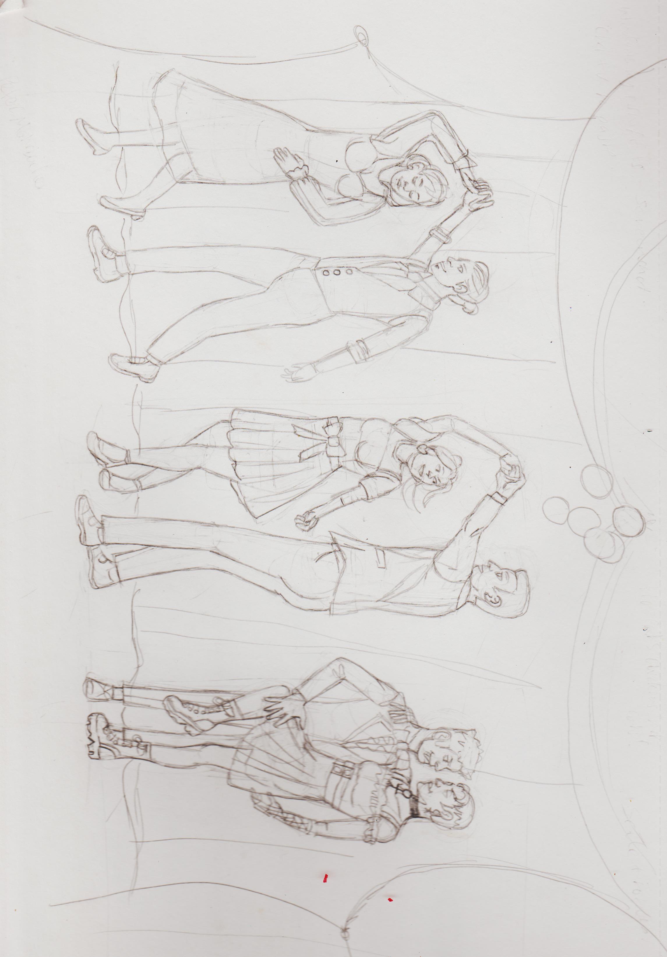
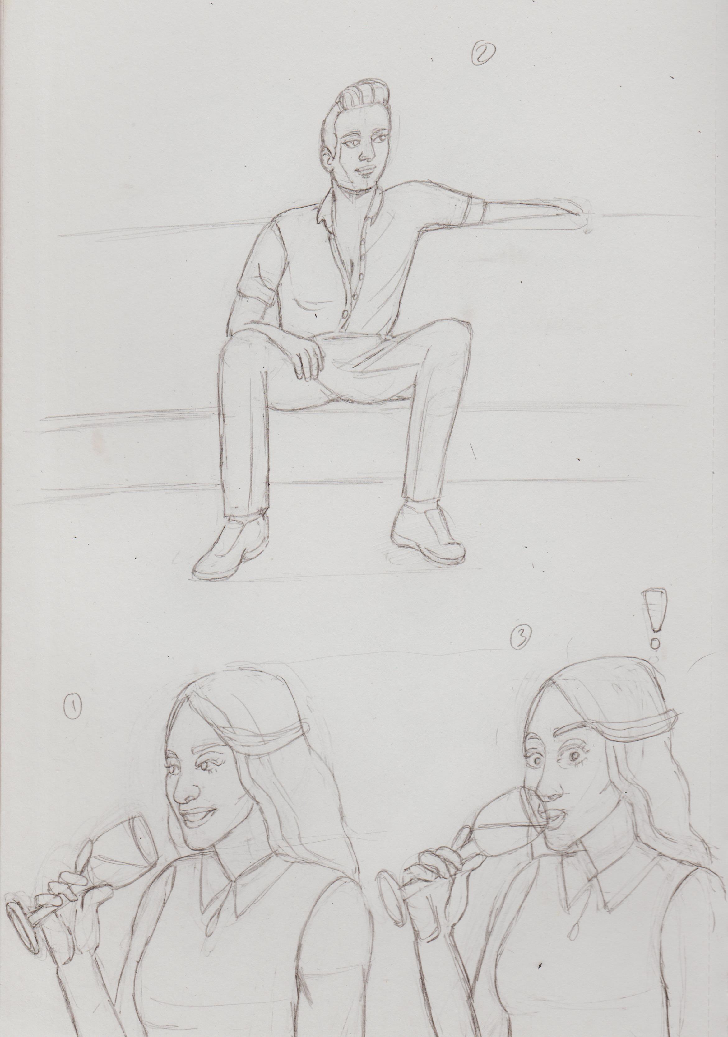
Started drawing some fandom images I've wanting to create since I was 13. X-Men: Evolution was one of my very first fandoms. Always wanted to draw images of Remy and Rogue (Romy), Kitty and Piotr (Kiotr) and Wanda and St. John (Jonda) at prom. The original brief was them just slowly dancing front to front together, but I wanted them to look more dynamic. I have a plan of colouring it in the future. I have a plain pencil version, just in case a traditional version doesn't work. (But if Valoofle can do it!)
.jpg "Filename: Image (408).jpg
Size: 437.28 KB01-16-2023, 10:46 AM")
Ran away with it and did prom photos, too!
.jpg "Filename: Image (410).jpg
Size: 637.93 KB01-16-2023, 10:47 AM")
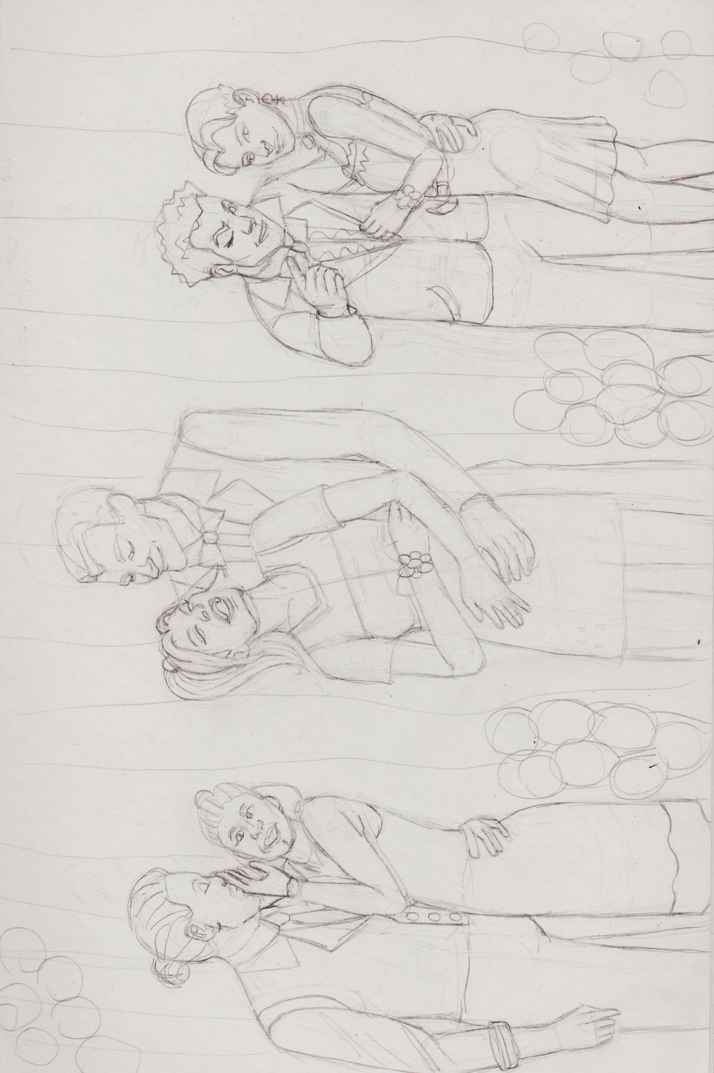
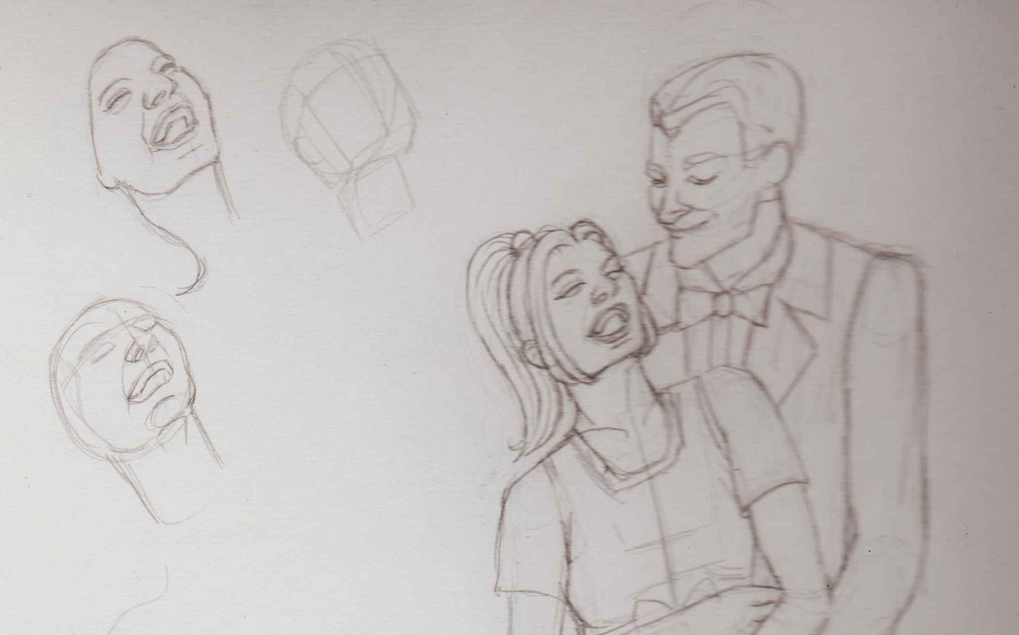
My goodness it up turned faces difficult! Had to do this head a least three times. Wanted St.John slightly bowed, while cheekily pointing at the audience/camera.
.jpg "Filename: Image (407).jpg
Size: 147.98 KB01-16-2023, 10:48 AM")
Wanna start to do more costume designs.
.jpg "Filename: Image (411).jpg
Size: 381.62 KB01-16-2023, 07:40 PM")
.jpg "Filename: Image (412).jpg
Size: 284.5 KB01-16-2023, 07:40 PM")
Really loving Piotr Jablonksi's dark moody work and costume design. Brough some of that in here.
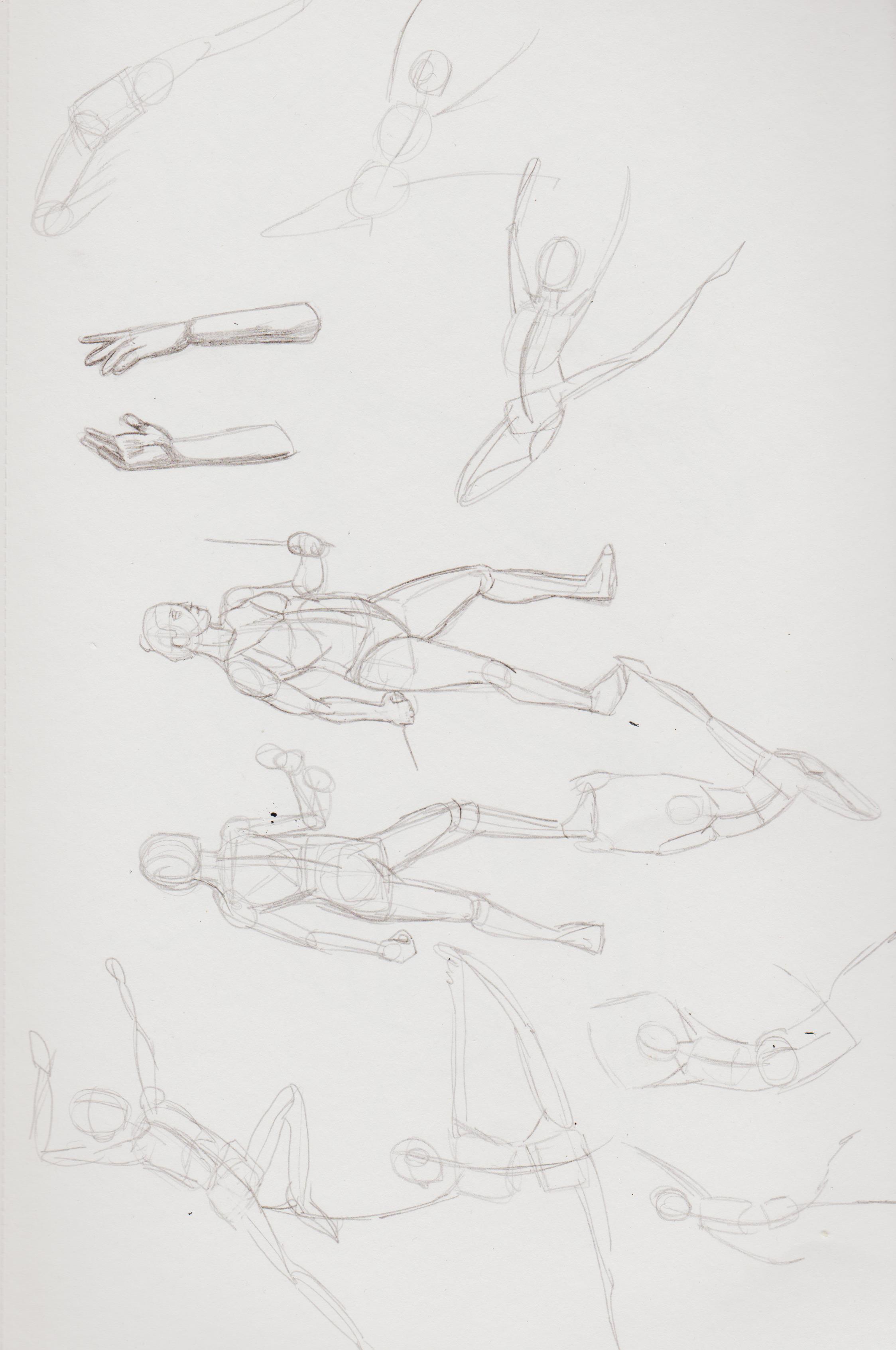
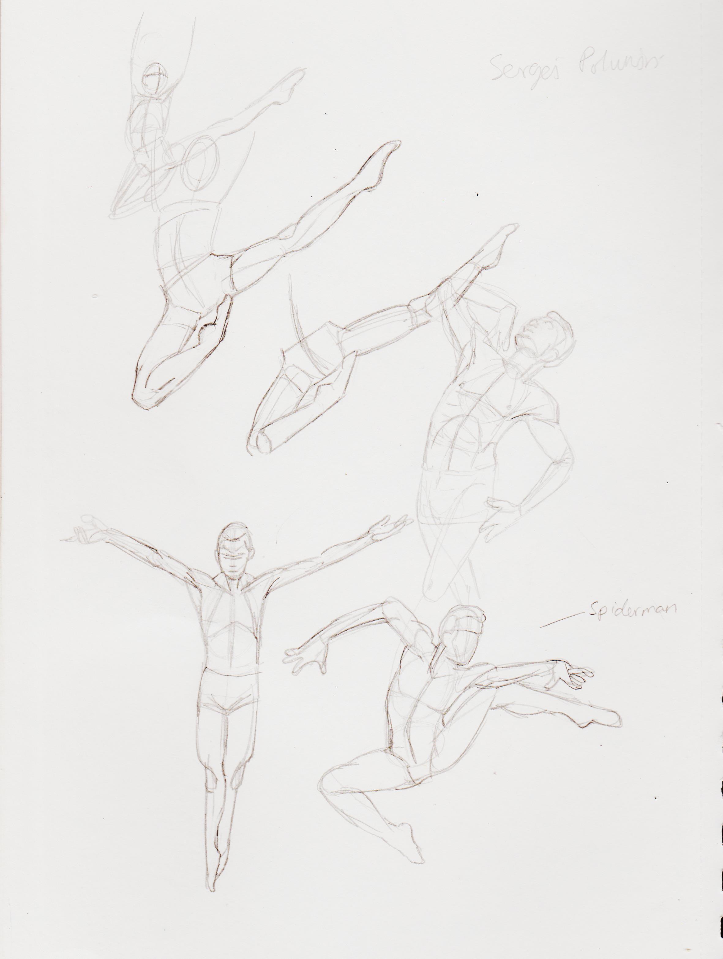
Went back to gestures:
.jpg "Filename: Image (413).jpg
Size: 368.59 KB01-16-2023, 07:44 PM")
Trying to recall a past pose. The same one I refed for the Barda piece. How does one learn dynamic anatomy? How long do you spend on a pose, before trying recall it? After 30 seconds or a longer study. Wanna get to a point where I can just riff away on my head and it come out correct or at least convincible.
.jpg "Filename: Image (414).jpg
Size: 416.11 KB01-16-2023, 07:44 PM")
.jpg "Filename: Image (415).jpg
Size: 275.56 KB01-16-2023, 07:45 PM")
.jpg "Filename: Image (416).jpg
Size: 673.3 KB01-16-2023, 07:45 PM")
.jpg "Filename: Image (417).jpg
Size: 253.72 KB01-16-2023, 07:46 PM")
Drawing male ballet dancers because they are graceful and beautiful. <3

Started to get back into digital after a lagging issue caused me to stop. When back to Huion, but couldn't get the driver to update, so pulled out the Intuos, where I had to reinstall. Thank God I still had the original box and CD. I'm using CSP.
Finding it hard to create a hard edge in it, my best bet with this was the 'Oil paint flat brush' brush. Getting the likeness of the model wasn't my aim with this, I just wanted to finally learn how to tackle digital painting.

Female Thea bust shot. Still figuring how to use Clip to render. They're supposed to be a green tinted blue, but not sure how over lays work. How do layers even work? I do a sketch later, then flats, like the tutorials, then get lost. I try to create another later then blend the flat colour via colour picking, but it won't let me. I suppose, because it's on another layer. But, I'm sure I've done it before. Not sure if Clip has a 'Colour Blending' mode like Procreate. Right now I'm blending on the flats layer, because I'm not sure what else to do.

Must better than my first attempt after not using Clip for almost a year.

Put the Lara Croft crouching pic into Clip to attempt to draw. Consider this a W.I.P. Want more like Adam Hughes colouring, but no idea how he does it or how to do it on Clip. Or at least 'painterly-like'?

Posts: 25
Threads: 2
Joined: Jan 2023
Reputation:
0
Digital art can be a nightmare to get used to. From experience, it can be both physical and technical issues.
It sounds like with your Clip Studio paint issues, there might be frustration in organization? (Please correct me if I am wrong). Its important that you take your physical environment into consideration. What kind of tablet do you use? is it on a desktop or ipad? Having navigation issues in a program can cause frustration in the learning process over all. I have some resources that may help you.
As for your painting questions, have you ever watched Marco Bucci's 10 minute to better painting series on youtube? They are very well made and I feel like they will aid you in your painting process.
Overall good starting point for digging deeper into digital art.
Posts: 369
Threads: 6
Joined: Sep 2019
Reputation:
23
Hey, so glad they hung up the portraits you made of them!
I was referring to something you wrote about realizing that drawing from imagination is actually working from memory, which I only partly agree with: The extra bit is the exploration that you can make when drawing from imagination and still come up with convincing poses that you never studied, all that because your inner eye that knows more about the world than your educated self, guided you out of the fog.
I can't find any good reference on drawing water from above but Marianne Nguyen's painting that you linked to shows it all: See how the white areas partly hide what's below them, making things lighter. On paper you might be able to achieve this with some diluted white paint.
In the first digital portrait above you managed pretty well, especially the shadows around the shoulder area are very convincing. For hard edges the flat brush does work indeed, or just use a smaller brush when painting more precise details and edges, even if it's an airbrush or the old plain round brush with no effects.
I'm not sure what you mean by color blending layer and whether CS has it, but if you lower the opacity of your brush you will get blending with the underlying colors - whether on the same layer or the underlying ones. Can you clarify what you're after?
I think the Thea renders rather flat because you put too much highlight everywhere, as if she was surrounded by hard lights - but this may be what you want to represent?
Take everything I say with a jar of salt because i'm just an amateur.
Posts: 201
Threads: 3
Joined: Jan 2021
Reputation:
3
(01-18-2023, 05:16 AM)OG-SAN Wrote: Digital art can be a nightmare to get used to. From experience, it can be both physical and technical issues.
It sounds like with your Clip Studio paint issues, there might be frustration in organization? (Please correct me if I am wrong). Its important that you take your physical environment into consideration. What kind of tablet do you use? is it on a desktop or ipad? Having navigation issues in a program can cause frustration in the learning process over all. I have some resources that may help you.
As for your painting questions, have you ever watched Marco Bucci's 10 minute to better painting series on youtube? They are very well made and I feel like they will aid you in your painting process.
Overall good starting point for digging deeper into digital art.
Hi, it's very hard. I have an idea of what I'll like to implement, but have no idea how to do it. There are other random frustrations, too. Like when I colour pick and it doesn't give me the right colour and I don't know why. I'm using a desk tablet, have no coin for a display one. I used Krita before, but got CSP for Christmas, so I'm trying to focus on that. It doesn't have the same brush I'm used to and I have to take a pause as my tablet keep on lagging. It would either do that or stop abruptly and then strike a line forward. I have looked up Ctrlpaint, but he uses PS and like 99% of digital painting tutorials. I get so far then get lost, because I don't know what the equivalent brush is in Clip/Krita.
Is Marco's the same? I'll look it up, though.
(01-19-2023, 11:07 AM)Leo Ki Wrote: Hey, so glad they hung up the portraits you made of them!
I was referring to something you wrote about realizing that drawing from imagination is actually working from memory, which I only partly agree with: The extra bit is the exploration that you can make when drawing from imagination and still come up with convincing poses that you never studied, all that because your inner eye that knows more about the world than your educated self, guided you out of the fog.
I can't find any good reference on drawing water from above but Marianne Nguyen's painting that you linked to shows it all: See how the white areas partly hide what's below them, making things lighter. On paper you might be able to achieve this with some diluted white paint.
In the first digital portrait above you managed pretty well, especially the shadows around the shoulder area are very convincing. For hard edges the flat brush does work indeed, or just use a smaller brush when painting more precise details and edges, even if it's an airbrush or the old plain round brush with no effects.
I'm not sure what you mean by color blending layer and whether CS has it, but if you lower the opacity of your brush you will get blending with the underlying colors - whether on the same layer or the underlying ones. Can you clarify what you're after?
I think the Thea renders rather flat because you put too much highlight everywhere, as if she was surrounded by hard lights - but this may be what you want to represent?
Take everything I say with a jar of salt because i'm just an amateur.
Yeah, I though it would be in the gallery area, but it was in the bar instead lol. Still trying to crack coloured pencil. (Like how do you stop the 'tooth' of the paper doing through?) I mean that when you study from reference, then make up something creative on the fly. You are drawing something that doesn't currently exist as a whole form in 2-D or 3-D, but it's a composite of all the things you liked/saw before/know of/studied. You are pulling this amalgamation from your 'visual library'. Hope you understand what I mean.
I tried using Nguyen's drawing as a ref, but I probably got bored and wasn't too observant. (Didn't want to ape her completely, but I guess 'Hey ho, steal like an artist.'.  I might do some studies in the future. I usually focus on the face and ignore the neck collar bone/shoulder area, so devoted more attention to that area. Glad you noticed. Hard edges= flat brush. Noted. Most of the time in order to get details I will just zoom in and try to foreground the values of the area, while cleaning up the edges. I'm trying to figure out what the 'hard round brush' on Clip even is.
I was watching a Youtube short that talked about it. Basically AIA, you can create a line art layer as you would, then a layer for flats, then another layer, where if you set it to 'colour blending' mode you can colour pick and/or just blend out the colours. I could try lowering the opacity. I guess I just need to know how layers work. I can get the the part where I create a sketch later and the a flats layer and drag the colour layer underneath, so I can still see the line, but then I try and blend on another layer and then things don't go to plan. For example I try and colour pick on the new layer above the flats layer, but it won't let me colour pick. (Because, I guess it's on a new layer? But, then how to you colour? I just end up colouring on the flats layer in the end, whereas a tutorial doesn't show that.)
I didn't want to Thea to look like that, but even time I tried to create a highlight it wouldn't 'read', so I started testing out the brushes and the 'highlight' airbrush worked, only problem is it's too harsh a highlight. But, serendipitously it kinda works, her being an alien and all. Wanted to make her skin more blueish, but I don't understand blending modes or gradient maps yet, so didn't know how to maintain the right values.
Thanks for the feedback.
Posts: 369
Threads: 6
Joined: Sep 2019
Reputation:
23
They have a gallery at the factory!? But the bar is a better place for the portraits I would say. The staff get to see them more often :)
What I meant by hard round brush is basically the plain pencil with a wider diameter, no effects on it. It's totally possible to paint with that if you play with the opacity and size depending on what part you're painting. It's actually a good exercise to master it before using more complex brushes.
I think you can change the options of Clip Studio's color picker to pick either from a specific layer or the blended result: https://www.clip-studio.com/site/gd_en/c...ropper.htm
I've never used highlighting or darkening modes so I can't advise. Could be that you don't really need these? I find it more satisfying to find the colors I need rather than tweaking the underlying ones.
But the technical glitches you experience with the tablet, the delays and such, are worrying, they can hamper you and even turn you away from digital painting. When I started digital I had a long period of adjusting to the delays (which are probably slighter than what you have), also looking at the screen while moving the pen on another, slippery, surface was a bit painful.
Posts: 25
Threads: 2
Joined: Jan 2023
Reputation:
0
(01-22-2023, 06:13 AM)Dominicque Wrote: (01-18-2023, 05:16 AM)OG-SAN Wrote: Digital art can be a nightmare to get used to. From experience, it can be both physical and technical issues.
It sounds like with your Clip Studio paint issues, there might be frustration in organization? (Please correct me if I am wrong). Its important that you take your physical environment into consideration. What kind of tablet do you use? is it on a desktop or ipad? Having navigation issues in a program can cause frustration in the learning process over all. I have some resources that may help you.
As for your painting questions, have you ever watched Marco Bucci's 10 minute to better painting series on youtube? They are very well made and I feel like they will aid you in your painting process.
Overall good starting point for digging deeper into digital art.
Hi, it's very hard. I have an idea of what I'll like to implement, but have no idea how to do it. There are other random frustrations, too. Like when I colour pick and it doesn't give me the right colour and I don't know why. I'm using a desk tablet, have no coin for a display one. I used Krita before, but got CSP for Christmas, so I'm trying to focus on that. It doesn't have the same brush I'm used to and I have to take a pause as my tablet keep on lagging. It would either do that or stop abruptly and then strike a line forward. I have looked up Ctrlpaint, but he uses PS and like 99% of digital painting tutorials. I get so far then get lost, because I don't know what the equivalent brush is in Clip/Krita.
Is Marco's the same? I'll look it up, though.
I believe Marco Bucci mostly uses photoshop but his overall knowledge on painting is very good.
Check out his video series on painting
Also, Check out this video on clip studio's workspace settings. I would learn to set up Quick access. It really a great way to organize CSP tools.
I hope this helps. 
Posts: 1,076
Threads: 4
Joined: Jan 2016
Reputation:
43
Nice work with your latest sketches, you have some very dynamic and interesting poses there! Nice to see you painting again as well! Are you planning on developing them further? I think they could use some more depth in terms of shading. Try thinking in simple shapes when shading for the initial stages to give a more dimensional look. Keep it up!
Posts: 201
Threads: 3
Joined: Jan 2021
Reputation:
3
(01-22-2023, 09:34 AM)Leo Ki Wrote: They have a gallery at the factory!? But the bar is a better place for the portraits I would say. The staff get to see them more often :)
What I meant by hard round brush is basically the plain pencil with a wider diameter, no effects on it. It's totally possible to paint with that if you play with the opacity and size depending on what part you're painting. It's actually a good exercise to master it before using more complex brushes.
I think you can change the options of Clip Studio's color picker to pick either from a specific layer or the blended result: https://www.clip-studio.com/site/gd_en/c...ropper.htm
I've never used highlighting or darkening modes so I can't advise. Could be that you don't really need these? I find it more satisfying to find the colors I need rather than tweaking the underlying ones.
But the technical glitches you experience with the tablet, the delays and such, are worrying, they can hamper you and even turn you away from digital painting. When I started digital I had a long period of adjusting to the delays (which are probably slighter than what you have), also looking at the screen while moving the pen on another, slippery, surface was a bit painful.
.
Well, they have a gallery as part of the social space with the working bar, the brewery is in a separate location. It's a social enterprise that helps people with disabilities gain employment and experience. The brewery is the newest strain. They also run art classes and wood working workshops. So a 'hard round' is just a pencil? Always thought it was one of the actual paint brushes. I'll try and play around with it. I guess what the link you supplied, I would need 'Image', but I'm not sure where that is. On the 'reference' button on layers doesn't have a drop down. I'm trying to get a pure white to highlight, but it ends up being tinted. I just found the 'highlight' airbrush after playing around with some brushes.
I was working on the earlier girl centaur piece and quit, because my tablet kept on stopping and lagging, plus when I colour picked it wouldn't pick up the same colour. After not using it for a while I had to reinstall my Wacom (couldn't get the Huion to work properly), it's working OK, for now...
Digital is a learning curve, I find getting used to drawing on a surface tablet and viewing a screen in tandem not too cumbersome. However, learning what all the tools are for and how to get them to work for you when you just want to immediately drawing/paint is a lesson in frustration.
(01-29-2023, 04:28 PM)OG-SAN Wrote: (01-22-2023, 06:13 AM)Dominicque Wrote: (01-18-2023, 05:16 AM)OG-SAN Wrote: Digital art can be a nightmare to get used to. From experience, it can be both physical and technical issues.
It sounds like with your Clip Studio paint issues, there might be frustration in organization? (Please correct me if I am wrong). Its important that you take your physical environment into consideration. What kind of tablet do you use? is it on a desktop or ipad? Having navigation issues in a program can cause frustration in the learning process over all. I have some resources that may help you.
As for your painting questions, have you ever watched Marco Bucci's 10 minute to better painting series on youtube? They are very well made and I feel like they will aid you in your painting process.
Overall good starting point for digging deeper into digital art.
Hi, it's very hard. I have an idea of what I'll like to implement, but have no idea how to do it. There are other random frustrations, too. Like when I colour pick and it doesn't give me the right colour and I don't know why. I'm using a desk tablet, have no coin for a display one. I used Krita before, but got CSP for Christmas, so I'm trying to focus on that. It doesn't have the same brush I'm used to and I have to take a pause as my tablet keep on lagging. It would either do that or stop abruptly and then strike a line forward. I have looked up Ctrlpaint, but he uses PS and like 99% of digital painting tutorials. I get so far then get lost, because I don't know what the equivalent brush is in Clip/Krita.
Is Marco's the same? I'll look it up, though.
I believe Marco Bucci mostly uses photoshop but his overall knowledge on painting is very good.
Check out his video series on painting
Also, Check out this video on clip studio's workspace settings. I would learn to set up Quick access. It really a great way to organize CSP tools.
I hope this helps. Thanks for the links, I'll try and acquaint myself to Clip's user interface.
(01-30-2023, 02:52 AM)cgmythology Wrote: Nice work with your latest sketches, you have some very dynamic and interesting poses there! Nice to see you painting again as well! Are you planning on developing them further? I think they could use some more depth in terms of shading. Try thinking in simple shapes when shading for the initial stages to give a more dimensional look. Keep it up!
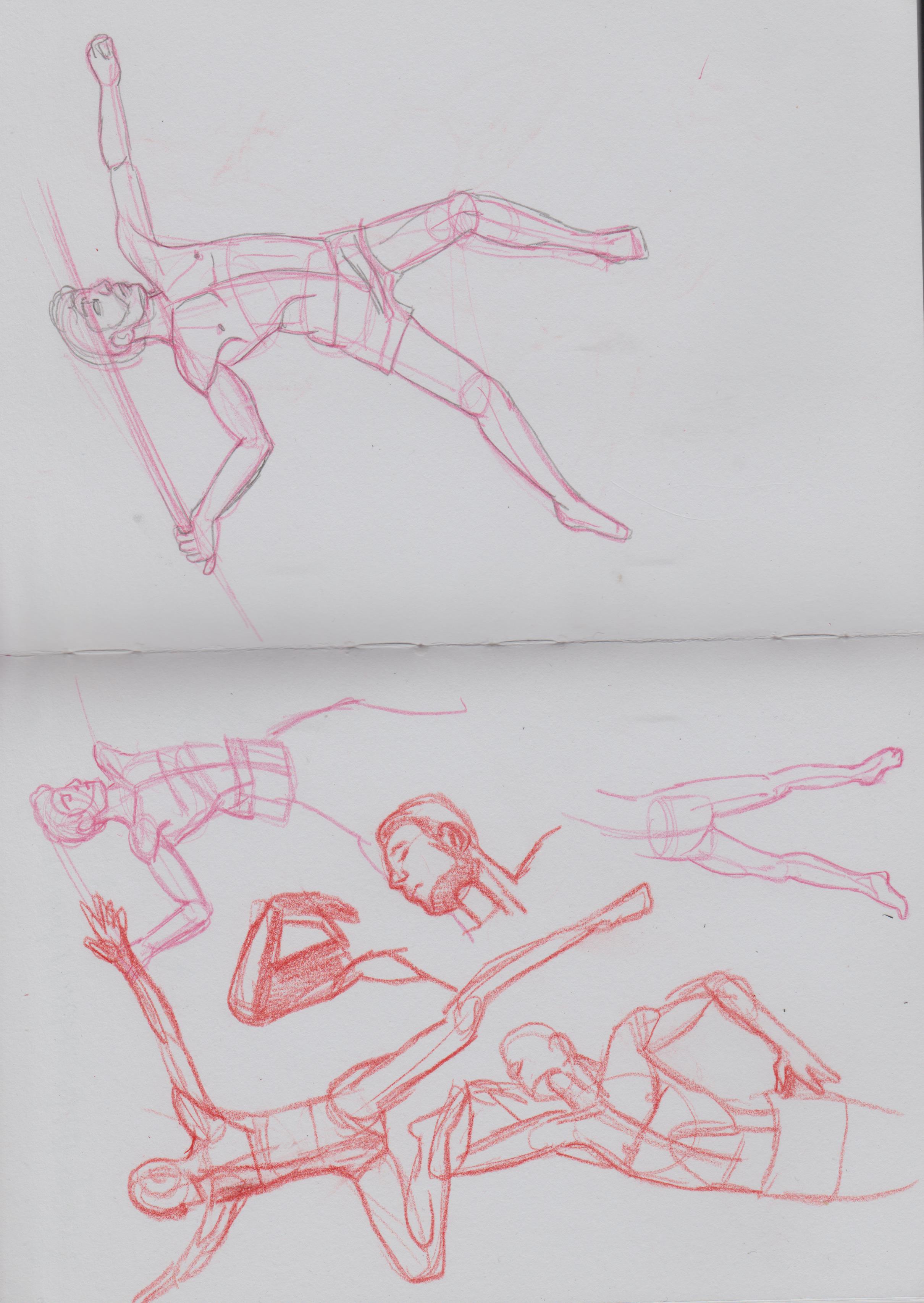
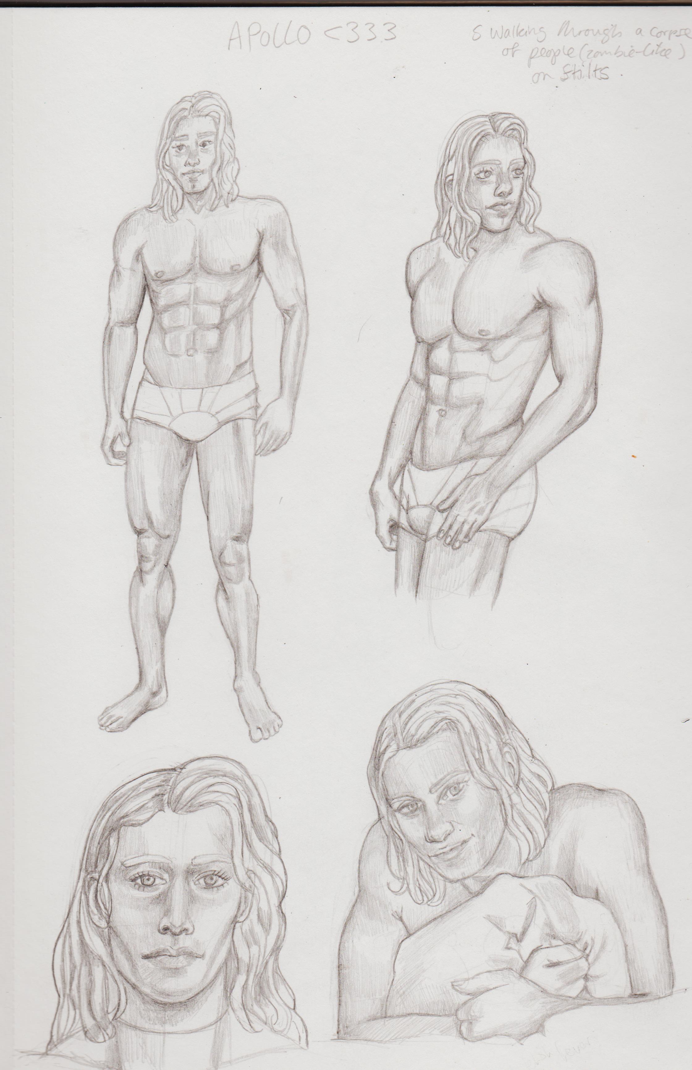
Thanks, ultimately I want to draw dynamic figures from 'imagination', but it's a long and frustrating road ahead. I'm so used to just focusing on shapes, construction and having clean lines, I forget about the 'filling'. I want to learn how to draw men, so I've been doing studies, then turning them into Apollo from The Authority, because he's super beautiful. I've drawn some fanart and will try to digitise those as I would already have something to go of off, when I try and paint. I'll try to still keep the 'simple shapes' thing in mind, but I may need to take some time out for some separated study to truly grasp the concept.
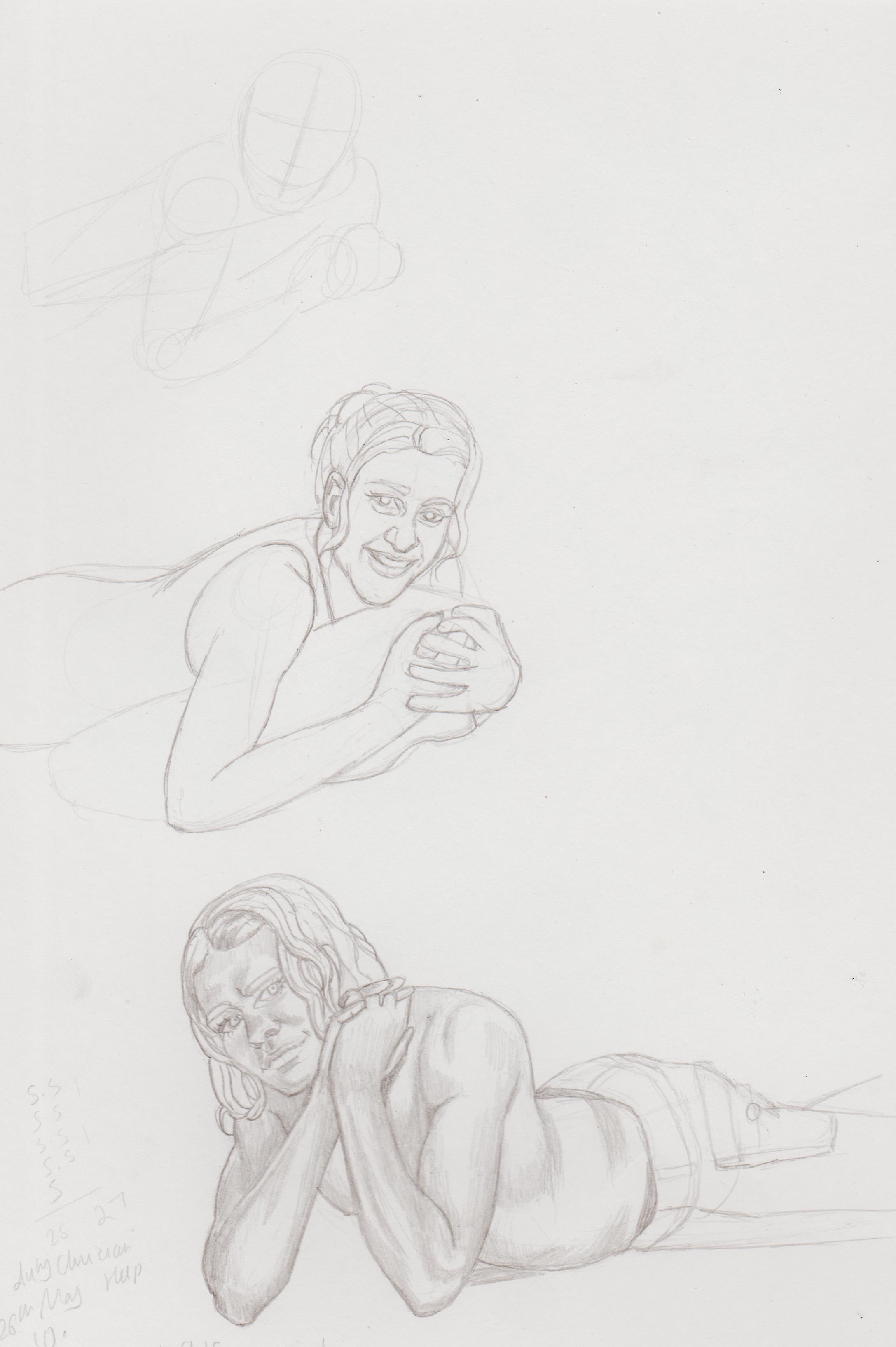
I find masculine women and feminine men really appeal, so I wanna get better at drawing them. Most of the poses I want for women are done by male models. Saw this image on Pinterest and couldn't help, but draw a female version.
.jpg "Filename: Image (428).jpg
Size: 645.84 KB01-30-2023, 08:28 AM")
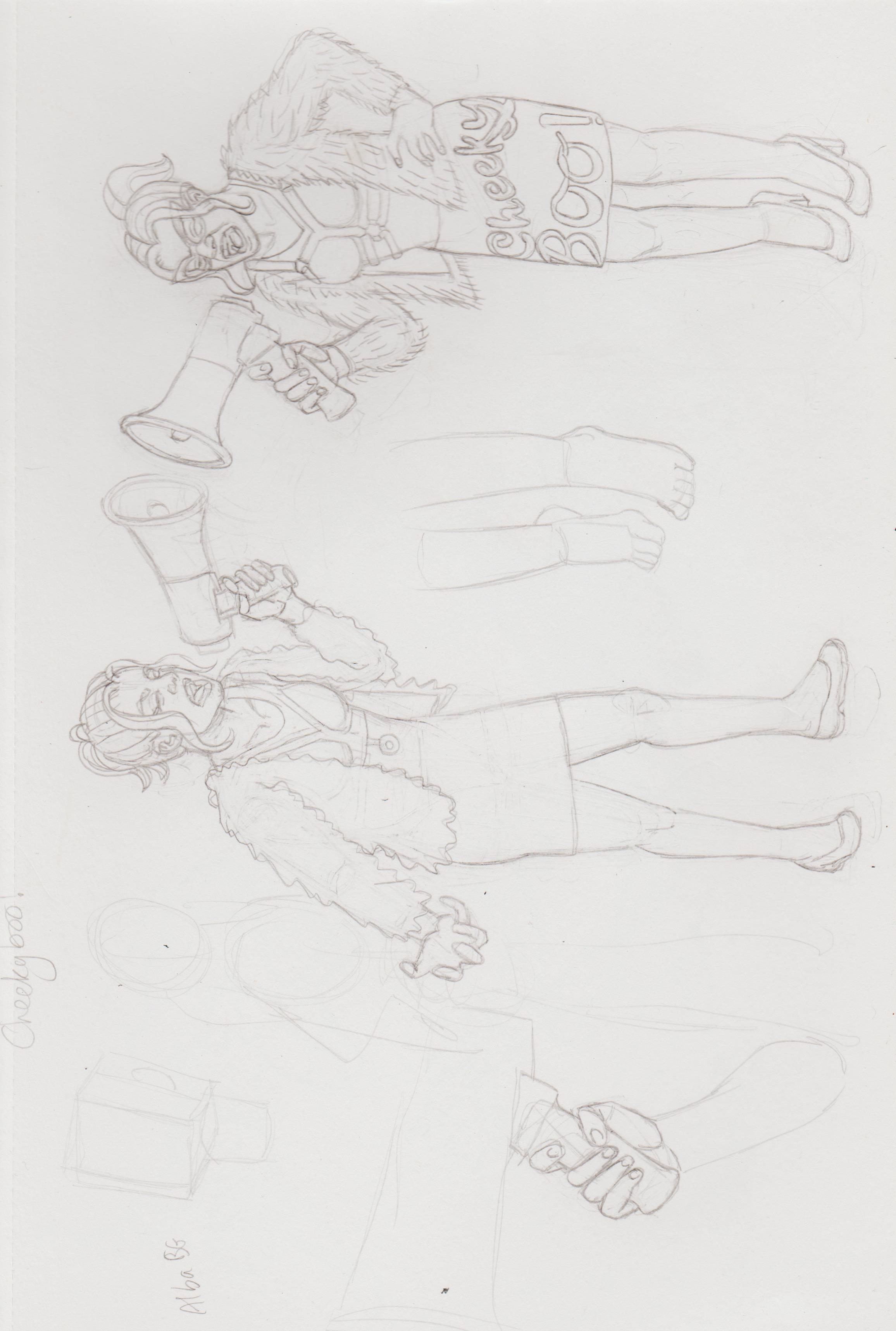
I have several fashion brands in my head starting with the 'Cheeky Boo!' brand. Basically very funky and quirky fashion for plus size women- there's a gap in the market. The initial concept was all three fashion houses in one image, but I couldn't get it right, therefore went looking for references and just focused on the first girl.
.jpg "Filename: Image (429).jpg
Size: 421.53 KB01-30-2023, 08:28 AM")
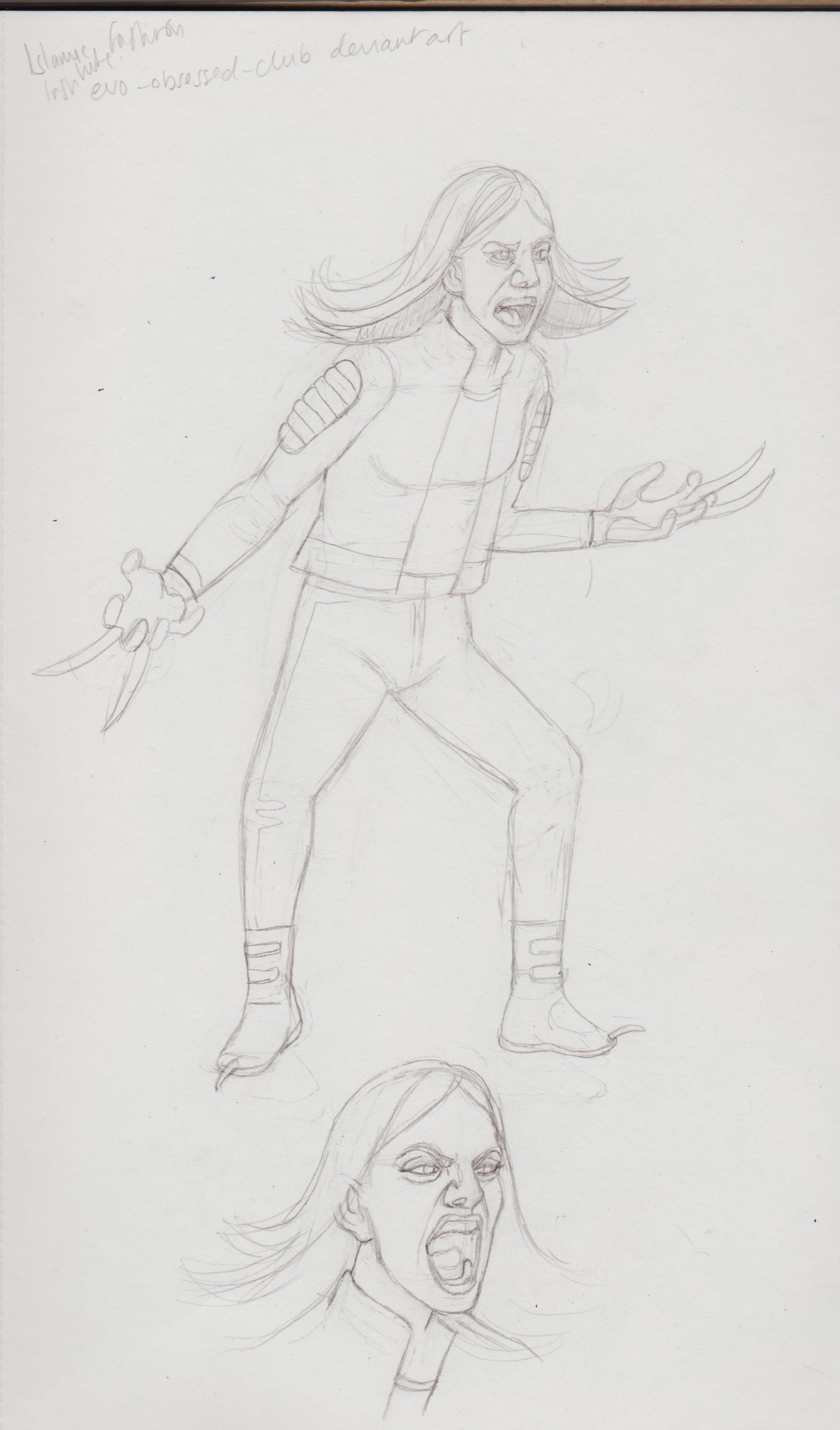
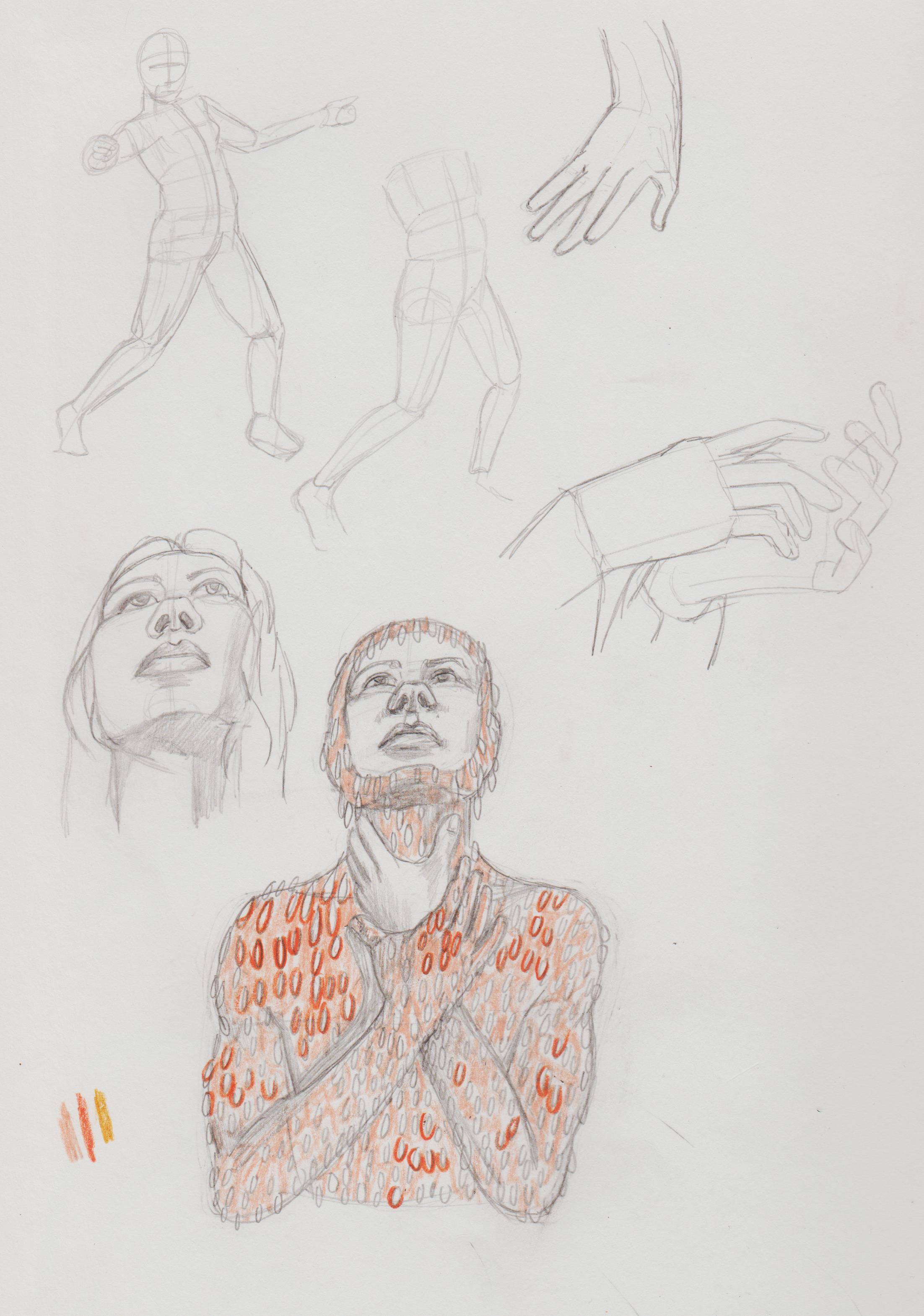
Trying the Wolfsbane 'screaming out' pose, but with Evo!X-23. Wasn't so happy with the face, so studies from a reference. If I digitise this, I plan to fill and adjust the face. The model was an adult, but the character herself is only around 14 years old. Any tips on how hair works with wind/motion, like this?
.jpg "Filename: Image (430).jpg
Size: 461.94 KB01-30-2023, 08:30 AM")
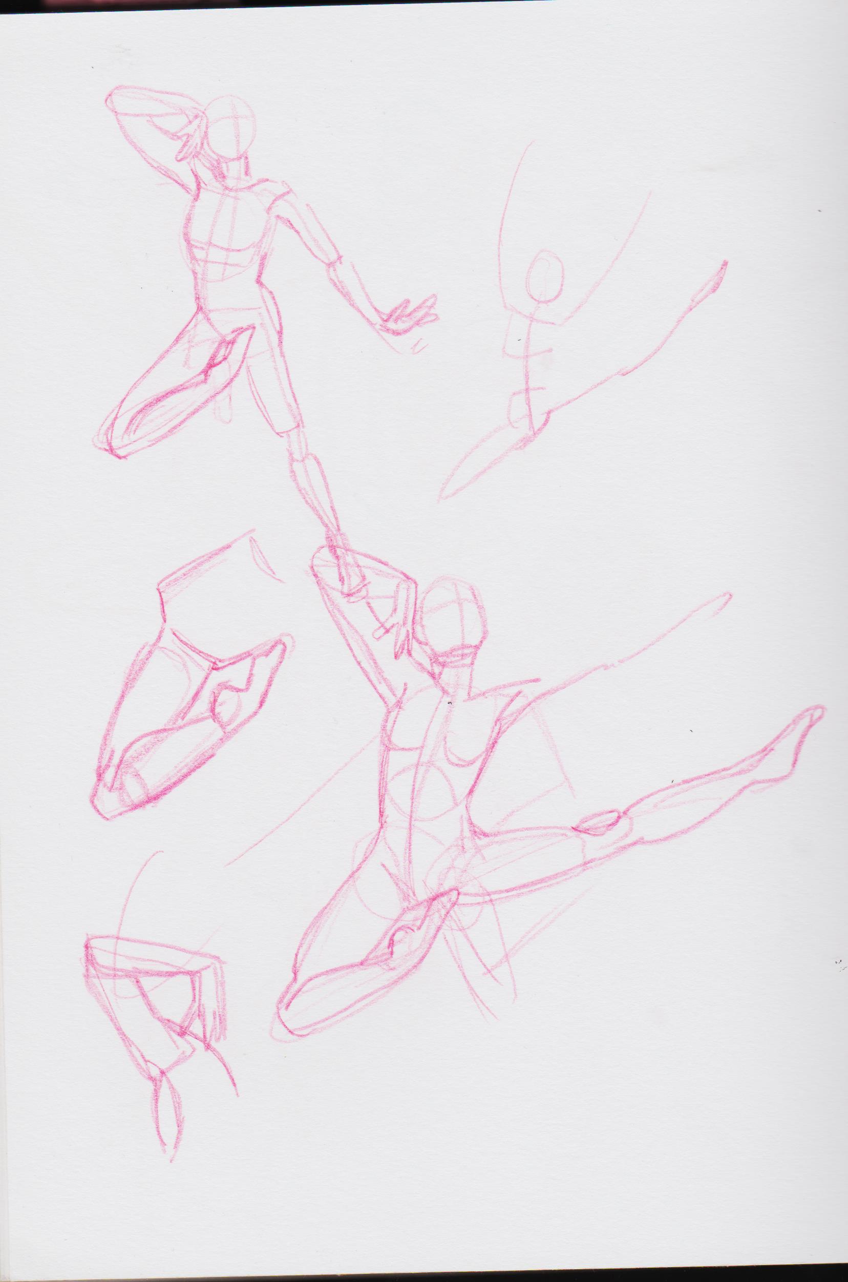
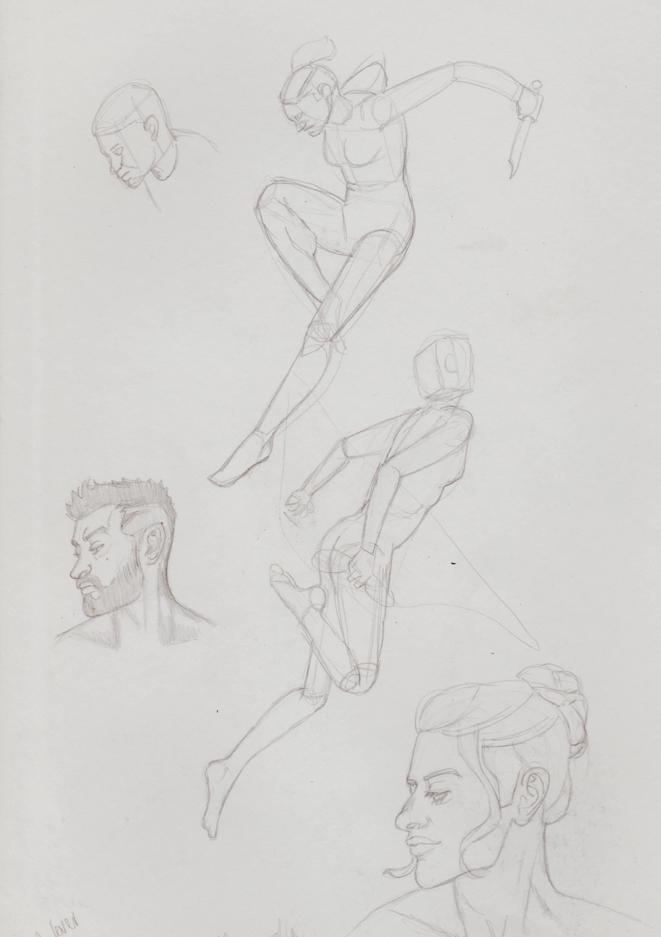
Some pose studies and drawing men as Apollo.
.jpg "Filename: Image (431).jpg
Size: 395.04 KB01-30-2023, 08:30 AM")
Having a go a painting Apollo's profile. I used two lighting refs.

.jpg "Filename: Image (418).jpg
Size: 632.4 KB01-30-2023, 08:31 AM")
.jpg "Filename: Image (419).jpg
Size: 347.71 KB01-30-2023, 08:31 AM")
Wanna play around with painting style, people use just flats, but it's more 'polished' than this. It has charm though, saved this version if/when I try a 'blended' out version, like above.

A concept I tried, but couldn't get quite down.
.jpg "Filename: Image (432).jpg
Size: 493.76 KB01-30-2023, 08:35 AM")
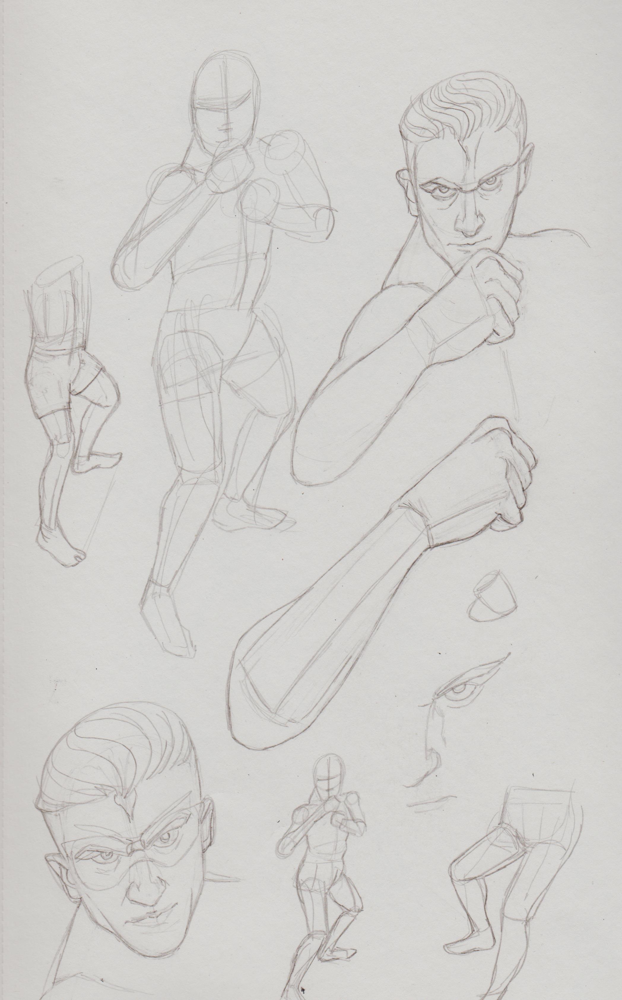
Breaking down a fight pose.
.jpg "Filename: Image (433).jpg
Size: 539.72 KB01-30-2023, 08:35 AM")
Using that to draw Iron Fist.
.jpg "Filename: Image (434).jpg
Size: 226.4 KB01-30-2023, 08:37 AM")
Actually trying to get an idea down from my head without refs. I still can't do it. It's so tiresome.
.jpg "Filename: Image (420).jpg
Size: 198.89 KB01-30-2023, 08:37 AM")
Here is the same image with refs. I did enjoy this though. It was fun, I just need to work on the feeling that it's 'not mine'. Sometimes the fear creeps in.
.jpg "Filename: Image (421).jpg
Size: 209.94 KB01-30-2023, 08:41 AM")
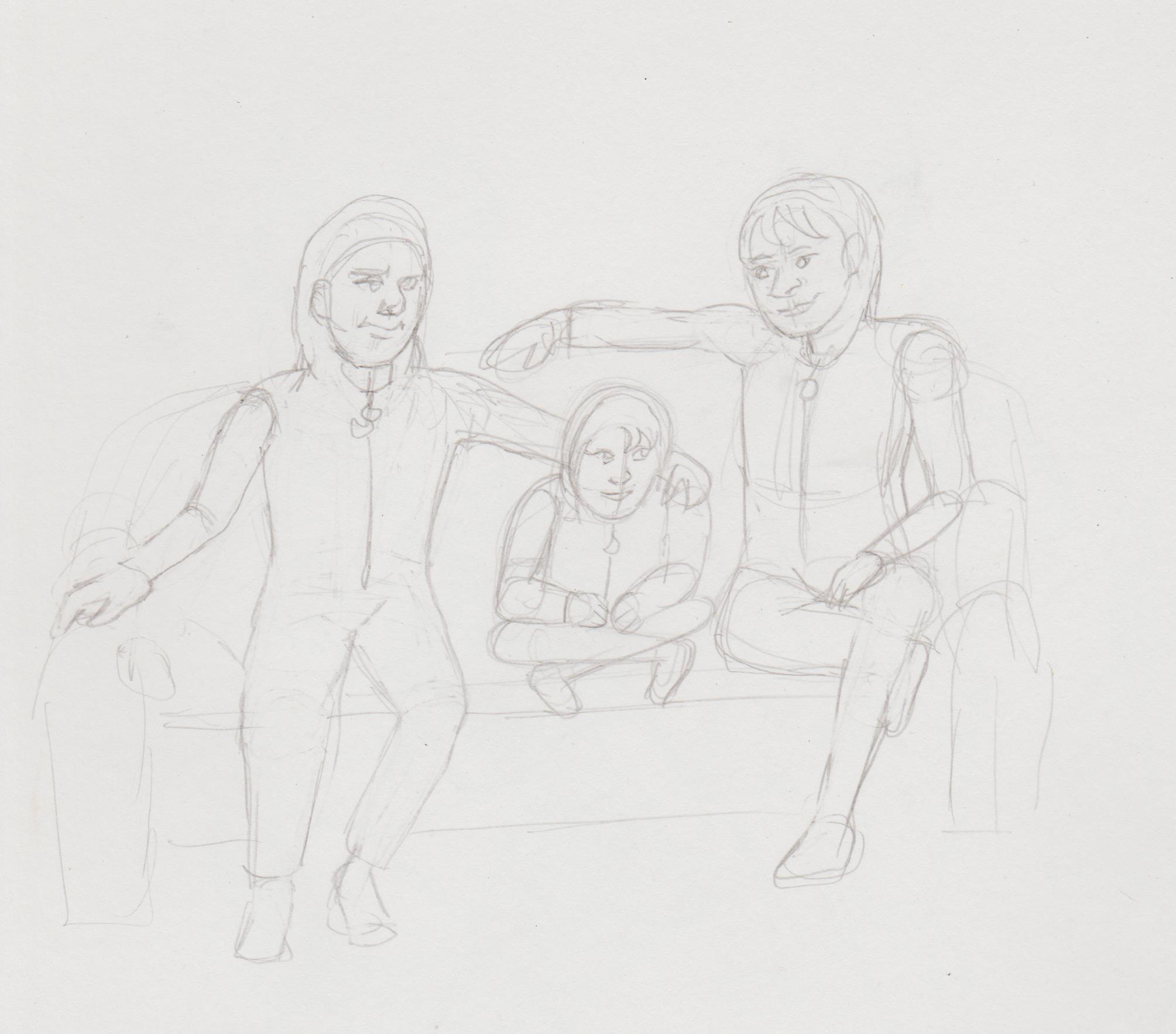
An older version of Jenny and her fathers.
.jpg "Filename: Image (423).jpg
Size: 201.79 KB01-30-2023, 08:41 AM")
The female version of Apollo and Midnighter: Andrea and Lucille.
.jpg "Filename: Image (426).jpg
Size: 501.17 KB01-30-2023, 08:44 AM")
The Trent-Pulaski's getting ready for bed. This was very hard. What are backs? What is perspective? If anyone wants to redline, fine by me.
.jpg "Filename: Image (427).jpg
Size: 377.3 KB01-30-2023, 08:44 AM")
Posts: 369
Threads: 6
Joined: Sep 2019
Reputation:
23
The color picker options that I linked to are not on the layer but on the color picker itself (tool options), either picking the color of the active layer or the color of the whole image at the pixel.
Yeah, every tool that sets colors on the layer is basically a digital brush, even a pencil. Depending on the software there are some subcategories, I think CSP distinguishes between pencils (little to no effects, maybe some texture) and brushes (with complex color blending operations). I may be wrong.
One weakness I perceive in your drawings from imagination is the shoulders and hips. May I suggest studying the bones and muscles at these articulations? They are a bit complicated, especially the shoulders, but can be simplified and still look realistic.
If you ever continue your centaur painting, I think you don't need to push the rendering too far, it has an oniric mood to it that would work well with lose brush strokes.
Your concept here https://crimsondaggers.com/forum/attachm...0(432).jpg is interesting and shows a vision, do you care to push it further and adjust the face perspective a bit?
Posts: 1,076
Threads: 4
Joined: Jan 2016
Reputation:
43
Lots of studies, admire your dedication. Great to see you tackling general anatomy, I think that will really help you improve. Maybe try to emphasize form a bit more with your studies? That should give your sketches a more professional feel. Keep it up!
Posts: 201
Threads: 3
Joined: Jan 2021
Reputation:
3
(02-01-2023, 11:05 AM)Leo Ki Wrote: The color picker options that I linked to are not on the layer but on the color picker itself (tool options), either picking the color of the active layer or the color of the whole image at the pixel.
Yeah, every tool that sets colors on the layer is basically a digital brush, even a pencil. Depending on the software there are some subcategories, I think CSP distinguishes between pencils (little to no effects, maybe some texture) and brushes (with complex color blending operations). I may be wrong.
One weakness I perceive in your drawings from imagination is the shoulders and hips. May I suggest studying the bones and muscles at these articulations? They are a bit complicated, especially the shoulders, but can be simplified and still look realistic.
If you ever continue your centaur painting, I think you don't need to push the rendering too far, it has an oniric mood to it that would work well with lose brush strokes.
Your concept here https://crimsondaggers.com/forum/attachm...0(432).jpg is interesting and shows a vision, do you care to push it further and adjust the face perspective a bit? Sorry, I'm not sure what you mean. Google talks about 'tool property'. Here is a screencap of my colour picker. Are you referring to the two squares?

I'm already trying to look at neck connections with the collars. I've studied the shoulder girdle from Hampton, but my issue is remembering it. I think particular studies for direct application will help. As you noticed I have problems drawing people sitting.
Right now I'm focused on getting better at digital work and am planning to colour several of my past sketches, so I might go back to it. I was focused on making it more 'tight', but I might make it looser per your suggestion. I reason why I stopped was mainly problems with my tablet.
The original idea for that piece was to have a more 'huddled' pose, hands towards the face, but I wasn't sure how to do it. May try again, now that I have my reference dolls. The design was supposed to look more 'dripped' too, less strawberry.
(02-05-2023, 12:47 AM)cgmythology Wrote: Lots of studies, admire your dedication. Great to see you tackling general anatomy, I think that will really help you improve. Maybe try to emphasize form a bit more with your studies? That should give your sketches a more professional feel. Keep it up! Do you mean focus more on mannequinisation? Ta.
Apollo update. I want to get to the point where I don't have the sketch layer underneath, but perhaps that doesn't matter as long as it looks good. (Didn't for the second image.


My traditional art looks much better and trying to line this looks horrible. It changed when I was introduced to this brush. TPU Skin Brush - CLIP STUDIO ASSETS (clip-studio.com)It's fab. I used it for all of them.
I wanted to post the full image, rather than post the W.I.P, but fuck it, it's my sketchbook and I shouldn't feel pressured.

The re-do.

Posts: 369
Threads: 6
Joined: Sep 2019
Reputation:
23
I mean the settings for the color picker (eye dropper) that I had sent you a link to in the CSP manual. I found a clearer explanation in this reddit thread:
https://www.reddit.com/r/ClipStudio/comm...cker_tool/
The first reply contains an image showing where to configure the eye dropper to pick either the color on the current layer or that of the image as a whole.
The second image in your last post (this one: http://crimsondaggers.com/forum/attachme...dwoman.jpg ) contains some magic that I can't exactly pinpoint. An Art Moderne feeling with a touch of the seventies. There's a few things anatomy-wise that I could criticize if I was a machine, but there would be no point to it, the painting works as it is!
Posts: 201
Threads: 3
Joined: Jan 2021
Reputation:
3
(02-16-2023, 01:16 PM)Leo Ki Wrote: I mean the settings for the color picker (eye dropper) that I had sent you a link to in the CSP manual. I found a clearer explanation in this reddit thread:
https://www.reddit.com/r/ClipStudio/comm...cker_tool/
The first reply contains an image showing where to configure the eye dropper to pick either the color on the current layer or that of the image as a whole.
The second image in your last post (this one: http://crimsondaggers.com/forum/attachme...dwoman.jpg ) contains some magic that I can't exactly pinpoint. An Art Moderne feeling with a touch of the seventies. There's a few things anatomy-wise that I could criticize if I was a machine, but there would be no point to it, the painting works as it is! AHA! Thanks for the link with the screenshot. The official manual is so technical I can't made heads or tails of it, most of the time. It's not quite the same as the screenshot (I think I have an updated version), but I got it to work. Whew! That makes life much, much easier.
I'm curious how do you isolate an attached file to repost as a link? I'm trying to colour previous drawing/sketches, so knowing this would be really helpful. Thanks, it's an older drawing produced after doing some iterative Adam Hughes studies. I can see anatomy mistakes like the left arm, I tried to 'warp' it, but it looked worse, so I left it. I still like it though. Trying to create more completed pieces for a portfolio.
Here's the latest. An update on the Midpollo+Jenny baby pic. Love how Jenny's face turned out. I have really clear references images for her, not so much for her fathers, but I tried.

Here's the start of the older pic:

Continuing colour practice from older drawings I actually liked. Know the anatomy is wonky, but in the pencil form I at least liked the stylisation.

After getting new brush that I'm currently using.

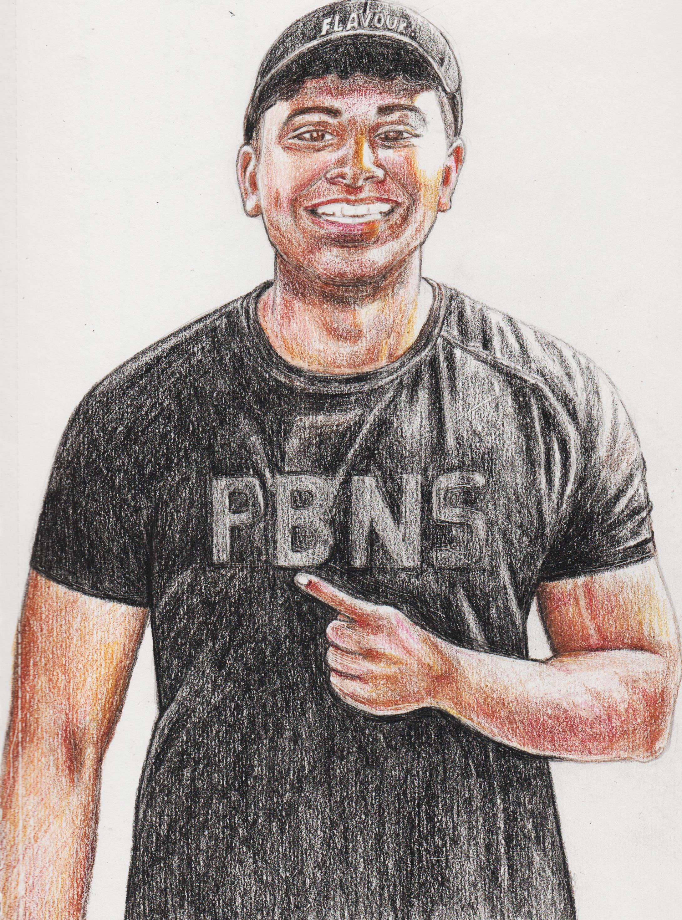
Pic of colleague that's leaving for uni. Did with pencil, still not sure how to remove the 'teeth' of the paper when rendering.
.jpg "Filename: Image (435).jpg
Size: 1.57 MB02-25-2023, 01:22 AM")
I'm trying to upload a coloured version of the 'floating water lady' I'm frustrated with, but I can't upload the image. It says 'it says can't upload past '2.1 MB'. Even tried to post in another file format, but still no dice. Are we limited per day?
Posts: 201
Threads: 3
Joined: Jan 2021
Reputation:
3
I still don't know why it won't allow me to post as an image attachment on CD. Mariyan Hristov suggested imgur, so that's what I ended up using. Wanted to say this in my original update post. I wanted to create more finished pieces digitally so when back to the 'floating lady'. No lie, I painted and repainted her face SIX times and could never capture the original. Asked discord, but my question was 'too vague', so just asked how to keep the original pencil sketch without losing details. Someone told me I could just 'Convert brightness to opacity' and paint under the original lines. I didn't know that was an option! I've just been creating a new sketch layer over the top and using that. The first two images are where I tried my paint over, the third is the image I'm currently working on. Now I can just try and render the water itself without the face making me want to chop a desk in half.
nnnnnnm
First cock-eyed, second a dead corpse, the third just right. (Would have just typed above the images, but the writing is tiny/something wrong with the code.
![[Image: HFfGBy2.jpg]](https://i.imgur.com/HFfGBy2.jpg)
![[Image: cUuV9D1.jpg]](https://i.imgur.com/cUuV9D1.jpg) [size=1]j
[size=1]j
[size=1]![[Image: TsK3vPa.jpg]](https://i.imgur.com/TsK3vPa.jpg) [/size][/size] [/size][/size]
Posts: 88
Threads: 1
Joined: May 2014
Reputation:
5
Nice work here! This last piece looks very promising. I'd say don't be afraid to spend a stupid amount of time on finishing pieces. Especially when figuring out digital tools and all that, it can take forever. Just go with it. Seems like you figured out the brighness to opacity thing already. Now you can block in all the colors you want, start some rendering of the form and once you have it all sort of jell together, make a new layer on top of everything and try "painting out" your pencils. It's an ambitious image with all the water, the hair and everything, dont hesitate to get good references at this point. If you want I could do an overpaint once you've pushed it as far as possible, let me know. Have fun!
|


 I might do some studies in the future. I usually focus on the face and ignore the neck collar bone/shoulder area, so devoted more attention to that area. Glad you noticed. Hard edges= flat brush. Noted. Most of the time in order to get details I will just zoom in and try to foreground the values of the area, while cleaning up the edges. I'm trying to figure out what the 'hard round brush' on Clip even is.