09-27-2021, 11:05 PM
|
Zizka's Sketchbook (Nudity and Vulgarity, NSFW)
|
|
09-27-2021, 11:05 PM
  
09-27-2021, 11:12 PM
 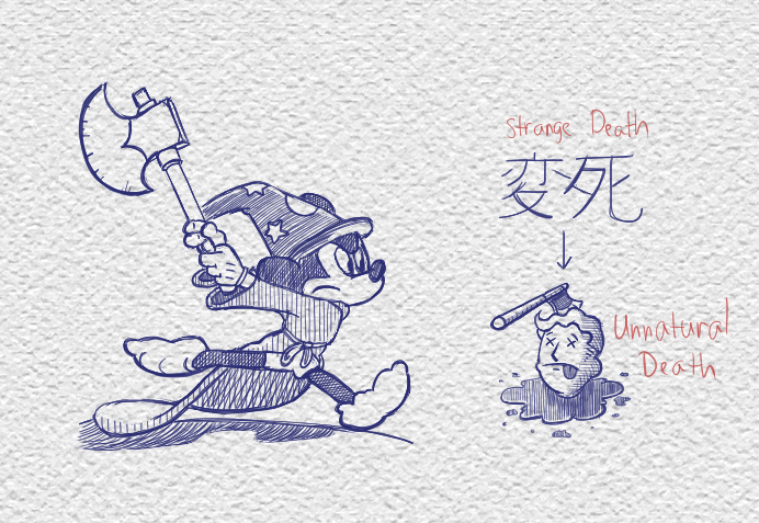 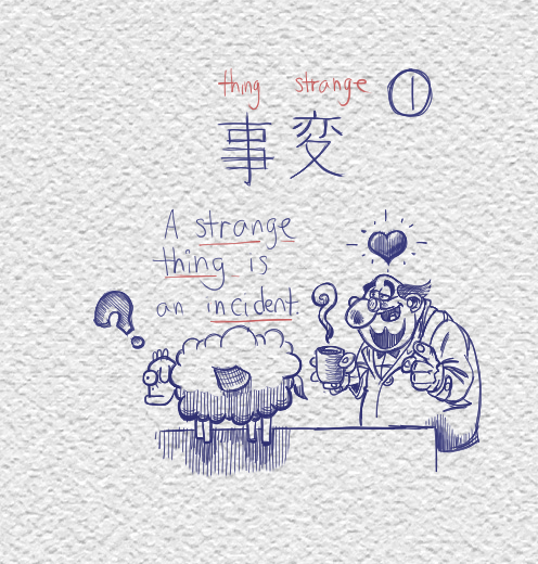 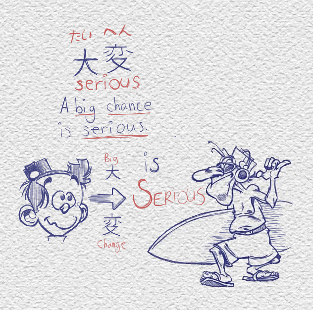
09-27-2021, 11:13 PM
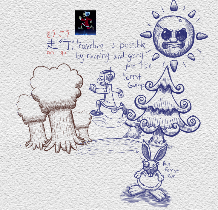 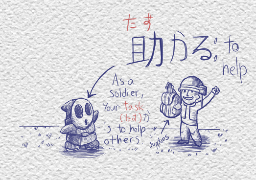 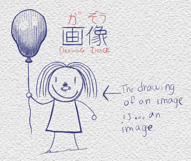 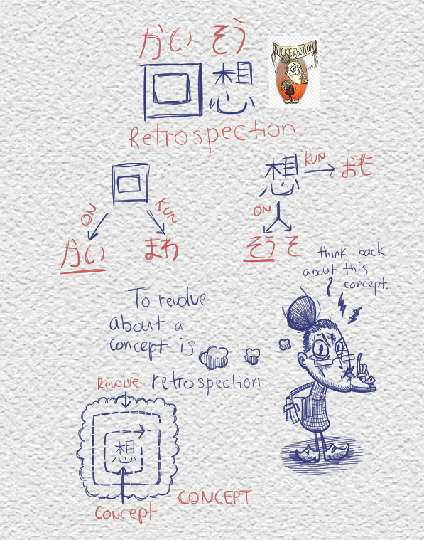
09-27-2021, 11:15 PM
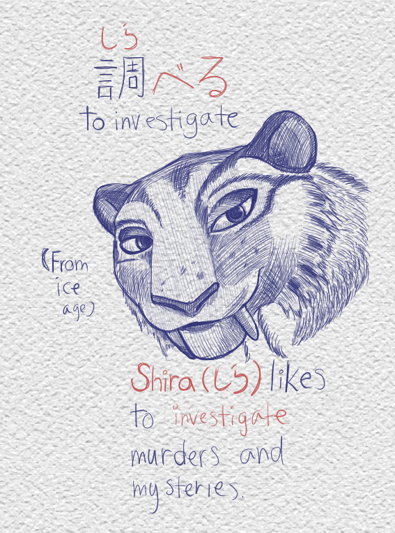 
09-27-2021, 11:16 PM
09-27-2021, 11:18 PM
09-27-2021, 11:19 PM
09-27-2021, 11:20 PM
09-27-2021, 11:21 PM
    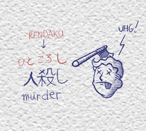
09-27-2021, 11:23 PM
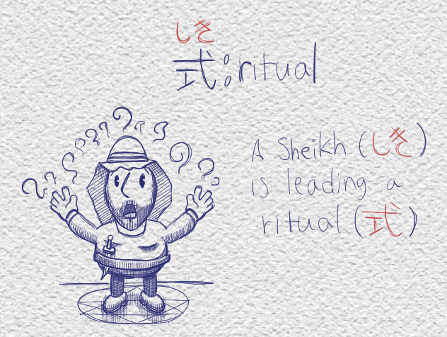 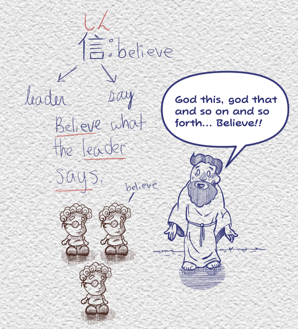 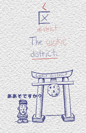 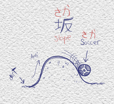 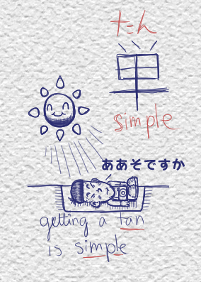 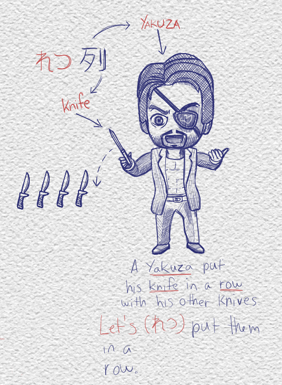
09-27-2021, 11:24 PM
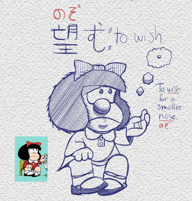
10-01-2021, 10:33 AM
Man, this does remind me of good old times http://www.kanjidamage.com/
Ganço is creating personal projects of pure underground arts and goods. 🌏https://www.downfor.art/ for Client Inquiries.
10-13-2021, 01:24 AM
Haha thanks!
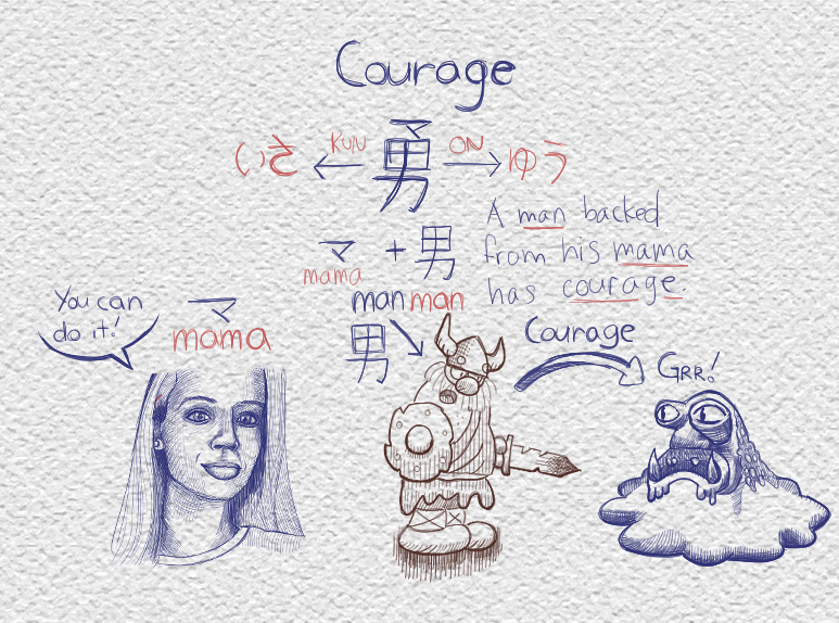
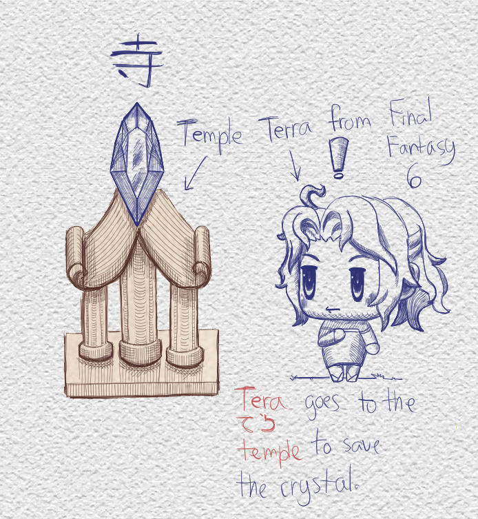
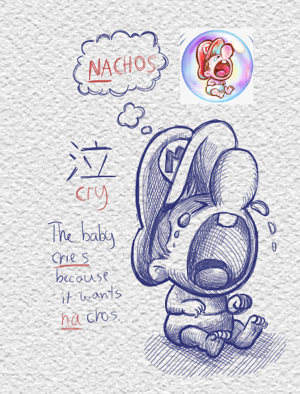
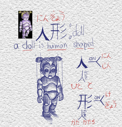
So this is my lastest design notes. I'd be nice to know if there are things lacking on the graphical side before commiting anything to code (as that then involves costs). ![[Image: e8duayI.jpg]](https://i.imgur.com/e8duayI.jpg) [size=1] ![[Image: zdH5fXe.jpg]](https://i.imgur.com/zdH5fXe.jpg) [/size] [/size][size=1][size=1] ![[Image: HisKSns.jpg]](https://i.imgur.com/HisKSns.jpg) [/size][/size] [/size][/size]
11-29-2021, 06:58 AM
Wow almost two months. I was thinking of starting a new thread as people won't go through 14 pages of content so there's little point in bumping the thread over and over again.
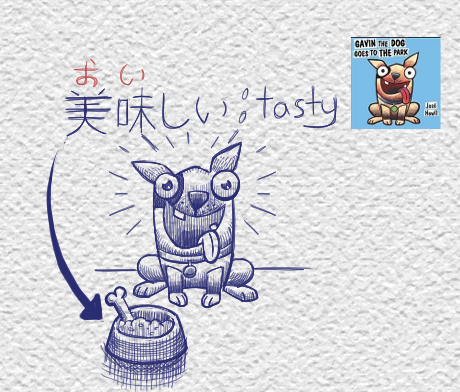
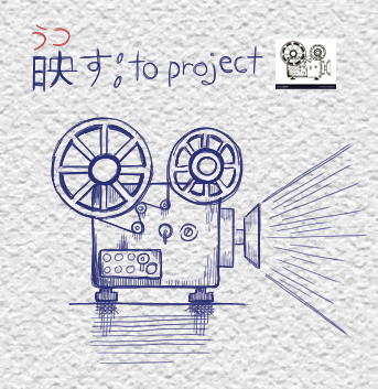
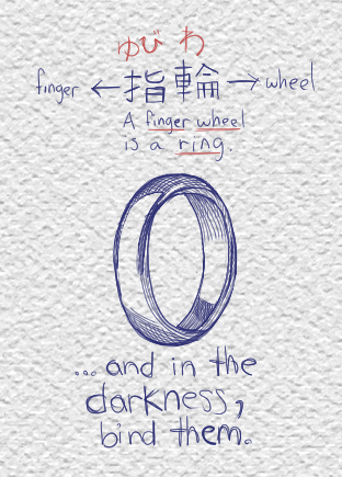
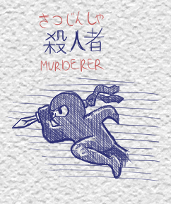
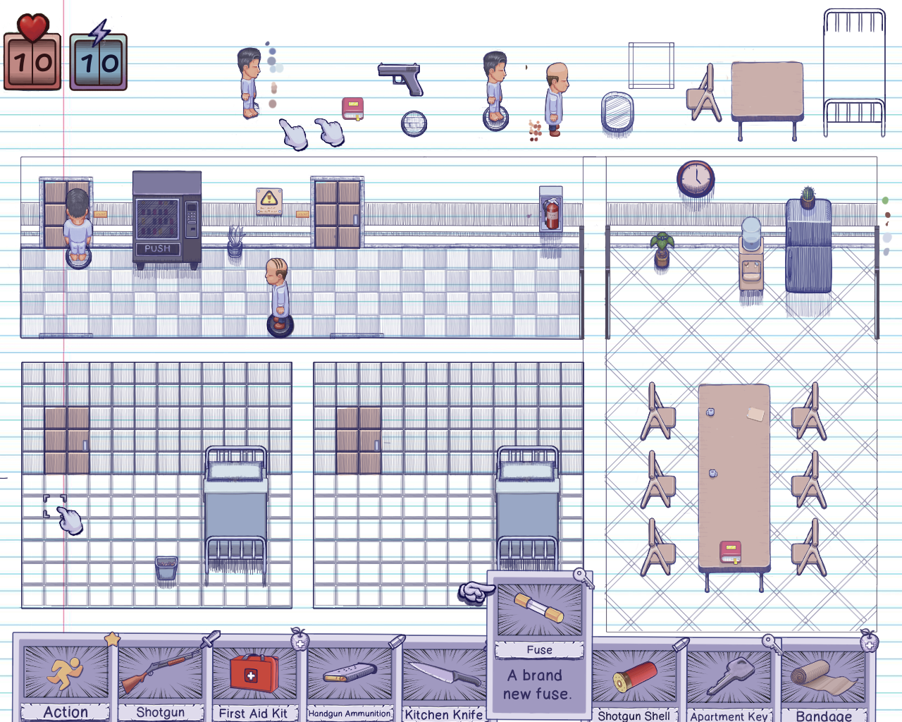 I'm still working on my game. I'm trying to recreate as if the game was taking place as scribbles on a sheet of paper (in blue ink) but it doesn't work... Any ideas how to fix this? Objects in color can be interacted with while non-colored ones can't. I might have to ditch the concept but it'd like to make it work. (any other feedback is welcomed, negative or otherwise).
11-29-2021, 02:48 PM
(11-29-2021, 06:58 AM)Zizka Wrote: Wow almost two months. I was thinking of starting a new thread as people won't go through 14 pages of content so there's little point in bumping the thread over and over again. Hi, As I wrote before — I'm a fan of your precise line work and style. As for starting a new thread: it looks like your still getting a lot of views here (over 20k) so people are still finding your sketchbook and art every time you post — so unless you just want a clean slate — I don't think it'd be necessary. Keep up the good work and best wishes with your game
12-12-2021, 05:51 AM
That may be! I'll stick to this one for now then.
I'm not getting much feedback on the recent art but maybe someone will have to say about the animation. :) ![[Image: Jrkn05A.gif]](https://i.imgur.com/Jrkn05A.gif) Sorry about the empty space and the white background. I'm trying to animate with ClipStudio but I can't seem to be able to trim my animation. If I try to trim the content of the cell, I'm told the frame will be deleted. I'm a bit disappointed with the animation flow of Clip Studio compared to Krita. To me it's needlessly complex. I don't even draw on each cell, I draw on a different document and copy/paste each frame. I guess it's a learning process. It must be good since it's used by pro. Krita was just a lot simpler to me. Yeah, I could use Krita but I'd like to learn to use Clip Studio properly. Does this animation read right to you? What could I improve upon do you think?
12-12-2021, 01:13 PM
whoa that animation looks sick! Idk how to improve it.
12-13-2021, 01:48 AM
Well coming from you and your knowledge of anatomy, I guess it's good enough for now!
12-13-2021, 02:07 AM
Well I guess If we are talkin' anatomy, the hand only has 4 fingers haha
It looks really good as a graphic tho I didn't really see your new game stuff before, but I like the blue pen aesthetic I feel like that's working. Not sure If I would really get the colored vs. non colored interaction thing just because most things are seem to be colored and the things that remain grey don't seem out of place to me. It's only a few screens though so maybe with more context that would be clear. I think that idea could be stronger by making the interactable objects have a distinct color, like they are drawn in red pen or something. Up to you how big of an element you want that to be though.
12-14-2021, 01:34 AM
Quote: I think that idea could be stronger by making the interactable objects have a distinct color, like they are drawn in red pen or something. Up to you how big of an element you want that to be though. That's a good idea, wish I had read that before coloring so much stuff though! XD I could try the red ink idea, worth a try. Working on another animation. In order to help with feedback, I'm providing the individual frames for criticism or paint overs. When an animation is going on, it's easier to cheat as each frame is displayed for such short time, people don't notice shortcomings. ![[Image: tslbC6H.png]](https://i.imgur.com/tslbC6H.png) The top is my progression through trial and error, I'm not using a reference, just what feels right although I do look at my own hand to get a general idea. The bottom line is the current animation (currently 4 cells) and I'm aiming for 7 individual unique frames. So frame B is obviously a modified version of frame A (the one on the very left). Same thing with frame C being a modifified version of D. That's because drawing unique frames is hard and time consuming for me so I try to be pragmatic. Comments? |
|
« Next Oldest | Next Newest »
|