Posts: 50
Threads: 2
Joined: Apr 2021
Reputation:
1
 04-17-2021, 03:53 PM
Posts: 460
Threads: 10
Joined: Mar 2016
Reputation:
64
Nice start to your sketchbook! I feel like some of your colors are going into muddy zone, but other than that, it's really quite solid work! Keep it up!
Posts: 50
Threads: 2
Joined: Apr 2021
Reputation:
1
(04-19-2021, 04:29 AM)Zorrentos Wrote: Nice start to your sketchbook! I feel like some of your colors are going into muddy zone, but other than that, it's really quite solid work! Keep it up! Thank you! It's been hard switching from traditional (where I normally used a limited palette) to digital while still not becoming oversaturated or have... odd colors. I'll try to keep watch for that.
Posts: 50
Threads: 2
Joined: Apr 2021
Reputation:
1
I made it back. I have two actual pictures and a two page essay. Verbosity is my talent.
I pulled out a few old pieces to take in for the next intake at the art gallery. (I pay a membership to basically be in an artist's guild. So not a fancy gallery. They're actually located at the mall. But I prefer that over the gentrifying bullshit the actual art center of my town has become).
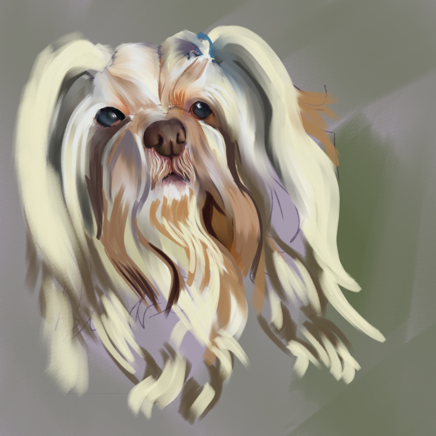
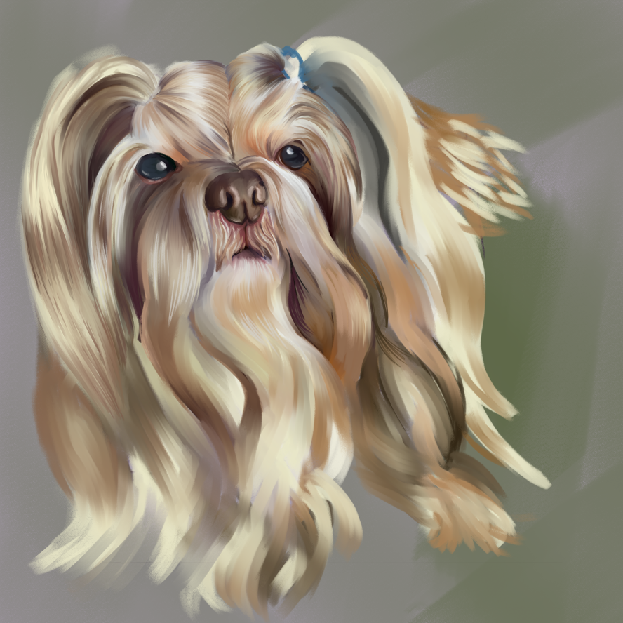
So with this in mind I decided to tackle a few pet portraits as they're pretty marketable in gallery and whoring for commissions setting.

But of COURSE I asked my work wife for a photo of her beloved shih tzu. I swear they naturally have this odd, slanted look. And so much hair. Hair obscuring EVERYTHING. And I realized that I should have planned more. I should have known the gravitational force on the hair needed deliberate planning to emphasize that the head was tilted and this wasn't a cross-eyed Cousin It.
And so the struggle continues.
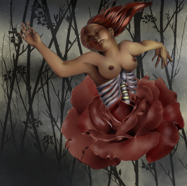
The other thing I've struggled with is this pixel barf.

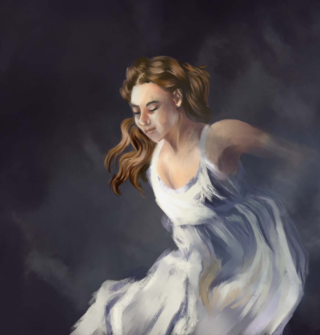
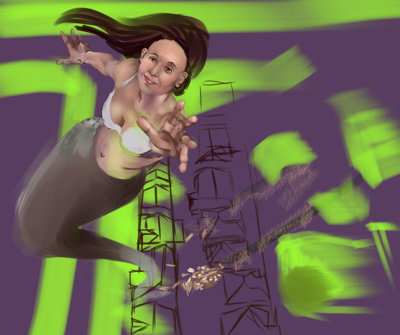
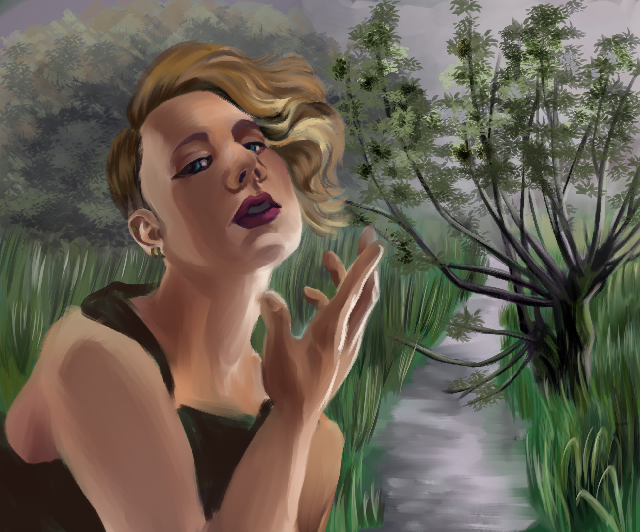
I was enthusiastic about this because it was the first real *artsy* thing I'd managed to make on a computer. For some reason, I decided to try a digital grisaille. There are also a million layers and I only know what five do. And I didn't exactly plan for a background, so I tried to force one in. The edge is too close to the top of the frame, but at some point I made a layer mask with no actual idea how masks work and I can't fix it. And I think the proportions are off.
I might leave this one behind and move out of town.
(personal note in case my computer dies and I forget what I'm using, the brushes are CH Gouache and Noa's PS Chalk Brushes).
Posts: 181
Threads: 0
Joined: Oct 2017
Reputation:
41
Hey Anomily. Welcome to CD. Great start to your sketchbook!
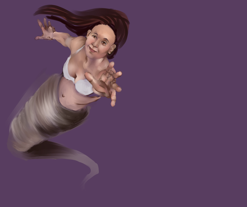
You are correct in that the proportions are off in the piece above, and it extends to there being issues with the anatomy and perspective as well. Proportion wise, take note of how the right hand (her left) is furthest away from us, but in the image it's drawn to be larger than the hand closest to us. Things close to us should be bigger, things further away smaller, etc. Anatomy wise, the right arm (her left) doesn't make much sense - it's hard to tell the difference between the shoulder and arm. And her arm is closer, but it's smaller than the forearm. Her chest is also very high - there's isn't much space at all between her neck and boobs.
Maybe the above notes will help? The best thing to do if you're struggling with proportions and the pose is to attempt the pose yourself in a mirror or take a photo. That way you can compare.
Posts: 50
Threads: 2
Joined: Apr 2021
Reputation:
1
(04-22-2021, 04:07 PM)chubby_cat Wrote: Hey Anomily. Welcome to CD. Great start to your sketchbook!
You are correct in that the proportions are off in the piece above, and it extends to there being issues with the anatomy and perspective as well. Proportion wise, take note of how the right hand (her left) is furthest away from us, but in the image it's drawn to be larger than the hand closest to us. Things close to us should be bigger, things further away smaller, etc. Anatomy wise, the right arm (her left) doesn't make much sense - it's hard to tell the difference between the shoulder and arm. And her arm is closer, but it's smaller than the forearm. Her chest is also very high - there's isn't much space at all between her neck and boobs.
Maybe the above notes will help? The best thing to do if you're struggling with proportions and the pose is to attempt the pose yourself in a mirror or take a photo. That way you can compare. Thanks so much for your feedback. I actually posted the draft version on another forum and got comments that were nowhere near as helpful, like "that backwards hand is damn hard to read." I'm not sure about going back to this piece (especially not for a while), but it's nice to finally learn what's wrong with it!
Posts: 181
Threads: 0
Joined: Oct 2017
Reputation:
41
All good! I tried to keep the advice generic enough that you could take it into your future pieces too. Like being more aware of size/perspective relations, portions, anatomy, referencing the pose etc in your future artworks to help push them. Basically the notion of making sure your sketch/drawing works and is solid before adding in paint. Looking forward to seeing what you do next :)
Posts: 50
Threads: 2
Joined: Apr 2021
Reputation:
1
Feeling a little off, so no long ramblings today.

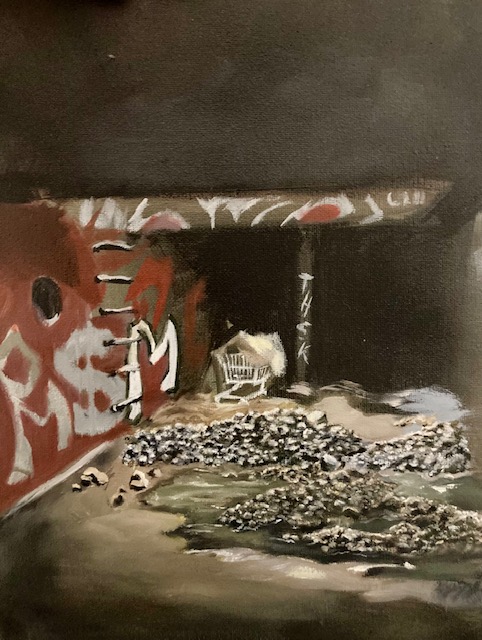
I was trying to paint the center with blue tones to show the sunlight was strongest there and with yellower/muddier tones away from there. The rock piles just look like they're different colors. I plan to go back in and darken the surrounding areas more instead around the light source.
The palette is Payne's grey, Indian yellow, and Van Dyke brown.
Painting rocks is not fun...

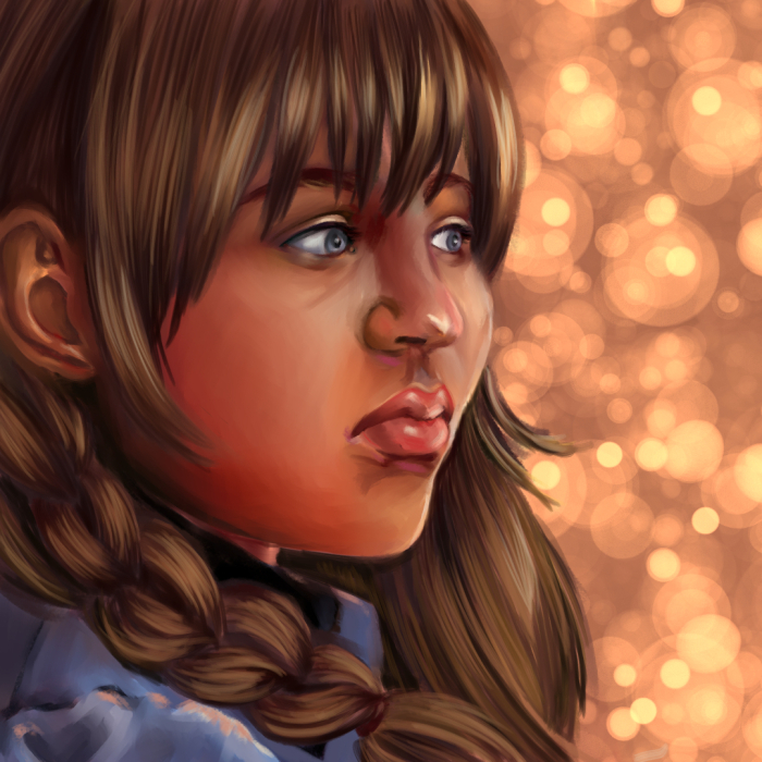
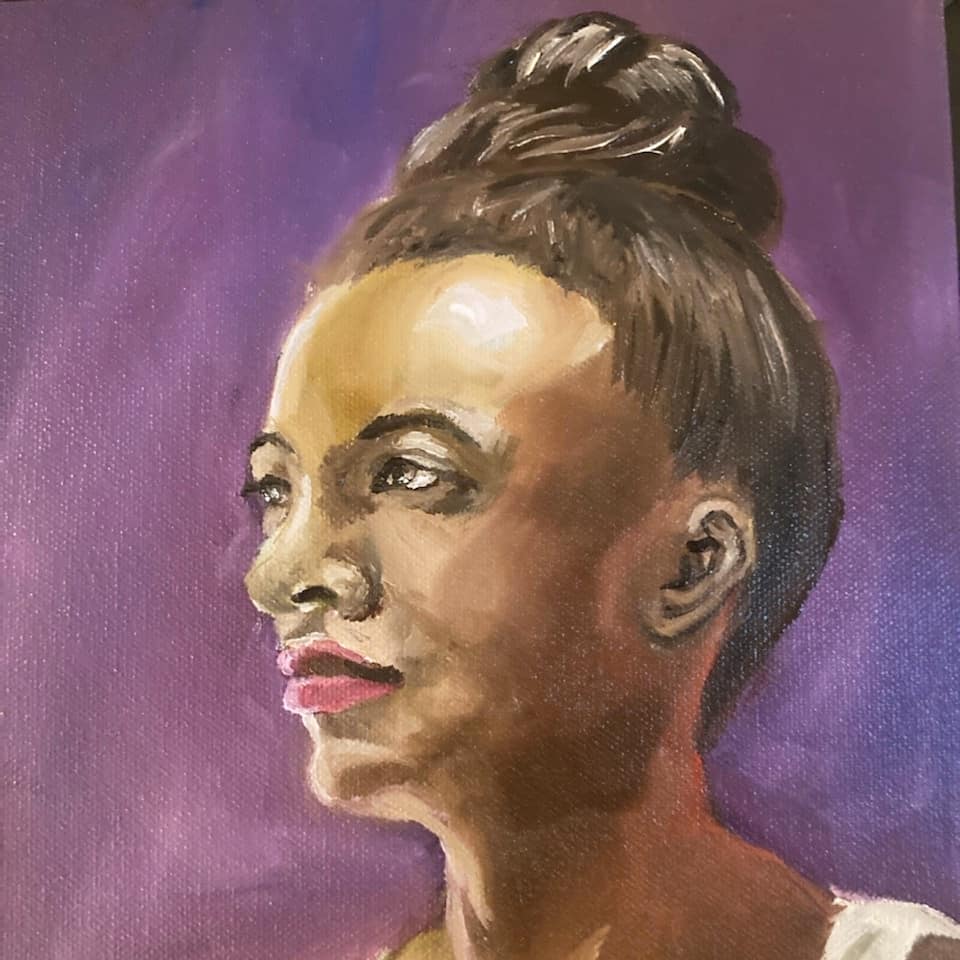
I liked this piece. Then I didn't. (The braid isn't curving to flatten out as it hits her shoulder and I feel the ear placement is bad - it looks like a balloon randomly blowing up at the edge of the frame from her).

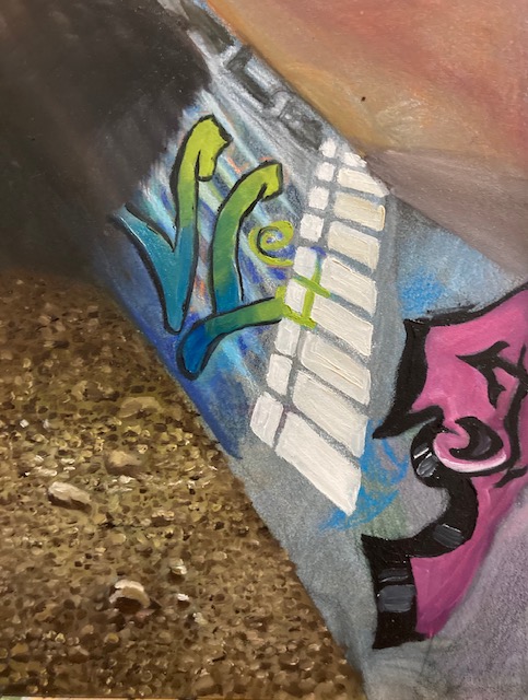
I tried not to repeat the same mistakes in the first piece and the lighting source is stronger in the center. The perspective is a different matter. It had more of a diagonal tilt in the photo, which I unintentionally removed. I'm trying to make a more normal view work, but I'm not sure it is. Painting graffiti is difficult as the lines are clean and the colors are bright, but there's still a texture from the wall and shadows.
Posts: 1,076
Threads: 4
Joined: Jan 2016
Reputation:
43
Very solid start! I think your digital paintings could benefit from having a more well balanced midtone for a more natural look. Are the rocks traditional? Seems to have a much richer texture compared to your other works which I dig. Keep it going, looking forward to seeing more work from you!
Posts: 124
Threads: 2
Joined: Nov 2020
Reputation:
13
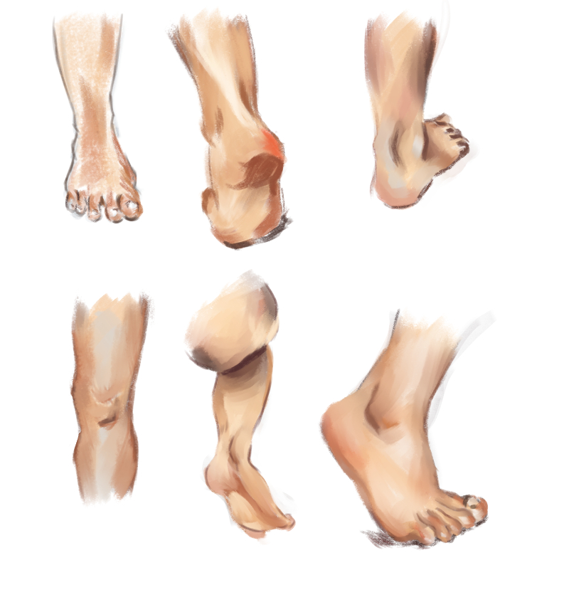
the foot studies and the graffiti paintings are great. If you're struggling with colours, here's what I personally did, not sure if its useful to you
1) learn about the hue value saturation theory of colour
2) copy loads of other good paintings using the above to identify the colours
3) do photo studies and attempt to make colours look nicer based on above
Also got recced this video that was very useful https://www.youtube.com/watch?v=4LhcNbFMkTw&t=530s
Posts: 50
Threads: 2
Joined: Apr 2021
Reputation:
1
(05-01-2021, 05:27 AM)cgmythology Wrote: Very solid start! I think your digital paintings could benefit from having a more well balanced midtone for a more natural look. Are the rocks traditional? Seems to have a much richer texture compared to your other works which I dig. Keep it going, looking forward to seeing more work from you! The rocks are traditional. Is the midtone i have now too saturated or just closer to nonexistent? I'm a Jenny Saville fan, so I can get too lurid with colors if I'm really feeling it that day. And thanks so much for your feedback.
Posts: 50
Threads: 2
Joined: Apr 2021
Reputation:
1
(05-02-2021, 10:09 AM)Skeffin Wrote: the foot studies and the graffiti paintings are great. If you're struggling with colours, here's what I personally did, not sure if its useful to you
1) learn about the hue value saturation theory of colour
2) copy loads of other good paintings using the above to identify the colours
3) do photo studies and attempt to make colours look nicer based on above
Also got recced this video that was very useful https://www.youtube.com/watch?v=4LhcNbFMkTw&t=530s I think part of the problem is that the skin palette I have for digital is a cel shading one. So I downloaded a more painterly one and hopefully! that will make a difference. I think I need to restrict my colors more and set up a palette for each piece so my colors are consistent. I seem to have this bad habit where I'll start throwing oranges and pinks in on a whim.
Posts: 50
Threads: 2
Joined: Apr 2021
Reputation:
1
Uieqebgojljwgenjkf  Well good news is that I was promoted and that resolves a majority of my "being the sole source of income while my boyfriend is disabled" problem, but I'm not sure where that'll leave my art. I'll be learning ArcGIS to... basically track homeless people, so yeah. That's a busy learning curve. But my goal is to keep posting on the weekends, even if it's simple pencil gestures. I'll need a hobby to stay sane.
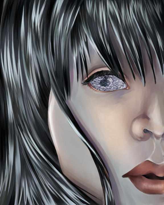
 I started this piece a while ago and I'm afraid the face is too wide (measuring eye width kinda shows that one eye over is cutting 3/4 into the nose and not where the inner corner of the other eye should be). Looking at it again after the advice from here, I can see the midtone problem. I might add more to the outside of the nose and corner of the mouth.
For some reason my boyfriend is sitting in front of the rat cage with a cardboard brace in it and I kinda want to ask but at the same time???

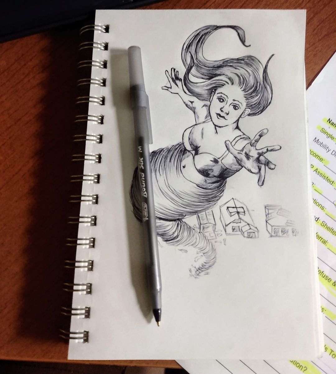
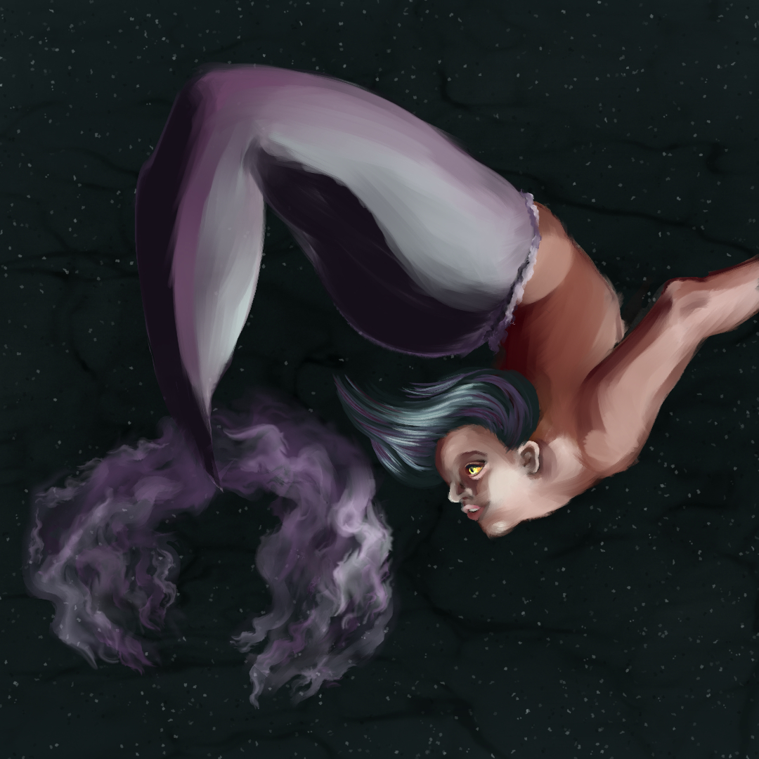
 I've always wanted to try drawing a tornado mermaid.
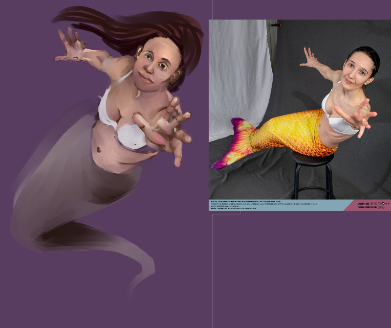
LOL. So, I thought to myself,"Why not go back to using the grid method?" I haven't used grids since college because I'm lazy and my teacher insisted it was a bad technique to rely on. Now I can't use the darn grid correctly. Everything ends up way larger than intended and doesn't match up to the grid on the photo. It does help to determine the angles and spacing between certain elements though.
The reference photo is by jookpubstock on Twitter.
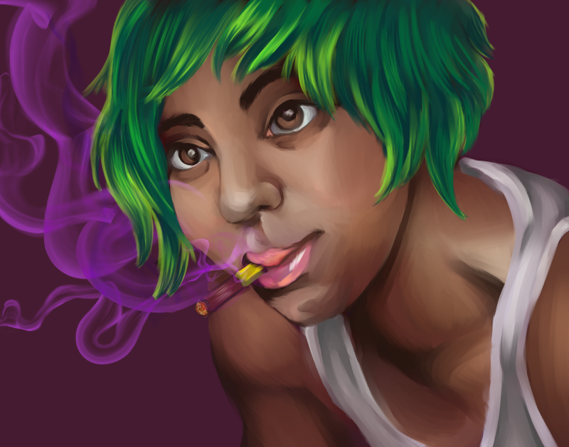
I'm trying to use a different skin palette, but I think I need to pick 5-6 colors from it and focus on those.
It's a disaster if I use the color picker\wheel...

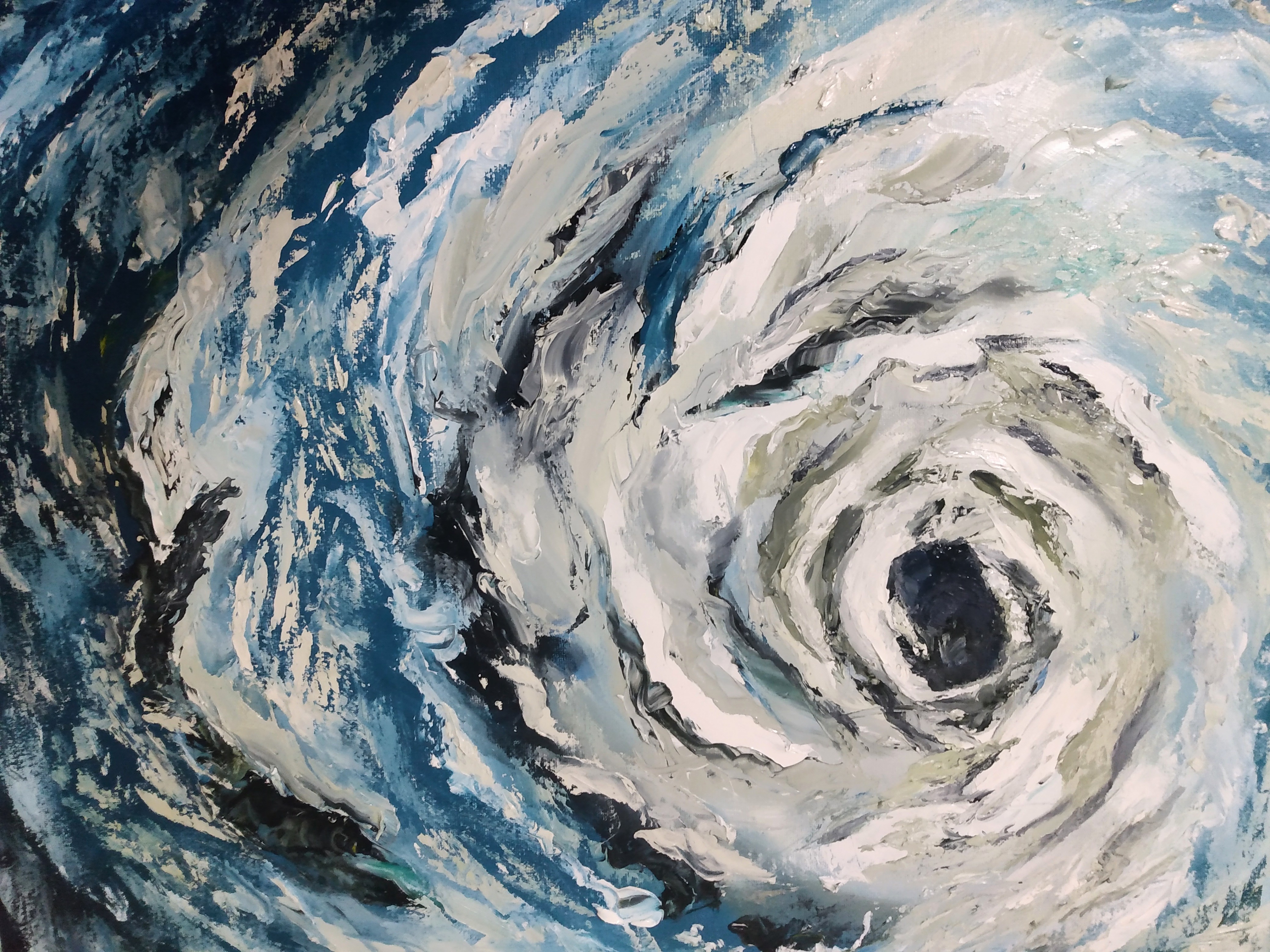
I thought I'd make a painting for my new office. I jumped the shark and made a palette painting of a hurricane. I will not be putting it in my office, lol.

This is proof that I do go back to work on projects despite my ADD hellscape.
(I accidentally published a version of this post before it was ready, so sorry if you caught that!)
Posts: 50
Threads: 2
Joined: Apr 2021
Reputation:
1
I'm baaaaaack.


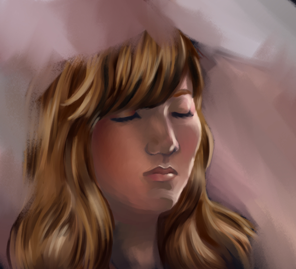
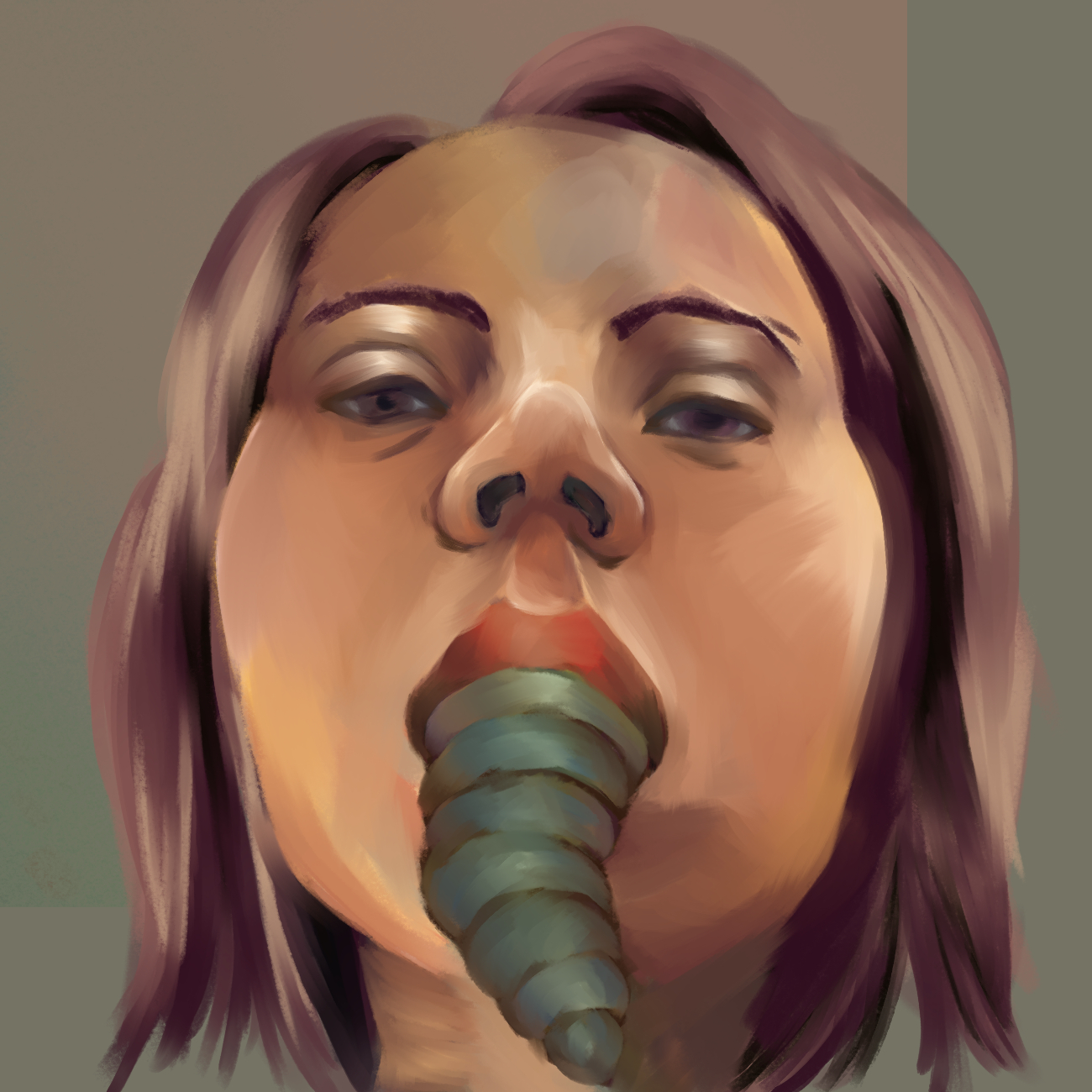
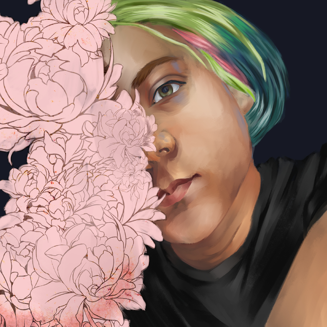
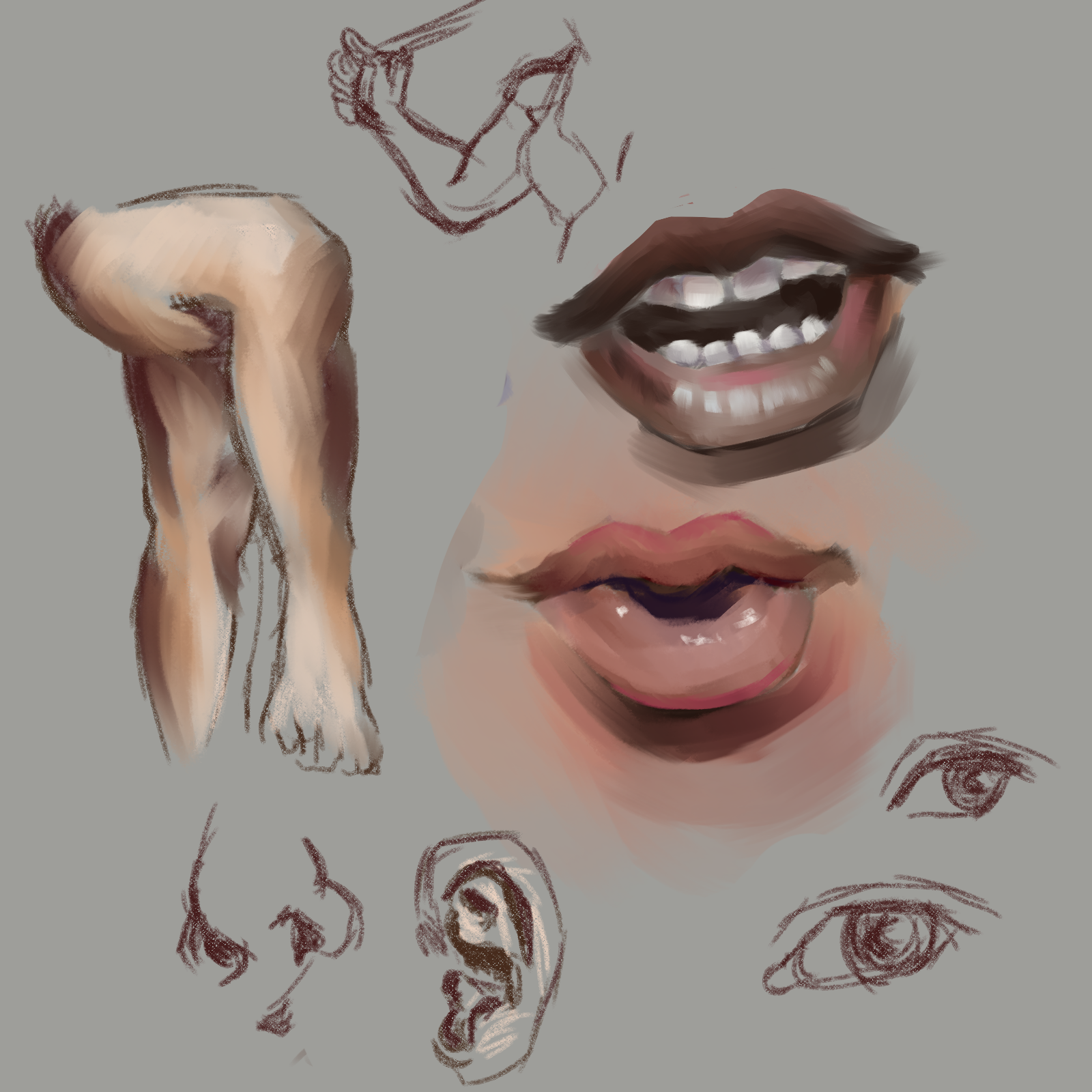
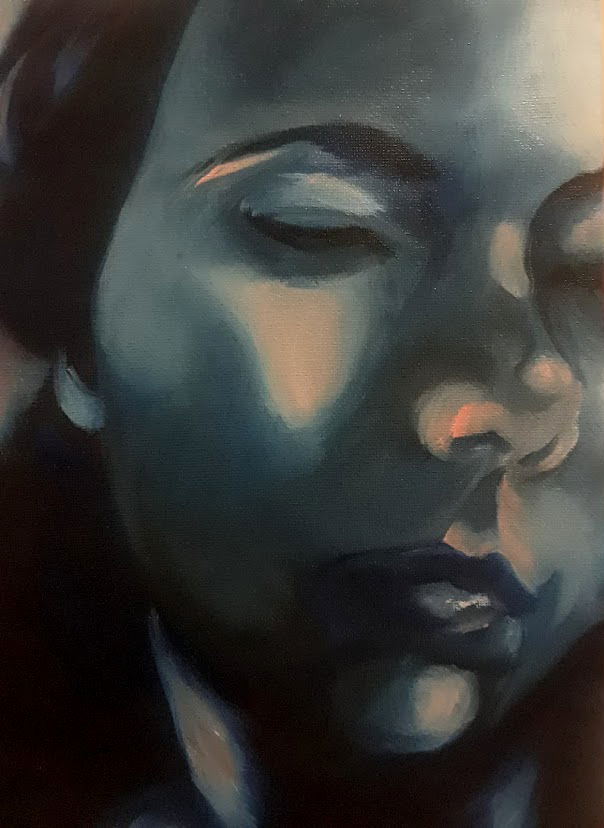
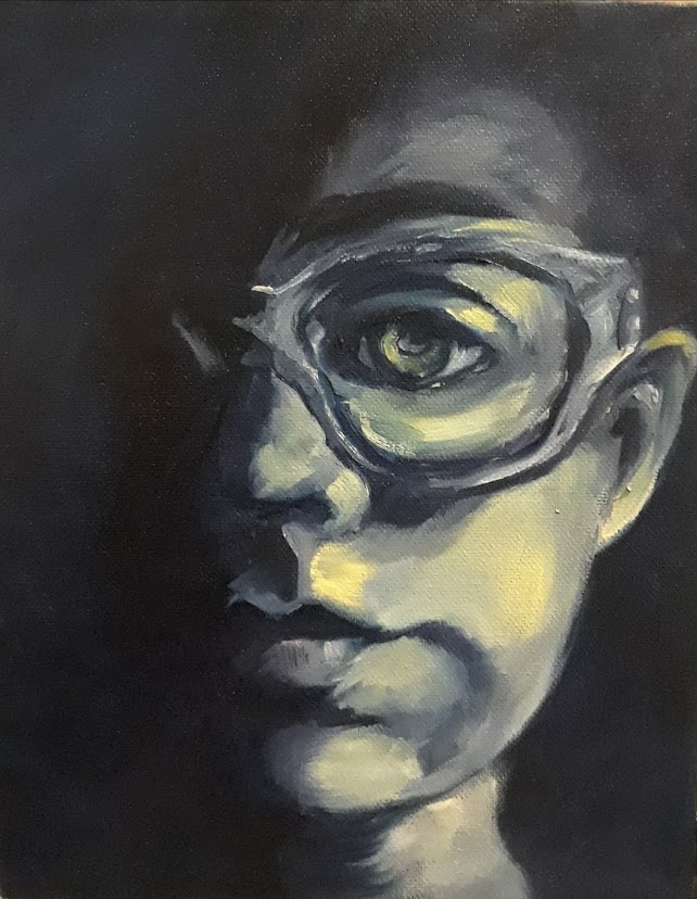
Practice pieces. I feel that my eyes always end up at a different angle from the rest of the face. I've started trying to make cleaner line drawings before starting to shade.

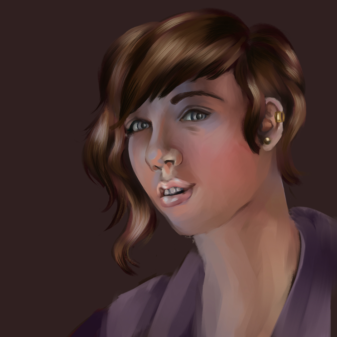
An update on this piece. I feel that the shape of the face is off.

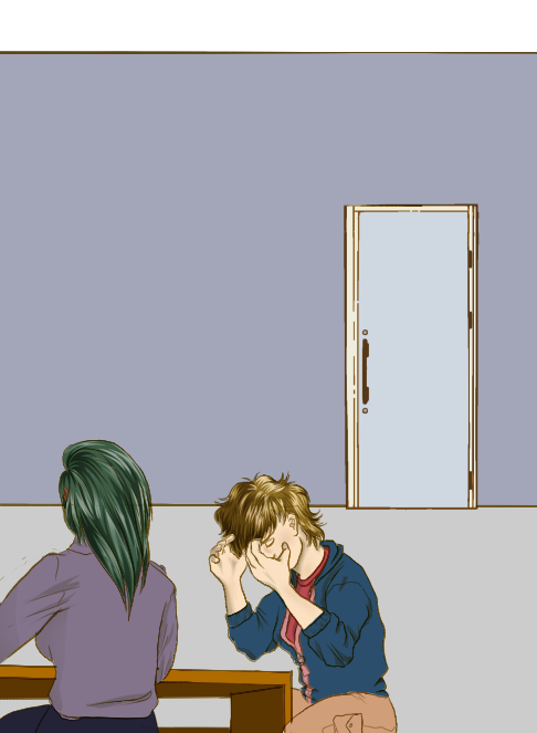
A comic piece which isn't... great. Awkward crop to hide the uncanny valley of the arm. I'm too lazy to redraw the chairs.
I rely heavily on models to get them to a reasonable quality in a shorter amount of time. I'm think about hiring a background artist in a month or two. So if you like doing simplistic stuff like office backgrounds, homeless encampments, ambulances (and inking them) behind my somewhat lackluster figures feel free to let me know. (I'm probably looking at $15-30 per a few panels/hour). 90% of the people who responded to my post on Reddit are worse than I am or have no samples of background work. If only I had that level of hubris. If only.
And looking at this, saving it has ruined the lineart, which is another huge technical hurdle I have to combat.
Tips are always welcome.
Posts: 124
Threads: 2
Joined: Nov 2020
Reputation:
13
Okay so the last comic art piece, it very much looks like the desk and the people at it are sunken into the ground or in a deep hole ? Did you do any sort of perspective set up at all , or even just a horizon line ?
Posts: 50
Threads: 2
Joined: Apr 2021
Reputation:
1
(05-09-2021, 12:24 PM)Skeffin Wrote: Okay so the last comic art piece, it very much looks like the desk and the people at it are sunken into the ground or in a deep hole ? Did you do any sort of perspective set up at all , or even just a horizon line ? Tbh perspective is absolutely one of my weakest areas. And setting it up with 3-D models is difficult in it's own way. I should probably go back and study the basics before diving into setting up environments with 3-D tools.
Posts: 50
Threads: 2
Joined: Apr 2021
Reputation:
1
I said once a week, so here goes...
I'm pretty tired. Today i hid in a room for 20 minutes with the door shut and ate lunch. But that new salary though...

I definitely need to go back in and add more highlights and define the neck.

That ear... I need to do ear studies.

A redraw of one of the first pieces i posted. (it's flipped to a different angle). Tried really hard on a midtone.
Edit - my bad, i never posted that one. So here's the first attempt.


So next time ear and perspective studies.
Posts: 50
Threads: 2
Joined: Apr 2021
Reputation:
1
Eh, well my once a week goal flew out the window.


These are here mainly because they were accepted into a county art show and I'm proooud.

Something I'm currently working on.
Posts: 50
Threads: 2
Joined: Apr 2021
Reputation:
1
My application to have a show at a swanky coffee shop was approved, so it's time to bust out some pieces. >.>
It's in October, because nothing will interrupt November and my opportunity to simp over video game characters when the new FFXIV expansion drops.
Crit always welcome.

Posts: 76
Threads: 1
Joined: Oct 2019
Reputation:
5
Congrats on the show! Sounds very cool!
You have great sense of movement in your pieces, with the poses, the hair and the brushstrokes!
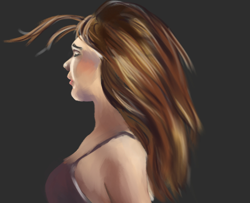
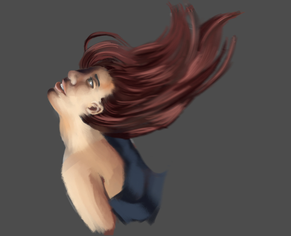
As for a crit, in the last painting the top right part of the hair seems to come from the right, think of it as coming from the skull. You can also draw all of the head, to judge proportions easier, and crop it later.
The drawing above that looks great, but I feel the nail on the thumb slants to the wrong side, or if the thumb is bent that way, then the part of the thumb closer to the hand doesn't seem to fit with the upper part.
Keep 'em coming!!
|

