I need some feedback on my LotR illustration
#1
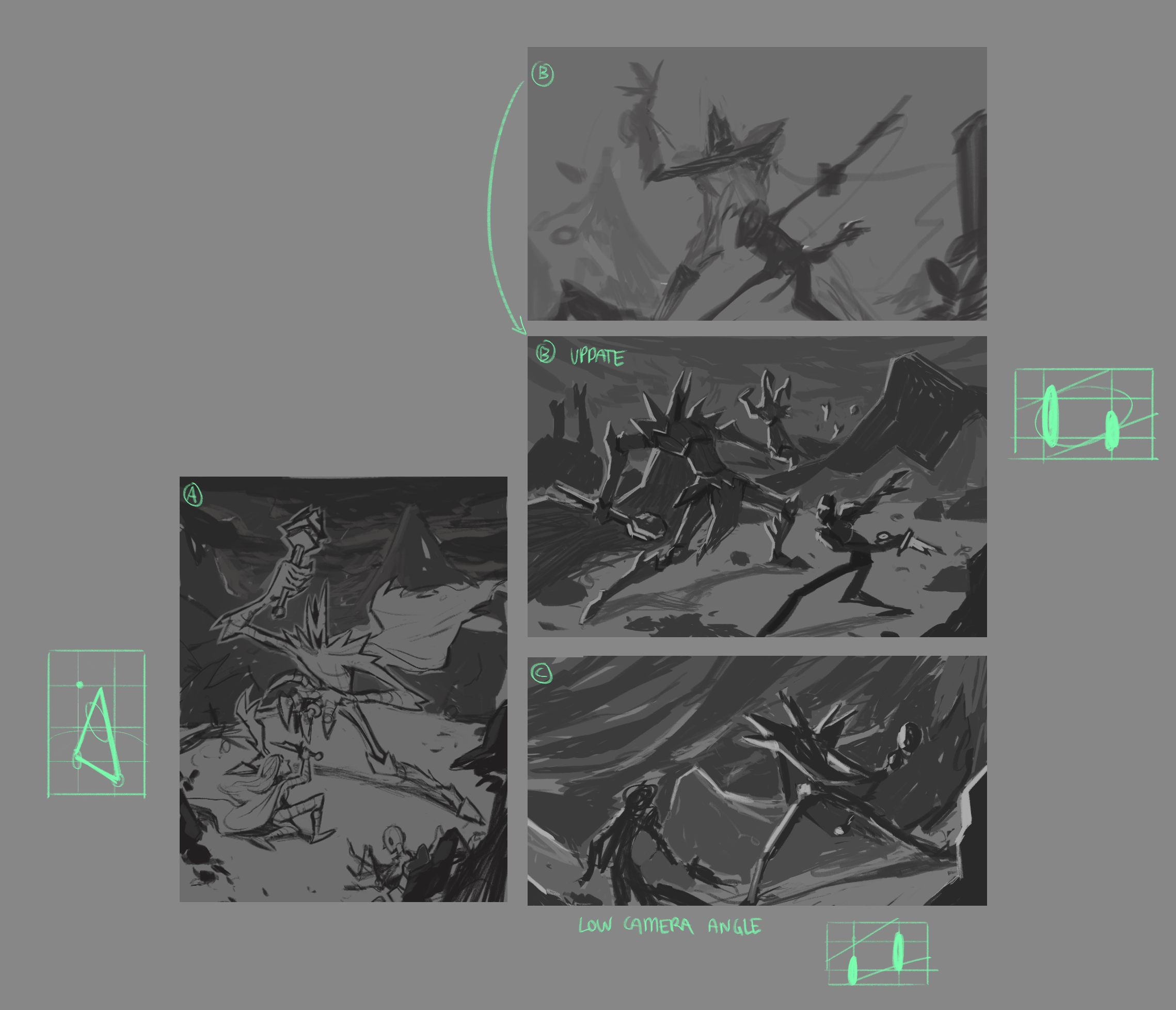
Hello guys, I'm doing and LoTR project with some friends wich the ideia is to making an illustration based in a scene from de movies/books, also redesign a characters that is presented in the scene. The one that I picked is the battle of Isildur against Sauron, I tried to represent some moments before and after he cuts the Sauron finger with the ring. I really looking forward for feedbacks. 

Sauron Redesign - Looking for something more stylized.
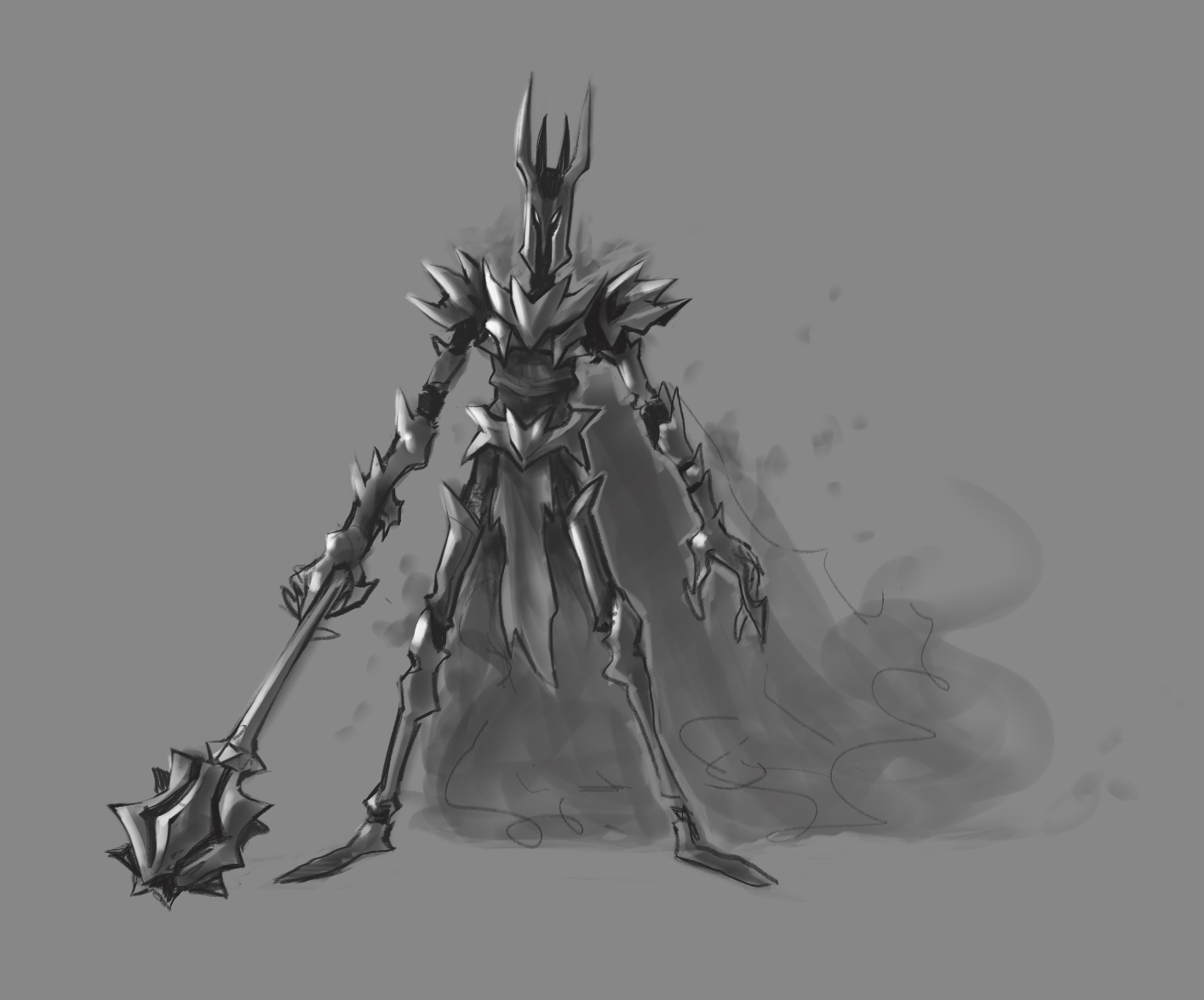


Illustration thumbnails exploration.


Elianai dos Santos
Freelancer Illustrator
contact: [email protected]
https://www.artstation.com/eliz0r
Reply
#2
(07-10-2019, 10:44 AM)Eliz0r Wrote: Hello guys, I'm doing and LoTR project with some friends wich the ideia is to making an illustration based in a scene from de movies/books, also redesign a characters that is presented in the scene. The one that I picked is the battle of Isildur against Sauron, I tried to represent some moments before and after he cuts the Sauron finger with the ring. I really looking forward for feedbacks. 

Sauron Redesign - Looking for something more stylized.


Illustration thumbnails exploration.
Hi, very interesting work! I was especially surprised by the style of drawing. It turned out very nicely! I wish you great success in this matter!
Reply
#3
These are all really cool compositions. I like how you push the style and have the shapes in the background kind of complement what the figures are doing. However, I do think from like a cinematic staging perspective, a closer shot to the action would be best. In the film you pretty much never get a zoomed out shot of Sauron and Isildur because it would kind of show too much on the same plane, and feel flat. Of course in a painting you might need to do something like this, but still. The composition idea at A would be more effective I think if it were more from the perspective of Isildur looking up at Sauron, for example rather than a kind of outside view of them both fully in frame.

I gravitate toward C because it's a little closer shot. Sauron still looks big, but Isildur is near the viewer so we can see some of his expression. And the bottom of the canvas does cut them off a bit so it feels natural and believable.

Reply


Forum Jump:


Users browsing this thread: 5 Guest(s)