Trash Panda: Thanks I guess, although I didn't consider things over yet was just waiting for CBinnsIllustration to update on what the deal was, he has been very busy in the times. I still have a final to post technically that is not seen here.
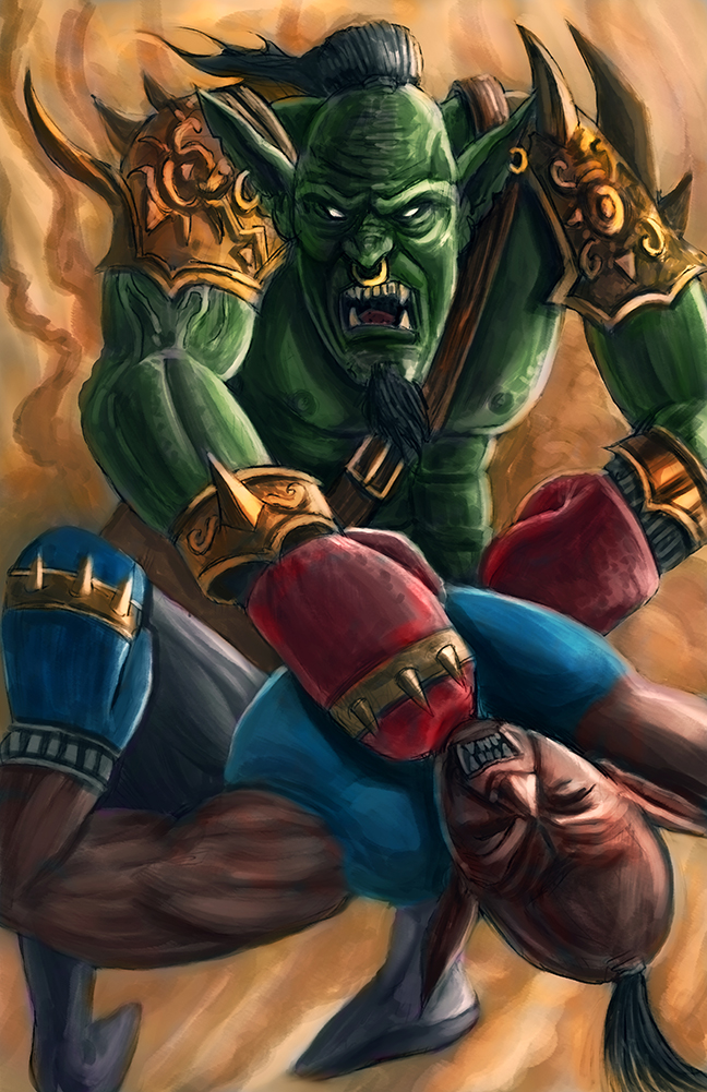
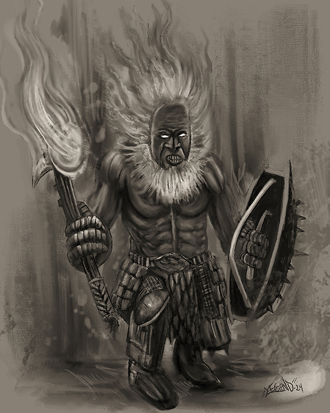
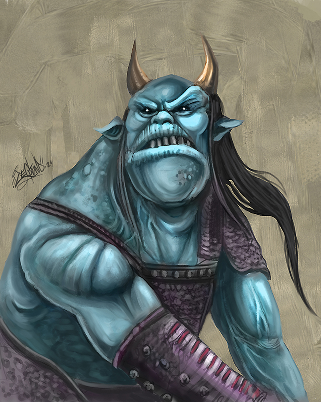
I'm very glad you enjoyed the studies. I was actually putting my own spin on some old characters found in the old D&D Monster Manuals, I have like all of them.
I think studying the basics is great, but you can learn a lot on the job, so you might have actually learned more jumping in the challenge and figuring out your dos and don'ts from there. I think that following the below work order of operations could really help you and if you have any questions feel free to ask.
1. Get an idea and thumbnail it out loosely and easily just for the sake of getting the idea out of your head, it doesn't have to be pretty.
2. Create a rough sketch based on the thumbnail of choice.
3. Then gather reference to try and better that rough and apply the reference accordingly where you feel necessary.
4. Once upgrading the rough sketch with your referenced additions for things like faces, hands, etc, drop the opacity of your rough drawing and create a new layer to draw over it cleaning it up more. It's up to you to do a third drawing or just keep with the second. Unless line work is going to be present in the final work it doesn't have to be clean if you're just going to paint over it.
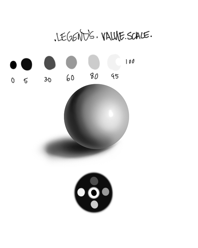
5. Apply values to your line work, it's your choice the hardness of your brush but I like doing this with a soft airbrush and erasing back where need be with a medium to hard brush, a simple round will do. Sometimes it helps to establish a light source first and then re-iterate on that once you get your shadows in. You can do this all under the line work of if you are working from a traditional sketch where everything is merged together you can create a multiply layer for shadows and simply use a screen layer for quickly adding your highlights over the sketch, and if you really want to get advanced you can look up tutorials on sketch lifting. I like to keep my value range in accordance to this chart. I typically start with a middle value as a mask to character or base and then work out into the shadows and then highlights, sometimes it does help to establish the light source first and re-iterate once shadows and such have been laid in. Really working with a mid-tone and shadows to get forms to read is a really great way to work cause once you add the highlights the image really reads well. So just two values starting off can go along way, for instance a 30% and 60% gray, then add some darker shadows and brighter highlights as needed. I save extreme black and white for the darkest areas and specular highlights of the image.

6. Once the values are set I go ahead and use my brush of choice, usually a charcoal, or chalk brush to massage the values to where the forms start reading, you are not rendering to final, but focusing on just the values in the beginning really helps speed up the process of the creating the image. Some people like to work in value and color and I can work that way too, but I prefer usually working from black and gray monochromatic image to just focus establishing my light sources and developing out my forms.
7. Once my forms are reading I proceed with adding color using transparent layer modes at different opacity settings. I usually start with a color layer, then proceed into overlay, and then experiment with other transparent layers as I feel necessary for whatever it is I'm trying to do with the image. I like using a soft airbrush to do this.
8. Once your colors are all laid in you can get to actually painting in color by color sampling from the colors you have laid down and focusing more on rendering and polishing the forms that you have already created in the early stages of this process. You can experiment with adding textures and such in places like the highlights and so forth. The idea at this stage is to have fun and really start bringing things to a finish, but do not smooth things out too much in this stage which can be tempting. Continue pushing and pulling the image laying down paint and using the sample color blending technique as you go along. This is why I like the chalk or charcoal brushes cause you can create hard edges while also doing some medium blending along the way.
9. This is the stage to make any final lighting adjustments or effects like using the dodge or burn tools, or an overlay layer where you use shades of gray to adjust the lighting, 50% is the magic area and anything above or below is either lighter or darker. You can apply color balance for a shift in your work or experiment with transparent color layers over the whole image in an attempt to make everything more harmonious.
10. This is the final rendering stage where you are adding in details with your tapered brush and then getting into doing softer blending or smoothing of the image in places, but be careful when doing this cause it is easy to blend away all your interesting brush work, and also try to stay away from using the smudge tool as it tends to desaturate and muddy things, use it very sparingly if at all. I typically use the smudge tool only for special effects, and this is referring to working in photoshop....other programs like Procreate and others it is absolutely necessary and more functional to use the smudge tool. I tend to do a lot of my soft blending with a soft airbrush with wet edges option on and the flow or opacity set low. Flow set low is a more solid blend where lowering just the opacity creates a finer blend.
11. This is the post editing stage where you might want to do things like adjust your levels, add noise to the image, sharpen the image, blur in places, etc.
Some additional tips:
*Keep in mind this is what works best for me most of the time but everyone is different. Instead of using line work to do your sketch work via linear, you may be more comfortable blocking things out roughly with paint and erasing back as if you were sculpting with clay and so forth. I personally prefer line work because it is more expressive and when you are doing things volumetric you still have to go back into the silhouette and add in all the little details of things.
*Stay zoomed out for the majority of the image, I typically stay zoomed out at about 25% the majority of my whole image, come in 50% here and there, and only zoom in at 100% for very detailed areas.
*Keep your main workhorse brushes simple. You can do the whole image with one to three brushes, so don't let brush selection mess you up or scramble your brain unless you are going for a specific look in the work that someone else has already established, then brushes matter, but if you are not looking for a specific look in the work to the likeness of someone else's work then brushes don't matter and you need to focus more on the settings of how that brush feels for you when you paint with it, along with how it is looking laying down paint and blending some as you move along through the image. Also, use larger brushes to begin and establish the foundation of the image which can also help give the image a looser look, and then use medium to smaller size brushes as you start to finalize the image.
*Have fun and let loose, if you just let go and have fun with what you are doing that energy will show in the work overall. If you are all tight ass and stressed working on the image then that is going to show in the work also. Just fall back on the foundational elements and enjoy the journey and usually something good to great will come out of it. The more you fall back on foundation and execute that properly in the work, the better the images are going to get. Don't be afraid to just let go and enjoy yourself.
There is a bunch of other stuff I could write but this all should do for now. I'm hoping this can help you and whoever else's prying eyes might be on this forum who prefer to extract value only from this forum opposed to adding to, or people completely new to all this to get some type of foundation as all of the above has definitely helped me a lot. 100


 "Everything has been done, but not by you"