Character Design Challenge Critique
#1
[font=system-ui, -apple-system, system-ui,]
20 hrs
[/font]


[font=system-ui, -apple-system, system-ui,]Hey all
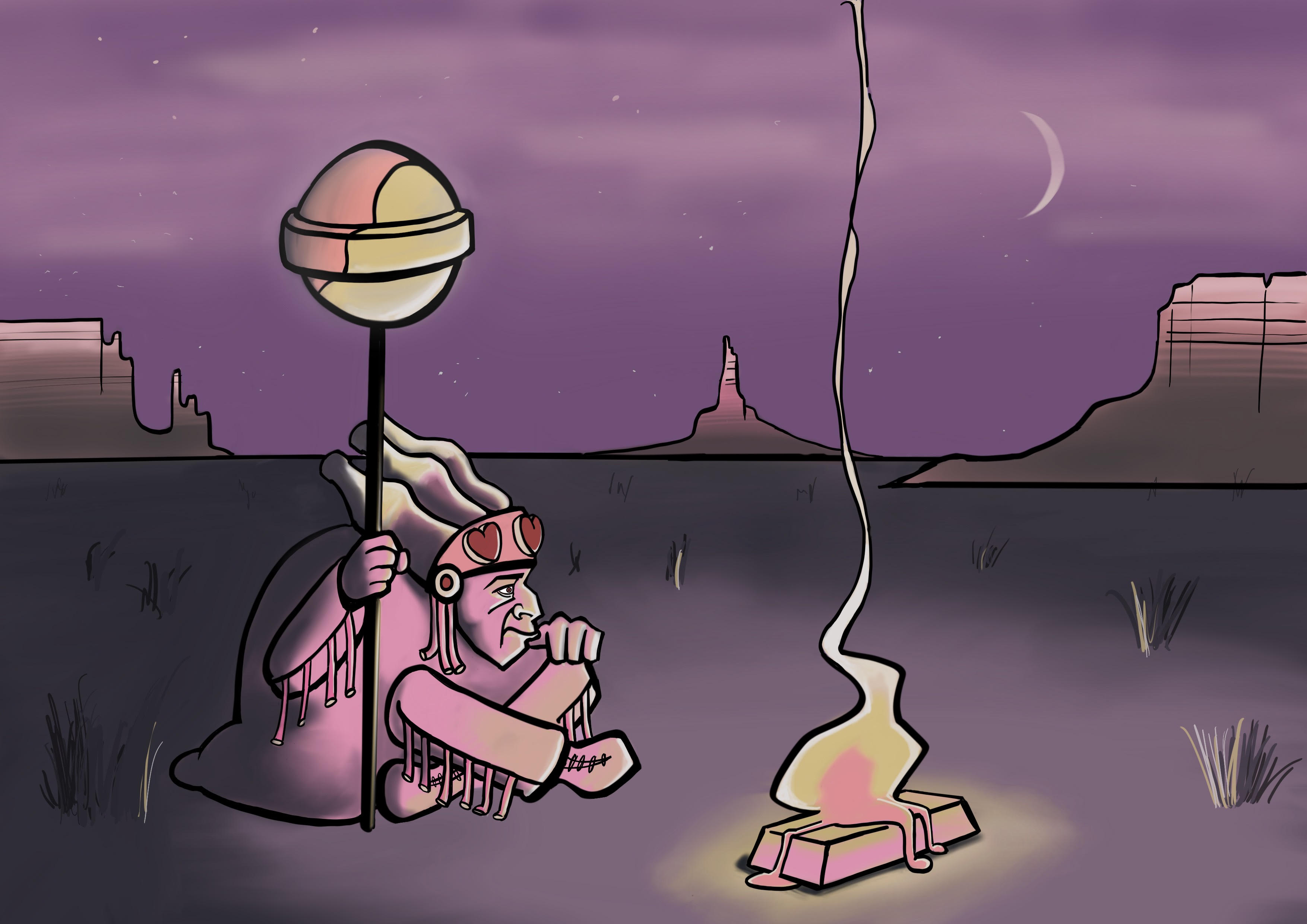
I decided to have a go at the Character Design Quarterly monthly challenge. The brief is 'Candy People'. Do you think this reads well? 
Any feedback/tips you have to make it better please lay it on me! Still working on my digital art skills...
[/font]
Reply
#2
The grass doesn't follow the cartoon style you made it clash with the rest.You could work on getting a bit of more depth with some atmospheric perspective.The light on her hair is kinda strange it doesn't follow the two light source in my opinion so is the big lollipop.I am not an expert of double light source yet so i won't risk myself into a paint over.I advice more study on light but also more attention on the direction of light source for example the mountain should be much dark than they are right now.Also you could play with that outline of the bottom of those rock formation to give an extra sense of dimension.
My Sketchbook
The journey of an artist truly begin when he can learn from everyone error.
Teamwork make your dream work.
Asking help is the key to growth.
Reply
#3
(09-26-2018, 06:45 PM)darktiste Wrote: The grass doesn't follow the cartoon style you made it clash with the rest.You could work on getting a bit of more depth it some atmospheric perspective.The light on her hair is kinda strange it doesn,t follow the two light source in my opition so is the big lollipop.I am not an expert of double light source yet so i won't risk myself into a paint over.I advice more study on light but also more attention on the direction of light source for example the mountain should be much dark than they are right now.Also you could play with that outline of the bottom of those rock formation to give an extra sense of dimension.

Thank you, will review these points!
Reply


Forum Jump:


Users browsing this thread: 1 Guest(s)