Posts: 5
Threads: 1
Joined: Jul 2021
Reputation:
0
Hello,
I am into programming and I am working on little Game Projects.
For that I am also making Artworks.
I am not sure, if I can dare to call it "concept art", but theoretically what I am doing is the most pure form of it:
I am coming up with an idea, putting it down on paper/the screen, then making it into a game-asset and implementing it into the game.
I started a Youtube Channel for these projects and since the beginning of July I did 2 videos a week, always showing the progresses or little things that I learned (not necessarily about art).
I will show you pictures of each project and put a Link to a video about that project.
Hopefully anybody besides me finds Game-Making-Projects like this interesting.
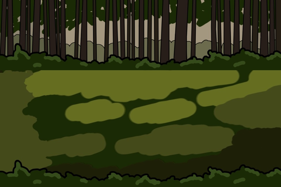
1. 2d RPG Adventure Game
RPG DevLog 1
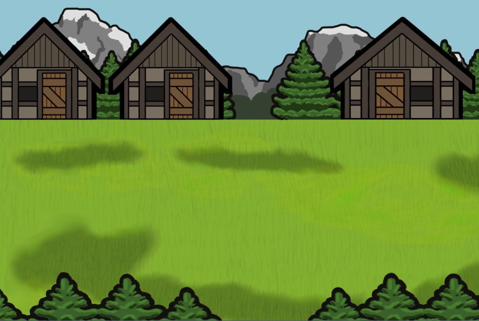
The "Artwork" for this Game is very simplistic, because it was easier to produce and get it on the screen.
I will have to change it in some way to make it appealing to a player, because right now probably most people would find it not appealing enough to wanna play it. Especially the characters, who are only better stickfigures.
 2. Isometric Game (like a City-building game)
Isometric DevLog 1
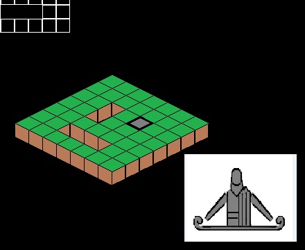
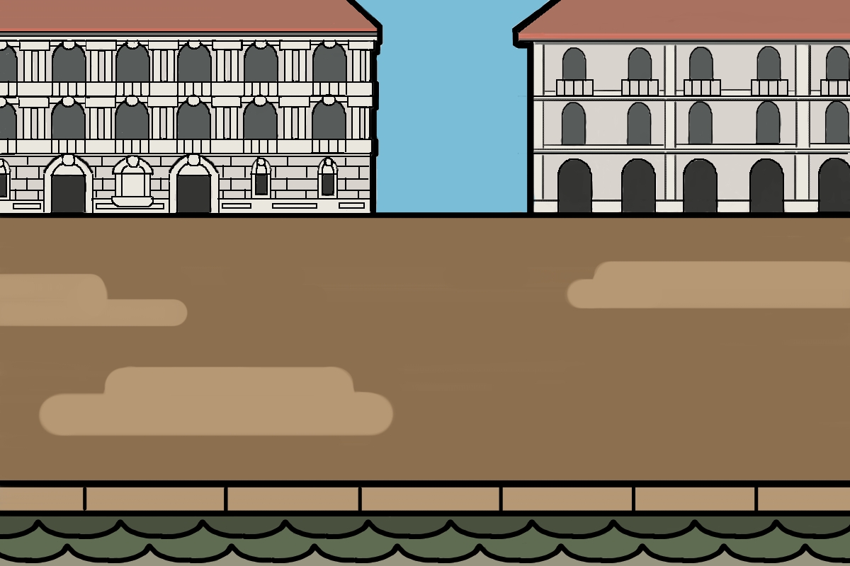
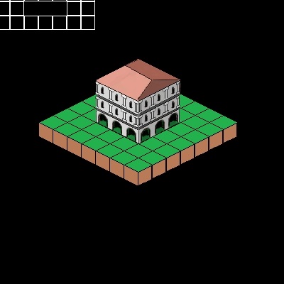
Because the "graphics" of the first game are so simplistic, I was experimenting with Isometric Graphics, because it might have more appeal. But it is of course way more complicated than the 2d view.
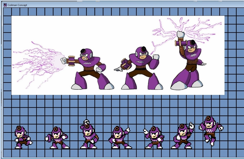
3. Finished Project: A Megaman Level (and Boss)
Finished Level
Concept beforehand
I made this to warm up with progamming. In the video you see the whole finished Level without commentary. The other video was the idea beforehand.
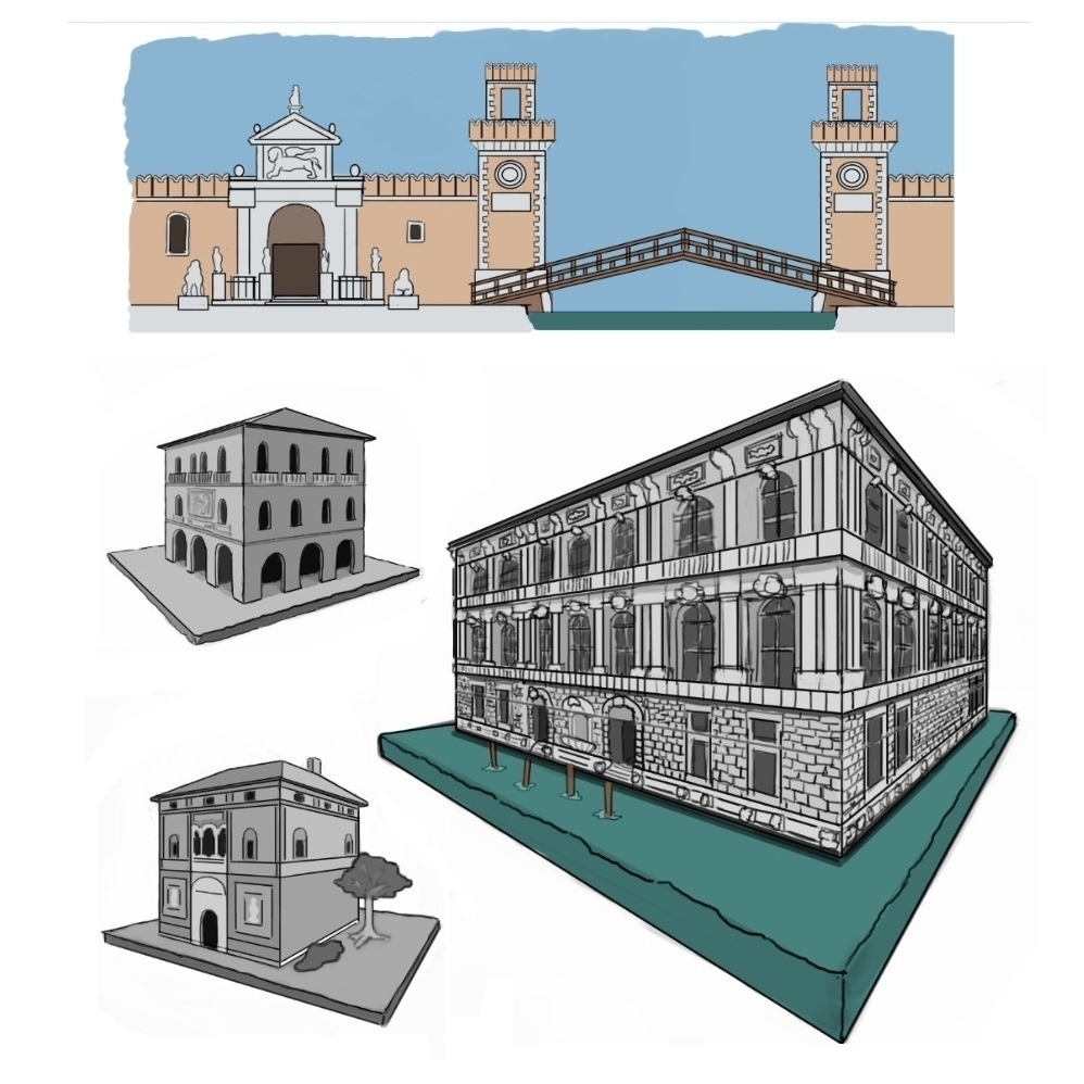
And recently I began with my "Concept Art" like this: I was studying Architecture and then turning it into Game Assets for Game 1 and 2.

 Video about this.
Also here is [b]DeviantArt:
Video about this.
Also here is [b]DeviantArt:[/b]
https://www.deviantart.com/epistokrat
I am curious, if there is anybody, who finds this stuff interesting. I do, but I don't know, if other people do.
Posts: 852
Threads: 6
Joined: May 2018
Reputation:
116
I find it interesting. This is nice work, even though as you say it's a little simplistic. Even so it does give visuals to the ideas you are working with which is what concept art is all about. But concept art is also about really going into those ideas and changing them or coming up with something else entirely. Figuring out what works.
I did watch the video about the isometric renaissance game, because that's something I find interesting. And just as concepts, not critiquing the artwork, I guess I have a few comments.
I think your concept for the time period and architectural style is a little fuzzy at the moment. You have examples of buildings characteristic of the Italian Renaissance, but you also refer to the game as medieval. Many fantasy worlds kind of roll elements from the Middle Ages, Renaissance and even Baroque periods together and that's absolutely fine. But you may need to do more research to nail down exactly how you want to do that so that there aren't things put together that don't belong together. I think that a Renaissance inspired city for a merchant city makes a lot of sense since we associate the Renaissance with rich architecture and commerce.
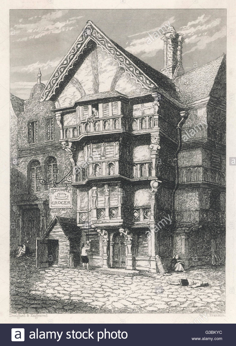
However, the house you've designed to be a 'peasant house', doesn't really match that. The lower class wouldn't live in marble palaces. Instead maybe consider designing something like this:
for a standalone house
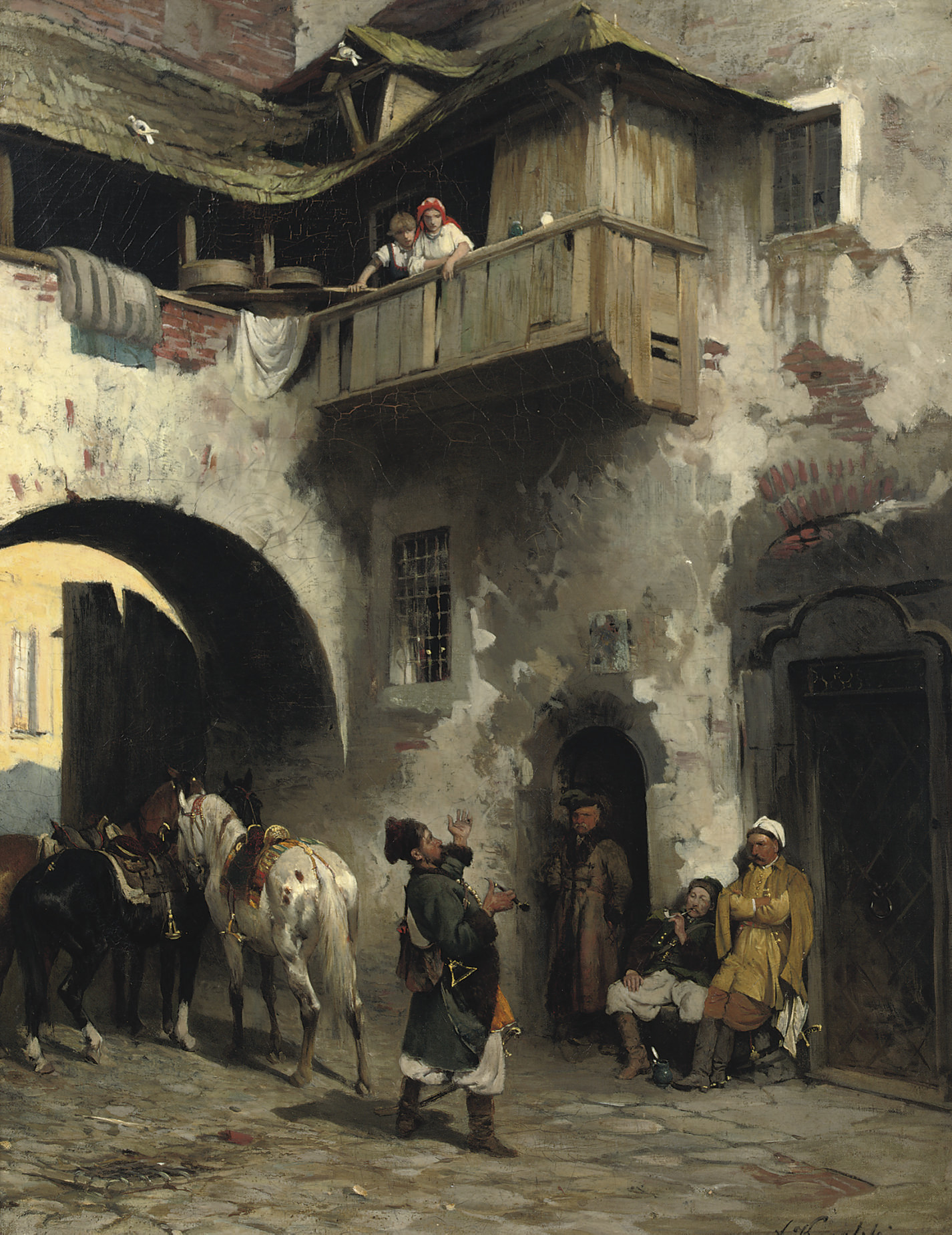
or this: for an apartment building. These are both English, but the point is they read as lower class housing because they are timber frame and kind of lopsided. The second example is pretty characteristic of lower class housing in the 15th/16th centuries in cities, because space was very limited. They made the most of their architectural footprint by making the top floors bigger than the base, instead of the cube that the marble palaces had. And then tons of people probably would have been squished in there.
This one also gives a good idea of what could be used in the design. Whitewashed brick with some showing through, and a rickety wooden upper level.
So this kind of visual research is something that can be applied to all your ideas, and it just makes it all more interesting, elevating it from just a basic idea of a house or a tree or a whatever, like you kind of have in your 2d rpg game, and making it tell a story. That being said, I like what you are coming up with for the Merchant city, especially top picture with the bridge.
Posts: 559
Threads: 6
Joined: Jul 2015
Reputation:
68
I find it interesting, and Joseph is on the money about refining the style window a bit more.
I get from one image that you are going for a venetian style house on the water, but they're not always a plain cube. There is a lot of jutting and bridges and beams connecting building and parts of in Venice. It's totally worth making the shape more interesting, and also consider the style difference between class districts.
There's a great reference on isometric buildings by this guy: https://tips.clip-studio.com/en-us/articles/2312 It's on CSP but it's pretty universal and if you want to make the designs more interesting I think you would make great use of some of his tips.
Posts: 261
Threads: 7
Joined: Jan 2021
Reputation:
19
Regarding the Mega Man character, it seems to be an edit/re-skin of an original boss. I thought Metal Man at first from MM 1 but I'm not sure anymore. Maybe it's the thing on the forehead which reminds me of Metal Man.
![[Image: SAGO6f7.png]](https://i.imgur.com/SAGO6f7.png)
Anyhow, the outline is missing pixels at certain spots. It'd be neat to see your animations of the character to comment further. The rest has already been covered by people more knowledgeable than I am about the topic.
Posts: 5
Threads: 1
Joined: Jul 2021
Reputation:
0
(07-21-2021, 09:22 AM)Zizka Wrote: It'd be neat to see your animations of the character to comment further.
I made a whole Level and posted a Link to it.
I have one more Link, but the video is German I think, so I didn't post it before.
(no commentary, full Level)
https://www.youtube.com/watch?v=WkGsB6Ll9go
(the first Idea for the level beforehand, english)
https://www.youtube.com/watch?v=e4y-sCf0ngA
(making of the characters with German Commentary)
https://www.youtube.com/watch?v=Jd-z6i7CsiI
Posts: 5
Threads: 1
Joined: Jul 2021
Reputation:
0
Thanks for the reply and feedback, Josephcow.
(07-20-2021, 04:11 AM)JosephCow Wrote: I think your concept for the time period and architectural style is a little fuzzy at the moment. You have examples of buildings characteristic of the Italian Renaissance, but you also refer to the game as medieval. Many fantasy worlds kind of roll elements from the Middle Ages, Renaissance and even Baroque periods together and that's absolutely fine. But you may need to do more research to nail down exactly how you want to do that so that there aren't things put together that don't belong together. I think that a Renaissance inspired city for a merchant city makes a lot of sense since we associate the Renaissance with rich architecture and commerce.
My Idea for the time period is not fuzzy. Maybe I explained it not detailled enough. I am thinking of a medieval period, where the Renaissance is slowly coming up. Like you also said, the Merchant City can be associated with more rich buildings and thats why I found this fitting.
Quote:JosephCow
However, the house you've designed to be a 'peasant house', doesn't really match that. The lower class wouldn't live in marble palaces. Instead maybe consider designing something like this:
Quote:JosephCow
So this kind of visual research is something that can be applied to all your ideas, and it just makes it all more interesting, elevating it from just a basic idea of a house or a tree or a whatever, like you kind of have in your 2d rpg game, and making it tell a story. That being said, I like what you are coming up with for the Merchant city
This should be, what I did already. Maybe I misspoke somehow, if I said "peasants". With those posted pictures I did not intent to make Houses for "low class people" specifically. I tried to make Houses/Screens, that look like Renaissance Buildings just to get started.
As you stated, they are fitting for a merchant city.
But yes, from here I can design lots of different houses and buildings, also some low class people houses.
Maybe, if its a city-building game, the player starts with low class houses and when his city gets bigger, he can upgrade them. And the latest upgrade looks like the one I already did.
But most likely I will figure out how to make it look better, specifically not so flat, and work over it again.
It was just the first test.
Also, I edited the first post and added my RPG Game - Screen into that post.
Quote:

Posts: 852
Threads: 6
Joined: May 2018
Reputation:
116
Ah, I see. Perhaps I misinterpreted. Well good luck with your projects!
Posts: 5
Threads: 1
Joined: Jul 2021
Reputation:
0
In Order to write "cleaner" Code and in order to get everything down correctly,
before continuing the Isometric-Prespective Game, I will make a project with
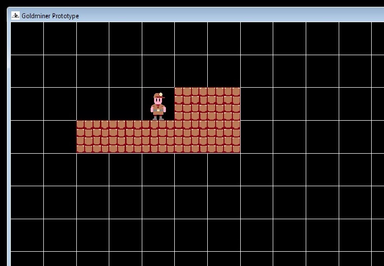
2d Tile based Graphics (an underlying Grid, where the Artwork is placed on).
Youtube-Link: Miner-Game
This will be a Mining Game, where you build a goldmine and dig through the earth.
I find it pretty neat already and it will be so cool! :)
In case you know, how to make the tiny 64x64 pixel-artworks really appealing, all ressources are welcome.

Posts: 5
Threads: 1
Joined: Jul 2021
Reputation:
0
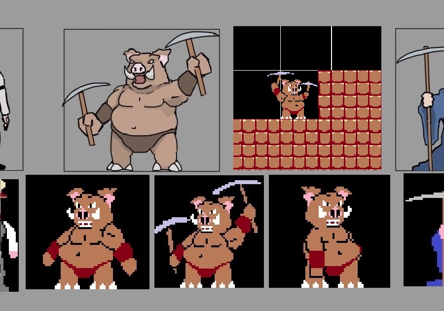
I created 3 factions, that the player can choose. Also translated it into Pixelart.
These are the three factions:
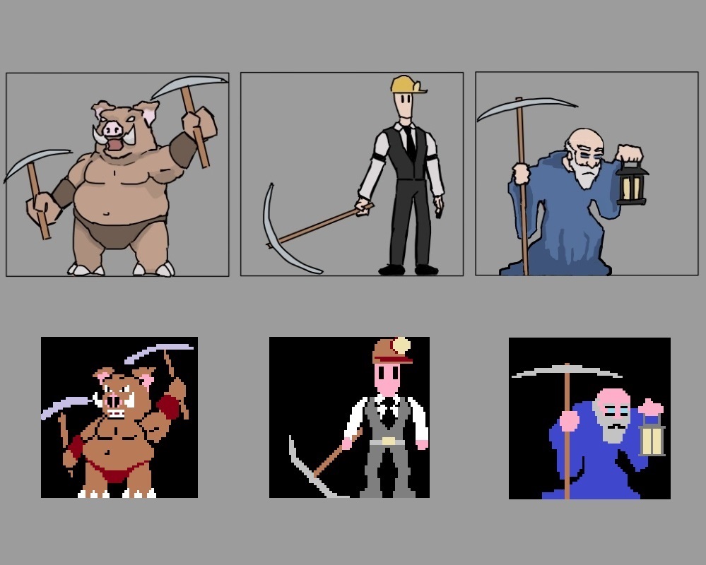
I also made the idle Animation, Walking Animation and Digging Animation for all three.

They are also animated and implemented into the Prototype-programm.
All of this can be seen here:
Youtube-Link:
DevLog #4
https://www.youtube.com/watch?v=SplkoF5Jx1c
|


![[+] [+]](images/collapse_collapsed.png) Spoiler
Spoiler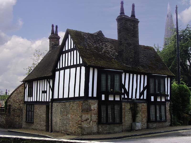
.jpg)


![[Image: SAGO6f7.png]](https://i.imgur.com/SAGO6f7.png)
